Windows 8 beta first impressions: brave but flawed
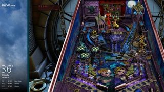
For example: Microsoft says that the Start menu needed rethinking because it wasn't an efficient use of screen space or resources. True on a tablet, where tapping small icons with any degree of accuracy is tough. But with a mouse it's far less work to call up all your programs and settings from one corner of the screen than it is to scroll back and forth across the entire width of your panel – as the Metro Start page asks you to.
Here's a practical example: take the process for shutting down the PC from the desktop. In Windows 7 you click Start and then you click Shutdown. From the Windows 8 desktop you move the mouse to the right side of the screen, hold it until Charms appear, click Settings, click Power, click Shutdown.
I have a lot of sympathy for Microsoft. This is a difficult transition time from the traditional desktop, with its overwhelming flexibility, to something more focussed for the future. It makes me think of Cory Doctorow's essay about the War on General Purpose Computing , but if you want to game on Windows, there's no avoiding what's coming.
So how does Microsoft wean us off of the desktop? In Windows 8, it's by using positive reinforcement. Devs who focus on Metro apps get big shiny colours and a potentially huge tablet audience to appeal to. Use the desktop if you have to, but you'll be niching yourself out of the future.
This isn't necessarily a problem for games: Metro apps can access most of DX11, and there's work going on to open up the whole API to them. It takes a bit of work to learn the new Windows Runtime environment, but it seems entirely feasible that before too long developers will be making Skyrim or Deus Ex class games with Metro launchers. Even if no developers I've spoken to are willing to commit to this yet.
As gamers, we're used to running full screen apps most of the time anyway, and there's nothing in Metro that says all programs have to work on an ARM tablet. You can still have minimum system requirements, just as you always have.
But that's the future and it's going to take time to adjust. Right now Microsoft can't give up the desktop because it has to support legacy apps, and where new Metro collides with the old way of doing things, it's a series of kludges which may or may not get fixed before release.
The biggest gaming news, reviews and hardware deals
Keep up to date with the most important stories and the best deals, as picked by the PC Gamer team.
Take this scenario: I use the note taking app Evernote for almost everything I write. There's an Evernote Metro app. But I need Evernote to be open next to my wordprocessor window so that I can read my notes as I type, and reference links I've saved in notebooks. So I need to install the desktop version of Evernote as well to use when I'm writing, as well as the Metro app if I want to clip pieces from other Metro apps, like a news reader. Both have the same application icon in Start, and I've lost double the disc space.
Things are worse when it comes to the built in browser. The Metro browser and the desktop browser are both called Internet Explorer and use the same Start launcher. That'll have you installing Chrome or Firefox for the desktop faster than you can say 'homepage'.
These are teething troubles, though. Experiences Microsoft and I both have to go through as the PC changes into something more suited to the future. They may even have worked themselves out by the time Windows 8 hits its next big milestone, the Release Candidate stage.
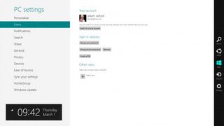
I worry more about control panels. One of my biggest issues with Vista was controls panels – many, if not all, were simply rushed over from Windows 2000 in the back of a coding cab. They weren't just old fashioned, they were jarring and amateur. They made the whole OS feel like it lacked the kind of design consistency that Apple is so venerated for. Windows 8 – at the moment – has a similar issue.
The new Metro control panel is very pretty and very high level. You can make basic adjustments to your system, but if you want to change your desktop resolution, update drivers, add a second screen or callibrate a monitor – or example – you've got to do it from the desktop. I really hope this is fixed before it comes out of beta. I suspect it won't be.
For what it's worth, I don't think Apple's approach to the same issue of mobile/desktop convergence – which it's addressing with OSX Lion and Mountain Lion – are any more elegant. The thing Apple is doing better, however, is point releases for incremental change. If you don't like the iOS features in OSX, you don't have to use them - Windows 8 is a far bigger step to take in one go. Once Windows 8 is out, I hope improvements and refinements come as annual service packs which make Metro more desktop friendly and the desktop less essential. Waiting three years for Windows 9 to do that would, I think, be a mistake.
Having said that, after playing around with the Beta makes me wish Microsoft had been braver. I like Metro, even if at this stage I prefer Android as a mobile interface. If that's their vision for the future, so be it. Dump the desktop completely. Force the adjustment in one go, don't prolong the agony. Instead of integrating the desktop, work on compatibility layers for older apps.
I understand why they didn't, but here's the thing – if you don't like Metro, you won't buy Windows 8 anyway. And for gaming, there's not going to be a technical reason for you to upgrade for a while yet.
'When a widespread outage affects devices from starting properly, Microsoft can broadly deploy targeted remediation': MS introduces 'quick machine recovery' for Windows 11
Windows 11 now has a publicly available roadmap so you can get to see what forthcoming horrors or awesome features await you

