Windows 8 beta first impressions: brave but flawed
Microsoft made the public beta, or 'Consumer Preview', of Windows 8 available for download on Wednesday afternoon , so we've had the best part of two days now to play around with it and work out what we like and what we don't. So far, I've used three PCs to try it out – one normal machine, one with a touchscreen and one Atom-powered tablet.
People have described Windows 8 as genius, ground breaking. A long overdue reworking of the tired desktop metaphor that better reflects how people really use their computers. Others look at it as a mess, forcing a look and feel designed for mobile phones onto unwilling desktop users. They see it as broken in the ways that Windows ME or Vista were.
Me? I see it as both. Fabulous and flawed at the same time.
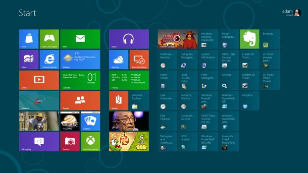
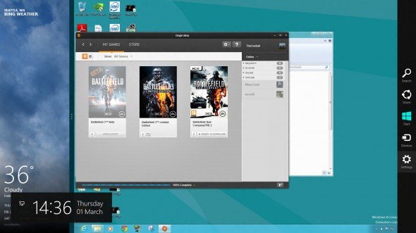
I won't spend too long describing what's in Metro – you can read about that in plenty of other places . It basically boils down to full screen apps without borders, a menu which hovers on the left for multitasking, and one on the right for context sensitive 'Charms' like search and settings.
Then there's the tile-based Start screen, iconic and finger friendly on a tablet; a lot of primary coloured squares with small text labels on a large screen. Some of these squares display live pictures and information, like more limited versions of Android's widgets.
But my concern is how Windows 8 affects PC gamers. For a start, it's clear that the desktop is an unwelcome necessity which has only been grudgingly included to appease old timers.
The desktop isn't an alternate user mode to Metro, as many make out. Microsoft explicitly want you to see it as just another app, which can be sidelined when you're not using it. This subtle but important difference underlines the inevitability of Metro: as familiar programs are rewritten to take advantage of the new Windows Runtime framework, you'll spend less time on the desktop and more in the Cool New Place.
The biggest gaming news, reviews and hardware deals
Keep up to date with the most important stories and the best deals, as picked by the PC Gamer team.
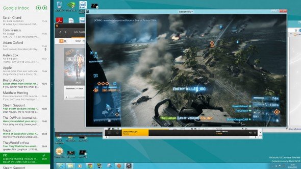
You're positively, eagerly, enthusiastically encouraged to play around with the big, bold Metro interface and enjoy its large print, full screen apps. These apps are delivered to you by the Windows Store, which looks like the front end of a games console because - Hey! - shopping is fun and desktops are boring.
The fact that I don't really need a mail app filling the entirety of my 30inch screen with 40 point text (there's no option to resize it) is neither here nor there. In the future, I won't need a 30-inch screen unless I operate a workstation, because focussing on one task per screen is the new way of multitasking.
What's more, even on a touch screen monitor a lot of the gestures don't work. You can't swipe in from an edge if there's a bezel around it, see? That problem is solved by the introduction of mouse movements and clicks which are used to replace gestures. Hover the cursor on the side of the screen, and you can bring up the same multitasking or 'Charms' menu that you can with a swipe.
On the whole these are straightforward and simple to learn: but it almost always takes more effort to get straightforward things done than before.
