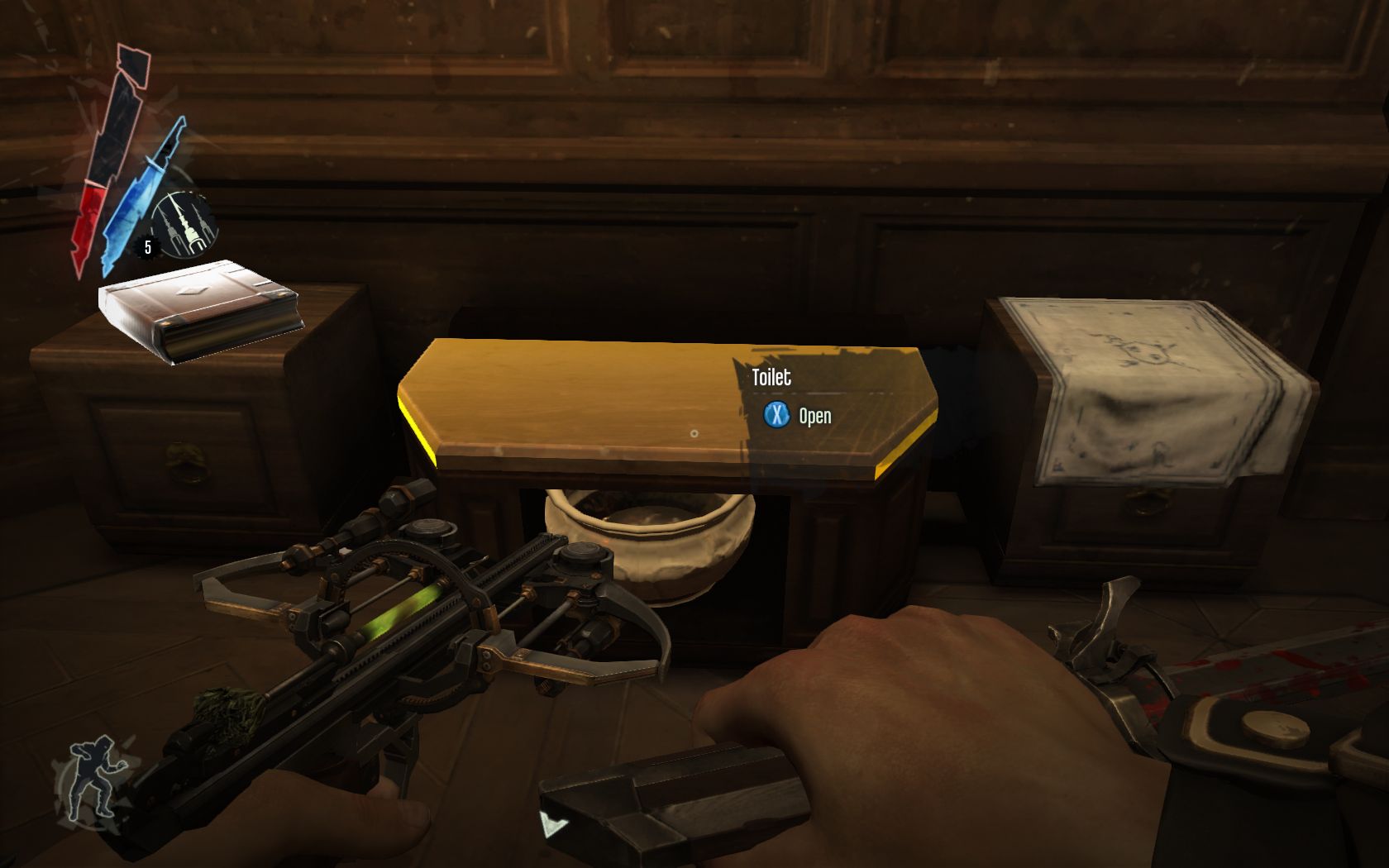
Why I Love: The toilets of Dishonored
Keep up to date with the most important stories and the best deals, as picked by the PC Gamer team.
You are now subscribed
Your newsletter sign-up was successful
Want to add more newsletters?

In Why I Love, PC Gamer writers pick an aspect of PC gaming that they love and write about why it's brilliant. Today, Sam marvels at the attention to detail in Arkane's Dishonored.
There’s nothing memorable about the toilets in most games, but I’ll never forget the toilets in Dishonored. When I reflect on the WCs in gaming’s recent past, I can remember plenty instances involving toilets—flushing the loo in almost every first-person game, for example or finding a recording in a particularly dirty one in BioShock—but the toilet itself, as a piece of visual design, is always unremarkable. It doesn’t need to be an outstanding flourish of a prop, after all, because it’s functional. PC Gamer would not mark a game down for having a boring toilet. Even in Andrew Ryan’s Rapture, the best that mankind has to offer is satisfied with a bit of familiar porcelain—unless mediocre lavatories were the real reason the civil war kicked off, which I’m pretty sure isn’t what Ken Levine and company were going for.
Dishonored’s fancy opening and closing chamber pot, pictured below, shows just how granular the team at Arkane got with world building in the 2012 immersive sim. It’s so pretty that I’d happily use it as an ottoman in my flat. I love this toilet because it shows how far the team was willing to go in making even the most functional elements of the world a little bit special. Late last year, I played through for the second time and invested hours in exploring every detail, locked room or systems-driven variables in how I completed each level. I wanted a comprehensive playthrough, having foolishly mainlined the story the first time. What I considered along the way is that Dishonored’s environments are collectively the perfect size: enough for the player to get a proper snapshot of the world, but not so large that it feels like it’s repeating itself (even instances where you revisit parts of the world later in the story are given a strong narrative justification).

You might only spot Dishonored’s toilets once every few missions, or maybe not at all, but I enjoy the idea that getting something like this right is as important to Dunwall feeling coherent as something high-concept, such as the Tall Boy walkers or automated turrets. World-building should not be limited to just the big stuff, and it speaks to how consistent Dishonored is as an immersive sim. I can’t think of a single basic element of the game that they get wrong: later parts of the story that leave the mission structure behind might lack the energy of earlier levels, but there’s little I can think of that would improve the art direction, combat, AI and stealth.
Article continues belowDishonored is a brilliant piece of work, whatever angle you take with it—the success of creating this world comes down to that ideal balance between size and detail. Even if you empty these worlds of NPCs—and I did, because I prefer the kind of stealth scenarios where everyone dies in increasingly novel and hilarious ways—it’s worth hanging around to pick out the side rooms and artistic flourishes. Like the very best immersive sims, Dishonored tells a story with its art direction, one of class difference, outrageous and gaudy wealth built on a foundation of socioeconomic decay. The contrast between rich and poor is one of the strongest visual ideas this game has, but this only works because the world feels so lived in and fleshed out. Every piece of set design is there for a reason, to contribute to the telling of Dunwall’s story. Even the shitter.
Keep up to date with the most important stories and the best deals, as picked by the PC Gamer team.


