Why I love physical videogame maps
The dying art of real life game cartography.


In Why I Love, PC Gamer writers pick an aspect of PC gaming that they love and write about why it's brilliant. This week Joe recalls his 'artistic' youth.
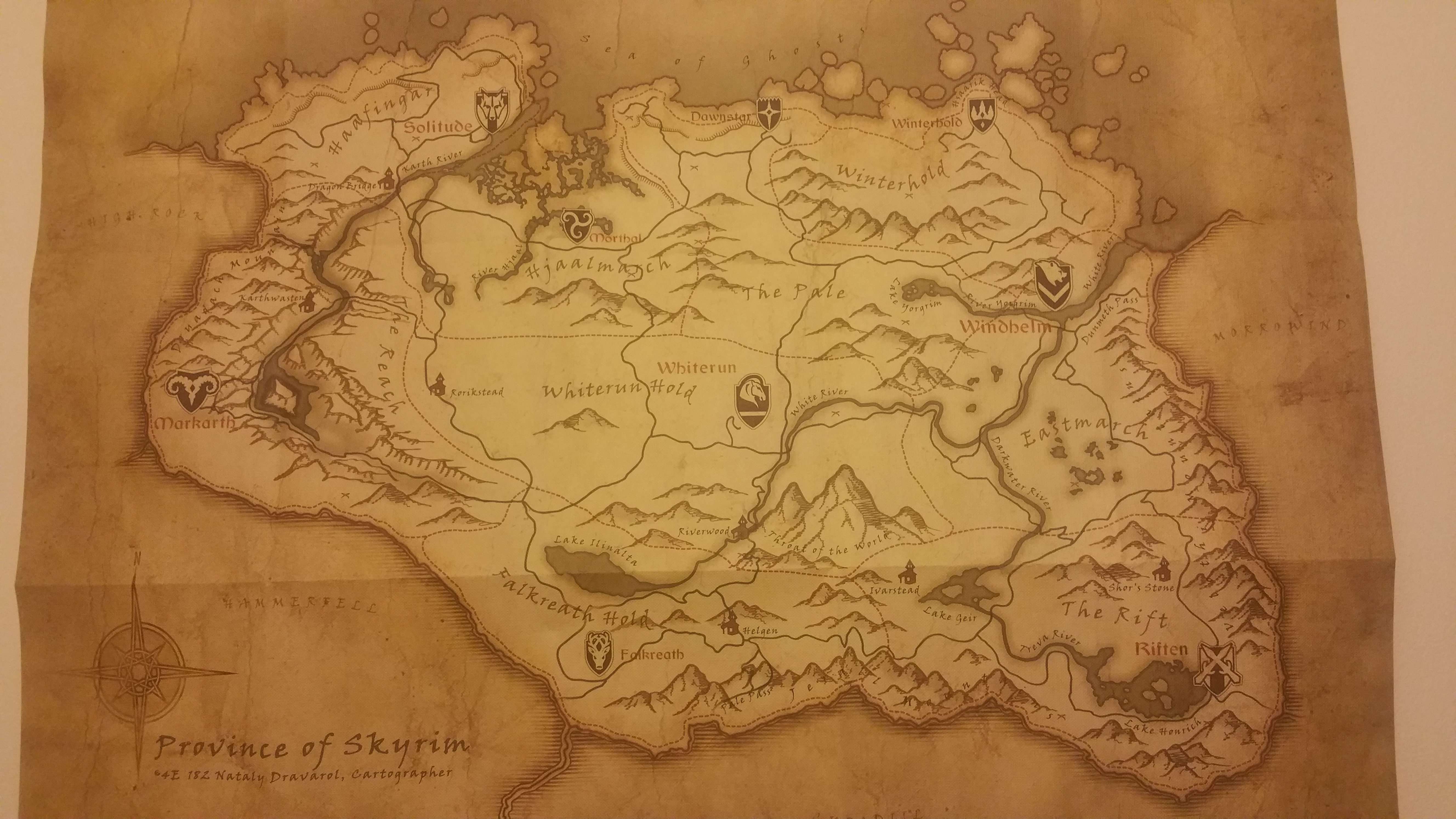
My introduction to the Ultima series was a late one. Having missed numbers one through eight for a number of reasons (namely age, and the fact my dad had a bizarre and exclusive penchant for pinball games—a genre which in turn commandeered our games library throughout my childhood), I decided to pick up the Ultima Collection in 1998 at the behest of some series worshipping mates. This would get me up to speed, I thought, and would also grant me a sneak peak at the then upcoming Ultima 9. With ten games to play with, this was sure to swallow my free time, but what I hadn't bargained for was how hard I'd fall for the Collection's seemingly novelty cloth maps.
They were beautiful and I became obsessed. I'd spend hours poring over each game's respective blueprint before every session, and then push myself to reach the far-flung corners of their digital incarnations. I'd invent imaginary treasure hunts and would spend entire evenings recreating my own crude interpretations of the game's vibrant, colourful cartography with crayons and felt pens and coloured pencils. I was an adventurer, an explorer, a keyboard trailblazer—and there was as much fun, if not more, to be had with a physical map than the actual games themselves.
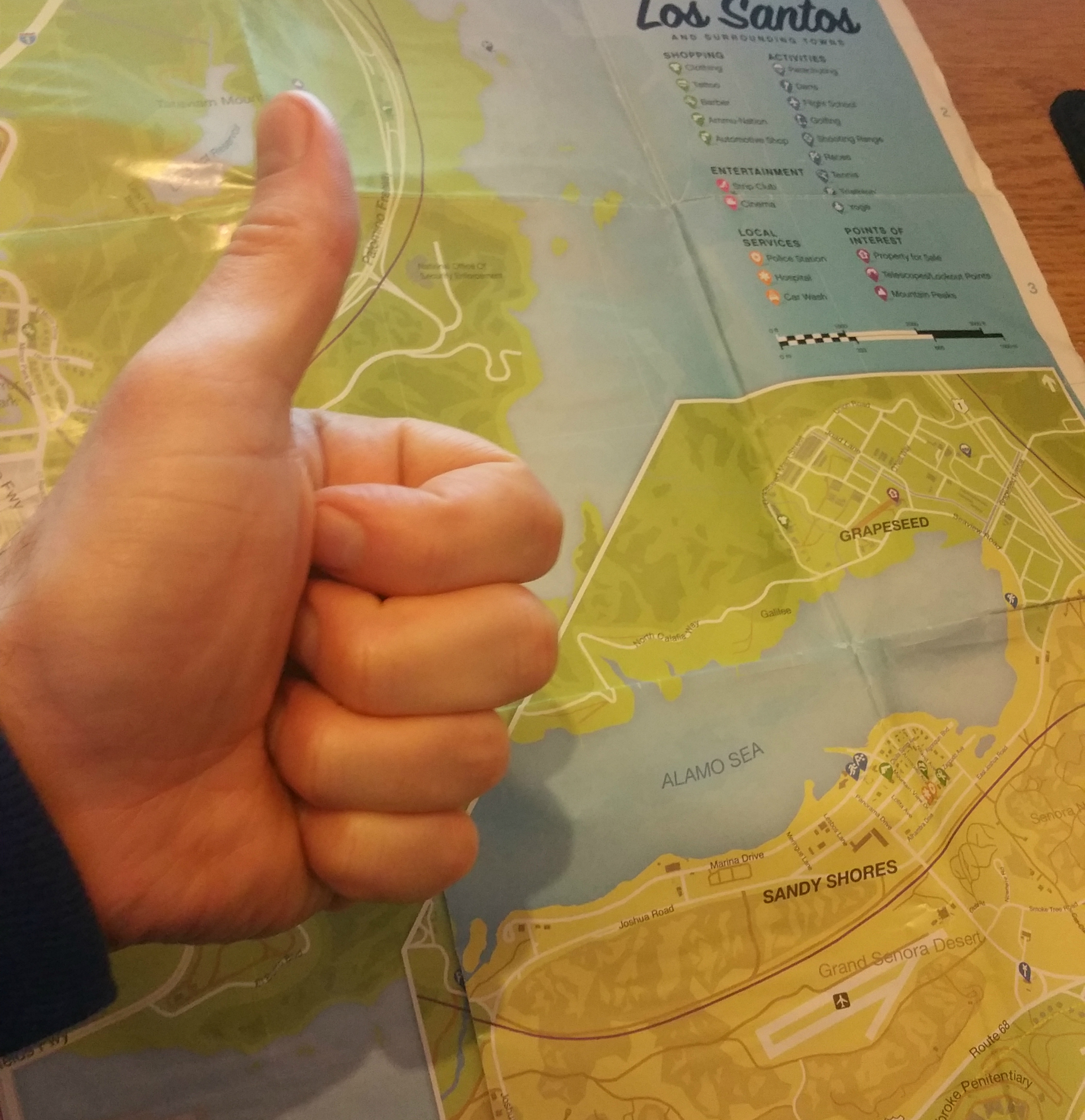
Later that same year, my friend lent me his big brother's copy of Grand Theft Auto and I discovered a whole new world of detail. The Manhattan-like homogenous grids of Liberty City, Vice, and San Andreas were masterful, and I'd delight in rallying between the Pay 'n' Spray in Brocklin, the bomb shop in North Hackenslash, the hospital in Eaglewood. The original GTA's 'open world' was ahead of its time, but its concrete playground felt far bigger as I traced each journey with my finger before and after each playthrough. The connection I made between what I had on paper and what I could see onscreen lent this boorishly visualised cityscape an extra layer of credibility.

And then of course every game needed a physical map—even the ones that didn't have one. I made bird's eye view reconstructions of my Theme Parks, Theme Hospitals and SimCity 2000's which, given their topdown/isometric perspectives wasn't all too difficult to achieve. Crafting the likes of Tomb Raider's Atlantis, on the other hand, and thinking my use of protractors and steel rules and speed squares made one jot of difference towards their legibility, was a different story/mess entirely.
As games became more sophisticated, in-game maps gradually begun to emulate my hand-crafted creations. Silent Hill 2's map is one which stands to mind. As fumbling protagonist James Sunderland makes his way around the titular otherworldly town, road blocks appear from nowhere, interminable holes form as if by magic, and busted locks—so many busted locks—prevent him from accessing certain areas.
When James first happens upon maps for each zone in turn he starts with a clean slate, but as he discovers said insurmountable obstacles, he draws the obstructions on himself—much similar to how I penned my masterpieces in my formative years. Towards the end of Silent Hill 3, without spoiling its plot, one area's in-game map mirrors that of a child's crayon drawing. It's a real flash of charm in an otherwise horrendous setting.
Like instruction manuals, physical maps are few and far between in today's games. I'm part of the problem—I rarely buy physical games anymore. But if I ever catch wind that one is bundled with a real life, hold-in-yer-hand map, then I'll almost certainly be first in line to buy it. I might even stop for crayons, pencils and steel rules on the way home.
The biggest gaming news, reviews and hardware deals
Keep up to date with the most important stories and the best deals, as picked by the PC Gamer team.

