Find all previous editions of the PCG Q&A here. Some highlights:
- What book should be turned into a visual novel?
- Which keys do you always rebind?
- What's your favorite gaming snack?
Steam's big library redesign is in open beta, so you can check it out for yourself right now. Go to the Steam dropdown, click on Settings, and then the Change button under Beta Participation. After a restart you'll be able to see a new home page highlighting games you own that have been recently updated, and then ones you've played/bought recently. The library's been redesigned too, with new filtering and organizational options, and game pages have been redesigned. Now they show community content by default, and any rare achievements you've earned have a sparkly glow.
Under Settings — Library you can tweak some of these changes, with nice options for Low Bandwidth and Low Performance modes and different sizes for icons. For those of you who've had a chance to try it out: What do you think of the new Steam library? Let us know in the comments.
Christopher Livingston
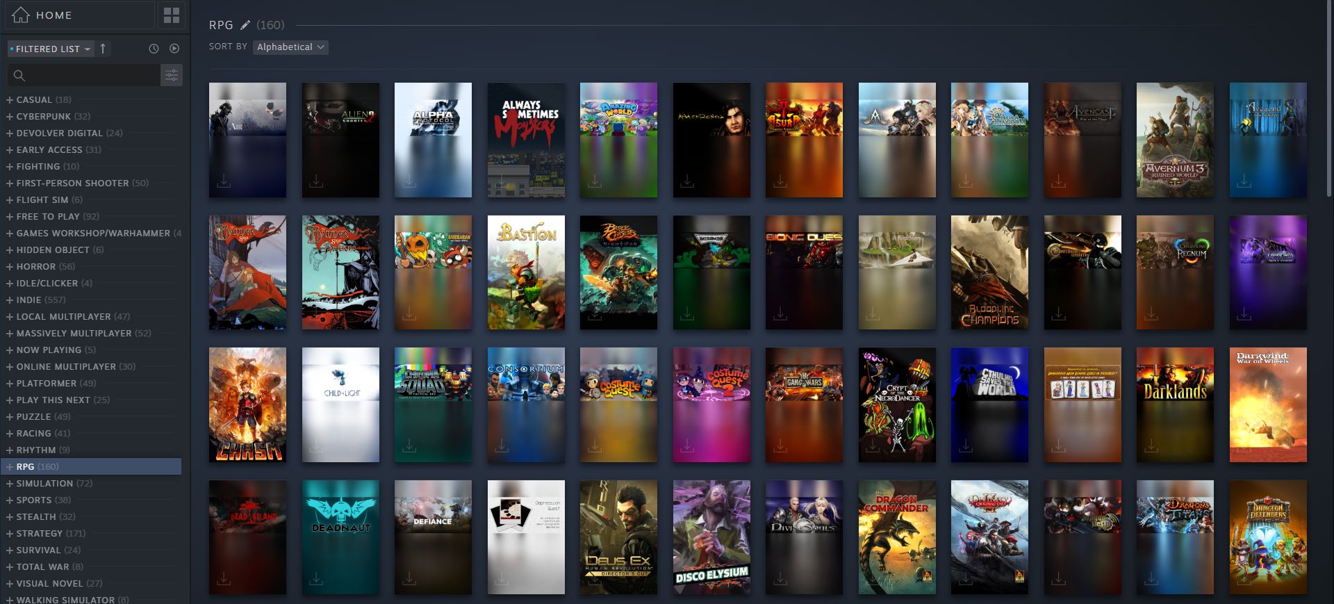
I've never really felt much need to sort my Steam library like I might sort a music library, but now that the tools are there (in beta, at least) I'm finding it pretty useful. Just by grouping all the RPGs together, for example, I discovered I owned over a hundred, which was kind of surprising since I can name maybe only a dozen off the top of my head. I also like that I can easily see a list of games I own but have never played, so on a rainy afternoon I can get around to finally playing, well, whatever I forgot I bought.
I do hope they add back the 'Small Mode' option, which is how I typically want the Steam client to look on my desktop. Just a little tiny window on my screen showing the handful of games I currently have installed. I like the idea of lots more features, but I'd still like it to look simple as well.
Lauren Morton
Like Chris, I do enjoy being able to see all my games of a type together. The thing is, I've already manually sorted them into collections years ago which took a long freaking time. As Chris points out though, using Steam's user-assigned tags for RPGs means you get a very long list of things that maybe aren't exactly an RPG. I prefer my hand-picked RPGs list. But the "played" and "unplayed" boxes for sorting are quite nice because I've also made manual categories for those (yes, really) and Steam's input there would be more accurate than my memory.
As for the individual game pages in the library, they're very pretty but my eye hasn't quite trained to pick out the valuable information yet. The relevant game links along the top bar for "store page" and "community hub" are nicer than when they were tucked along the right sidebar. Oh, and glowing rare achievements keep catching my eye. Quite proud of my shiny "Beloved Farmer" achievement for Stardew Valley. Overall though, it feels a bit like when Facebook used to change its layout on us years ago and we all complained until we got used to it. Maybe it's better, maybe it's worse. It's probably here to stay regardless.
Jody Macgregor

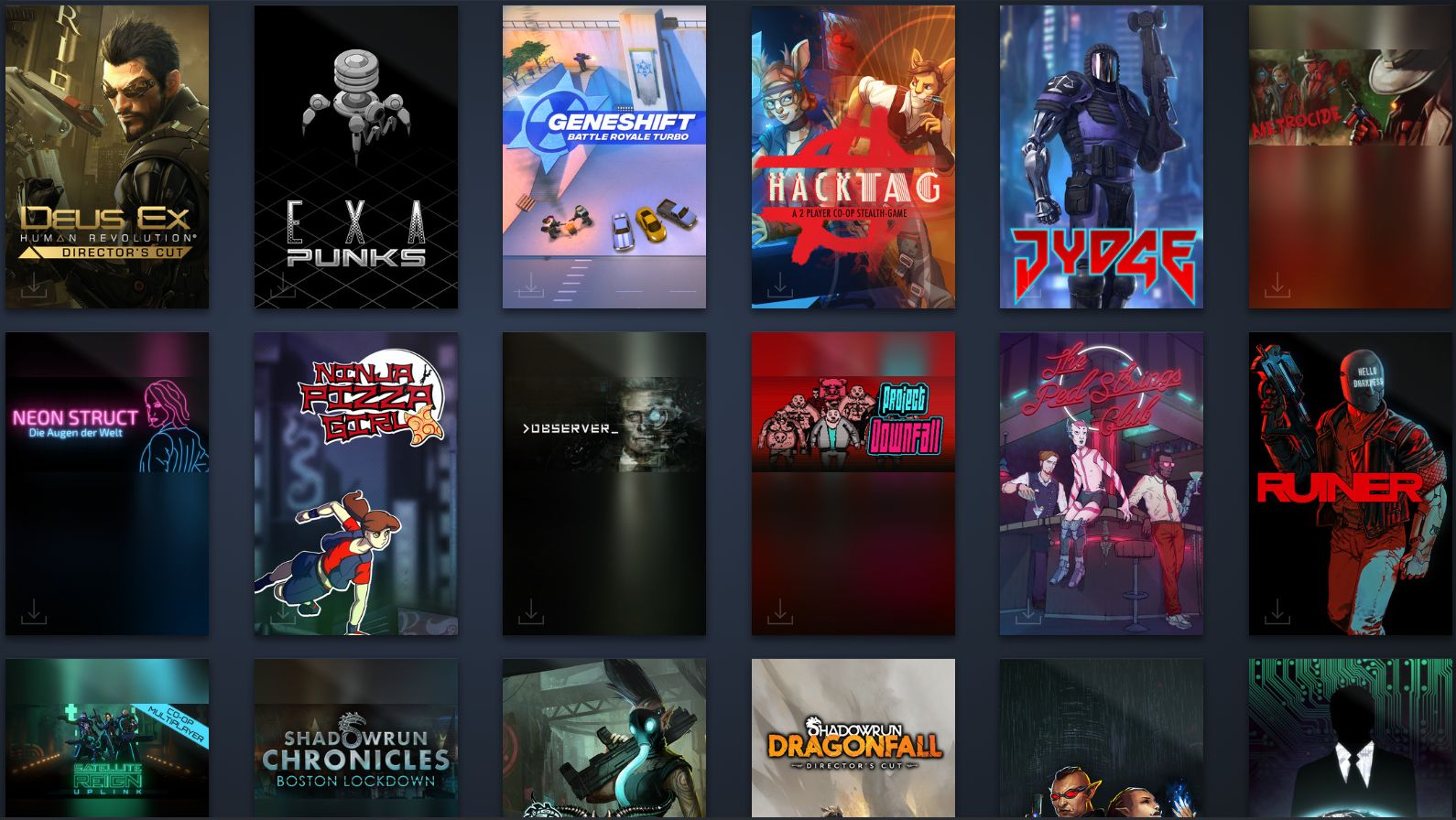
The portrait-style artwork in the library makes me feel bad for developers who have to reformat their key art yet again. Every storefront has a different set of dimensions which means finding a way to get that art and logo looking nice for every one, which must be a total headache. Right now half of my library just has landscape art floating in a vertical blur.
The biggest gaming news, reviews and hardware deals
Keep up to date with the most important stories and the best deals, as picked by the PC Gamer team.
I appreciate the attempt to make them look more like physical game boxes, but GOG achieves that by displaying each game's title and tags underneath landscape art and putting them on a shelf (I'm team wood-grain for life). I used to swap in custom art for some games on Steam's old grid view, and I'm not looking forward to replacing all that.
Still, being able to filter my library by ticking a couple of boxes to see, for instance, all the co-operative games I currently have installed is super useful. For that alone I'm down with this update.
The collective PC Gamer editorial team worked together to write this article. PC Gamer is the global authority on PC games—starting in 1993 with the magazine, and then in 2010 with this website you're currently reading. We have writers across the US, UK and Australia, who you can read about here.
