Keep up to date with the most important stories and the best deals, as picked by the PC Gamer team.
You are now subscribed
Your newsletter sign-up was successful
Want to add more newsletters?
Find all previous editions of the PCG Q&A here. Some highlights:
- How much free storage space have you got on your PC?
- Which Nintendo game do you wish was on PC?
- What game have you spent the most hours in?
Elden Ring's a recent example of clunky mouse-and-keyboard controls, but there are plenty of other games that make terrible use of the PC's default setup. Games that don't let you rebind keys; that use double-tap for dodge; that bind the map to something other than M or tab; that bind multiple, contradictory things to the same keys so you end up jumping when you're trying to open doors or skipping dialogue when you mean to crouch; that don't let you use the mouse in menus. (Shout out to Killer is Dead, where you left-click to select menu items, but have no cursor and so have to highlight them with the arrow keys first like some kind of savage.)
What are the worst mouse-and-keyboard control sins?
Here are our answers, plus some from our forum.
Article continues belowChristopher Livingston, Features Producer: I was recently reminded of an old Apple II game I used to play called Aztec. Made in the early 1980s, it was basically a precursor to Spelunky, with randomized dungeons, placeable explosives, monsters, traps, treasures, and a fedora-wearing adventurer. It was unprecedentedly janky—you could actually blow up the floor, fall through, and walk around on the UI elements—and the keyboard controls were truly bizarre.
W was walk, R was run, J was jump, and S was stop. Yes, you had to tell the adventurer to stop or he'd keep on going. This included climbing stairs (C for climb), and if you didn't tell him to stop climbing stairs he'd keep trying, even in the absence of stairs. O was open (a box), L was look (look into the box you just opened) and T was take (take something from the box you opened and looked into). How do you kneel? K for kneel? C for crouch? Nope. G! Explosives could have been E, but instead it was P (for place explosives). And I'll let the user manual explain how combat worked.
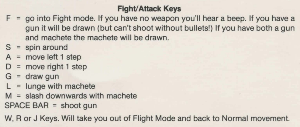
I guess a positive view is that it really made full use of the keyboard. On the downside, you really had to be a talented touch-typist to play.
Tyler Wilde, Executive Editor: Chris, I keep rereading that control scheme document and laughing at a different line. Forget paying respects, I'm pressing F to "go into Fight mode" from now on. It's unbeatable. I especially like the line at the bottom which explains how to leave "Flight Mode." Is it a typo, or are there both Fight and Flight modes? I really hope it's the latter.
Keep up to date with the most important stories and the best deals, as picked by the PC Gamer team.
Anyway, to actually answer the question here, there are tons of things that bother me, but one I can't stand is when Esc doesn't back out of a menu. Someone else mentioned it recently, and I keep thinking about how much it annoys me, because it's often not a rebindable control. Especially bad is when Esc opens the menu, but a different key closes it. Noo! When in-game, Escape should always open the main game menu, and pressing it again should always close that menu, unless you've navigated to a submenu, in which case it should move you "up a layer" back toward the main menu. A related thing that irks me is when hitting Esc exits an options screen and discards my changes. I understand the desire for clarity, but I promise that the stakes are not so high that I need an extra keypress to save my mouse sensitivity tweaks. (However, I do insist on a "reset to default" button in case I want to find the baseline again.)
Christopher Livingston: It's a typo in the manual. This adventurer has enough trouble walking and climbing stairs. Flying is definitely not an option.
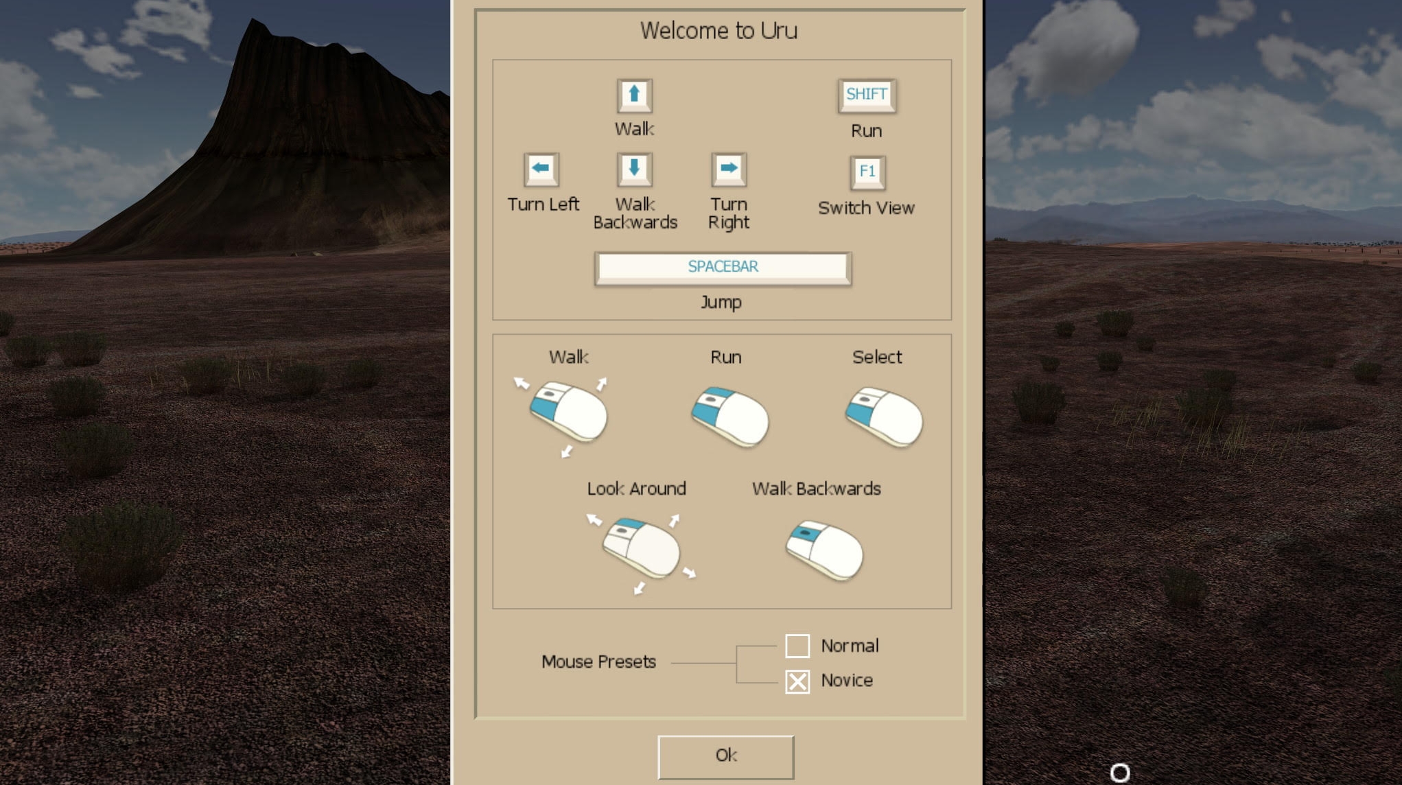
Andy Chalk, NA News Lead: I really enjoyed Uru: Ages Beyond Myst, Cyan's 2003 puzzle-adventure, but holy cow the controls are brutal. In the default setup you hold the left mouse button to walk, or left and right buttons to run; the middle button is for walking backwards, and holding the right button enables mouselook—but only in a very limited field of view when in third-person mode.
Seriously, look at this hot nonsense:
It's possible to remap most of the control keys for a more conventional WASD setup, but full-time mouselook isn't an option: You still have to hold the right button to control your direction as you move forward. Interactivity isn't possible in that mode, though, so if you want to push a button or flip a switch, you must release the button to bring up the cursor, which disables the directional control. Worst of all, though, is the sidestep, a painfully slow shuffle left or right—the sort of movement you'd expect from someone terrified of heights who's being forced to inch along a shallow outcropping along the side of a cliff. It's incredibly frustrating, and there's nothing that can be done about it.
I'll always have affection for Uru, but this old Gamespy review is spot on: "The [control] scheme is difficult to use and never becomes intuitive. You'll probably find yourself running in place and missing jumps because the movement keys are uncomfortable. Far too much of the game is spent worrying over the controls instead of enjoying the puzzles and atmosphere. It's easily the worst part of Uru, and it's unclear why Cyan didn't simply make the controls as easy to use as those in first- and third-person shooters."
It's a shame, really. Uru had a lot going on, but those controls sucked, and that's what I remember most about it.
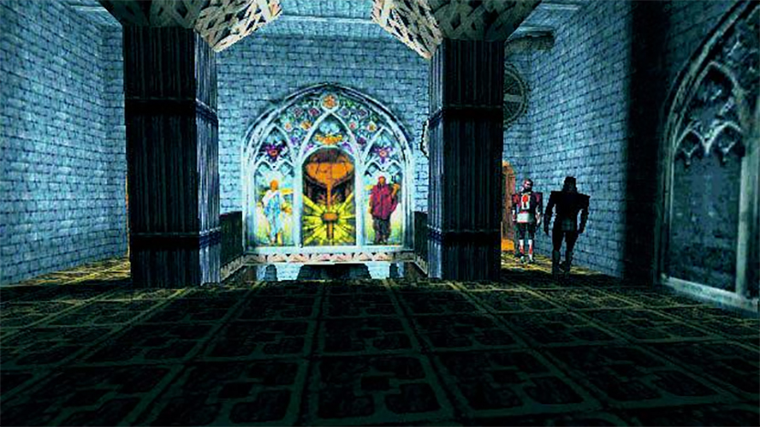
Jody Macgregor, Weekend/AU Editor: I remember the dark days before mouselook and strafing became standard and the keys for left and right—whether A and D or the left and right arrow keys or whatever—would spin you in that direction instead. At least some games would let you rebind them, like Thief: The Dark Project, which had strafe left and right bound to Z and C by default. It also had W as run and S as walk, with X for backstep. I left those the way they were when I first played it because it was handy to be able to control your speed, and I hadn't really adapted to WASD yet anyway.
As far as modern games go, FromSoftware really take the cake. I assumed after the debacle of the Dark Souls PC port that things would have improved by Dark Souls 3, but it was still terrible with mouse and keyboard. Though thinking about it, even after I switched to controller I couldn't consistently pull of the kick.
Special mention to Cyberpunk 2077 for having both toggle crouch and skip dialogue bound to C, though. Oof.
Evan Lahti, Global Editor-in-Chief: Six years later, pressing C to crouch remains an act of degeneracy. As I wrote in 2016, "C is the male nipple of keyboard bindings, a remnant that’s for some reason survived decades of gaming evolution." It's not ergonomic, it's awkward, and it's illogical. An epoch ago, when we used the Ctrl key to fire our guns in FPSes, it was passably acceptable. Today it's an act of antiquated, alphabetical arbitrariness. Do we map Jump to J? G for Grenade? (Yeah, that's dumb too.) Rebind crouch and be reborn.
Nat Clayton, Features Producer: I don't know that I have a serious response but I WILL fight Evan over C for crouch. Toggle crouch, at least. Regular crouch can remain, as ever, in its natural home—mouse button 4.
Evan Lahti: Romero's mullet, it's worse than I thought. The youths are binding different types of crouching to different keys? Each day we drift further from enlightenment.
From our forum
Withywarlock: In MMOs it's keyboard turning/clicking. The former is where you use the A/D or Q/E keys to turn left/right on the spot (as opposed to strafing), respectively, where a mouse should be used for movement to free up keys and fingers for abilities. Clicking is somewhat related to that previous point, in that clicking is dragging your mouse cursor over your on-screen ability buttons instead of using their designated keys, meaning less time is spent moving and firing off abilities. It even happened at the high end of World of Warcraft, where top players were being laughed out of their 15-FPS 360p FRAPS recordings for doing keyboard turning and clicking.
In terms of game design though, not being able to press up at the highest point of a menu to go straight to the bottom, and vice versa. It's even worse on controllers where 1) you have to remember if it's the thumbstick or directional pad that only works in menus, and 2) neither are better than a keyboard or mouse for menus. >.<
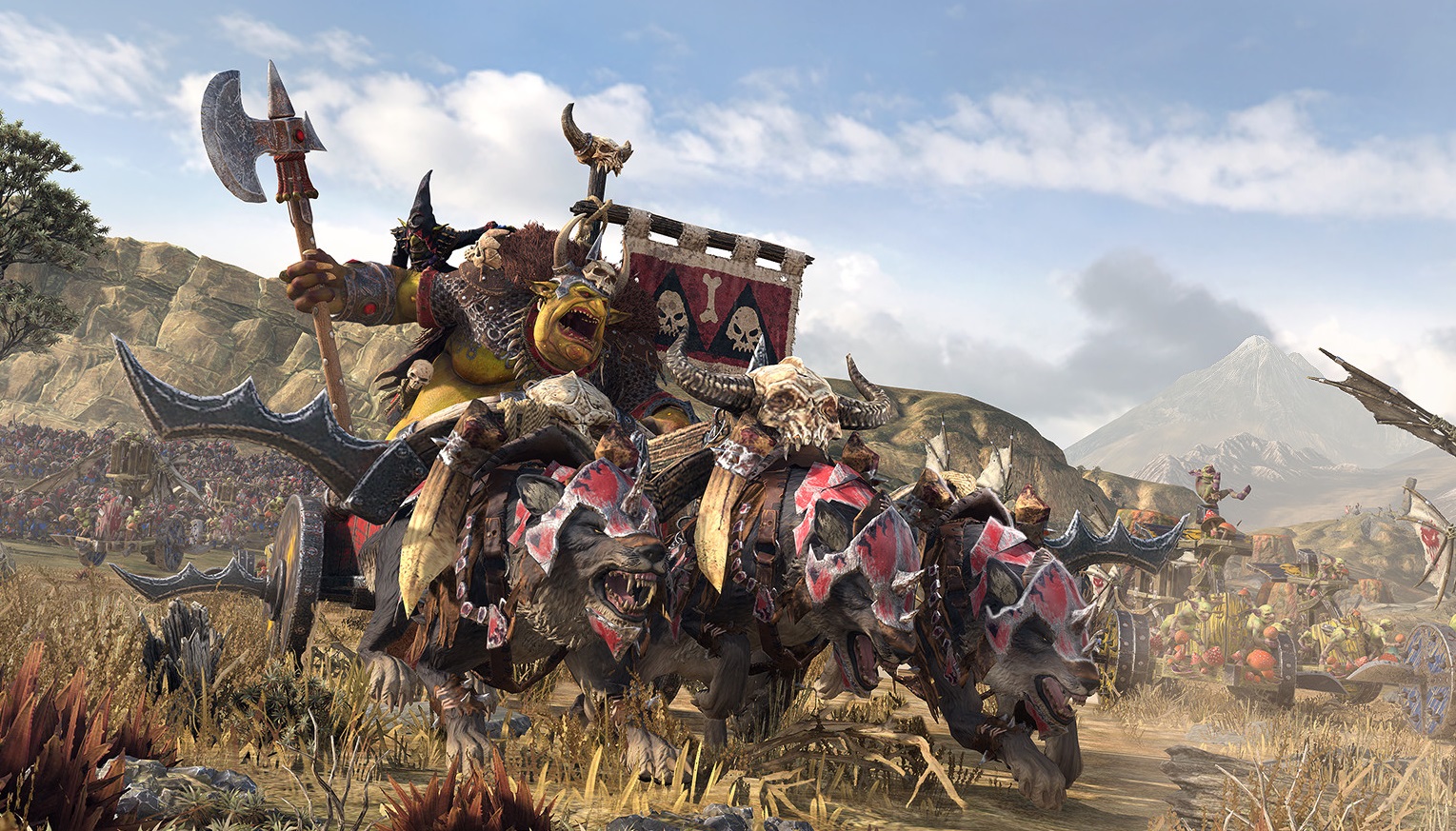
Pifanjr: Not being able to rebind keys is obviously the worst one, but not being able to use hotkeys is almost as bad. Total War: Warhammer 2 for example just doesn't have a hotkey to toggle guard mode or the fire at will stance. It's not something you need to toggle very often in a battle, but it would still be nice if I had the option to just use the keyboard.
Another example is Skyrim. I would have loved it if you could cast certain spells with just one button press, instead of having to equip them, cast them and unequip them. I like the idea of using the spells for setting traps, but the hassle of switching back and forth just doesn't make it worth it. And I know you can use the numbered keys, but there's only 8 of them available, which isn't enough.
Actually, now that I think about it, I would love for games to just let me set macro's.

Frindis: The first that comes to mind is not being able to bind the enter key to something else. When I played Forza Horizon 5 and tried to snipe cars at the auction house it was almost impossible to snipe cars fast enough because of how slow it took when using the enter key. So to combat this problem I had to use Microsoft PowerToys to be able to remap the key. Such an easy thing to fix, makes you wonder why not just make it possible to do in-game.
ZedClampet: If through incompetence and a lack of rebind options, you make it so that I have to ever take my hand off the mouse, I will curse your ancestors.
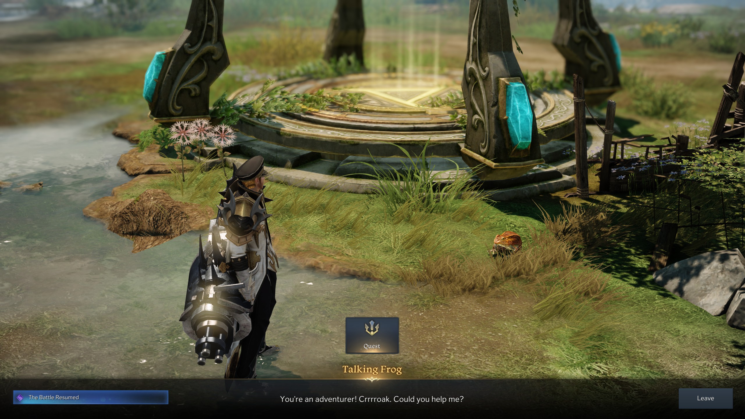
DXCHASE: Not being able to rebind is my biggest sin. Its like cutting out the biggest reason of why keyboards are better than a controller. I can't rebind my G key for going through quests in Lost Ark. My G is starting to chip.
mainer: Rebinding keys has never been a huge deal for me. Oh, I change a few here and there, especially If I'm using some mods that add some new gameplay mechanics that have their own key controls. Sometimes those key functions overlap what the game already uses, so some keys will need to be changed. I greatly appreciate it when a developer allows changing the bindings (or at least most of them).
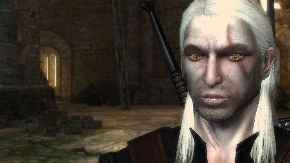
As far as games that had specific control schemes that bothered me, I know there've been a few, but the one that always sticks in my mind is the mouse controls for combat in the Witcher 1. Left click to attack, timed left clicks to chain attacks, double left click on the ground (but not too far away!) for an evasive maneuver, right click to dodge or duck, right click to cast a sign. The cursor would also change depending upon where your cursor was and what your were supposed to be doing. Most of the time I ended up flopping around like a fish out of water while getting stabbed in the face and clicking all over the screen.
Keeping track of the cursor changes, the types of clicks, and where to click was one of the strangest control schemes I've come across. Thankfully, a lot changed for the better between Witcher 1 and Witcher 3.
Zloth: Did you ever play Die by the Sword back in the 90's, @mainer? If I remember right, you actually had to control a set of muscles in the arm to make your swing.
I don't re-bind keys much but, when I need to, I really need to! Still, even though it doesn't cause as much proper harm, I think making the main menu not work with the mouse is the bigger sin. You've just gotten yourself ready to go, you're all hyped up to play the game, and you immediately get let down because they couldn't be bothered to make the mouse work there. I know it's only going to be a couple of minutes out of dozens of hours of gameplay, but the psychological effect is really nasty.
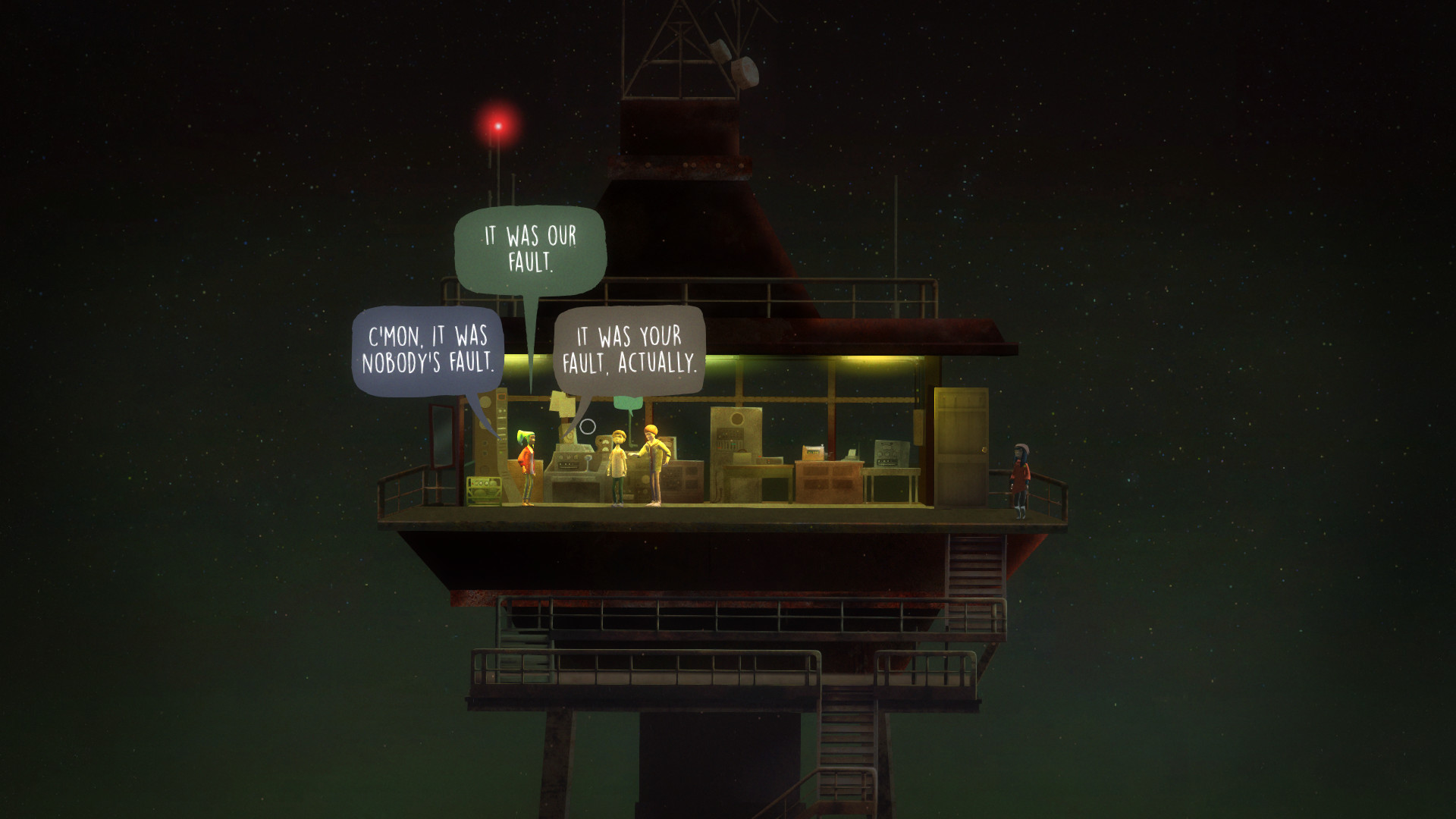
JCgames: Having to press 2 keys to go in one direction! A game called "Oxen free" did this when you had to walk down diagonal paths. It was mind numbing and nearly ruined the game. A game that could easily be played with just mouse clicking you had to press multiple keys far to often just to move. It doesn't sound like a big deal, but in a game where all your doing is try to move across the screen it was completely unnecessary. If i had to guess the designers used a controller and a keyboard+mouse was an afterthought.
I will give them a lot of credit though, they updated the game to work with just a mouse which is fantastic. I know I made a post requesting it and I'm guessing others did to because they added it. It was one of those games that I loved and hated. Loved, the story, the music, the theme, but the controls were a mess. How do you make a point 2D point and click with no click to move? With that little change it became a game that I trudged through, to an instant classic and a must replay!
So not enough mouse support is my biggest pet peeve games that could easily be played with just a mouse needing a Keyboard+mouse. Now if I can only get Concerned Ape to add Click to move in Stardew Valley I would be happy.
WoodenSaucer: I think this applies for either K&M or controller. But when you play a game series when they always set up the key/button bindings the same way, and then they come out with a new game in the series where they change everything, and it's not really any better than it was. Then you have to relearn all of the controls, and it's not even worth it.
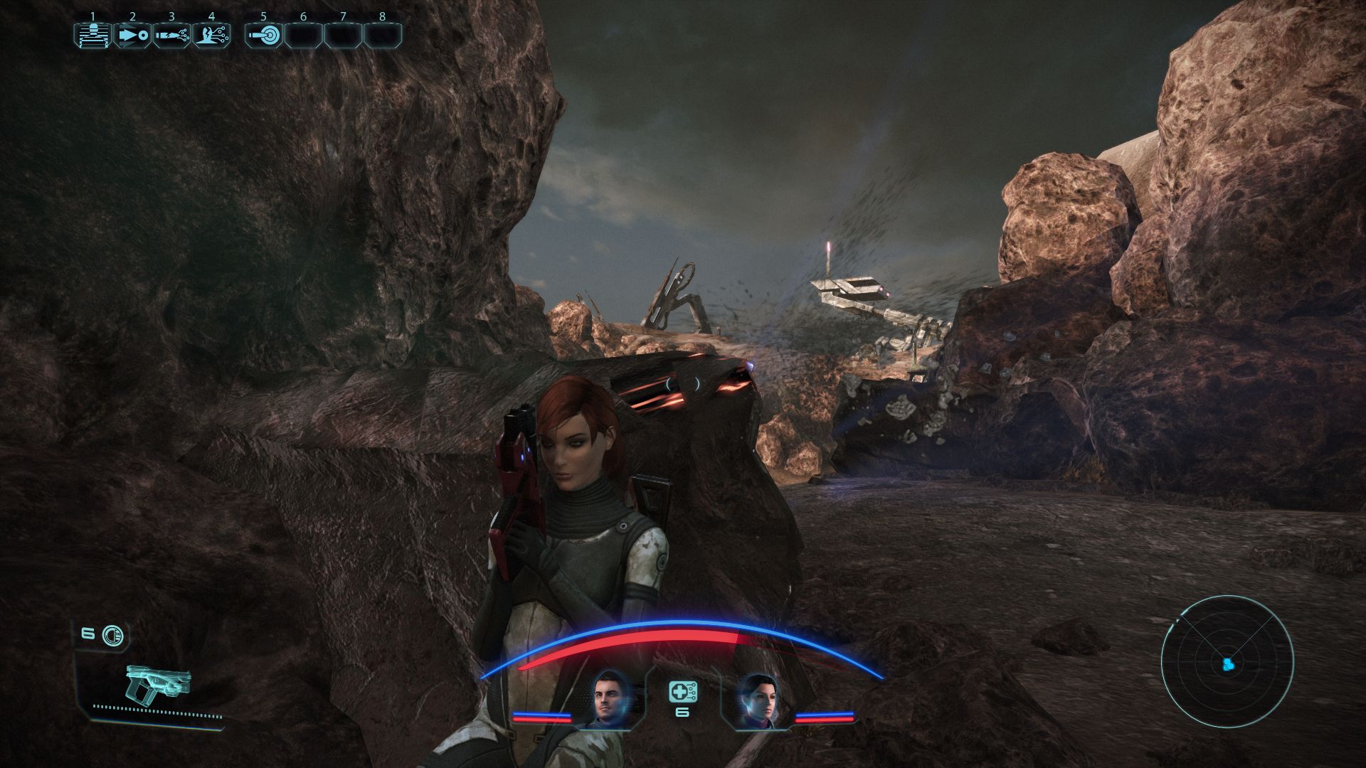
Krud: This might also apply to controllers, but it's especially egregious when you have an entire keyboard at your disposal, and that's context-based controls. I don't like it when games decide the spacebar is both Jump and Hide Behind Cover, depending on how close you're standing to something. It's frustrating to think you're about to protect yourself and hide, but instead you leap straight up in the air as if to say "Woohoo! Look at me!" (I think at least one of the Mass Effect games was guilty of this.) The reverse is also annoying, when you're trying to jump out but instead your character clings for dear life up against a wall.
Edit: I just realized that this was already mentioned in the OP, my apologies. But seriously though. We've got over a hundred buttons to choose from. There's no need for them to double up. At the very least, give us the option to enable or disable context-based buttons. Make it a toggle. Can't be that hard, can it?
The collective PC Gamer editorial team worked together to write this article. PC Gamer is the global authority on PC games—starting in 1993 with the magazine, and then in 2010 with this website you're currently reading. We have writers across the US, UK and Australia, who you can read about here.
