Steam's new mobile app is a big improvement, despite UI annoyances
The updated Steam app is much more modern, although some navigation troubles remain.

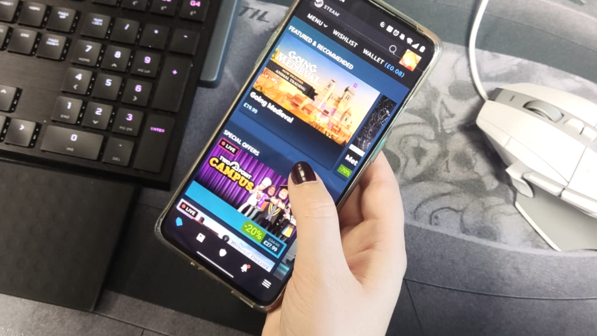
It's been a long time coming, but Valve has finally made some major updates to the Steam app for Android and iOS, as well the standalone APK. The changes include improvements to the UI and underlying framework, as well as some cool new features.
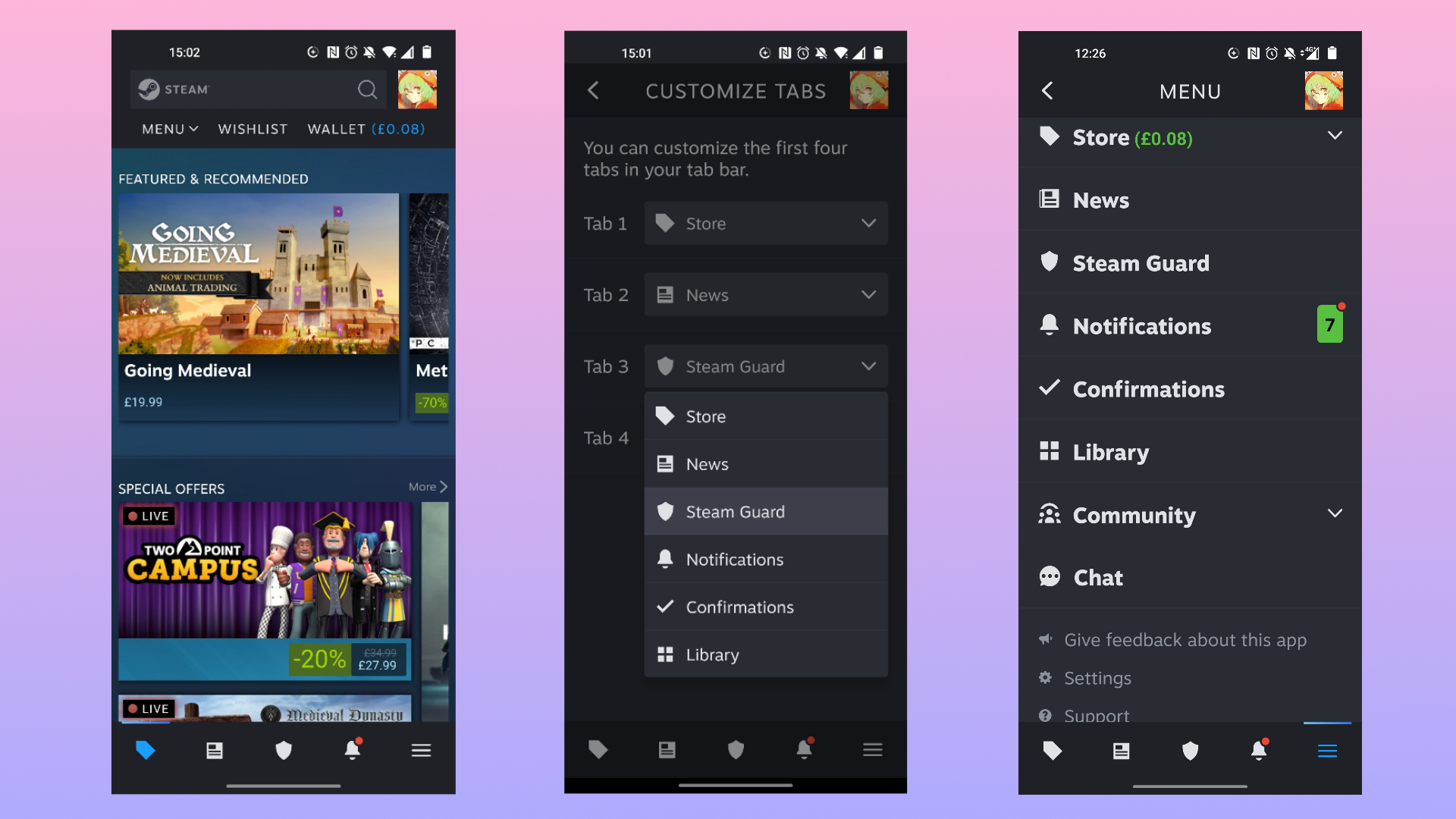
"We've completely revamped the Steam Mobile app," Valve says. "You’ll still be able to browse the store, get Steam Guard codes, and confirm trades—with additions like QR code scanning for PC sign in, smarter notifications, a new Library view with remote downloads, and customizable tabs."
Users can now log into multiple accounts in the mobile app, as well as manage device access, so you can make sure you're not still logged in on your ex-best friend's machine.
You can also use the app to remotely start Steam downloads on your PC, so you can have them ready for you when you get home. You can even customise the tabs now situated at the bottom of the UI, and personalise which page you see as your homepage.

I've been taking a look at the app myself this morning, and the UI looks a lot better than it did before. It has less of that "we built this in the '90s using HTML" feel. The fact you can now point your phone at your PC and use a QR code to log in, like with Discord and WhatsApp, is such a massive usability win. It's especially useful if, like me, your partner whose machine you intermittently need to log into to share your library is using some obscure keyboard layout.

Best CPU for gaming: The top chips from Intel and AMD
Best gaming motherboard: The right boards
Best graphics card: Your perfect pixel-pusher awaits
Best SSD for gaming: Get into the game ahead of the rest
One of my main issues with the app, however—and someone please correct me if I'm doing something wrong—is, when you're scrolling through a long list of games and decide to click one, using your phone's back button will land you right back at the top of the list again, or in an entirely different section. It's a similar case with Valve's Steam Deck, in that the Steam OS will send you back to the top almost at random, and it's such a pain to scroll back down to the place you were at in the list.
The ability to jump back to where you were when scrolling through the store something that's been missing through every iteration, and it's been bugging me. Just wanted to put that out there, but overall the update is great.
The biggest gaming news, reviews and hardware deals
Keep up to date with the most important stories and the best deals, as picked by the PC Gamer team.
Yesterday's Steam News Hub post has more details on how to make the most out of the app refresh, and for now it's nice to know that Valve's focus on making the Steam Deck more user friendly had bled across the board.
Next up, Valve says it will be working on bringing QR sign in to the Steam Deck, fiddling with new kinds of notifications, and making it possible to change device authorisation in the Steam Client, as well as the browser.

Screw sports, Katie would rather watch Intel, AMD and Nvidia go at it. Having been obsessed with computers and graphics for three long decades, she took Game Art and Design up to Masters level at uni, and has been rambling about games, tech and science—rather sarcastically—for four years since. She can be found admiring technological advancements, scrambling for scintillating Raspberry Pi projects, preaching cybersecurity awareness, sighing over semiconductors, and gawping at the latest GPU upgrades. Right now she's waiting patiently for her chance to upload her consciousness into the cloud.

