Tips for customizing Windows 10's Start menu
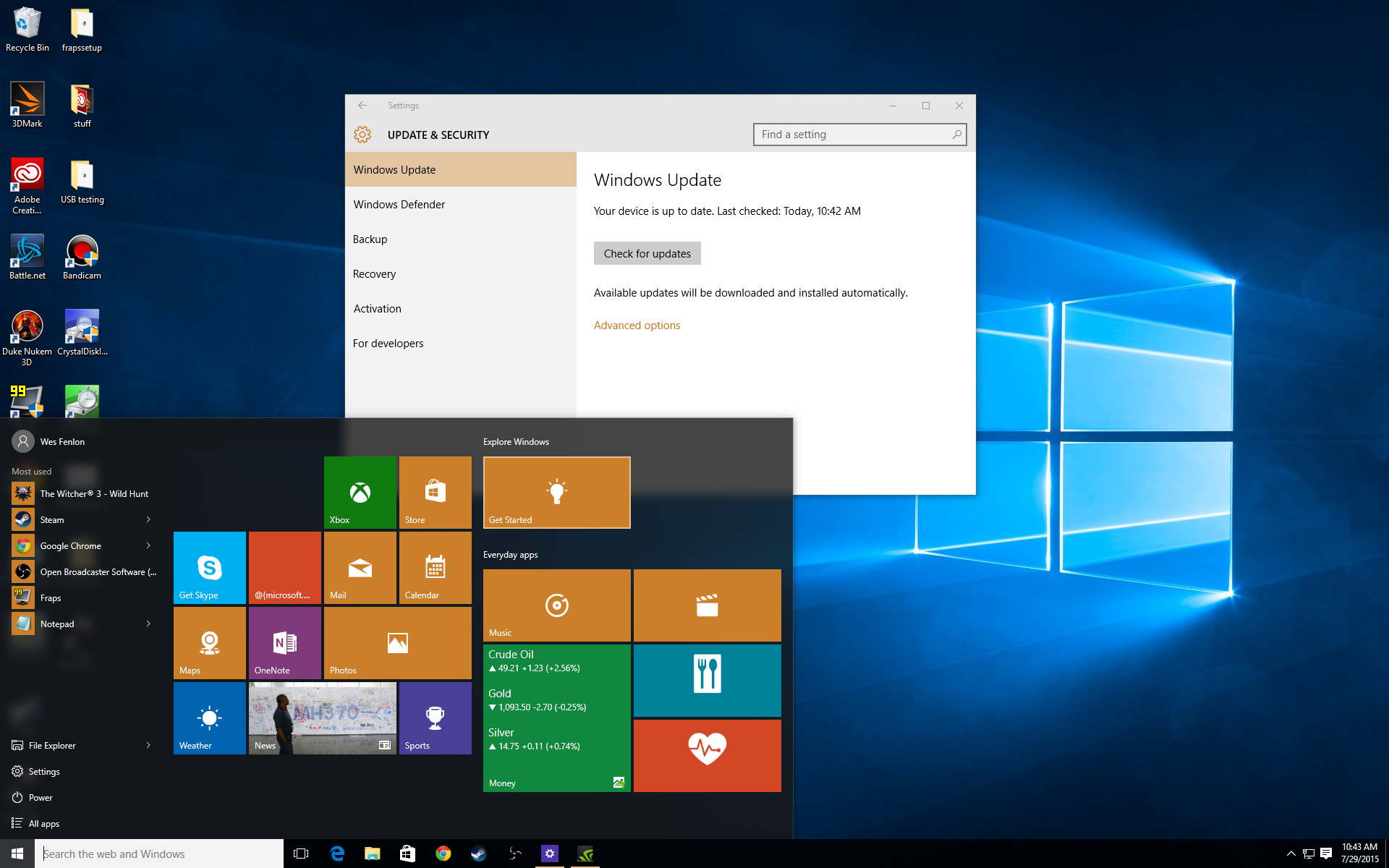
Windows 10’s release marked the return of the Start Menu, and what a glorious return it was. Desktop users could say goodbye to the confusing parallel of the Start Screen and the desktop and finally navigate programs and folders with an interface built for the mouse. Windows 10’s Start is a big improvement over Windows 8’s, for sure, but if you love the Start Menu of old, you may still have some quibbles with this new implementation.
I’ve got two complaints, myself. One: the block of color behind each application icon is garish, and stands out next to an otherwise elegant design. Two: the only way to ‘pin’ applications to the Start Menu is to pin them as tiles, unlike in Windows 7, where the left side menu was split between recently used and pinned programs. I think Live Tiles are a cool way to display information like news headlines or the weather, and I like the big tiles for pinning games with attractive thumbnails. But other programs like Notepad and the Calculator I’d much rather have as entries on a list, not large tiles (or very small tiles that I have to hunt for in a sea of blocks).
With those criticisms in mind, I tried out two customization tools for the Windows 10 Start Menu, Classic Shell and Start10, to bring back the Windows 7 Start functionality. Unfortunately, neither tool could mix Live Tiles with the pinning format of old, but they do offer more choice in appearance and organization than you get with the default Start Menu. Here’s how to customize Windows with both of them.
Start10
Download here | Price: $5 (30 day free trial)
Stardock has been offering Start Menu customization software for years and years, and you may have used its Start8 software to bring back the menu in Windows 8. Start10 will look plenty familiar, if you did: it’s a straightforward piece of software that lets you choose between the Windows 7 style menu, Modern menu, and Windows 10 menu. Here’s what each menu option looks like:
Windows 7 style menu
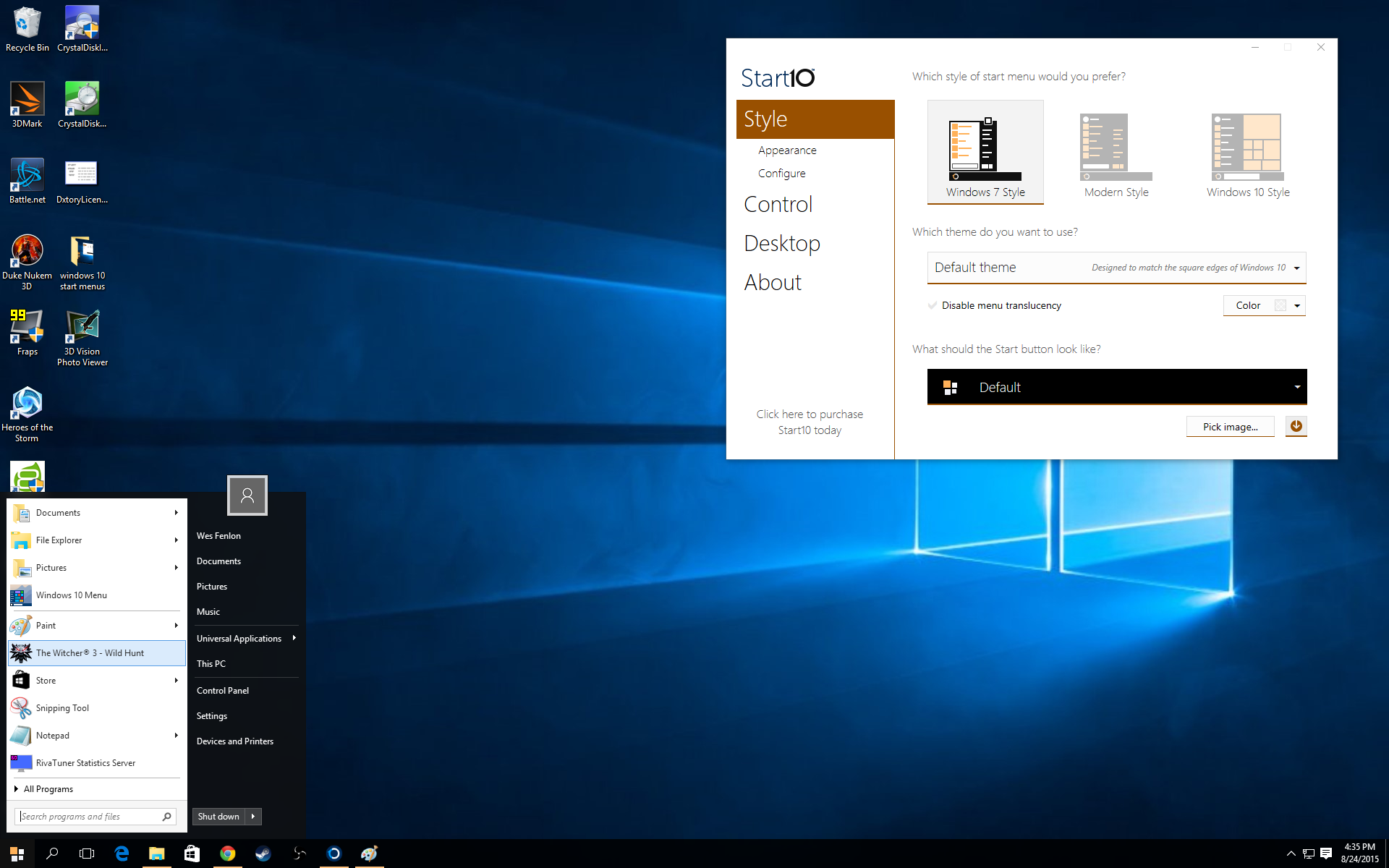
Yep, this sure looks like Windows 7. The “All Programs” menu opens the same way you remember, taking up the left menu column. The links on the right column to Documents, Music, etc. can be customized as usual.
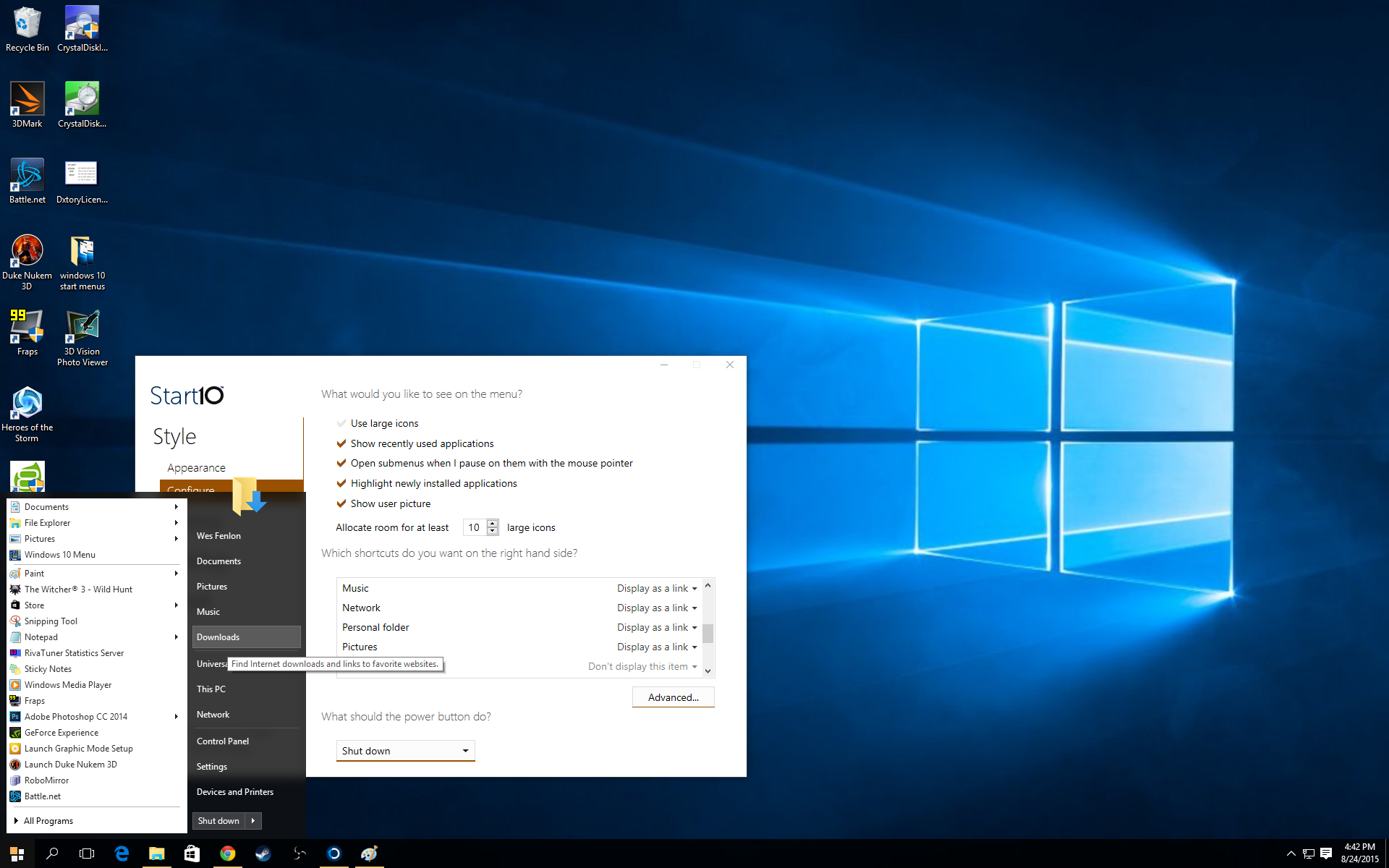
There are also a couple more options. You can choose to make the menu transparent (default) or not, and give it curved edges to match Windows 7’s style or leave them sharp and square to match Windows 10’s.
The biggest gaming news, reviews and hardware deals
Keep up to date with the most important stories and the best deals, as picked by the PC Gamer team.
Modern menu
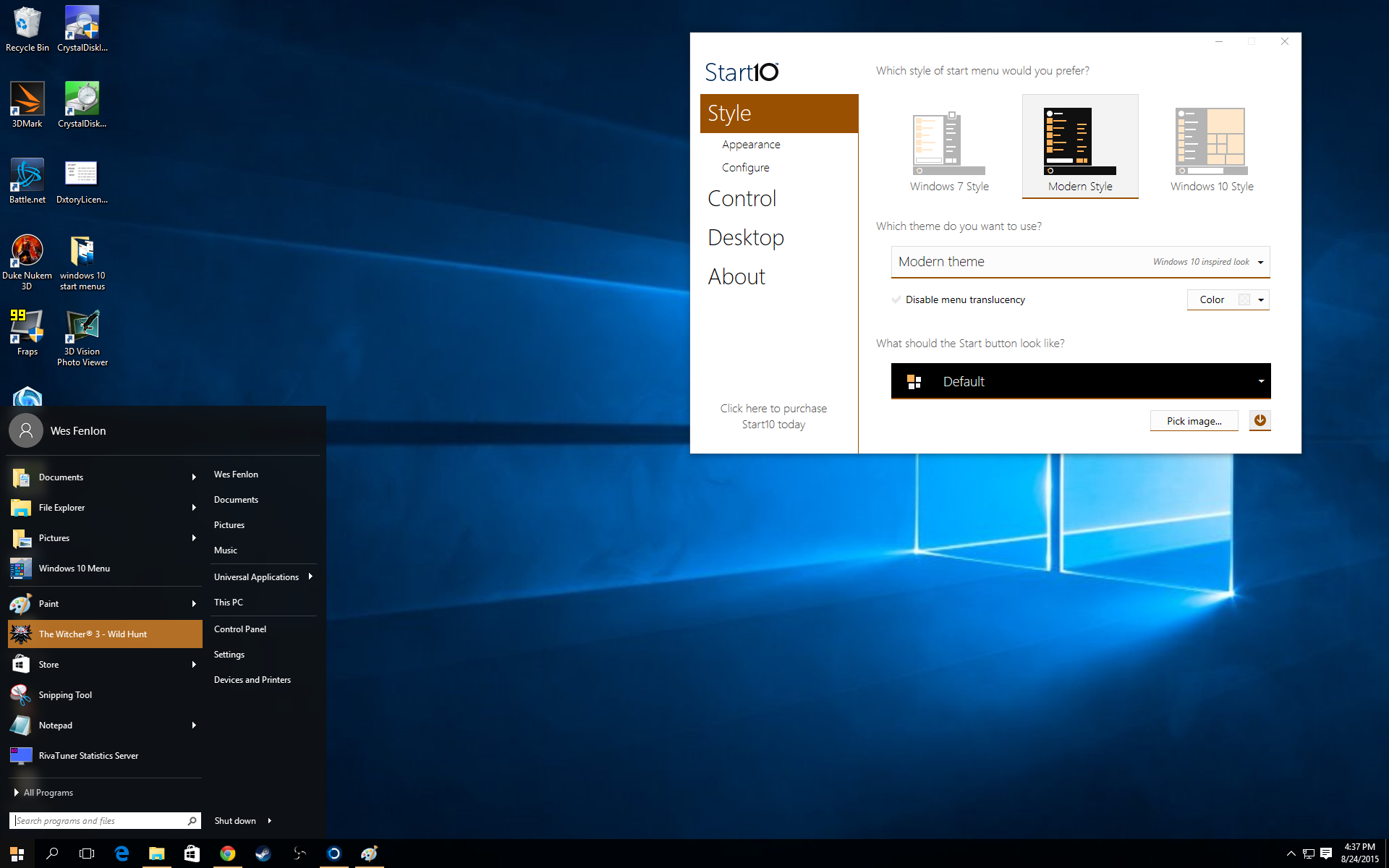
The Windows 8-styled Modern menu is functionally very similar to the Windows 7 Start menu. The main difference here is aesthetic: the entire menu uses a unified color scheme. There are also options with both the Windows 7 and Modern menus to use large or small icons.
An “advanced” option allows you to use extra large icons in a grid, if you prefer, but at that point, you may as well stick with Windows 10’s tiles.
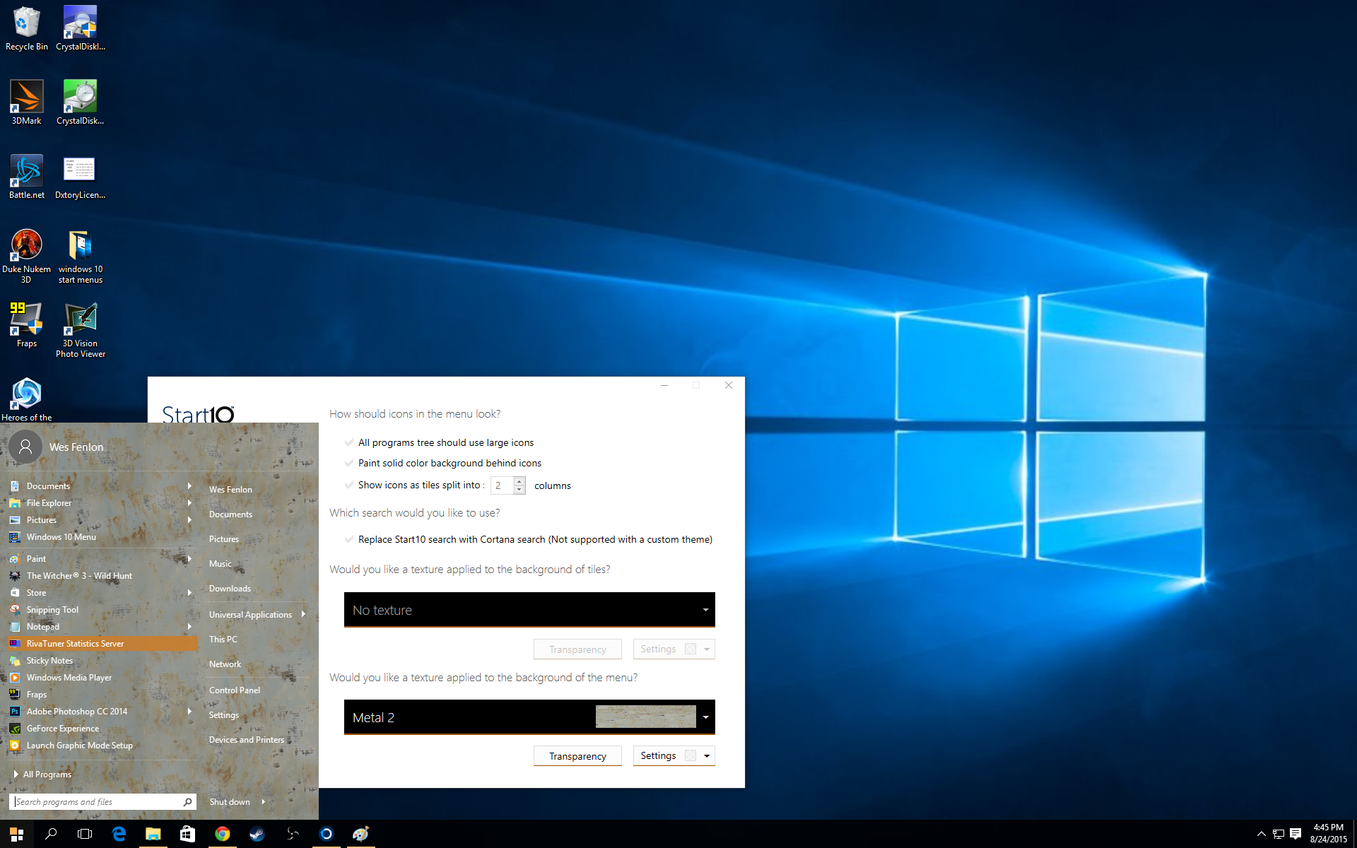
Since the entire Modern menu is colored, it’s ideally suited to customization, either the color of your choice or a texture. Textures are a good way to make your Start menu garish (or more subtly patterned, depending on your choice).
Windows 10 menu
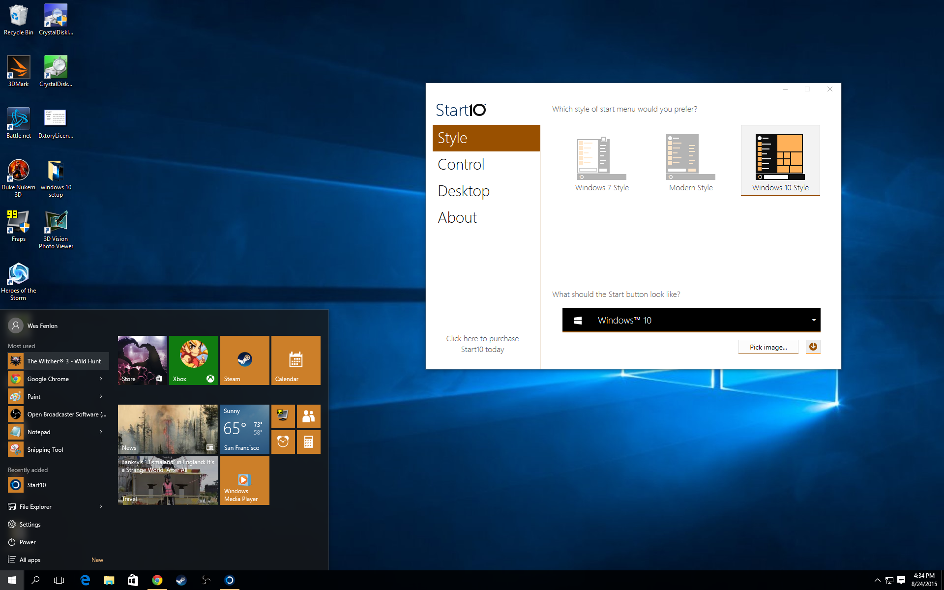
It’s the Windows 10 Start menu, all right.
No matter which theme you choose, Start10 allows you to customize the menu icon and color scheme. You can also choose some shortcuts options, like what key combination you press to open the unmodified Windows 10 menu. It’s nice to be able to reach that menu with a simple Alt+Click, either for the sake of comparison or to access something potentially hidden by the customized Start10 menu.
My favorite feature of Start10, though, is that it allows you to retain Cortana’s search even with a classic Windows 7 or Modern style menu. Cortana won’t work if you customize the menu theme, but pairing Cortana with those classic menu form-factors is still a nice bonus. If you do go for a theme, you’ll still have search, just without Cortana’s extra functionality. And if you prefer that more basic file search, Start10 can give it to you.
Start10 comes with a free month-long trial, so you can easily install it and spend a few days tinkering with the menus to decide which you like the most. Buying Start10 costs $5, which I’d say is worth the price for the degree of customization and retaining Cortana. But if you want to go the free route, ClassicShell is a strong alternative.
ClassicShell
Download here | Price: Free
ClassicShell has been around for a long time, and like Start10, it was recently updated to support the latest version of Windows. Unlike Start10, ClassicShell lets you roll back the menu to an even older iteration, Windows 2000-style. After you install ClassicShell, clicking on the Start Menu for the first time will bring up its configuration screen.
Classic Start menu
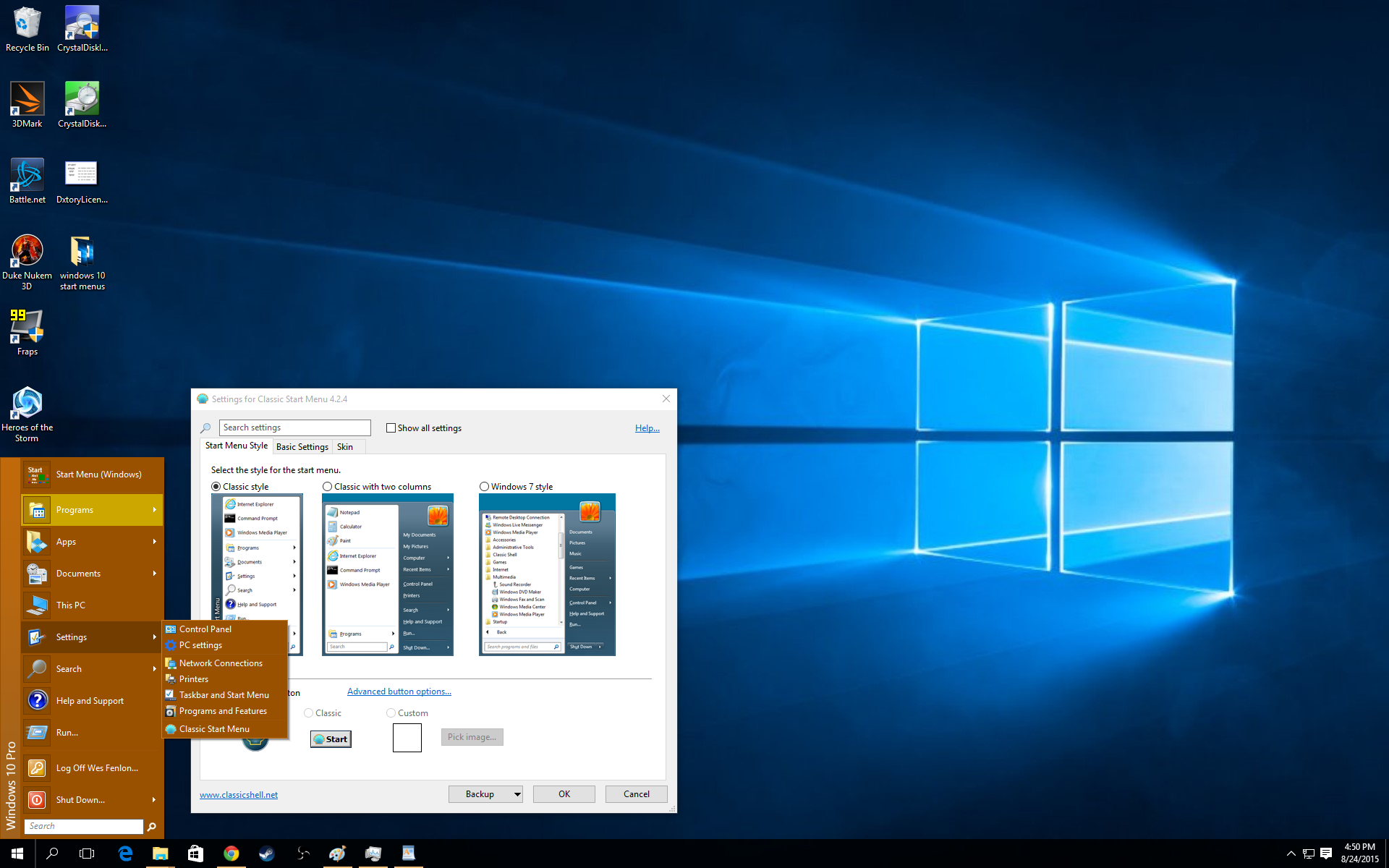
If you want a lean Start menu with jumplist sub menus when you highlight folders, this is your jam. I think later menus offer more practical usability, but it’s a nice throwback.
Classic 2 Column Start menu
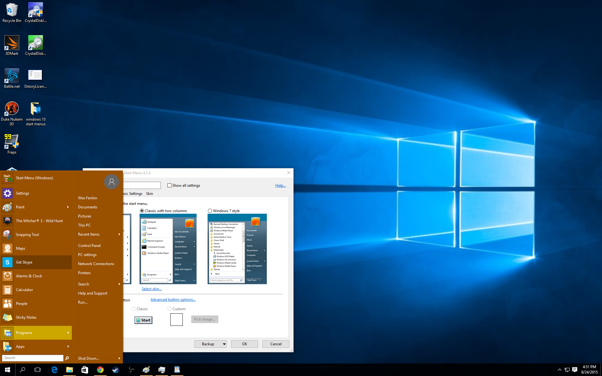
The two column menu jumps up to the XP era, and is more usable, though it still has the jumplist programs sub menu.
Windows 7 Start menu
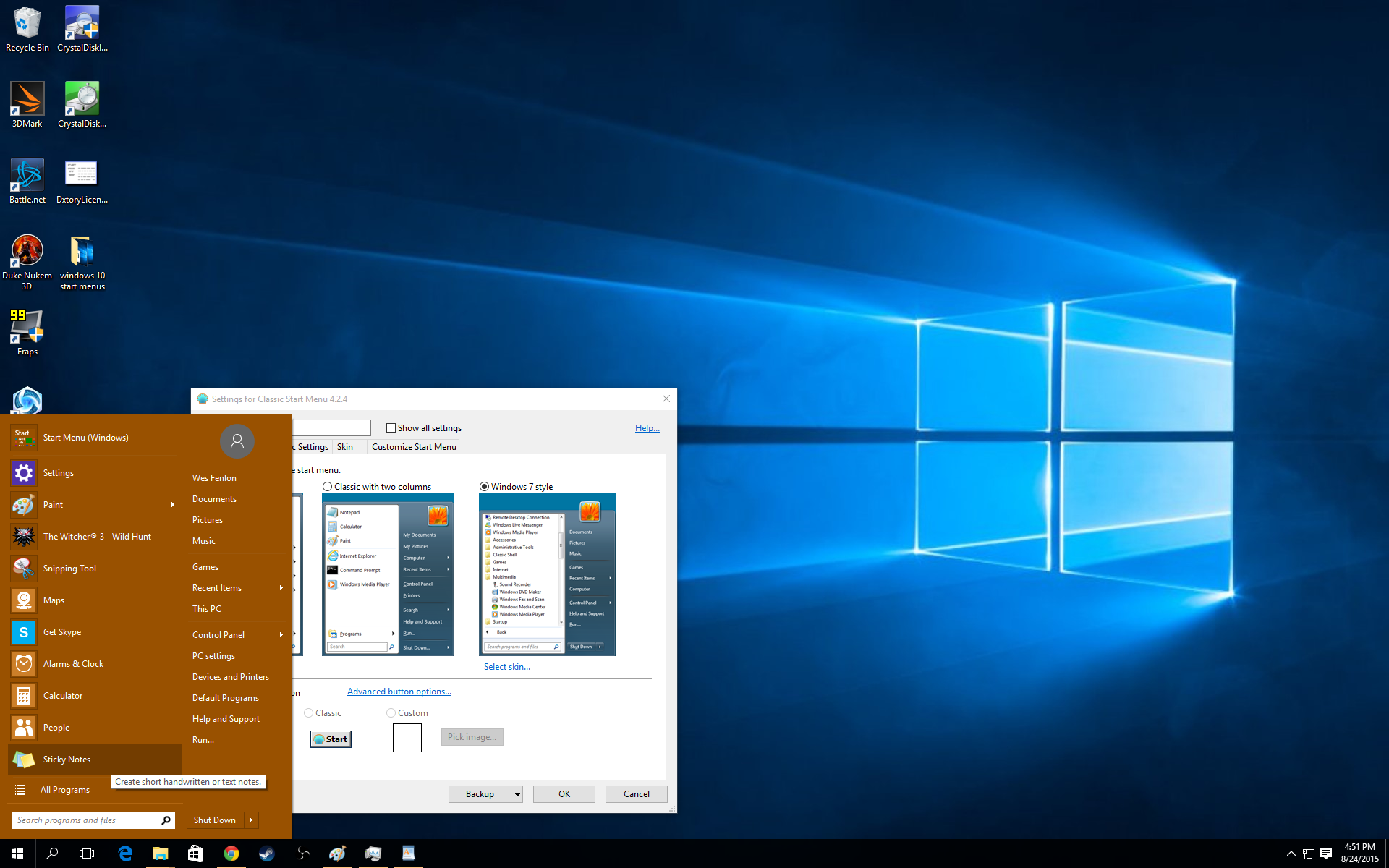
This is probably the one you want; a Windows 7 style menu that fits into the Windows 10 aesthetic. There are a number of skin options in ClassicShell, so the Windows 7 menu can follow the Modern UI style or adopt the Aero glass of Win7.
With any ClassicShell Start menu, color follows your Windows settings, which you can change by right-clicking the desktop and opening the settings menu.
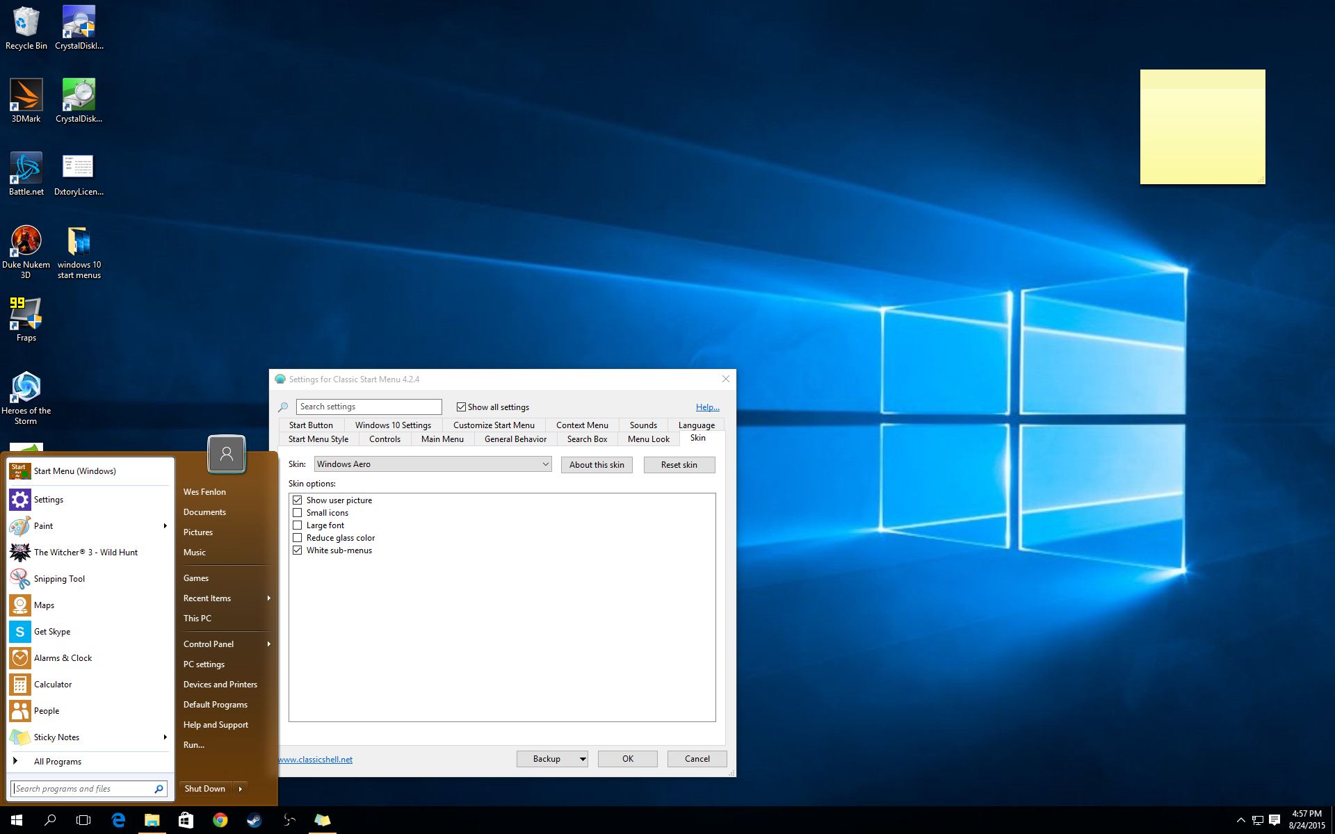
In both Start10 and ClassicShell, you can of course choose which menus are displayed in the right-hand column and futz with transparency vs. opacity (access those on the ‘Customize’ tab). ClassicShell’s ‘Basic settings’ tab houses the important settings for how to access the default Windows menu.
While I think Start10 looks a bit nicer out of the box, ClassicShell gives you more skinning potential. Check out the ClassicShell forums for some skins that the community is creating, though Windows 10’s recent release means there aren’t a ton just yet.
Wrapping up: a few more tips
Unfortunately, there’s no Start menu alternative that retains live tiles while modifying the left side of the menu. Perhaps that’s not possible, based on the way Windows’ pinning functionality works, but I’m hopeful a future mod will give us even more control over the Start menu. For now, either Start10 or ClassicShell can give you a more traditional layout. I’m going to continue using Start10’s Modern layout and the default Windows 10 menu to see which I find most useful long-term.
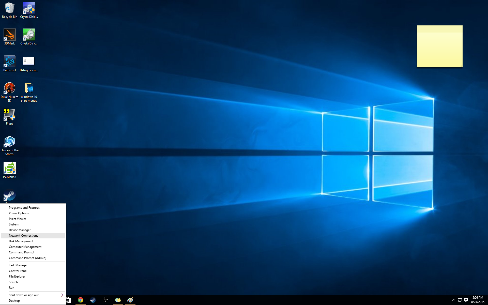
Even if you stick with the Windows 10 menu, there’s a thing or two you might not know about it. First, right-clicking on Start brings up a small menu of power tools that you’ve probably typed into the search box a hundred times: device manager, disk management, network connections, control panel... pretty much every system tool you need is available right here. Make use of it!
Second, you can change which folders appear on the Windows 10 Start menu by right-clicking on the desktop and opening the settings menu, then moving to the ‘Personalization’ tab. On that tab, click ‘Choose which folders appear on Start’ and select from the big old list that includes Settings, Documents, Music, Network, etc.
Finally, you can pin items from the Settings menu to the Start menu simply by right-clicking on them and choosing ‘Pin to Start.’ Want to pin Windows update because you regularly check for updates, or the Personalization menu because you love changing colors and wallpapers on a whim? Pin ‘em! Thanks to Lifehacker for those last two tips.
That’s as deep as I’ve gone with my own Start menu customization, but if you want to go even further, check out How To Geek’s guide to organizing shortcuts on the apps list.

Wes has been covering games and hardware for more than 10 years, first at tech sites like The Wirecutter and Tested before joining the PC Gamer team in 2014. Wes plays a little bit of everything, but he'll always jump at the chance to cover emulation and Japanese games.
When he's not obsessively optimizing and re-optimizing a tangle of conveyor belts in Satisfactory (it's really becoming a problem), he's probably playing a 20-year-old Final Fantasy or some opaque ASCII roguelike. With a focus on writing and editing features, he seeks out personal stories and in-depth histories from the corners of PC gaming and its niche communities. 50% pizza by volume (deep dish, to be specific).
