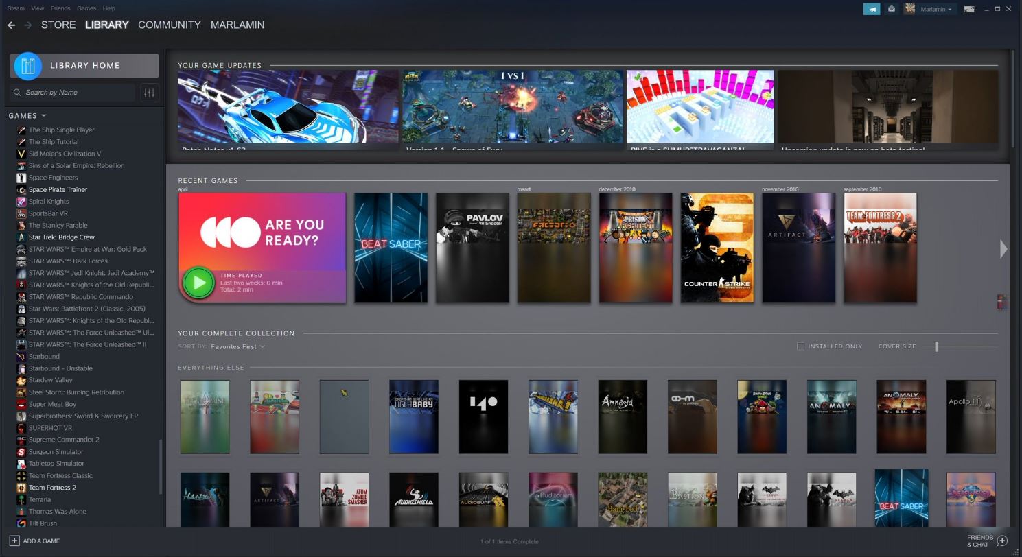
This is Steam's new design, according to a leak
Reworked library and game pages.

Steam Database has revealed images of what is supposedly a work-in-progress version of Steam's ongoing interface redesign. SteamDB said the pictures were "leaked through an update to the Chinese CS:GO launcher".
If they're legitimate, then it's certainly an upgrade on the current client—it's sleeker, and should be easier to navigate. I especially like how each game gets an icon in your library list on the left of your screen, as in other launchers. Update: These icons are already in the current version of Steam, but they're turned off by default. If you want to turn them on, click the plus sign at the top of your games list.
The image above is a specific game page, while the main library page is below.

SteamDB also showed off a new hover effect for trading cards that makes them pop out of the page when you mouse over them. Its Twitter account continues to tweet out snippets of the design, so keep an eye on it if you want to find out more.
Loving this hover effect on trading cards in the new library UI. pic.twitter.com/FSvHDYUzY0June 9, 2019
We know that a new design is due this year, alongside other changes to discoverability and chat that Valve outlined in January. If you're interested, you can see how Steam's design has changed over the past 15 years here.
The biggest gaming news, reviews and hardware deals
Keep up to date with the most important stories and the best deals, as picked by the PC Gamer team.
Samuel Horti is a long-time freelance writer for PC Gamer based in the UK, who loves RPGs and making long lists of games he'll never have time to play.


