This Halo Infinite screenshot looks bad, but at least it's honest
Finally, a marketing screenshot that actually looks like a screenshot from the game it's promoting.

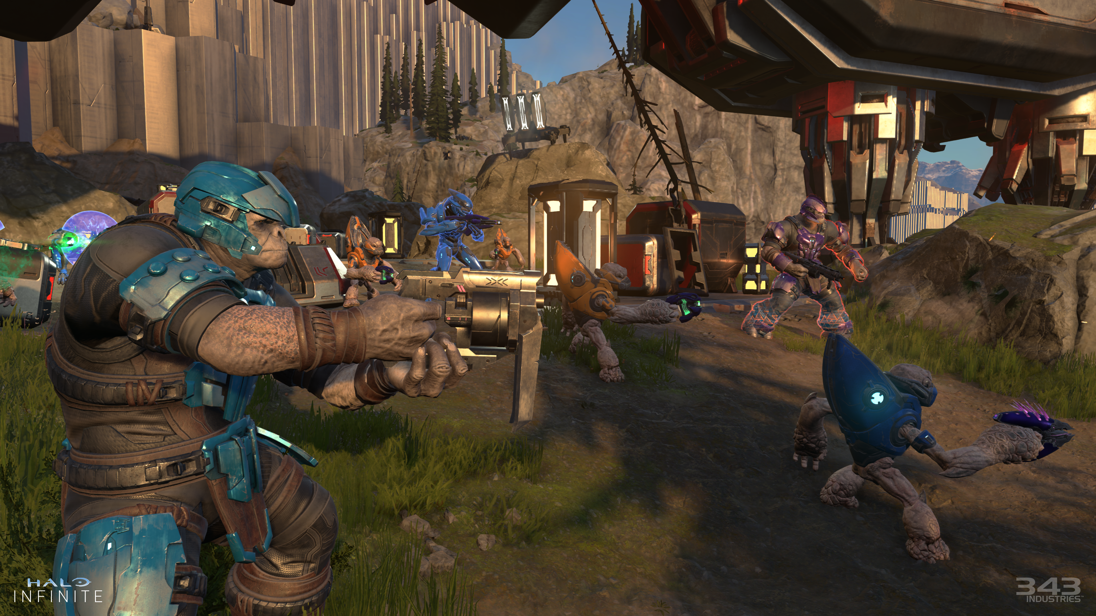
The official Halo Infinite screenshot above is bad. The texture on the cliff face in the background is blurry, and the composition is atrocious. It's a bunch of enemies looking out of frame, which draws the eye off the image. The Brute on the left is slightly distorted due to his proximity to the camera and the field-of-view setting, and his expression says "concerned" or "mildly displeased," not "life or death battle." The bits of architecture that barely make it into the frame at the top look like accidental shapes. It truly sucks as a piece of marketing material.
Naturally, this screenshot is getting roasted on Twitter along with other dated-looking stills captured from today's Halo Infinite gameplay reveal. But I feel like I owe 343 Industries some credit for its honesty here, because I've frequently complained about developers that release screenshots that look too good.
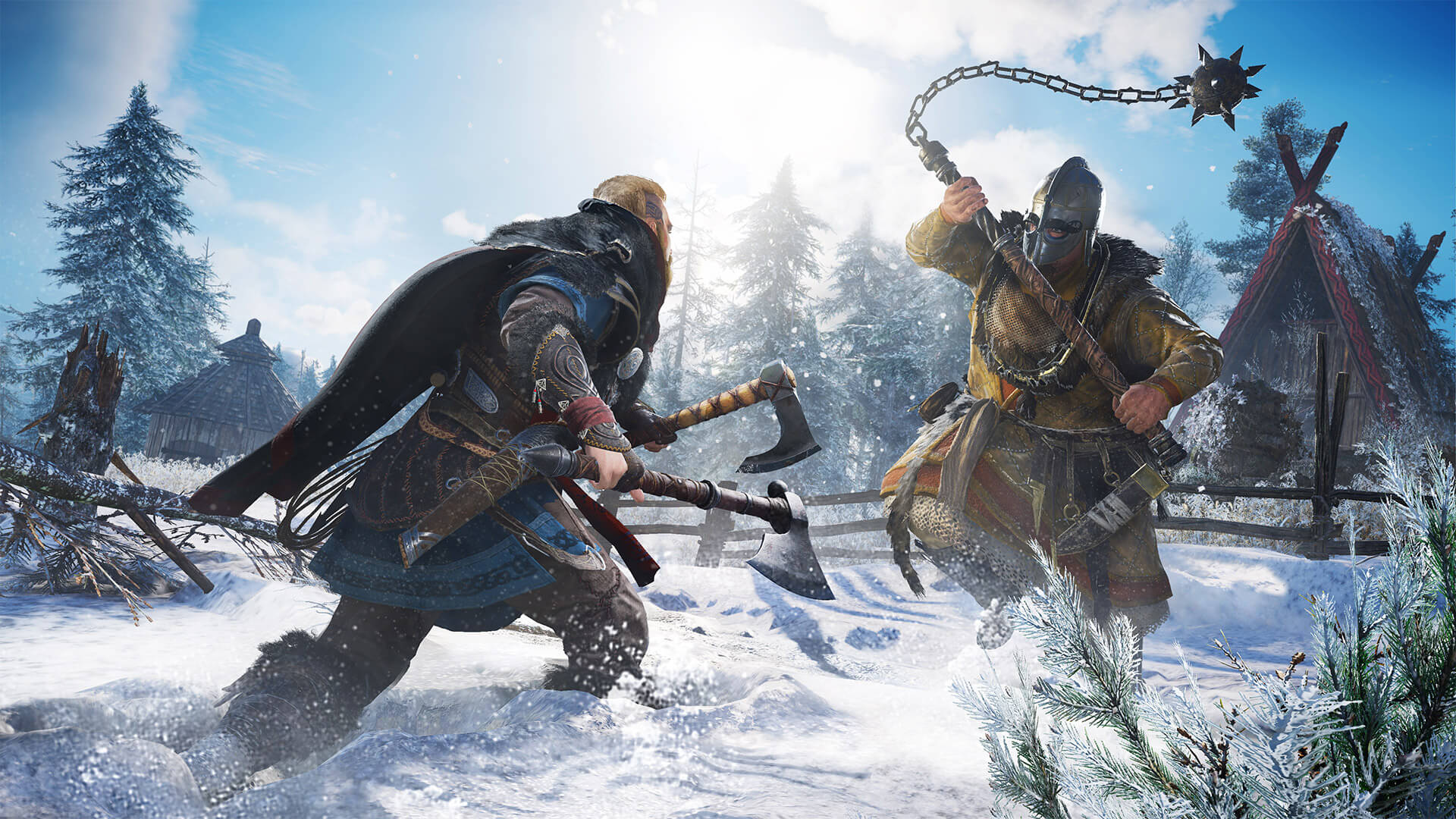
You might've heard the term "bullshot," which refers to official marketing screenshots that were meticulously composed using developer tools and sometimes taken at super-high resolutions and downscaled. Ubisoft is quite skilled at the art of taking attractive screenshots. Here's an Assassin's Creed Valhalla screen it released, for example:

Compared to that image, the Halo screenshot is practically outsider art. A free camera was used and the HUD was removed, but otherwise it looks like something we might actually see while playing the game. You can learn things about what Halo Infinite is like to play by looking at it, which I wouldn't say for the Valhalla screenshot. It's a rare thing, the realshot.
Halo's sad screenshot also illustrates part of the reason bullshots are made: Regular screenshots can make a game look like ass even if it looks fine in motion. That's not to say that Infinite suddenly becomes a stunner when you unpause it, but it definitely looks better.
A lot better? Well, that's maybe up for debate (and we debated the reveal quite a bit earlier today). Even in motion, Infinite looked mushy and dull to me, as if its rocks went into a blender and then were reformed from paste. It didn't make me feel much, but it wasn't hideous by any means.
Some of the other screenshots look quite a bit better. Here's a decent one:
The biggest gaming news, reviews and hardware deals
Keep up to date with the most important stories and the best deals, as picked by the PC Gamer team.

Pretty clouds, nice grass. It's a bit flat-looking despite the composition, which sets us overlooking the path forward, but it's pleasant.
And hey, looks aren't everything. Maybe Halo Infinite will be a blast, and one thing is for sure: It won't be accused of being "downgraded" when it releases. We wanted truth in advertising, and here it is.

Tyler grew up in Silicon Valley during the '80s and '90s, playing games like Zork and Arkanoid on early PCs. He was later captivated by Myst, SimCity, Civilization, Command & Conquer, all the shooters they call "boomer shooters" now, and PS1 classic Bushido Blade (that's right: he had Bleem!). Tyler joined PC Gamer in 2011, and today he's focused on the site's news coverage. His hobbies include amateur boxing and adding to his 1,200-plus hours in Rocket League.

