THE LOWS
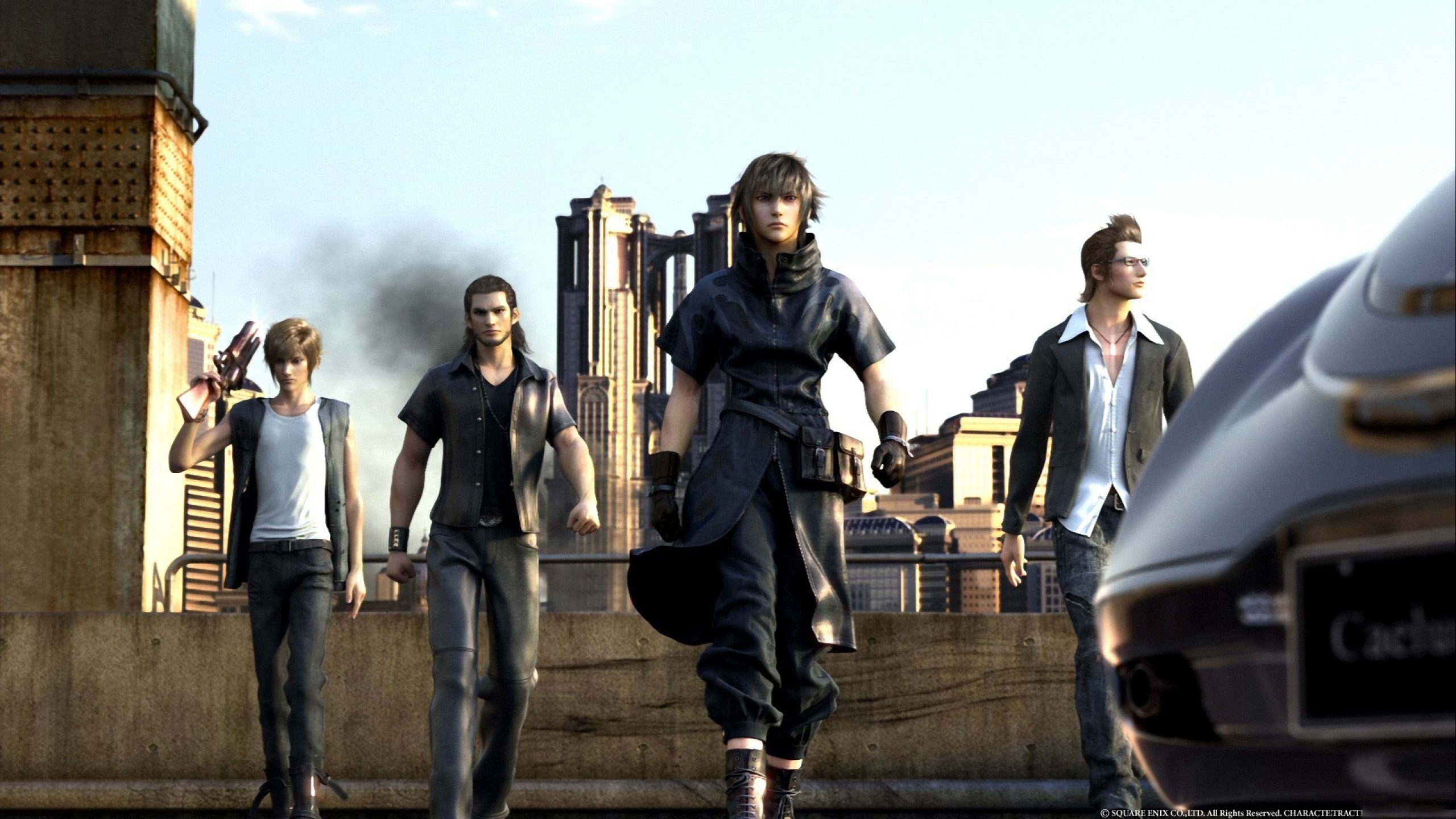
Samuel Roberts: Waiting for FFXV
Having so much great news in one week has left me with very little to gripe about. Two interesting chunks about the same series came out this week (a series I quite like, actually): Final Fantasy Type-0 a port of an old, kinda good PSP game that arrived on PS4 earlier this year is now coming to PC, too. Plus, Square Enix confirmed that the previously announced Lightning Returns: Final Fantasy XIII is still coming to PC, despite the port taking quite a long time (hopefully because it’s doing a better job with it than the last two).
This is great news, to see Square Enix bringing more of the traditionally console-centric Final Fantasy series to PC, but I wish they’d release instalments that could generate a little more excitement. Final Fantasy XV is the one everyone is buzzing about, and it’s a shame that it’s still not pegged as coming to PC. It’s such an obvious win waiting to happen, for me, and interest in Type-0 was only as high as it was because people wanted to try out that Final Fantasy XV demo. No such luck on PC so far.
Phil Savage: Not Hatred
Hatred isn't my low this week, as that would give it too much credit. Turns out it's not shocking or transgressive, but just kind of boring. Its only real success was in utilising its theme to generate enough controversy to generate interest in a buggy twin-stick shooter. My low is that there are so many other games in the genre that deserve the attention instead. To redress the balance, here are a few of my favourites.
Nation Red: As a grey-brown zombie shooter, this should be awful. Amazingly, it's not. It's a fun, slightly throwaway arcade shooter with an excellent perk system that lets you tailor your character to that specific run. Get a decent load-out and a high combo and you really start to rake in the points.
Waves: Waves is all about the combo. You're given bombs as it builds, which you can use to kill a huge radius of enemies, thus building the combo even more. As a level progresses, the number of enemies can become seemingly uncontrollable, but by chaining these combo bombs you can clear out the field in the most satisfying of ways. Waves is one of the few games to tempt me into a fierce leaderboard competition against friends.
Beat Hazard: In Audiosurf, your music becomes adversarial. You're playing against it, as it defines the speed and hazards of each course. In Beat Hazard, you play with it. Your music becomes your weapon—which pulses and flares to the beat of your chosen backing. In this world, acoustic guitar solos are the extreme difficulty. It's not perfect, but it's fun! Which is more than you can say for the game that kicked this all off.
The biggest gaming news, reviews and hardware deals
Keep up to date with the most important stories and the best deals, as picked by the PC Gamer team.

Tom Marks: Pay2Sparkle
Blizzard (because apparently all I follow are Blizzard games nowadays) announced this week that Hearthstone would start getting cosmetic skins for each class, purchasable only with real money. There’s been a very negative reaction to this announcement on the Hearthstone subreddit and beyond. While it concerns me as well, I don’t think for the same reasons as everyone else. I don’t mind the $10 price tag, I’m not worried about this setting a bad precedent, and I don’t think this is “distracting” the dev team from making other things like new cards and features.
No, the reason this bugs me is because of the hypocrisy it presents in Blizzard’s design philosophy about Hearthstone. Time and time again, we’ve heard that the “new player experience” is at the top of their priority list, which is awesome and a great thing be concerned with. They’ve cited it many times as the reason for not adding certain features to the game, like more deck slots or an auto-squelch option in the menu. I like that they want to make the game friendly to new players, but hero skins will do nothing but the opposite of that.
Imagine if you are brand new, been playing against the AI, finally learned what all nine classes do, and feel like maybe you want to play against other humans. So you go into a game and suddenly your opponent is a brand new hero you’ve never seen before and, in fact, can’t even select. You’d be confused, wonder if he has different cards, how to play him, and so on. I really truly love the look and detail Blizzard has put into the Magni Bronzebeard skin, but making something that literally changes the opponent you are playing against is not new player friendly at all and undermines the reasons they've given for not adding community requested features in the past.
Chris Livingston: Mod Squad
Modders, I love you all. I admire your creativity, your hard work, your dedication, and your imagination. But as a regular mod user and writer-abouter, I've gotta gripe about something: your frequency for tripping over the finish line.
I see this a lot: a modder posts a mod they've been working on, sometimes for years. There's joy, there's relief, there's excitement for people to try out their mod. What's missing? A decent description of what the mod actually is and a good feature list. Sometimes there's literally no description save for the mod title itself and a few vague screenshots.
And can we talk about installation instructions? As in, where are they? In the past week I've seen instructions that include the words "drop it in the folder that's in there" without stating which folder and where 'there' is. Another one stated that the mod relies on another mod, along with the suggestion that people Google it instead of simply providing a link. I watched an eight minute installation video which featured seven minutes of the guy installing the mod incorrectly, and even taking some time to clear files off his desktop, before finally getting it right. Sometimes there's nothing, not even a readme, just the assumption you know how it's done.
It's just such a shame when that happens. It must be a relief to finish up a long-term project, but there’s still a few more things to do: clearly tell us what it is and how to use it.

Andy Kelly: Apocalypse now
Look, I don’t want to be a downer when everyone’s getting excited about a new Fallout game, but I’ve got a problem with that trailer: it’s not post-apocalyptic enough. Fallout 4, if the locations we’ve seen so far are anything to go by, is one of the most populated, built-up games in the series yet. Yeah, I know, that part of America wasn’t as heavily damaged by the bombs as other places, but I’d love to play a Fallout set in a much more desolate wasteland.
For a world that’s supposed to have been ravaged by mass nuclear destruction, the Fallout setting in the Bethesda games seems weirdly intact. Wooden houses still inexplicably standing, computers still working, robots still operational. People still live in rubble-littered houses with holes in the walls. It looks cool and post-apocalyptic, sure, but shouldn’t they have tidied that up by now? It’s been years since the bombs fell after all.
Maybe it’s because I just saw the amazing Mad Max: Fury Road, but I love the idea of exploring a vast, barren desert dotted with fragments of humanity, rather than bustling shantytowns and cities. I’m looking forward to exploring post-apocalyptic Boston, don’t get me wrong, but I’m dreaming of a Fallout with the same desolate, melancholy atmosphere as The Road. But that doesn’t exactly gel with the series’ chirpy ‘50s Americana vibe, so I’ll just shut up.
Tyler Wilde: Fallout 4 looks bad?
Fallout 4’s graphics are not bad! Unlike Andy up there, I like the setting. Wastelands are boring. I want life among the rubble. I’m all about bustling shantytowns, even if, as Andy points out, they should’ve cleaned up by now. But as far as the graphics go, a lot of the conversation around the trailer has been that it looks bad, like a game from 2008. Sure, the character animations don’t look great, but this is not a game from 2008. If you think it looks like Fallout 3, you’re just trying to be grumpy. It does not.
The heart of the issue, I think, is that back in 2008, Fallout 3 was just incredible. Walking out of that vault for the first time was a breathtaking thing. But we’ve seen plenty of that by now. We’ve seen Far Cry 4 and Dragon Age: Inquisition and The Witcher 3. It’s just not going to have the same effect on us, and it can’t. That’s disappointing. It would be fun to go back to a time when a big open world was impressive on its own, or a time when Quake 2’s water effects were just great. But we can’t. What I hope the conversation turns toward is simulation. We know that graphics are going to keep getting better—not always at the rate we’d like, apparently, but they will—but where are the NPCs who feel like people? I want Fallout 3’s Boston to feel like a real place, or at least a really good tourist attraction, as Jody discusses in a recent article.
I do love pushing games to look as good as they can and talking about graphics and tech, but I feel like these things dominate the conversation when we can have just as much fun imagining the future of artificial intelligence and simulated ecologies. It’s not something that’s easy to show off in a flashy trailer, but the first time I feel like I’m truly exploring a “living, breathing world” (a cliché beloved by games writers, but hardly ever close to true), I’ll have that feeling of leaving Vault 101 again. From what I’ve played, The Witcher 3 is getting there, but again, the dominant conversation is about its ‘downgrade.’ At least, given that it already looks like something I can run, we shouldn’t have the same graphics controversy around Fallout 4. I’d rather talk about the machine beneath its textures and how well its clockwork society fools us, anyway.
PC Gamer is the global authority on PC games—starting in 1993 with the magazine, and then in 2010 with this website you're currently reading. We have writers across the US, Canada, UK and Australia, who you can read about here.


