The System Shock remake delivers a haunting return to Citadel station
The classic cyberpunk horror game is back, and it's been seriously upgraded.

Remember Citadel? Absolutely, and if there’s one thing that really stands out about the new System Shock reboot, it’s that five seconds in, I’m home. To be exact, I’m in the Citadel Station that I think of when I fondly remember the series, rather than the blockier, low-resolution version of it that passed for the future back in 1994. Evil AI SHODAN is back in her original home, orbiting Saturn. All around are the corpses and blood splatters marking the human population’s last stand—a failed one. As the hacker accidentally responsible for the whole mess, you enter the story hoping to prevent things from getting even worse.
And yet, saying that the alpha demo is simply the same does it a disservice. This isn’t just an HD remaster, but a complete rebuild intended to take advantage of what was almost unthought-of technology for the time. It even adds a few clever tricks of its own. It’s System Shock, but it’s also new license-holders Nightdive Studios proving they can handle the franchise—System Shock 3 is on the way, in partnership with Otherside Entertainment. This is a chance to put their own stamp onto it.
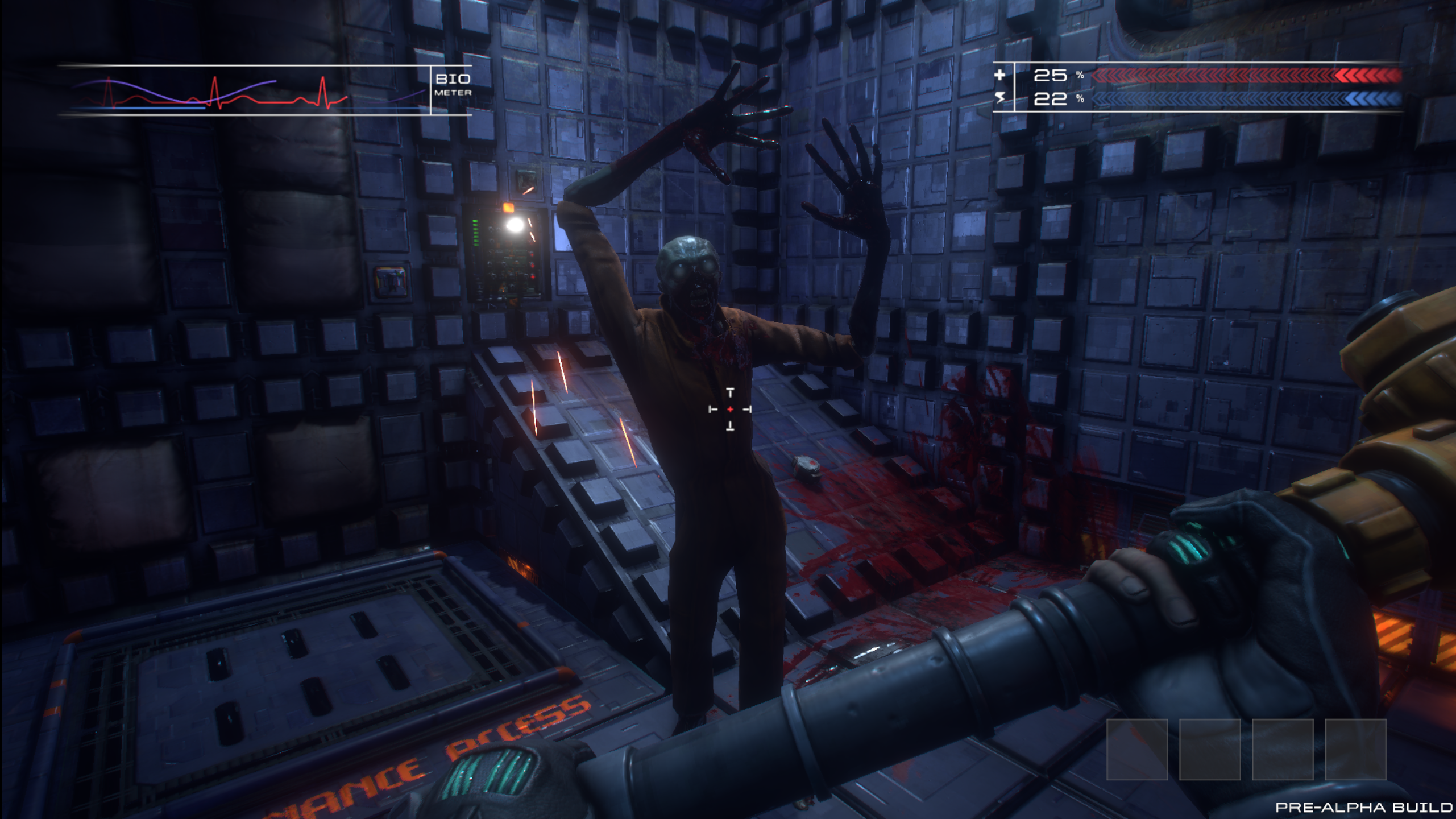
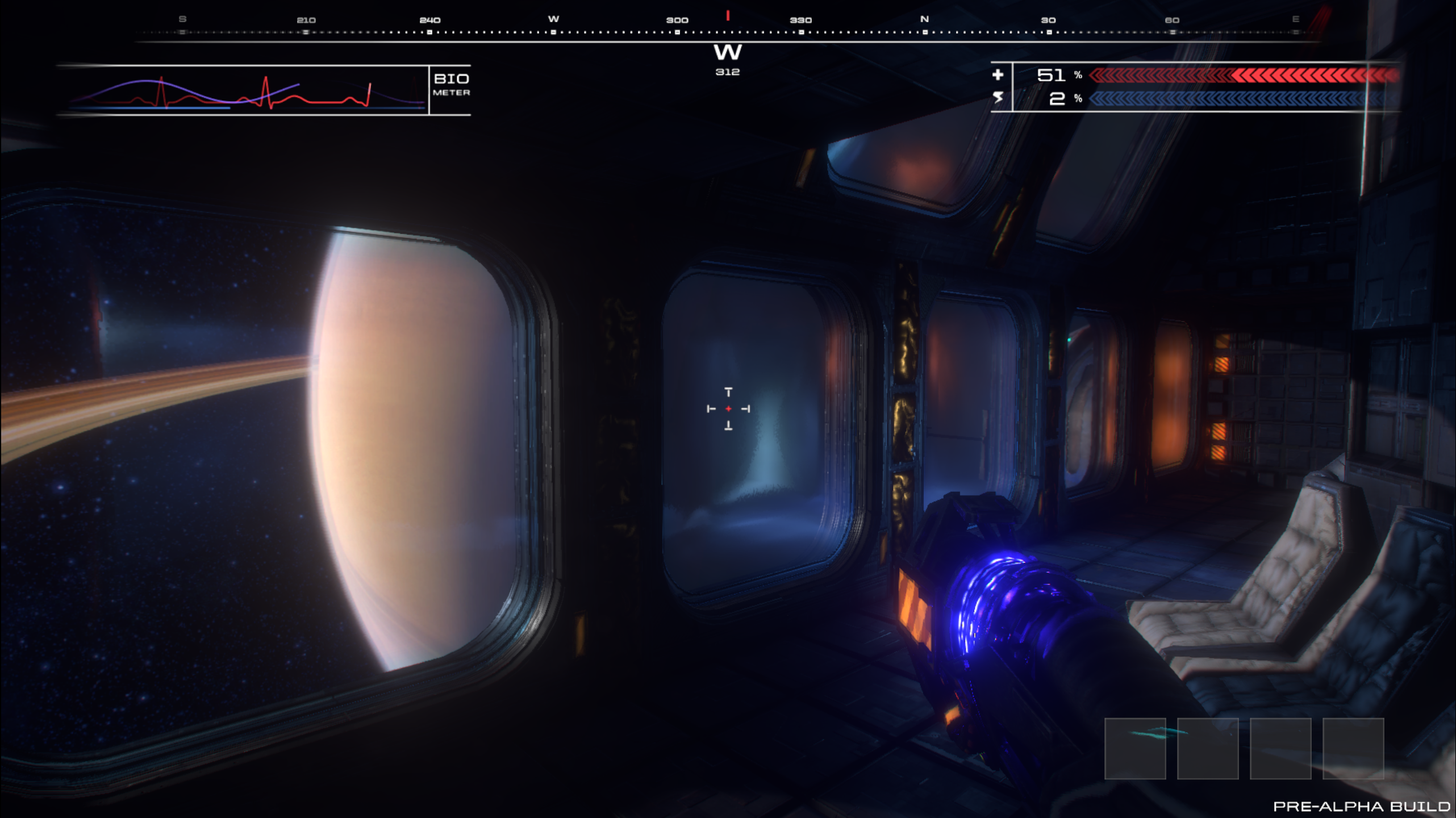
You don’t often hear this, but check out the walls. The section of Shock’s first level in the demo—a tiny, tiny slice of a huge space—follows its aesthetic down to the letter. Ordinarily, a level designed over 20 years ago is going to feel pretty simplistic regardless of how it’s updated, but no. Just the use of greebles on the walls to have bits sticking out and sucking in instantly makes things feel fresher. Likewise, while the opening Medical Suite area is extremely faithful to the original map, this reworking adds a few flourishes that simply make sense—notably a reception desk at the entrance and some comfy chairs for visitors. Where the now classic code 451 was originally in a datalog, now it’s painted across the wall in suitably smeary blood. Most dramatically, where System Shock’s idea of windows was originally black wall panels with dots painted on them, now we get proper skybox-driven views of Citadel Station and Saturn proper.
It all looks great. To be picky, the texture resolution is a little low in parts, but this is a pre-alpha. It's remarkable how shiny it all is, how much more packed the corners are with piping and equipment and smoke. I wouldn’t go as far as to say that it’s Shock as it would be made today. It’s got too much of a retro aesthetic and general feel for that. It does however successfully capture its soul in a much more, let’s face it, playable form.
The interface is completely new, and a great improvement. System Shock came out before exploring 3D space was a solved problem. Its interface was part mess, part MENSA test. Now, WASD controls and mouselook are your friends. You press buttons and rewire circuits with right-clicks, while left-clicks swing your trusty pipe and fire bursts of the Sparq side-arm—as in the original, an exquisitely flashy yet pretty much entirely useless gun. It all works fine, making a mockery of Shock’s original tutorial without cutting down on options that matter. You can still lean left and right for instance, there’s just no crazy need to click on a little man to do it.
The only real modern addition I’m not sold on is the way that picking up equipment like the messaging unit now involves overly long cut-scenes where the Hacker stares and tosses it from hand to hand while a pop-up explains. It feels distracting rather than immersive. Also, now clicking around the map produces pop-up text that’s meant to make Citadel feel more like a real place, but at the moment really doesn’t. Part of the problem is that it’s never sure whether it’s meant to tell you what a thing is—“there’s body parts from at least three people here”—or to react to your attempts to use it with a “you don’t know how that works.”
I like the idea in theory, to fill in gaps and make the random future-tech look like it has a place, but writing-wise it really needs a consistent point of view and purpose, especially since usable objects are perfectly well flagged up.
The biggest gaming news, reviews and hardware deals
Keep up to date with the most important stories and the best deals, as picked by the PC Gamer team.
Speaking of writing, even this little slice of the game has a few notable changes from the original. Your contact on Earth, Rebecca Lansing, has a subtly different script setting up how bad things are, while SHODAN’s welcoming message no longer lists every floor of the station up front. Luckily, while Rebecca is a different voice actress, SHODAN remains the one and only Terri Brosius. (Fun fact: prior to the CD version with voices, SHODAN was canonically male.)

Exactly how much Night Dive fiddles with the game remains to be seen, but it’s brought on both veterans from the original game and some new blood, most notably writer Chris Avellone, currently best known for his involvement in every RPG ever. That said, the issues that are likely to make System Shock feel old aren’t really in the graphics or the writing, but in some of the era’s design limitations. For example, even in the demo, there’s the feel of characters just waiting around to be shot and beaten up, as opposed to Shock 2’s wandering foes, which made you fear for an ambush at any minute.
Likewise, while that game evolved security cameras into something to be avoided for fear of unleashing an army on your head, here they’re just static props that you smash to reduce SHODAN’s control over the level. For the time, System Shock did a fantastic job of creating a feel of push and pull between the two of you, and SHODAN as an omnipresent malevolence pulling the strings from a distance. In practice though this was almost entirely down to atmospherics, performance, and enemies respawning on return trips to levels. 20 years on, it’s going to take more than that to convey the same feel of being watched and hunted.
With that said, it’s hard to imagine a more promising update than this one. It’s an update clearly made with both love for the original and a desire to see it be all it can be, and if the new content, puzzles, music and more can live up to the action in this small slice of the game, a great way for the original game to get its due with players who missed it back in the day. Its innovations have been much borrowed and often stolen, but there’s only one Citadel Station and one SHODAN. Unless you count that the one in Shock 2 was technically a copy, but nobody likes a pedant.
The System Shock remake is looking for $900,000 on Kickstarter. The alpha demo is available to download right now. Visit the System Shock kickstarter page for details.

