The evolving art of dialogue in games
Why a wall of text is hard to build.

It’s easy to think about dialogue within its traditional role in other mediums; as the spoken conversations characters have to flesh out characterisation, convey progression and deliver exposition. Videogames defy this, because everything from the pieces of the ground you can walk on, to the dimensions of the text box that appears on your screen, have to be strictly defined. To have a tangible effect on a player, messages have to be reinforced through every aspect of a game, down to the color, motion, and speed of text. Despite the complexity this suggests, written dialogue in games offers potential for narrative expression unlike any other medium.
“I’ve been using dialogue in my games a lot lately,” says indie creator Zenuel. “It’s an often underappreciated effort. You wouldn’t expect text in a game to be so divisive or complex, but when done right it empowers every area of a game, enriches even the smallest details and makes a world feel like it knows you’re there. You get the chance to forget you were ever anywhere else to begin with.” However, such an effect requires significant work to achieve, Zenuel admits. “You could write a basic dialogue system and have it doing what you need in almost no time. Honing it into exactly what is required by your game is where all of the work comes in. Even a basic dialogue system asks a ton of questions: Does your text all show up at once for each text box? Does it type itself out? Can you skip that typing animation? How does the game know when to [open and] close the dialogue? Again [that’s] not even approaching text animation, character portraits, UI, audio and all of the technical questions you need to answer for each.”
Things get even more tricky when you introduce player choice. David Stanley, the dev behind upcoming 2D action-platformer Skelattack, describes it like this: “You’ll have outcomes that have an on/off switch attached. Reply a certain way, or do a certain action, and the next relevant bit of code is turned on and the game continues. You can think of a [choice] as a tree branch, with twigs poking out of it. You’re gonna need to be concerned with stress testing this system, as it becomes easier to make mistakes in programming. The scope of a game with choice multiplies so much, it’s like making multiple games.”
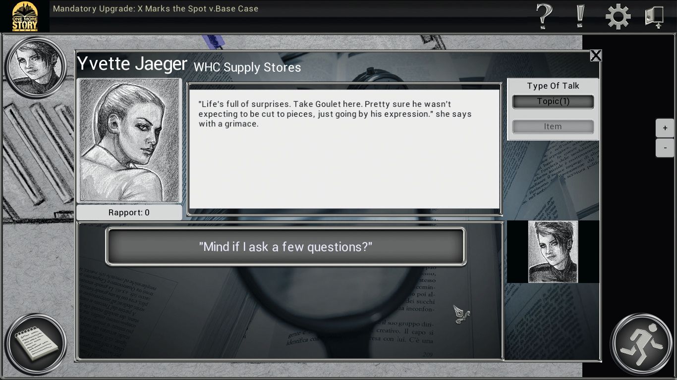
What can make this level of detail frustrating for an unprepared developer is that, if you design a text or choice interface well, the results are often invisible to players. “Since you want each element to fit comfortably in the game, this means designing the UI in a way that reflects the tone you’re trying to achieve,” says Zenuel. “For example, if you want your game to give the sense that choices are difficult and there are no right answers, then a UI element showing some dialogue choices in red and others in blue can give the wrong impression. Sometimes this just requires a careful eye when doing the artwork, but it also means that when designing everything after that choice is made, you have to be careful with how that branch plays out. Building interfaces is one of the hardest things I’ve been tasked with doing, just because of how many ways there are to convey information.”
Keeping it hidden
Chris Tihor, developer of narrative adventure Mandatory Upgrade: X Marks the Spot, notes that this call to make design elements invisible can extend to something as seemingly small as font choices. “I often find that you know you’ve got it right when the player doesn’t notice them,” says Tihor. “You have to pick something that feels natural amidst the rest of the design.”
Michael van Diest is among the people attempting to make the process of designing dialogue systems easier for his peers. He creates tutorials and assets to this purpose for the GameMaker engine. When I asked how he used the results of this system to reinforce portions of his own games, he linked me to a GIF from his upcoming game, Ribbert’s Adventure. Here, simply making text shake or vibrate conveyed surprise or shock just as well as detailed animations, for a fraction of the development effort. However, even the smallest text adjustments still do require time and effort.
These statements are a glimpse into the work that accompanies something that we take for granted. However, as underappreciated as text boxes may be, it’s still a somewhat known quantity. Next month, I’m going to focus on the devs deviating from this tradition, and experimenting with the edges of what form dialogue and choice interfaces can take.
The biggest gaming news, reviews and hardware deals
Keep up to date with the most important stories and the best deals, as picked by the PC Gamer team.
Dialogue designs
Four of the most common speech systems currently around.
Text boxes
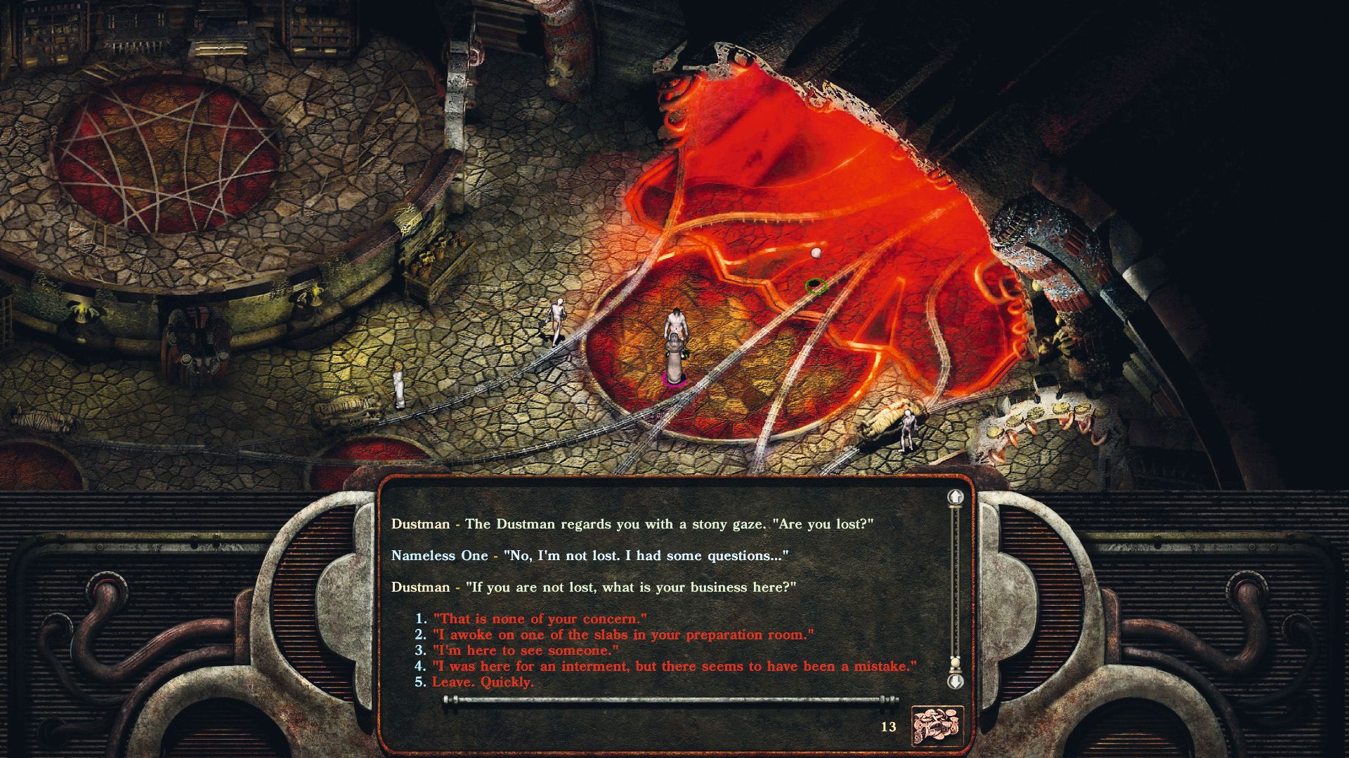
One of the oldest and potentially most familiar dialogue systems around (as well as the one most often replicated), the humble text box can be seen in a wide variety of genres, from platformers, to RPGs, to puzzle games.
The dialogue wheel
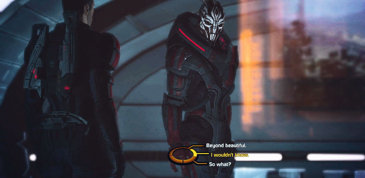
BioWare’s dialogue wheel changed the way many players viewed, interacted with and weighed the moral consequences of their choices. So much so, that BioWare patented its radial system in 2007.
Visual novels

Its recent, surprising rise on Steam, the free development tool Ren’Py, and the relative accessibility of the genre (even when incorporating more complex elements) has made the Visual Novel more prominent than ever before.
Interactive fiction
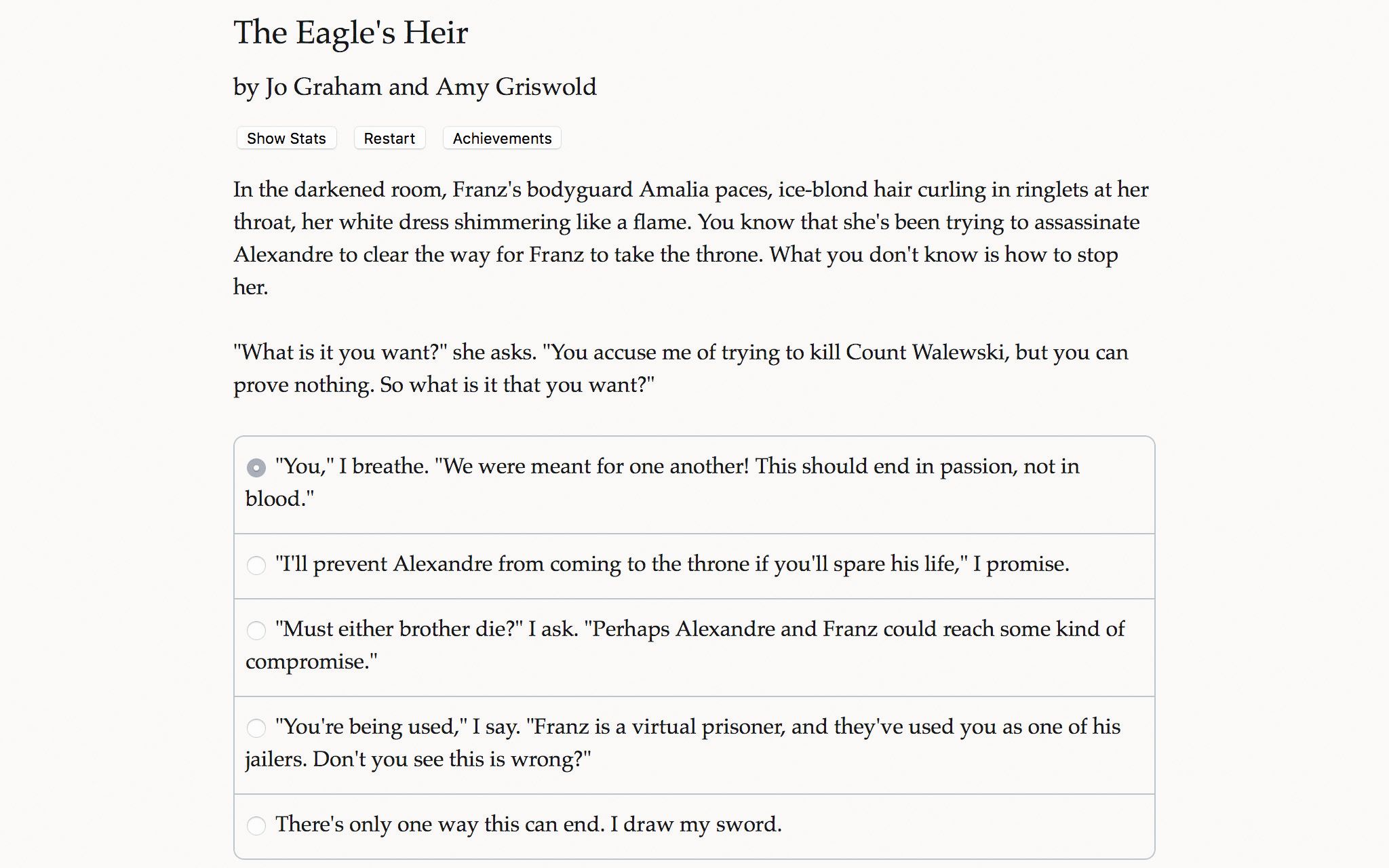
In the beginning was text. Description. Dialogue. Choices. Everything. It was the age of interactive fiction—and thanks to games like those in the Choice of Games catalogue, IF is again finding a place in modern gaming.

