Keep up to date with the most important stories and the best deals, as picked by the PC Gamer team.
You are now subscribed
Your newsletter sign-up was successful
Want to add more newsletters?
It’s been eight years since Valve released a singleplayer game. Hopes of seeing the Half-Life series completed have all-but vanished, and we’re unlikely to see another Left4Dead or Portal. Yet while Valve the developer may have turned toward enormously successful MOBAs and enormously unsuccessful card battlers, its last great singleplayer game still has a surprising amount of life left in it, courtesy of its community.
Since Portal 2 made its debut in April 2011, the community has designed more than half a million custom test-chambers, with dozens of new chambers being added every day. The majority of these are singleplayer chambers (although that still leaves over 100,000 cooperative chambers if you and a buddy have got a lifetime to kill). It’s an enormously prolific community, to the point where it can be hard to know where to begin expanding your Aperture adventures. Hence, I’ve selected a handful of the best chambers to showcase what the community offers.
When starting out your extracurricular Portal 2 activities, you’re best off looking for multi-part campaigns rather than individual chambers. It’s the easiest way to ensure a consistent quality in the chambers, with the puzzles evolving and changing based upon earlier ideas the designer had. There are plenty such campaigns to choose from, but a handful are a cut above.
Article continues below12 Angry Tests sees you guided through a suite of elegantly designed test-chambers by a dysfunctional turret gone rogue. A full-fledged campaign with its own story, 12 Angry Tests boasts a healthy mixture of the various Portal 2 environments, and plenty of inventive puzzles that make full use of the mechanics that Portal 2 offers (including some excellent use of light-bridges).
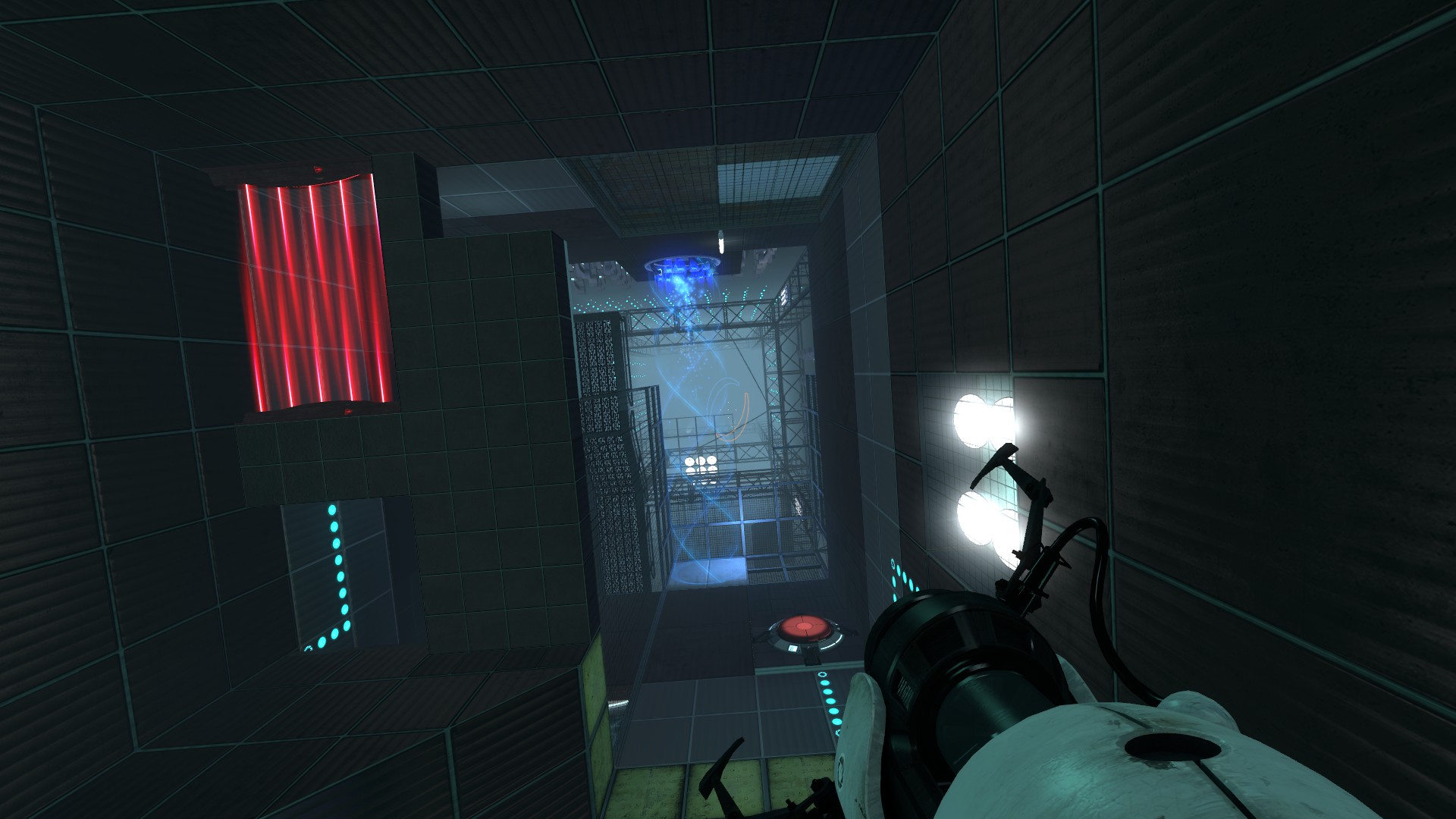
What makes it stand out, however, are all the Valve-like moments that occur along the way. It begins with a fun, Valve-style cold-open that plays out almost like a parody of 2017’s Prey. There’s also a fantastic sequence where you ride a particle- elevator through a vast vertical chamber lined with turrets.
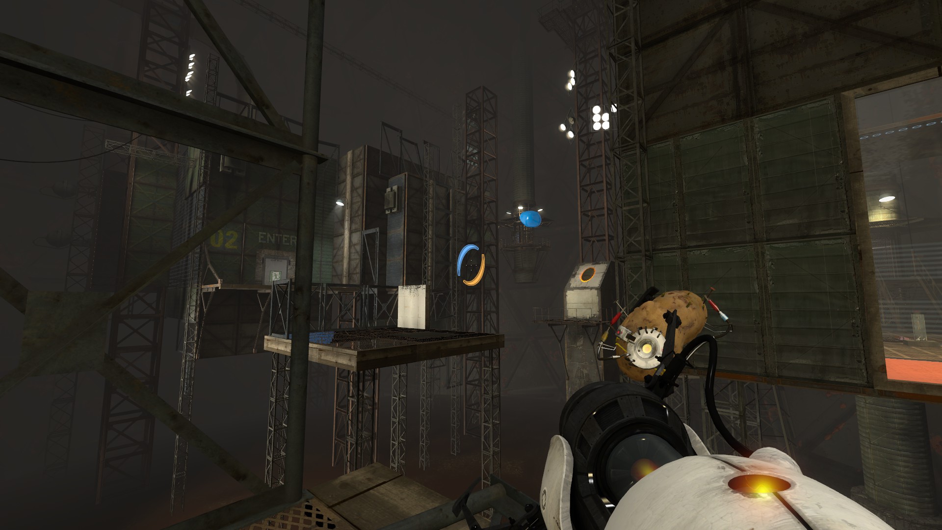
Designed For Danger is a similarly accomplished adventure. It kicks off in the middle of Portal 2’s vanilla story, segueing cleverly into a side-campaign where a rootin’-tootin’ AI core called Rick takes you on a thrilling (and extremely dangerous) series of test-chambers. Puzzle-wise, there a strong focus on cube manipulation, but it also has a real eye for grandeur. There’s lots of exploring the space between the walls, while a later chamber that takes you into Aperture’s dilapidated underbelly is truly breathtaking.
Multi-stage chambers
Another campaign well worth checking out is Refreshing Course. Unlike the previous campaigns I mentioned, this one doesn’t have much of a story. Instead it has large and hugely detailed chambers absolutely crammed with puzzles. These start out as short, individual vignettes, gradually broadening into elaborate multi-stage chambers where you need to work out the puzzle’s sequence step by step. Quick word of warning, however, the last chamber has a devious trick puzzle that implies you need to do some complex portal-jumping when you actually don’t.
Keep up to date with the most important stories and the best deals, as picked by the PC Gamer team.
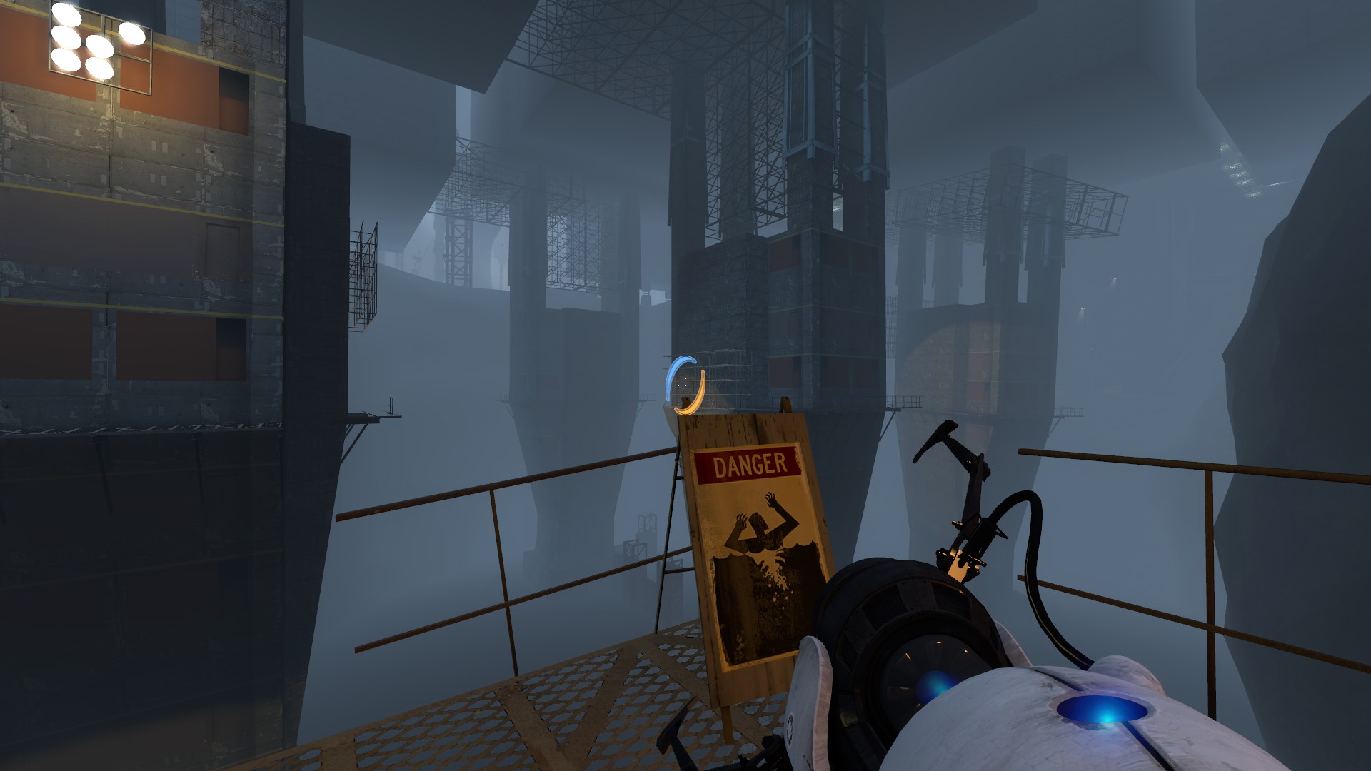
All these adventures are very well made in a general sense, but they basically exist for people who want a little bit more of the Portal 2 campaign. If you’re after something a bit different, there are a couple of alternatives. One of the most aesthetically pleasing map campaigns around is Decay, a short campaign in three parts that doubles down on the ramshackle style of Portal 2’s first third. It’s a relatively challenging set of levels, with puzzles that revolve mainly around lasers. But each test chamber looks beautifully grimy and unkempt, including some fabulous use of vegetation. If you’re a fan of the moodier elements of Portal 2’s atmosphere, Decay is a must.
If, on the other hand, you’re more into Portal for the surreal spatial manipulation, then you should check out Unreal Chamber, another three-part campaign that focuses on a specific element of Portal 2. Unreal Chamber is particularly interesting because it uses the portal technology in new ways. A typical example is a room with an archway in the centre which alters the layout of the room depending upon which way you enter it. Later on, Unreal Chamber introduces ‘Portal Frames’ windows into another room which, when you press your nose against the glass, will transport you instantly into the room you were looking in. It’s a very clever twist on Portal 2’s main mechanic.
As for individual chambers, well, few Portal 2 maps are truly individual ‘chambers’. The community seems implicitly aware that players are less likely to download a map that only lasts a few minutes.
Hence, the majority of individual chambers will comprise two or three puzzles at a minimum.
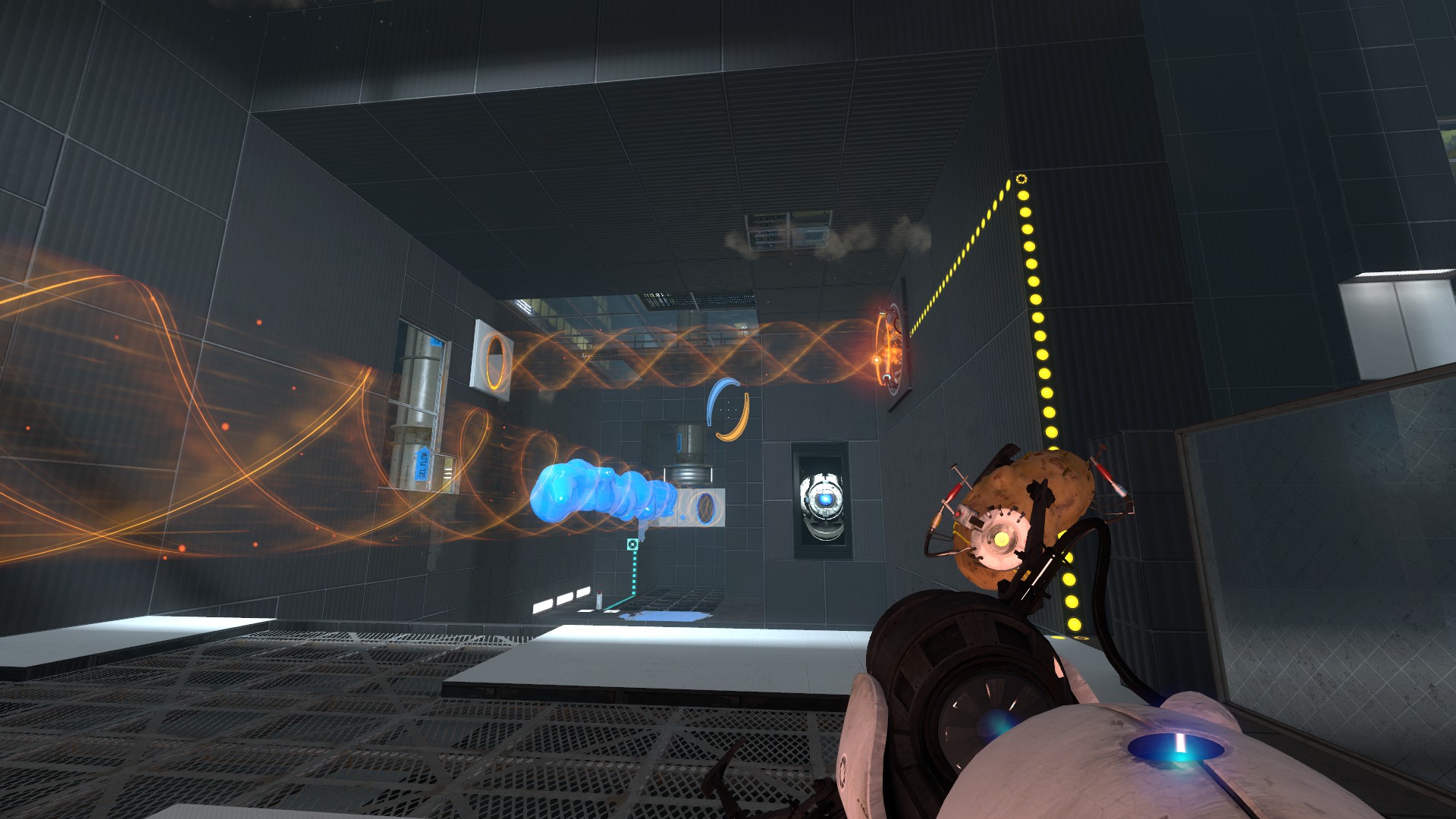
Nonetheless, there are plenty of individual chambers worth checking out. The best tend to focus on a specific theme. I particularly liked Ben 77’s Connection and Conversion chambers, as they make heavy use of the gels and the 1950s Aperture Science areas, both of which seem quite under-used by the Portal 2 community. I also enjoyed Expendable Human Launch Vehicle, a lofty and atmospheric map dedicated to punting yourself through portals like a fleshy Nerf dart.
The community’s desire to cram as much into a single Source map as possible has led to some fascinating designs. A recurring theme in Portal 2 map design is puzzle ‘towers’, collections of puzzles stacked vertically in order to get the most out of the map’s available space. One of the best vertical puzzle designers is Skyferret, who has designed at least three puzzle towers. The best is Verteron 2, a gloriously moody- looking map wreathed in electric blue. Not only does it have a wide variety of puzzles neatly balanced in terms of challenge, it’s also stuffed full of secret areas, and even features a cameo from everyone’s favourite idiot AI, Wheatley.
Speaking of Wheatley, the blue-eyed moron features regularly in community maps, and is even the face of several campaigns. This includes a Skyferret-designed campaign called Wheatley’s Reprisal. This is well worth a look both for its puzzles and the way it uses Portal 2’s destructibility and animation. Floors crumble beneath your feet, chambers smash into walls and other chambers. It’s filled with the dramatic environmental manipulation that was so impressive when Portal 2 originally launched.
Be warned, however, the way Wheatley’s Reprisal re-uses Stephen Merchant’s lines from the game may cause you some aural distress.
Broader fiction
All the available Portal 2 maps can be easily downloaded through the Steam workshop. It’s worth downloading a few at once, as even the biggest maps won’t last you more than ten to twenty minutes, and Portal 2 lets you load up a new chamber once you’ve completed it. Also, once you’ve finished a map, delete it, as the more maps you have downloaded, the longer it takes the list to fill up each time you boot the game.
What’s interesting about Portal 2’s maps is how well most of them fit into the broader fiction of Portal and Aperture Science. It rarely feels like you’re playing a mod, and more like you’re exploring another nook of Aperture Science’s impossibly vast underground labyrinth.
It’s also a stark reminder of just how fantastic Valve’s worldbuilding is. It says a lot that most maps which attempt to take Portal out of Aperture Science don’t really work, which is why I’ve focussed on maps that stay within the confines of Chell’s scientific prison.
Portal 2 is still the best first-person puzzler around. But thanks to the community, it’s also now the biggest, offering literally hundreds of hours of chin-scratching fun. It’s not quite the same as having a new, good-old-fashioned Valve game to tear through, but a large portion of the community’s designs are surprisingly effective in providing that uniquely Valve blend of surprise, wonder, and humour.
Rick has been fascinated by PC gaming since he was seven years old, when he used to sneak into his dad's home office for covert sessions of Doom. He grew up on a diet of similarly unsuitable games, with favourites including Quake, Thief, Half-Life and Deus Ex. Between 2013 and 2022, Rick was games editor of Custom PC magazine and associated website bit-tech.net. But he's always kept one foot in freelance games journalism, writing for publications like Edge, Eurogamer, the Guardian and, naturally, PC Gamer. While he'll play anything that can be controlled with a keyboard and mouse, he has a particular passion for first-person shooters and immersive sims.
