Keep up to date with the most important stories and the best deals, as picked by the PC Gamer team.
You are now subscribed
Your newsletter sign-up was successful
Want to add more newsletters?
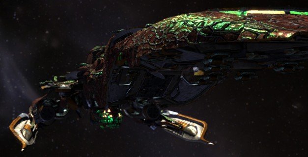
PC Gamer routinely features Developer Diaries: tales of what goes on behind-the-scenes in the development studios making your favorite games. In this entry, Sword of the Stars II: Lords of Winter's Lead Artist, Chris Gerspacher, talks about refining and upgrading a game's art style for a sequel. For more information, read the first and second entries, and let us know what you'd like to see developers discuss in future diaries in the comments.

Sword of the Stars II Developer Diary 3: Maturing the style
The great thing about sequels is that we get the opportunity to tackle new challenges and dig up old wish lists. It gives us a chance to go through old sketchbooks to find those pages with ideas we didn't have the time or processing power to achieve previously. For example, right off the bat I'm presented with the opportunity to triple the level-of-detail distances I was able to achieve in the first Sword of the Stars, not to mention greater vibrancy and individual lighting. These were all things I wanted to do on the first game, but was unable to achieve given the hardware requirements of the time.
Article continues belowMind you, all these new opportunities bring new challenges and logistical concerns. While all this modern flash and glamour is amazing to work with, the downside means that ship art can take up to three or four times longer for the same amount of content. For a game like Sword of the Stars 2, which thrives on the depth of its content, this means I have to constantly weigh looking great versus more filling. In the original game, a lot of detail had to be cut in order to keep the game moving smoothly with the fleet scales we had in mind. While it's great that we have tenfold the power in terms of graphics in SotS2, it's still important to use this newfound freedom wisely, not frivolously. We want to get the biggest bang for the dollar, and make a game that is accessible to the largest amount of fans out there.
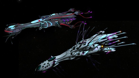
Dynamic lighting for greater mood and atmosphere
One of the obstacles I faced in the original was achieving crisp, high-contrast lighting for dramatic effect, while making sure the player could still see everything he needed to see at all times. All too often, the two goals clashed. Making the battlefield too dark an environment meant we had to settle on an averaging of the light levels to keep all the pieces on the board easily visible. The lack of shadows to break up areas of darkness made this difficult to accomplish. Shadows can give you interesting negative shapes and moving silhouettes, and now we have implemented a fully differed lighting system which has added tremendous depth and sense of scale to the images by using shadows. The system also allows for light sources on almost every object that could possibly cast light - a substantial new paintbrush to our arsenal of tools.
In addition to those major upgrades, we've added HDR (high dynamic range) to the lighting, which allows vibrant colors to retain their saturation. This lets us push for the cold, clean, and crisp forms that we strive for, and gives things a more realistic edge all around.
Keep up to date with the most important stories and the best deals, as picked by the PC Gamer team.
Deeper levels of detail
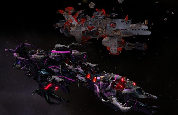
Making the ships look even cooler is something every artist on the team automatically wanted to do. Now we have the tools, and a logical, story-driven reason to do it. War, historically, pushes development like nothing else, and we always intended that the sequel to SotS should reflect that. Since the sequel is set further down the timeline of the SotS-verse, the warships are expected to be more detailed and more impressive. We are working hard so that players, old and new, can see the functionality of the ships. Everything in the universe has been given a makeover in terms of detail to give it a more realistic sense of scale and purpose in the game.
While technical improvements in looks is a given (after all, not many people make a sequel that looks worse?) we are just as excited to imagine and implement how the tools of empire building have advanced between games. Plans we laid years ago are finally coming to life as the SotS timeline catches up to them. We wanted this new era in the SotS-verse to drop the jaws of even the most experienced SotS player and, given the feedback we have been getting on the screenshots we have unveiled, we seem to be on the right track.
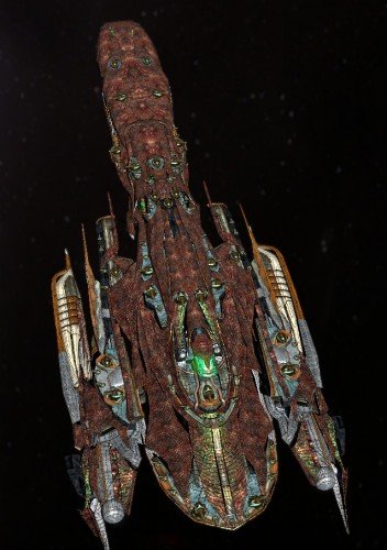
For the art team, the heart of our design philosophy is that form always follows function. For our ships, it's not just the outside we consider, but we also build up – either conceptually or literally - the internal structures of the ships; halls, crew quarters, turret support, and supply housings are imagined in order to determine the proper shapes and sizes for the different classes of ships, not to mention what alien faction the ship belongs to. So when I say we work with the internal concepts of crew quarters, I mean we take into account all the background material for the game as well. It's one thing when the ship belongs to humans, but it can be something else entirely when we're talking about the waterborne Liir, or the serpentine Morrigi. It's really rewarding when it clicks into place and the design lends itself to the form, or you start noticing parallels between warships with similar functions, but different races of origin. This is not something subconscious – artists don't work on multiple races, rather they work with a single alien race – these parallels come from each artist sticking to the first line of the style-guide; form follows function. The downside to this process is that the conceptual portion of the project is extended… prototyping the first few sections of a race is a long arduous process when you throw out “just because…” as a rationale for something you just made. On the upside though, you end up creating a 3D catalog of functional pieces that lets you eventually sit down and go “Ok, a Liir projector section is going to need this much crew space and that much support for the enlarged turret. Oh yeah, and probably some of those backup generator pieces I made for the Impactor, 'cause a projector's gotta have power to spare.”
We strive daily to avoid the pitfalls of endless tiny windows in places that don't make sense, or impossibly thin fins and spires just because it “looks cool.” The cool derives from detail, instead of just creating detail that looks cool.
Now if you take all of this technology and philosophy and style… and turn it up to 11, you may just be prepared to think about the Lords of Winter. See you next time!
-Chris Gerspacher
Lead Artist, Kerberos Interactive
PC Gamer is the global authority on PC games—starting in 1993 with the magazine, and then in 2010 with this website you're currently reading. We have writers across the US, Canada, UK and Australia, who you can read about here.

