Star Citizen video shows off smartwatch-style UI called mobiGlas
Has a home screen with customisable widgets.

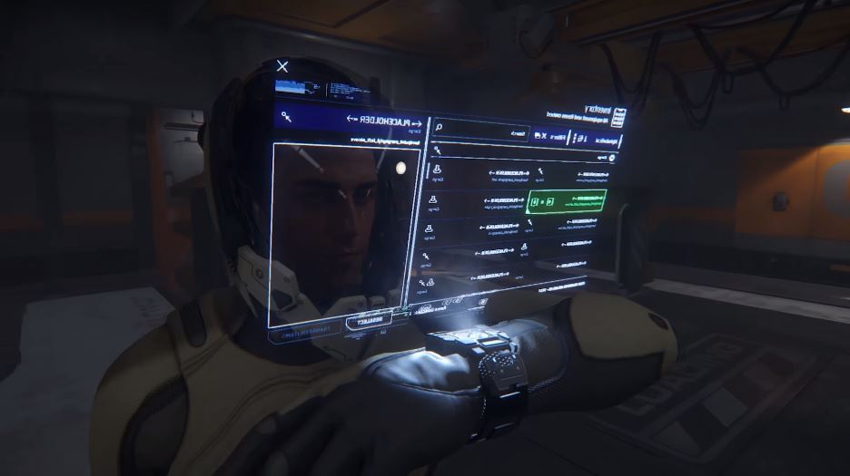
The latest of the excellent Around the Verse videos chronicling the development of Star Citizen is out, and it shows off the mobiGlas—essentially a futuristic smartwatch that acts as the main UI for the player.
The watch will have a home screen with customisable widgets that display everything from your oxygen level to the status of your current mission contracts. The mobiGlass will also house dedicated apps that you can tap into to view maps, customise your loadout, shop for new items, and more.
Basically, instead of scrolling through menus you'll be glancing down at your wrist. I really like the idea, and it looks suitably sleek. It's projected in 3D as well, so when you're tapping on icons other players will be able to see you holding your wrist up—a nice touch. In fact, a lot of the UI in Star Citizen will work that way including in-game kiosks, the video explains, with 3D holograms and projections that any players nearby can see.
The actual mobiGlas model on your wrist will be customisable too: players will eventually be able to snap modules on and off. I reckon a lot of people are going to spend a lot of in-game money to get the exact look they want.
Check out the video below and if you haven't yet watched the Around the Verse series, then here's the playlist. It's a refreshingly transparent look at the development process, and watching them has got me really excited for the release. You can read Chris's hands-on with the latest alpha build here.
The biggest gaming news, reviews and hardware deals
Keep up to date with the most important stories and the best deals, as picked by the PC Gamer team.
Samuel Horti is a long-time freelance writer for PC Gamer based in the UK, who loves RPGs and making long lists of games he'll never have time to play.


