Our Verdict
Shadowgate isn't just retro, it's retrograde, and the visual update really isn't as impressive as it first appears.
PC Gamer's got your back
Price: $20
Release date: Out now
Publisher/Developer: Zojoi
Multiplayer: None
Link: www.zojoi.com
I'm standing in the dark. My torch has run out, and I'm left to reflect on the foolishness of lighting the ones I passed in previous rooms and then leaving them in their sconces. No matter where I try to move in this pitch blackness, I take a step, trip, and crack my head open on a nearby rock. Several reloads have confirmed it: I have to start over. Welcome to Shadowgate.
Shadowgate is a vicious thing, rooted firmly in the era when the purpose of a game was not to shepherd players to triumph, but to keep them from ever reaching it. It's an element of the remake the developers obviously revel in, using "you will die" not as a threat but as a promotional promise, and die you will, often and arbitrarily.
Life's a bitch, and then you die
That's not necessarily a problem, but it highlights the fallacy of calling this a 'remake.' It's really just a new coat of paint on an old jalopy, a cosmetic upgrade that leaves the adventure game's nuts and bolts untouched: A collection of sometimes tenuously connected rooms within a massive castle packed full of traps, monsters, and puzzles that must be solved or bypassed in a quest to save the land from a great, generic evil. Even the default interface, with its fixed menu of selectable commands arrayed across the top of the screen, remains essentially untouched, although I ultimately found it easier to disable the HUD and use keyboard shortcuts to issue commands instead.

But the fundamentally punishing design of Shadowgate, which originally came out in 1987, hasn't aged particularly well. It's a harsh game, especially at the Master level, which most closely matches the gameplay of the original, and it remains every bit as opaque and unforgiving as it was back in the day. At one point I was stricken by an evil curse, but I didn't actually know I was cursed (and, more to the point, that I needed to find a cure) until it had already taken a serious toll on my body. It's effectively a timer, and much like the torches, it's tough luck if you die before discovering a cure. In the 80s, there were relatively few games to play and I was more tolerant of mean-spirited design, but 30 years later it just feels directionless; not in the sense of an open-world game that offers complete freedom of action, but in the less-admirable way that it makes zero effort to communicate important information.
Some of the puzzles are wickedly obtuse—one in particular I couldn't make heads or tails of even after I'd 'solved' it with a walkthrough—and hints are scattered, sparse, and vague. The addition of selectable difficulty levels makes life a little easier for newcomers, but it also introduces an unexpected element of confusion by simply locking out big chunks of the game at the 'easy' level. Some doors won't open, many inventory items have no function and there are even puzzles can't be solved because they're 'inactive,' but there's no indication when this is the case or what can safely be ignored. A statue of angels on a parapet all but screamed out for my attention, but not only did I not need to unravel its mystery, I literally could not; yet nothing prevented me from pointlessly sinking a lot of time into trying to figure it out.

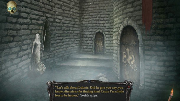
That may be precisely what a lot of old-time Shadowgate fans are looking for, but it's also the root of its real weakness: It's an anachronism that forgoes any kind of enhancement that would properly bring it into the current era. Some very basic elements of modern gameplay are missing, like the ability to rearrange inventory items, and despite the obvious need for an effective hint system, your companion Yorick—a wisecracking floating skull with glowing eyes—really isn't very helpful at all. His habit is to state what needs to be done rather than how to go about doing it; regarding a skeleton on a rock in the middle of a lake, for instance, he told me only that I should probably check it out, not exactly the most useful insight ever. Even the visual overhaul isn't all that terribly impressive; the hand-painted backdrops have an almost primitive look to them, lacking detail and clarity, the colors are drab and most of the rooms are empty and lifeless, not the sort of thing you'd expect from a 'living castle.'
Shadowgate is really just Myst in hell, and while it's an undeniable success as a straight-up reproduction of a mid-80s point-and-click adventure, the slavish devotion to its source material is tiresome and frustrating. Nostalgia is nice, but not everything improves with age.
Shadowgate isn't just retro, it's retrograde, and the visual update really isn't as impressive as it first appears.

Andy has been gaming on PCs from the very beginning, starting as a youngster with text adventures and primitive action games on a cassette-based TRS80. From there he graduated to the glory days of Sierra Online adventures and Microprose sims, ran a local BBS, learned how to build PCs, and developed a longstanding love of RPGs, immersive sims, and shooters. He began writing videogame news in 2007 for The Escapist and somehow managed to avoid getting fired until 2014, when he joined the storied ranks of PC Gamer. He covers all aspects of the industry, from new game announcements and patch notes to legal disputes, Twitch beefs, esports, and Henry Cavill. Lots of Henry Cavill.


