Revisiting System Shock, and the birth of immersive sim design
Back to Citadel to see the origins of the emergent sim.
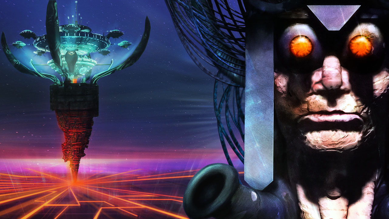
I can’t remember how far I got through System Shock the first time around. It was 1995, a few months after it came out, and I was attempting to play it on my family’s 486/33 PC. But it was a full 3D game, with lighting and all kinds of amazing stuff going on, and it was far too much for our entry-level PC.
I had to give up, but oh my, I wanted to love it. This adventure through the decks of a cyborg-riddled space station was a spiritual follow-up to Ultima Underworld II, which had stunned me the summer before. Like Ultima Underworld, System Shock is also in first-person and lets you jump and look up and down, and it features a huge, non-linear space to explore. But it exchanged Underworld’s caverns and labyrinths for the Citadel, the Guardian for an AI called SHODAN, and fantasy spells for guns and cyborg abilities. I remember seeing it as a heady blend of Doom and Ultima. Perhaps I could finally... talk to the monsters?
HUDs up!
Returning to System Shock today, by way of Night Dive Studios’ excellent Enhanced Edition, I’ve been realising just how far ahead Looking Glass was back in the mid-1990s. Well before the immersive sim was recognised as a subgenre, System Shock was showing how to create a world in which you feel completely enveloped, where everything fits in the fiction. And it still feels special. The feeling of mousing over something in the environment and dragging it into my inventory is still really powerful. It feels like I’m reaching into the world; it’s surprising how few games use this simple idea to establish a direct connection between player, the screen and the environment.
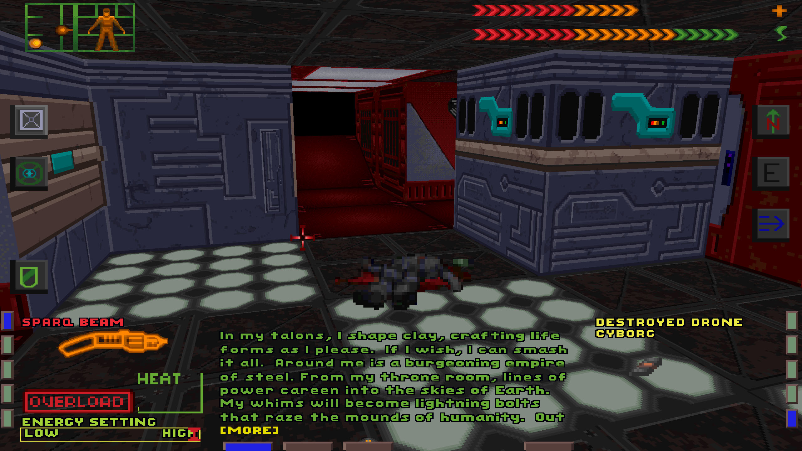
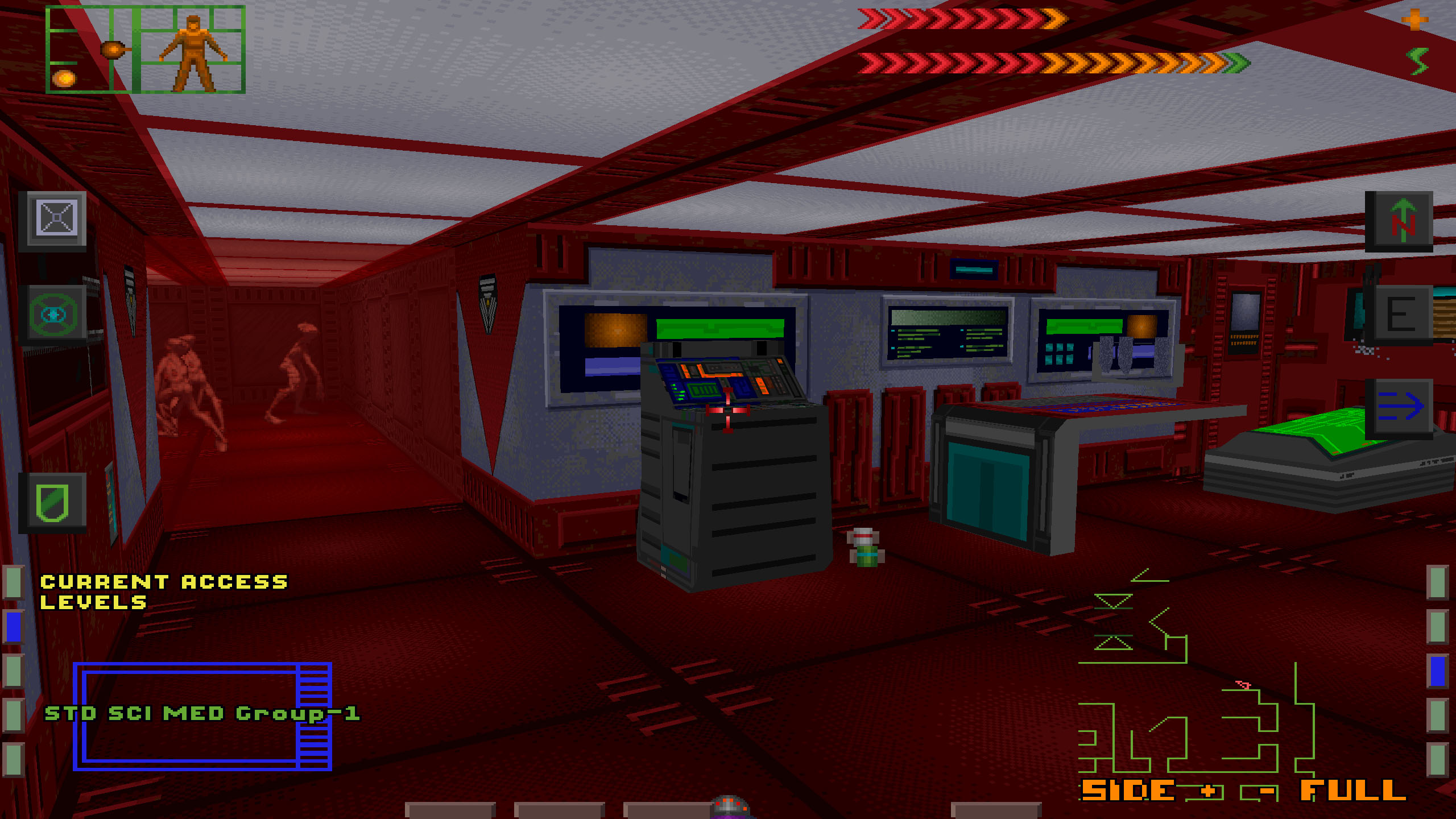
But my favourite thing has to be System Shock’s HUD, which takes up the lower third of your view and consists of three multifunctional displays. In the centre is the inventory, which has various tabs, and on either side are screens which let you choose what they display. I have the weapon display on the left, which also gives you specific controls for things like loading different ammo types and displaying overheat levels. On the right is my automap. But I could put a little game of Ping or Road in one of them, browse my emails, or check the Citadel’s status.
Then, superimposed in the main view, I can set up a rear-view video feed, so I’ll see if I’m being attacked by assailants from behind (I never have it on, since it consumes loads of energy, which is essentially System Shock’s mana). There are also buttons for my various other cyber-abilities, such as the Enviro-Shields (protection from toxic bad-stuff ), a weird quick-but-slidey movement mode, a compass, and going full- screen. What I love is that it feels like I’m taking an active role in managing my gear. All these features are presented as plugins to my robot- head. Get a better shield and it’ll be called v2. Get the targeting system, and the game will superimpose a hitbox around enemies and indicate the damage levels you’re causing them. If it presented them as menu options, they wouldn’t feel so special, and I wouldn’t feel like a cool 1990s cyberpunk hacker.
The way everything fits into System Shock’s world is matched by the way it tells its story. It only features cutscenes at the start and end of the game, instead leaning on environmental storytelling. Its grisly tableaus of a skull on the floor next to a note about encounters with homicidal mutants set the form, and it might well also be the source of the ‘Dire Warning Written In Blood on the Wall’ trope. The details of its narrative about corporate shenanigans, hacker criminals, and a very bad AI play out through found texts and audio logs, which the game also pretty much pioneered. The result is an experience in which you feel like you’re a part of the world, a place where your actions are the result of your own choices.
But replaying System Shock has also turned out to remind me of how much Looking Glass had yet to learn. The flip side of all that emergent openness is a game that can be awfully obtuse if you’re not paying attention. There’s aways a full explanation of where you’re going next, what you’re meant to do there and why you want to do it, but to get it, you have to sift through every audio log and note, some of which are found on easily-missed corpses, and to remember where certain rooms are when it’s time to backtrack across the station and up and down decks to get to the next objective.
The biggest gaming news, reviews and hardware deals
Keep up to date with the most important stories and the best deals, as picked by the PC Gamer team.
What’s more, the environments are pretty difficult to read. Things like buttons and levers have a real tendency to blend into walls. One particularly fun part for me is when I’m meant to get an Important Science Thing from a room doused in radiation. Thing is, it’s encased in a forcefield. I figure I’m not meant to get it yet, maybe until I have an Enviro-Shield, but in fact I’d missed a small button which blends into the blocky textures of a room that was steadily killing me.
Cyber-hell
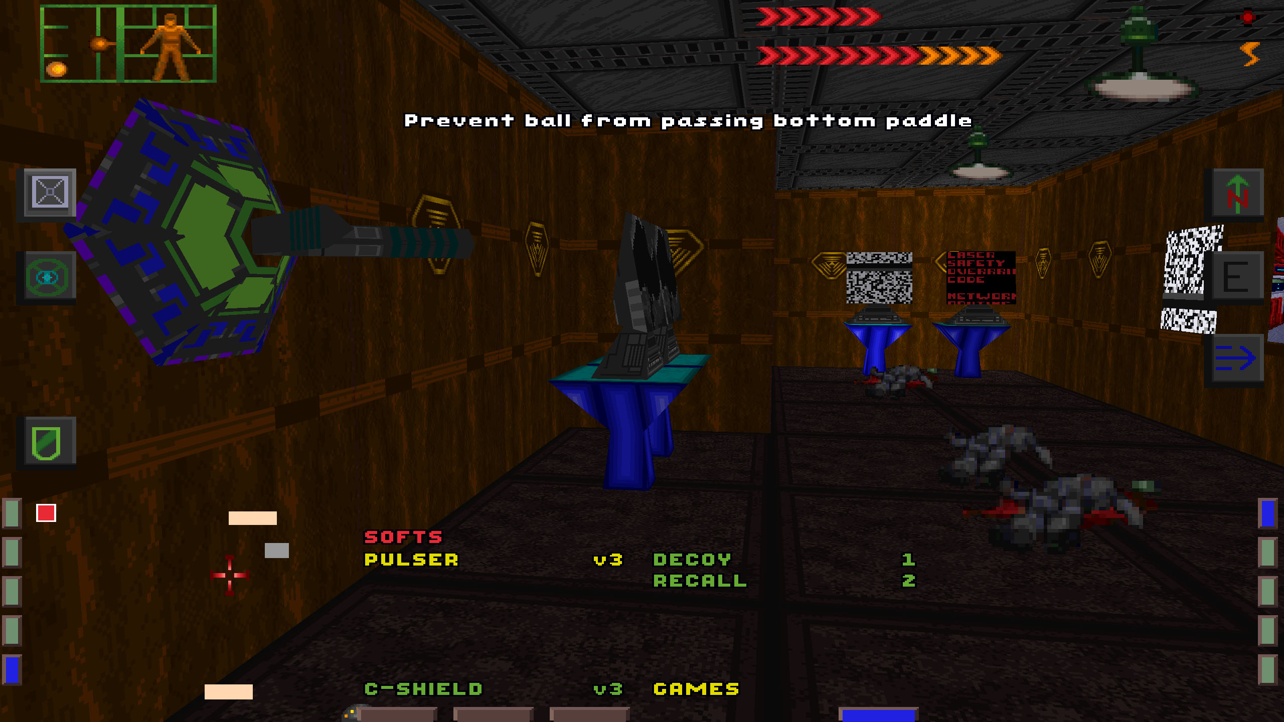
Lots of important interactive things have a tendency to hide among the wall textures. I love the way you can click on any surface or object to find out what it is, often with a little detail (“bulb needs replacing”), but it’s sometimes the only way you’ll discover a bit of wall is actually a door. Some of the names it gives things, like ‘comm port’, can be rather confusing, too. Is this something I should be using later?
These issues are compounded by the level layout, which struggles to make spaces that are memorable. The technical restrictions that came with developing a game of this complexity that could nominally run on our old family PC means that the Citadel’s decks are arranged on a very evident grid that’s pretty horrible to navigate.
But the hands-down worst thing about the game is cyberspace, something I’ve hated for—could it really be 24 years? Across the Citadel are several cyber-terminals which allow you to enter wireframe Lawnmower Man hell.
Here, you access keycodes and unlock doors by flying into big 3D shapes in 3D space, and it’s really annoying. One crime is the fact you’re constantly moving forward, so you can’t take stock of where to go at your own pace. Another is the fact that the walls of the cyber-rooms and cyber-corridors are transparent, so you often can’t tell when you hit a wall. Still another is the need to decipher all the talk of ICE and countermeasure electronics and realise it’s really just an overly complicated shooting game with zero sense of hit impact, and where running out of time or getting killed in cyberspace hurts you in real life.
And yet I also love cyberspace. It’s yet another layer of detail and ambition in a game that’s stuffed with things to poke at and understand and then get rewarded with an upgrade that makes things better.
It’s exciting to be in a world that’s both this coherent and restlessly creative, where there are mini games to play and hacking puzzles to solve, that there’s a stance system that lets you lean and crouch, loads of enemies to shoot, in-world screens that show views of other spaces. Oh and it also experimented in fresh, new ways to tell stories.
There’s a real sense of a development team showing off, pushing itself, and exploring what PC gaming could be in System Shock, and it’s good to think about how its sequel, which came out five years later, built on all of them, creating a more credible world, supported by actually-good combat and a clearer story. Playing the original today is to be reminded of where some of the most involving games of all time came from. It only makes the thought of the upcoming remake sweeter.
