Our Verdict
Theres certainly potential here. QUBEs unrefined ideas long for Valves QA sheen but theyre smart ideas all the same.
PC Gamer's got your back
Part game, part job application, QUBE is a first-person spatial puzzler set in a series of austere, white-panelled test chambers that you navigate and escape by way of handheld sci-fi gadgetry. It's a lot like Portal. In fact, it's pretty much a handwaving bid to become the next Narbacular Drop – the student project that proved so delicious its developers were hurriedly slurped up by Valve Corp.
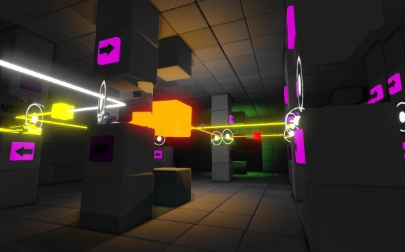
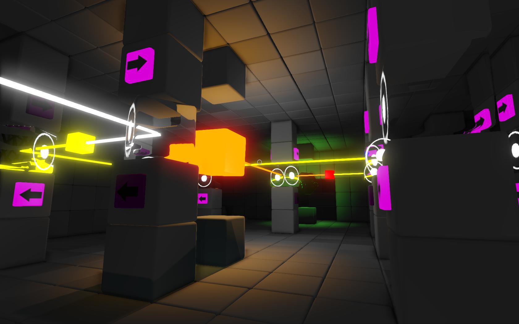
QUBE doesn't offer anything quite so elegant as the portals themselves, however, or even the propulsion gels of Valve's sequel. Instead, its core conundrum centres on the coloured blocks that extrude from the surfaces of its clinical test-chambers. Different colours do different things when activated by line-of-sight. Click on a blue block and it will recess into the floor, popping back out when you walk over it to propel you into the air. Yellow blocks come in a three-pack and elongate in a different height order depending on which block you click first. Red blocks extrude one segment per click. As you hop from one to another and to the exit, it seems a mundane foundation in contrast to Portal's space-splicing gimmickry.
It also takes a little too long for QUBE to layer-on the complicating factors that make its later levels a formidable challenge: balls that need to be bounced into special zones, lasers that need to pass through crystals of the right colour, rooms that need to be rotated like giant, inverted Rubik's cubes.
Article continues below 
Some of the most dastardly puzzles introduce magnets that effectively change the gravitational forces acting on free-floating blocks, which you herd into place by extruding different bits of scenery and flipping magnets on and off. It can be a fudge, however, thanks to the way some unseen code massages the laws of physics. A ball will sometimes drop like a dead weight and at other times will ricochet. One block will sometimes happily rest on another, even though only a few pixels of it are in contact, while at other times a seemingly innocuous nudge will send it spinning off. Rarely does this totally confound, but it does stop the game achieving the perfect, pat solutions of Portal.
So does it deserve to go on the top of Valve's CV mountain, or in the pile with the crank mail and Vortigaunt/G-Man slash fiction? It's not as good as Portal, certainly, and its deference to that game does a good job of constantly reminding you of the fact.
However, it's to QUBE's credit that the majority of its flaws feel like limitations of budget, rather than failures of design. There are rough edges aplenty, and the game's shonky art assets and cursory narrative trimming feel like placeholders, but take it as no-frills Portal mod pack and there are ideas here worth winding your brain around – building blocks of a development talent almost as impressive as the game it apes.
Review by Martin Davies.
Keep up to date with the most important stories and the best deals, as picked by the PC Gamer team.
Theres certainly potential here. QUBEs unrefined ideas long for Valves QA sheen but theyre smart ideas all the same.
PC Gamer is the global authority on PC games—starting in 1993 with the magazine, and then in 2010 with this website you're currently reading. We have writers across the US, Canada, UK and Australia, who you can read about here.


