After having mixed feelings about the original Psychonauts, I spent my weekend playing the sequel and I am hopelessly in love. Double Fine's follow-up fixes virtually all the problems I had with the first game, the pacing, the awkward puzzling, the random, punishing difficulty spikes, while also heightening everything that was great about the original. The wonderful writing. The charming characters. The empathetic representations of mental wellbeing.
Yet where Psychonauts 2 most astounds is in its level design. Its levels aren't simply brilliant, they're brilliant in several different ways, dazzling showcases of how to build unique and captivating 3D spaces. Each level demonstrates a huge amount of imagination and ingenuity, and I want to break down exactly what makes Double Fine's amazing spaces tick.
Use of technology
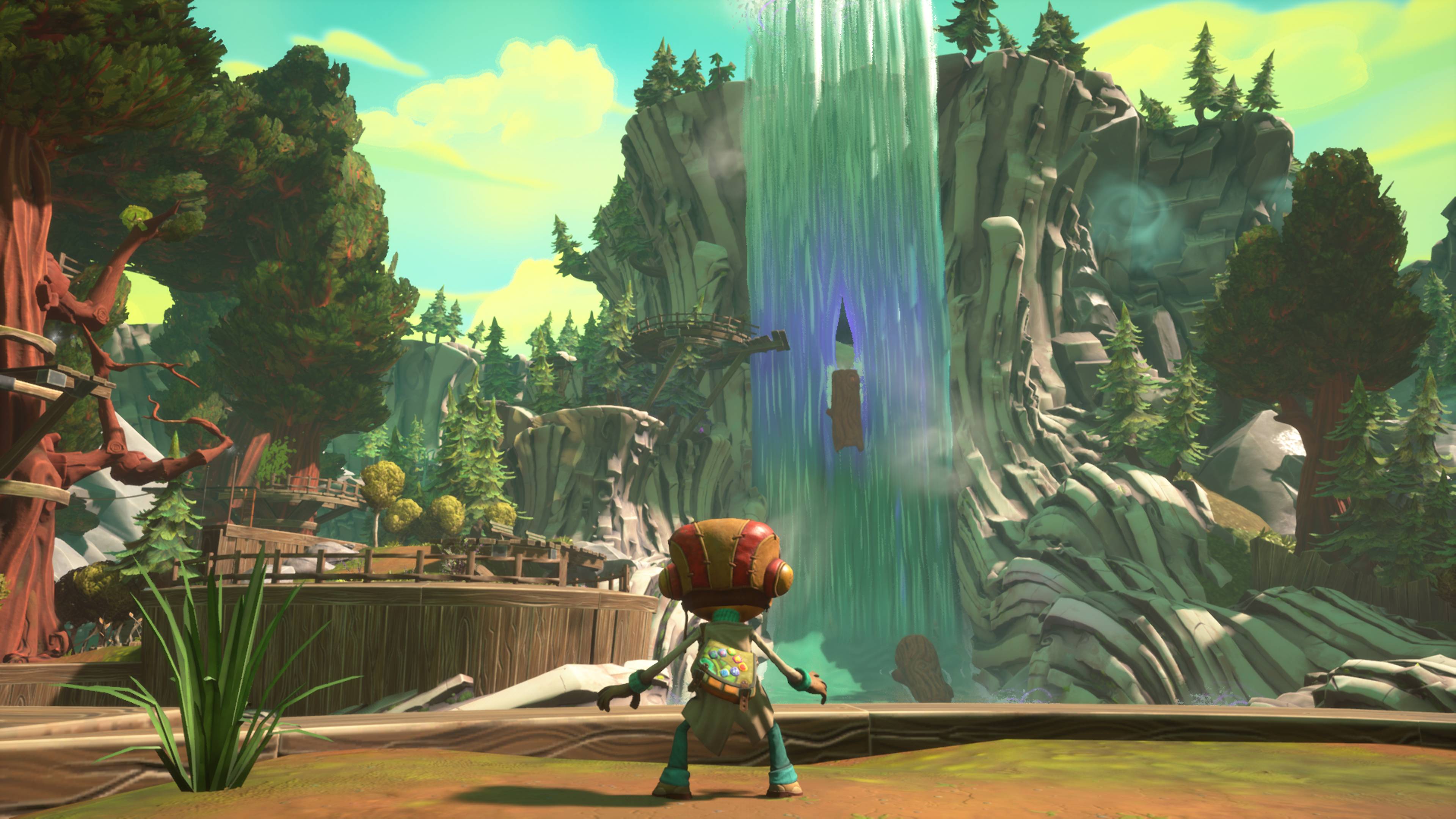
Before diving into design specifics, it's important to acknowledge the remarkable balancing act Psychonauts 2 pulls off in its general approach to visual presentation. Double Fine clearly wanted Psychonauts 2 to look modern and snazzy. The game is built in Unreal Engine 4 and obviously has a fair whack of budget behind it. But the original game's art-style is almost wilfully anti-snazzy, with characters who all look like they suffered horrible accidents in a Play-Doh factory.
Adding reflections to Ford Cruller's forehead seems like an action that would rend a hole in the universe. Somehow, though, Psychonauts 2 not only succeeds in rendering its weird, Claymation-ish world with modern materials and realistic lighting, it's one of the most visually spellbinding games I've played this year.
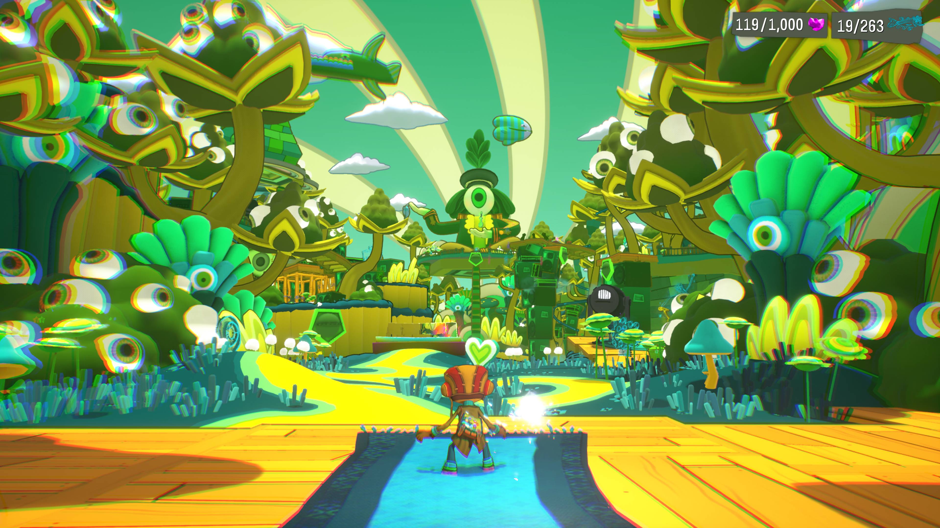
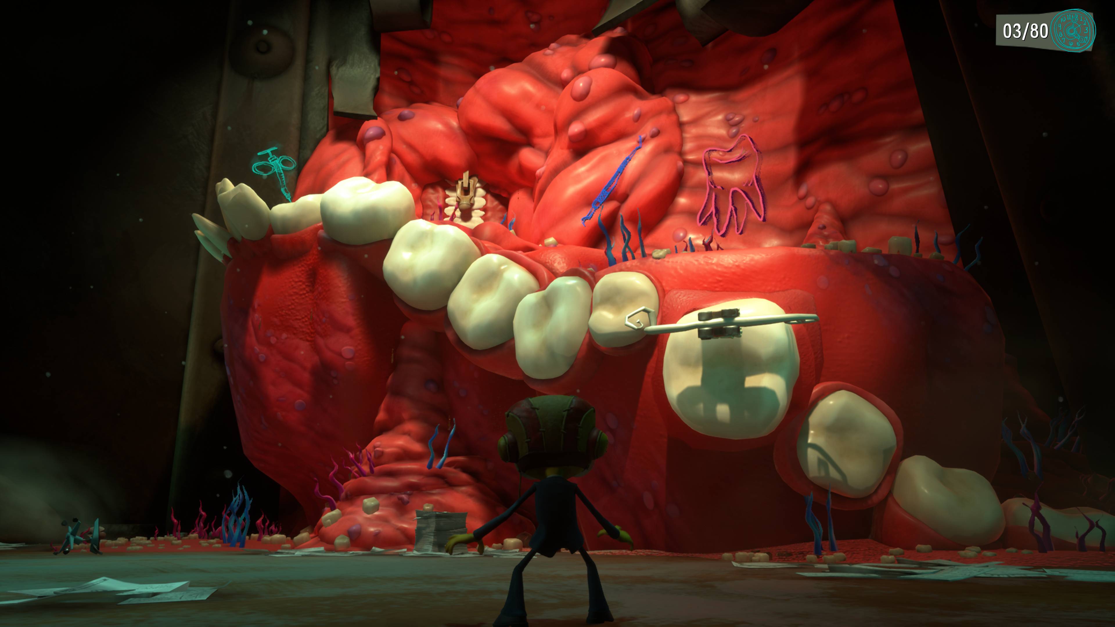
I'm not wholly sure how Double Fine has achieved this marriage of curation and modernisation, beyond lots of hard work and possibly some kind of Faustian pact. But one key tenet of Psychonauts 2's design is that the more modern elements always exist in service to the art. In the game's already-infamous tooth-world, for example, the game strives to make the world's disembodied teeth, gums and tongues look as realistic as possible, because it's more disgusting that way. Contrast that with the psychedelic realm of the Psi-King, which adopts a more cartoonish, hyper-saturated style to maximise its '60s vibes.
True surrealism
Most mainstream video-games struggle with surrealism, evidenced by how many of them resort to floating islands as shorthand for 'weird'. It's a trope you'll see everywhere, from games like Arkham Asylum and Spider-Man, to Doom Eternal and Bioshock Infinite. Even Dishonored 2, which has some of the best level design around, reverts to floating islands for its "Void" sections.
Psychonauts 2 thrives on surrealism. Its levels are a delightful medley of bizarre visions, a whirling carousel of fantastical, grotesque and carnivalesque spaces. There are worlds made of hair, worlds made of teeth, cooking gameshows with hand-puppet hosts and anthropomorphic food. Some of the ideas Psychonauts 2 cranks through could serve as the basis for entire games.
The biggest gaming news, reviews and hardware deals
Keep up to date with the most important stories and the best deals, as picked by the PC Gamer team.
Such wild variation could easily descend into incoherent nonsense. But there are several features of Psychonauts 2's dreamlike worlds that prevent them from feeling like randomness for the sake of it. Firstly, like a dream, each world has its own functional internal logic that makes sense while you're in the dream. For example, in Ford's Follicles, the liberally scattered hairdryers are not just silly set-dressing, they can be used to create new pathways through the level. The same goes for the disgusting tooth-doors in Dr Loboto's mind, or the prismatic rainbow bridges in the Psi-King's rekindling consciousness.
Moreover, everything within these spaces serves a purpose, either functional or representational. And not in a vague way, like how other games use floating islands as an all-purpose metaphor for a fracturing reality or mentality. These are specific, cumulative references designed to tell the player what is happening in this particular mind. Which brings me onto the next point.
"Levels as exposition"
This wonderful phrase was coined by Matthew Castle in his review of Psychonauts 2 to differentiate from the concept of 'environmental storytelling' which has been mocked into oblivion by a thousand jokes about putting skeletons on a toilet. Instead, Psychonauts 2's worlds are designed to communicate a specific idea at a conceptual level, one which builds over the course of the player's time in that place.
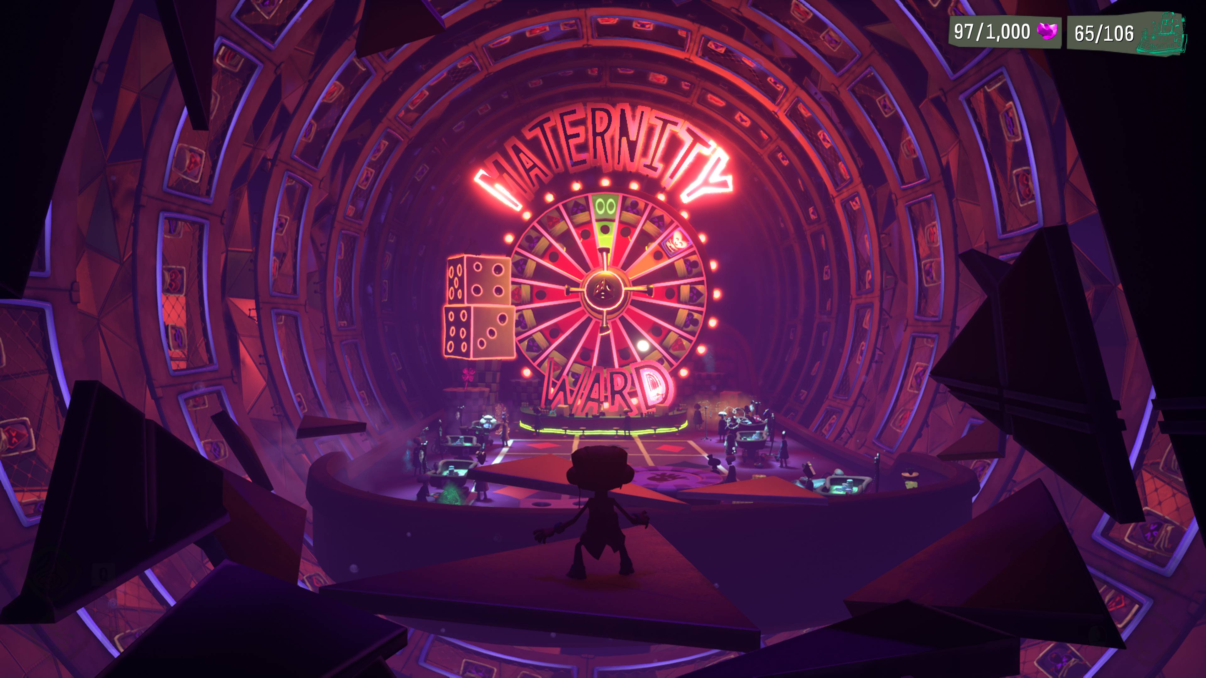
Perhaps the clearest evocation of that is Hollis' Hotstreak, wherein Raz deliberately manipulates the mind of a Psychonauts agent so she'll allow him to go on an important, possibly dangerous mission. Prior to Raz's mental meddling, Hollis' consciousness is represented as a hospital, a clean and orderly space where thoughts are treated with care and consideration. When Raz starts messing around, however, the hospital transforms into a casino, representing Hollis' increased impulsiveness and recklessness.
Taken broadly, it's a simple juxtaposition. But it's the way the level represents the process of Hollis' mental change, and how Raz attempts to undo the damage that he's done, that makes it such a brilliant example of level design as storytelling. At one point Raz enters Hollis' "Cardiology Department", which has been converted into a horse racing-style betting shop where the horses have been replaced with card suits. Here, Raz must convince Hollis' 'heart' to stop 'racing' on its own, and instead acknowledge that help from other people is a good thing, thereby stopping her from rushing off in the real world and doing damage both to herself and others around her.
Such use of juxtaposition and metaphor runs right through Psychonauts 2, with the game often using two conflicting or overlapping ideas at the foundation for its various worlds. The result is a gradual and consistent unveiling of each level's story, rather than having it fed to you in chunks by audio-logs or expositional graffiti.
Pacing
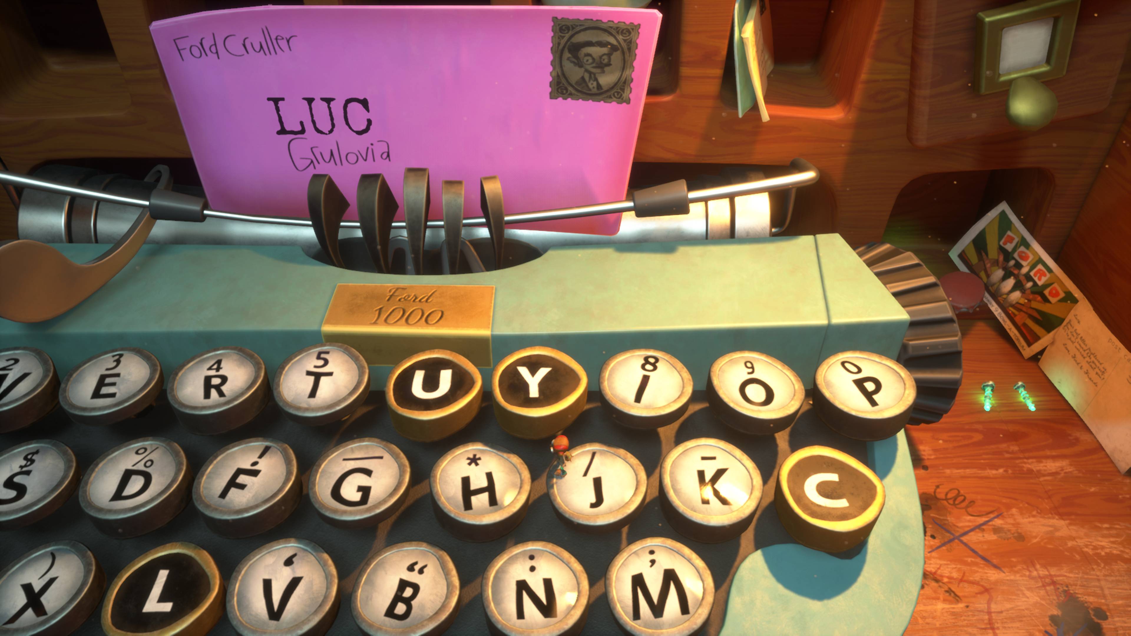
This is particularly important in the context of the first Psychonauts, which is similarly stuffed full of clever ideas, but struggles to execute them in ways that are consistently fun. Some levels are too long, while others are unclear as to how you're supposed to complete them. A few are just miserably hard, such as the infamous Meat Circus.
All this is fixed in Psychonauts 2. You always know where you need to go, either because the game visibly places your objective in the distance, or provides a clear path that lets you feel out the route. Levels still vary in length, but are broken down into digestible segments that minimise frustration and boredom. The difficulty curve is more gradual, and the game further complements this with a wide array of accessibility aids. The finicky, LucasArts style conundrums have been replaced with more physical, action-based puzzles, which means you spend far less time standing around in befuddlement.
All of this gives players more space and time to appreciate Psychonauts' level design. The remarkable artistry, the way they play with gravity and space, the way they help to tell the story. They're far more than platforming challenges designed to break-up the plot, and become holistic spaces designed both to explore the thoughts and feelings of its characters and provoke emotional reactions in you.
It's fitting that Double Fine's masterpiece sees the studio return to the game that put them on the map. For 15 years Schafer & co has tried but never quite succeeded in making something truly great, whether that was due to technical limitations, budget constraints, or unfortunate creative decisions like making Brutal Legend a strategy game (yes, that one still stings). But with every stumble Double Fine has learned and adapted. And with Psychonauts 2, they've blasted it into orbit.
Rick has been fascinated by PC gaming since he was seven years old, when he used to sneak into his dad's home office for covert sessions of Doom. He grew up on a diet of similarly unsuitable games, with favourites including Quake, Thief, Half-Life and Deus Ex. Between 2013 and 2022, Rick was games editor of Custom PC magazine and associated website bit-tech.net. But he's always kept one foot in freelance games journalism, writing for publications like Edge, Eurogamer, the Guardian and, naturally, PC Gamer. While he'll play anything that can be controlled with a keyboard and mouse, he has a particular passion for first-person shooters and immersive sims.

