Please stop sticking ugly logos on gaming chairs
They look hideous enough as it is.
Gaming chairs are a crime against aesthetics and I resent the fact that my ugliest piece of furniture is also my comfiest and most ergonomic. I wish my back and bum didn't need comfort. It's amazing, then, that chair designers are still finding ways to make them more grotesque, as if there's a competition to create gaming chairs that will cradle your backside while making you vomit.
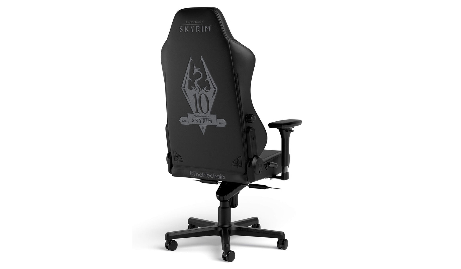
The worst of them are always the collaborations with different videogame brands. Take the new Skyrim 10th Anniversary chair from Noblechairs. Forgetting, for a moment, that it's very weird to create a chair so specific that it celebrates a game's anniversary (especially when the anniversary was the year before), it's just amazing how incredibly boring the design is. It's just a black chair with a dragon logo.
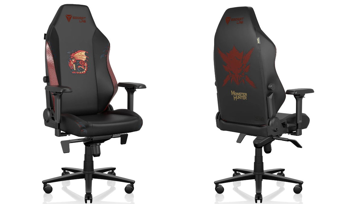
And it's almost always just logos. There are exceptions, like this Monster Hunter chair that includes a cute lil' critter, but on the back it's still got the game logo, and the game name, to boot. Why would I want words on a chair? Especially when those words are just the name of a game. I like understated furniture, so I probably wouldn't want any kind of Monster Hunter chair, as much as I adore the series, but surely anyone in the market for something bolder would prefer some cool game art and not what's basically just a very boring advert.
This Witcher chair would actually look fine with the swords and red accent, but then you've got all the other junk making it look tacky as all hell. So it's not like there aren't some neat gaming chair designs, it's just that they're willfully being ruined with over-the-top aesthetics. Why must our gaming rooms be cursed to look like shit?
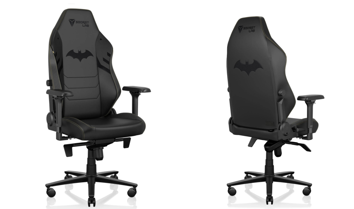
Admittedly, there are times when just using a logo makes sense. Like if I was looking for a Batman-themed chair, I'd probably expect the Dark Knight's emblem to be emblazoned on it. And that's exactly what you get with Secretlab's Batman chair. But since it's Secretlab, you've still got to put up with its logo and name, which are inevitably given top billing. It's inescapable.
This is like Ikea carving its name prominently on every desk it sold. Perhaps it's the connection to gaming, and thus electronics, that makes all these chair makers think this is tasteful. TVs, monitors and gaming peripherals all typically give the manufacturer's name pride of place, and I've never really given it much thought. But it looks so much more out of place on furniture. If you want none of the above, no logos, no text, no weird flourishes—just a plain chair designed for someone who plays a lot of games, you're shit out of luck.
It's a reminder that a lot of the companies making gaming-related products still have a very narrow definition of a gamer, typically a young man. When I was 21, I sure as hell didn't care about furniture matching or if my guests thought I stole a chair from an arcade racing simulator, but at 36 my priorities have changed a wee bit. But I still spend an inordinate amount of time glued to my desk, playing or writing about games. Way more than I did at 21.
The biggest gaming news, reviews and hardware deals
Keep up to date with the most important stories and the best deals, as picked by the PC Gamer team.
So I spent six months doing my Goldilocks routine and searching for a decent chair, and while there are understated ergonomic office chairs that broadly fit the aesthetic I was looking for, nothing was able to fit my practical needs quite as well as the heinous monster that now lives in my office.
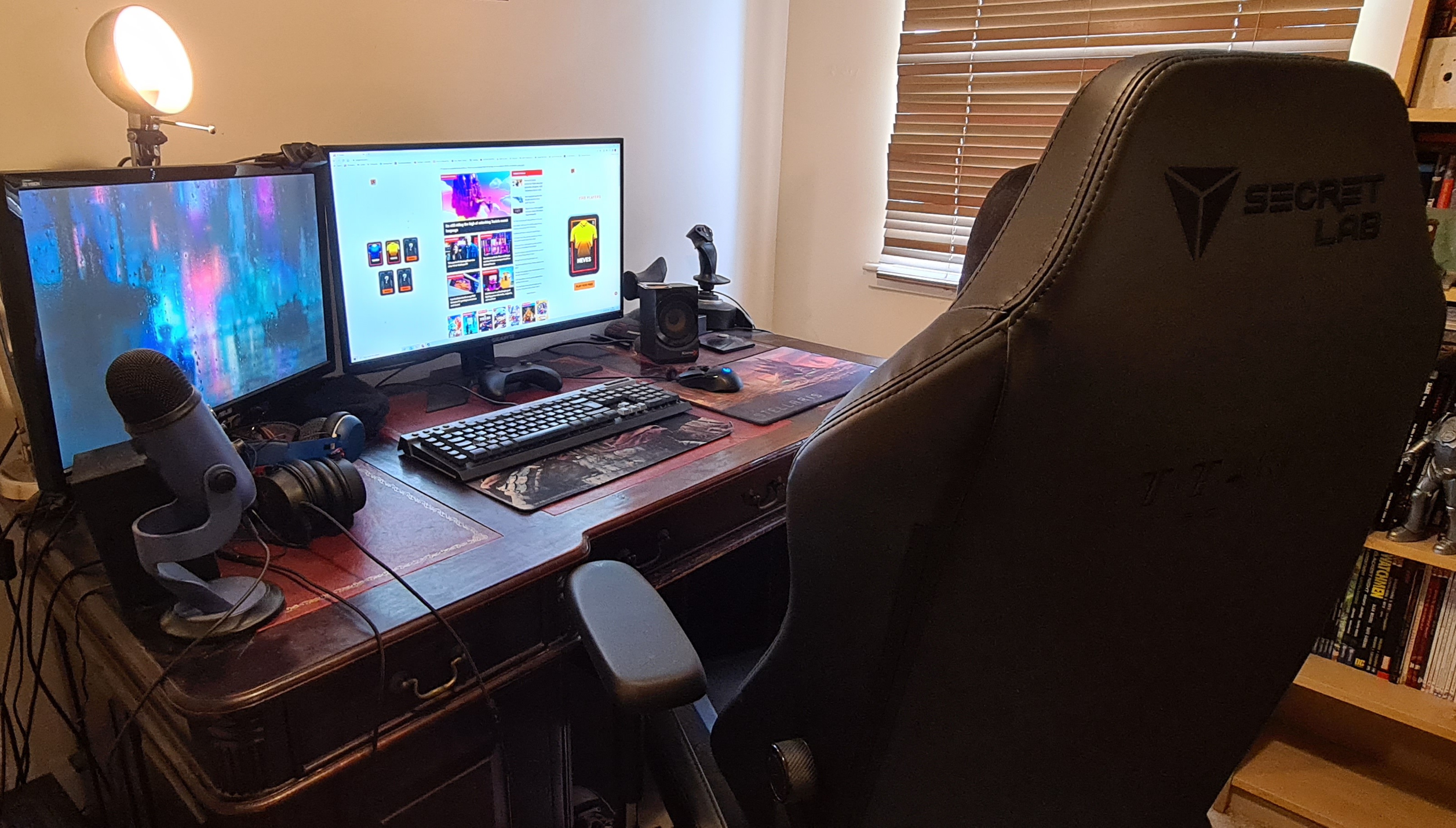
It is appallingly comfortable. I sometimes resent shifting to the sofa to play on my big telly. And I've got one comfy sofa. And even if I hated every aspect of it, I can't return it, because my puppy has chewed the shit out of the levers. Thanks, Cosmo.
There are worse gaming chairs, certainly. This is the plainest one I could find in the Titan Evo range, and it doesn't stand out too much, even if the shape is fundamentally ugly. But it's still got that bloody logo. Staring at me. Mocking me. I see it when I close my eyes. I think it follows me when I leave the flat. It might look like an unassuming corporate logo to you, but to me it's the Mark of the Beast.
Have I completely lost the plot? Absolutely. But that's an even better reason for Secretlab to make me a chair fit for an adult. My sanity depends on it.

Fraser is the UK online editor and has actually met The Internet in person. With over a decade of experience, he's been around the block a few times, serving as a freelancer, news editor and prolific reviewer. Strategy games have been a 30-year-long obsession, from tiny RTSs to sprawling political sims, and he never turns down the chance to rave about Total War or Crusader Kings. He's also been known to set up shop in the latest MMO and likes to wind down with an endlessly deep, systemic RPG. These days, when he's not editing, he can usually be found writing features that are 1,000 words too long or talking about his dog.
