We made a Doom level and got id designers to critique it
Designing maps can't be that hard, right?
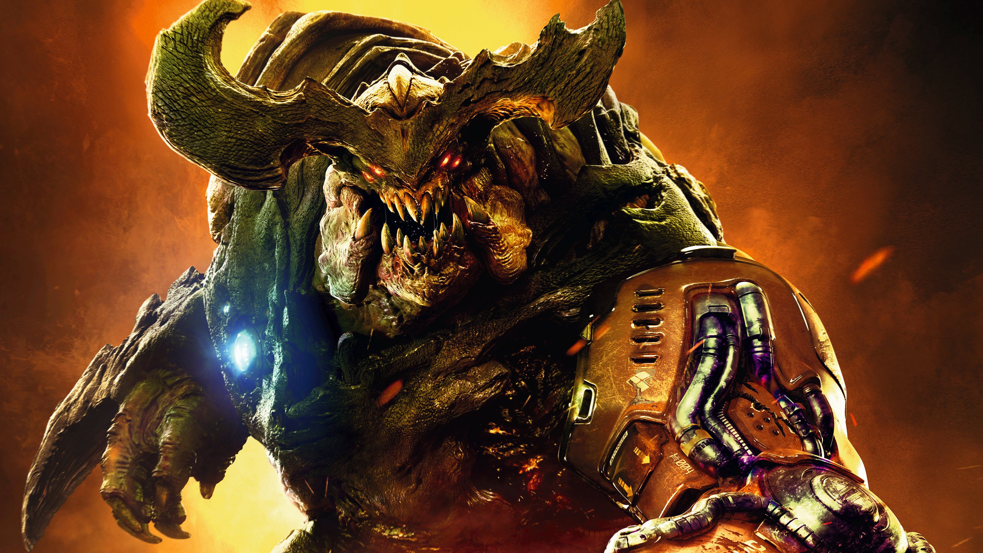
Want to play Andy's level for yourself? It's called 'A Cold Day in Hell' and the map ID is B9MKXVBS.
This article was originally published in our October issue. For more quality articles about all things PC gaming, you can subscribe now in the UK and the US.
I’ve played, and reviewed, a lot of first-person shooters. So when id Software announced SnapMap—an accessible map editor bundled with their superb Doom reboot—I decided to try to apply that experience to creating my own level. Without having to worry about coding and all the other stuff actual game developers have to deal with, I’ll be free to focus purely on the design. And when it’s finished I’ll get some of the team who worked on the game, and on SnapMap itself, to give it an honest review. Because it’s about time we critics faced some criticism ourselves.
People have created some wild stuff with SnapMap, including music sequencers, endless runners, and rudimentary RPGs, but I’m going to keep it simple. I want to make a fun, well-paced singleplayer level that wouldn’t feel out place in the main campaign.
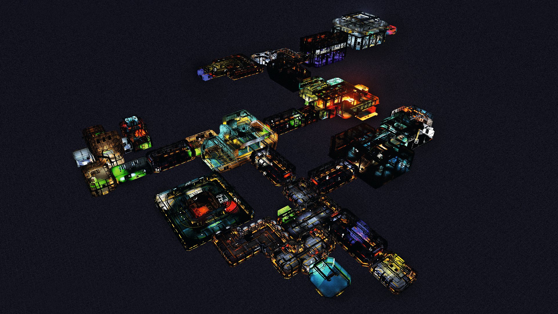
I start with a piece of paper and sketch a rough layout. I want it to be about 15 minutes long and keep the player interested the whole way through. And I want to squeeze as much classic Doom stuff in as possible, including secret areas, devilish traps, surprise demon ambushes, and coloured keycards. Then I begin the surprisingly long process of turning that vague scribble into a level.
SnapMap gets its name from the way you ‘snap’ rooms together. It’s been designed to be as easy to use as possible, and it only takes about 40 minutes to recreate my sketch. However, the biggest limitation of the tool is that you have to choose from a selection of pre-made rooms. You can’t create your own, which dampens your creativity somewhat. But luckily, there’s enough variety to make what I had in mind.
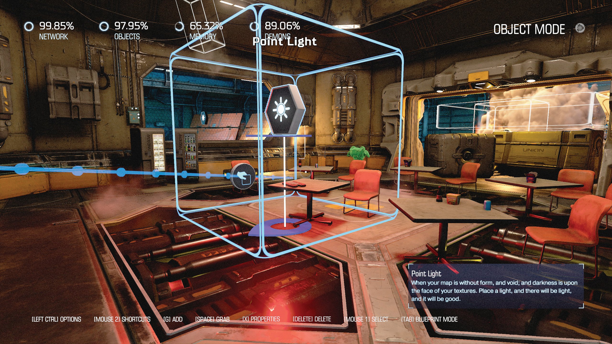
It’s basic stuff, really. A network of corridors occasionally opening up into large arenas, with branching paths that will force the player to hunt for a keycard. Once the level’s built I spend some time running around it, getting a feel for the layout. I make a few sections shorter to keep the pace up and think about where I’m going to place the enemies, health, ammo, and so on. Creating the map was the easy part; now I have to make it fun.
I go back to the editor and start placing demons. One thing SnapMap doesn’t tell you is that you can only have twelve in the level at once. Any more and they’ll stop spawning. So I have to get creative and set every demon to ‘hidden’, only revealing them when the player hits certain invisible trigger points. This makes the process of populating the level much more time consuming, but about an hour later I’m done. I do the usual FPS thing of starting with basic grunts, escalating to tougher foes.
The biggest gaming news, reviews and hardware deals
Keep up to date with the most important stories and the best deals, as picked by the PC Gamer team.
Logic objects are crucial to making a good SnapMap level. They let you use scripting to create set-pieces, puzzles, and other cool interactive stuff without having to write any code.
Logic objects are crucial to making a good SnapMap level. They let you use scripting to create set-pieces, puzzles, and other cool interactive stuff without having to write any code. You use them by dragging ‘chains’ between objects in the editor’s 3D view. So, for example, if you drag a chain from an invisible trigger point to a door, you can set it so that when the player enters the trigger point the door opens. Simple.
I use these logic chains to create a few traps, which are an important part of any Doom level. When the player picks up the red keycard, I make it so that a few Imps spawn behind them and block the exit. In another area I drop an enticing-looking chaingun and set a trigger to make a false wall slide away, revealing two angry Hell Knights. I’m sure some players will see these ambushes coming from a mile away, especially if they’ve played a Doom game before, but if I catch at least a few people out I’ll be happy.
And now it’s time for some set-pieces. To add some variety to the traditional running and gunning, I use an ‘event’ logic object to trigger a wave challenge. This basically automates a set-piece, with a few customisable parameters. I choose a big two-floor arena and make it so that when the player enters, the doors are locked until they kill four increasingly difficult groups of enemies. The demons that spawn are random; sometimes there are Cacodemons, sometimes there aren’t. It’s as simple as dropping the logic object in the room. Then I scatter some ammo and health around too, just in case.
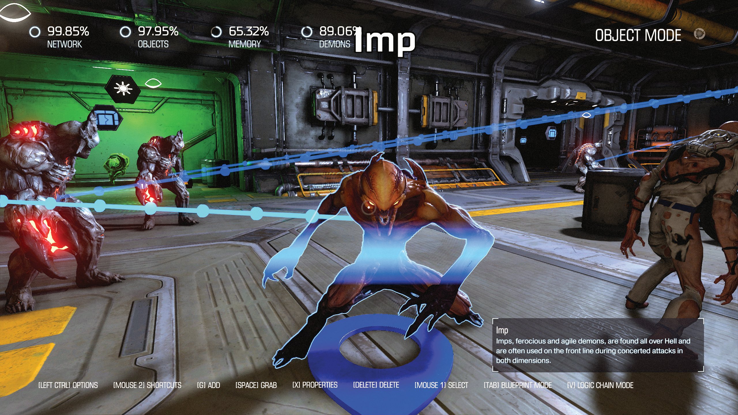
I use the same event logic to create a boss battle. In the final arena—a vast hangar that looks suitably dramatic—I set it so that two Barons of Hell with increased health attack the player at once. And, again, the door is locked, meaning they’ll be forced to fight and can’t just run to the exit. But to make things slightly easier, I make it so that if they die, they’ll spawn back at the entrance and any damage they dealt to the Barons will carry over. That should stop people getting too frustrated and quitting before the end.
And now, testing. Lots and lots of testing. I play the map dozens upon dozens of times, making sure there are no boring bits, that it’s paced well, and that none of my logic chains are broken. I make far too many tweaks to list here until, finally, I’m done. I can’t tell whether I’m happy with it, or just happy that it’s over. I know the level so intimately that I can’t look at it objectively anymore. I’m completely numb to it. Is it even any good?
The final step is something I’ve been looking forward to since the very start: decoration. There are loads of props, lights, and effects like fire and smoke to give your level personality. I’ve played a lot of SnapMap levels by other people, and many of them are quite barren and lifeless. So I spend hours littering each room with clutter, and using lights and environmental effects to heighten the atmosphere. I make the room where the player finds the red keycard a cafeteria with vending machines, tables and chairs, and discarded noodle containers. I’m probably overthinking it, to be honest.
The level is done, and now it’s time to face the music. I arrange for designers from id Software and SnapMap co-creators Escalation Studios to play the level and give me their feedback. And I ask them to be completely honest, because it’s not fair if they pull their punches. I certainly don’t when I’m reviewing games. I also share the map on Twitter, challenging people to find the secret area hidden behind a fake wall that conceals a super shotgun. Only a couple of people did find it in the end, which makes it a success I think.
Things start off well. The team say they enjoyed the map, and thought it was well paced. They liked that I tweaked the settings to disable demon scoring (which makes arcadey numbers pop out of enemies when you shoot them), making feel it more like an authentic singleplayer level. That was totally the idea! They also liked the attention to detail and the use of props, specifically mentioning the cafeteria I spent so much time making, and liked how I’d used objects to block off certain areas, to keep the player on a set path. So far so good, but then it was time for some criticism.
They say the difficulty ramping could be improved, that it starts out easy and then suddenly spikes. A fair observation. I tried to do this by starting with easy enemies and ending with harder ones, but I could have worked more to make the transition smoother. They also observe that the rocket launcher feels too powerful for the level, and having watched a few people play it myself, I agree. Once players pick that up they don’t bother with any of the other weapons in the level—including ones I’d set up as traps.
This was another criticism: that too many of my traps were tied to picking up items. This assumes that a player’s going to pick up absolutely everything, and means many will miss out on some or all of your set-pieces. They also noted that the green lights I’d pointed at a few doors to make them stand out to the player were confusing, because they made people think they were locked with a green keycard. Of course! I should have thought of that. Other negative points included the wave event being too long (I should have had three waves instead of four) and a lack of text or points of interest to assist navigation, especially at branching paths.
I’ve learned a lot, both from the developers’ feedback and the process of making the map. Level design really is an art, and creating something that’s varied, entertaining, challenging, and pretty to look at requires a lot of patience and skill. It took me almost 20 hours to make this relatively tiny level, and all I was doing was snapping pre-made bits together. Imagine the effort it takes to make something like BioShock ’s Rapture. This experience has given me a newfound respect for level designers.
If it’s set in space, Andy will probably write about it. He loves sci-fi, adventure games, taking screenshots, Twin Peaks, weird sims, Alien: Isolation, and anything with a good story.

