Our favorite title screens and main menus in PC gaming
Here's a couple PC games that make a strong first impression. What are your favorites?
First impressions are important. When we think of our favorite music, we often visualize the album art or a music video. Treasured childhood memories? The faces of the people there, maybe the smell in the room at the time. And with our favorite videogames, sometimes it's the the main menus and title screens that stand out most.
Color, imagery, and music come together to form our first emotional connection to whatever we're about to spend the next day, possibly years, playing and re-playing. Let's take a look at some of the best main menus and title screens in PC gaming and reminisce. You'll notice a lot from recent games on our list, but that's because developers are really beginning to master the art.
Shout out your personal favorites in the comments.
Borderlands 2
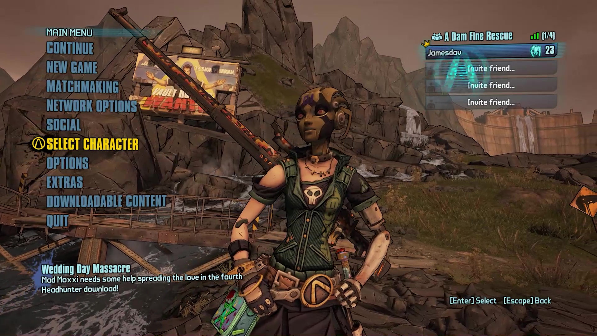
What I like about the Borderlands 2 menu is it lets you switch between your characters and see what they look like in-game with whatever cosmetics you've slapped on them. They pose on a cliffside looking cool while the camera slowly spins around. If you like Claptrap sometimes you get to see him here too, and if you hate Claptrap sometimes you get to see him fall off the cliff. — Jody Macgregor
Dragon Age: Inquisition
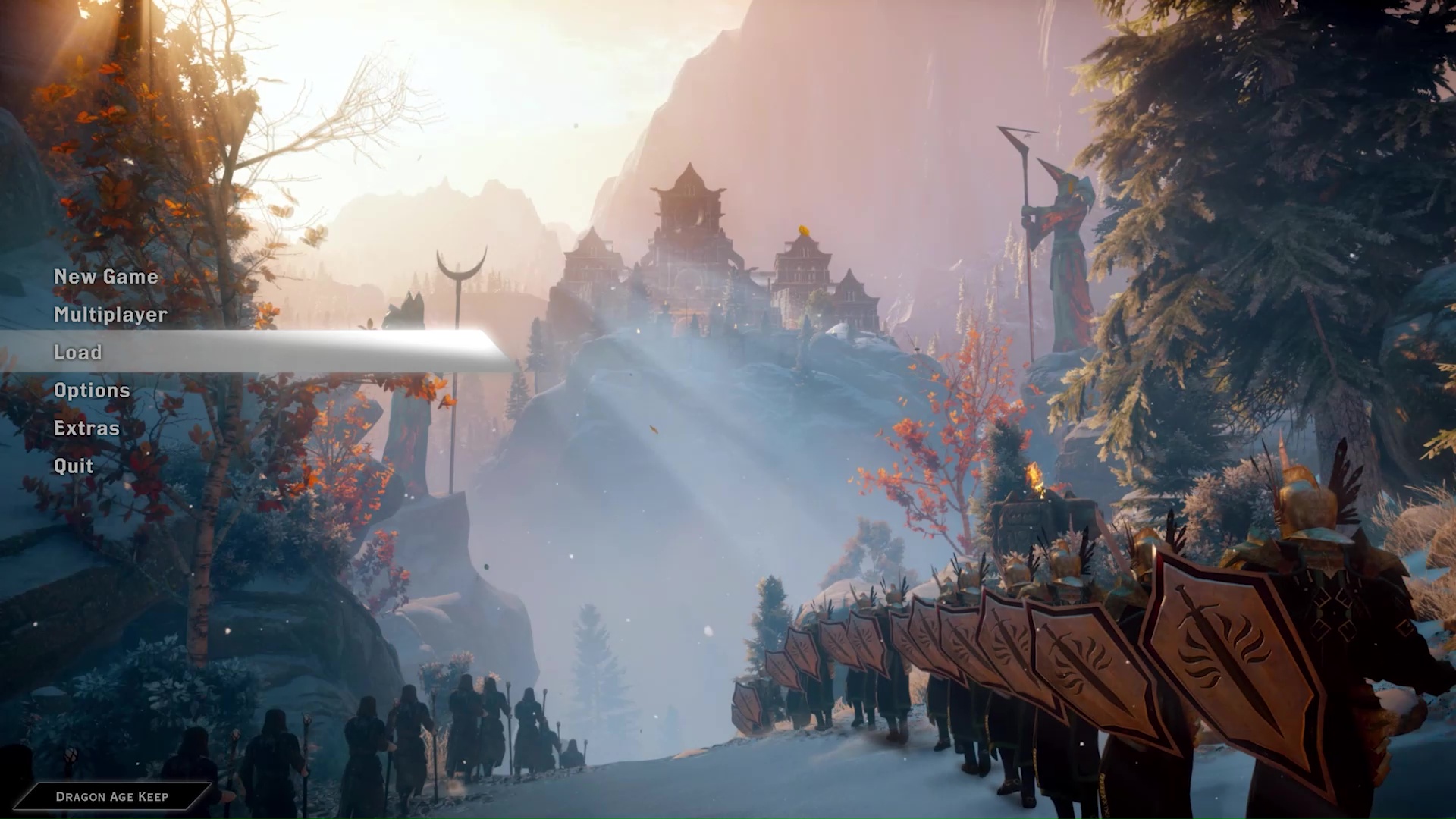
An endless procession of Mages and Templars march towards a peace summit decades in the making. It's a striking image for a main menu in its own right, but what makes it memorable is what happens next. Hit 'New Game', and the great temple they're convening at erupts in an enormous arcane explosion. It's the perfect way to nail the drama and surprise of the story's inciting incident, allowing the game to throw you right into the aftermath from minute one. —Robin Valentine
Halo: Combat Evolved
The menu screens for the Halo franchise are so iconic that someone created a website to play replay all the menus from all the Halo games. From Gregorian chants to the thumping war drums featuring the ominous Halo ring floating in the background. The Halo menu screen is awe-inspiring and screams epic space adventure. —Jorge Jimenez
Quake 2
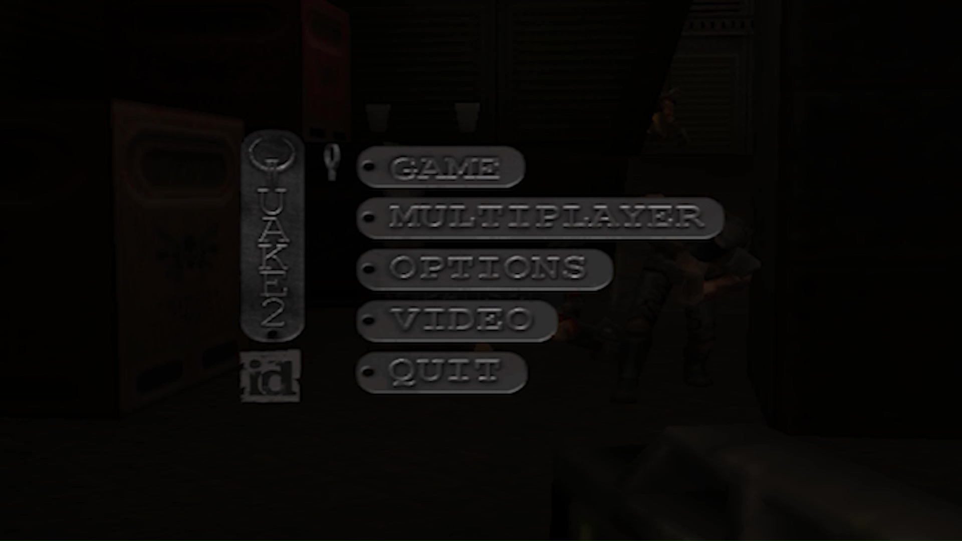
Quake 2 for me, mostly because of the sound it makes. —Tyler Wilde
The biggest gaming news, reviews and hardware deals
Keep up to date with the most important stories and the best deals, as picked by the PC Gamer team.
Spelunky 2
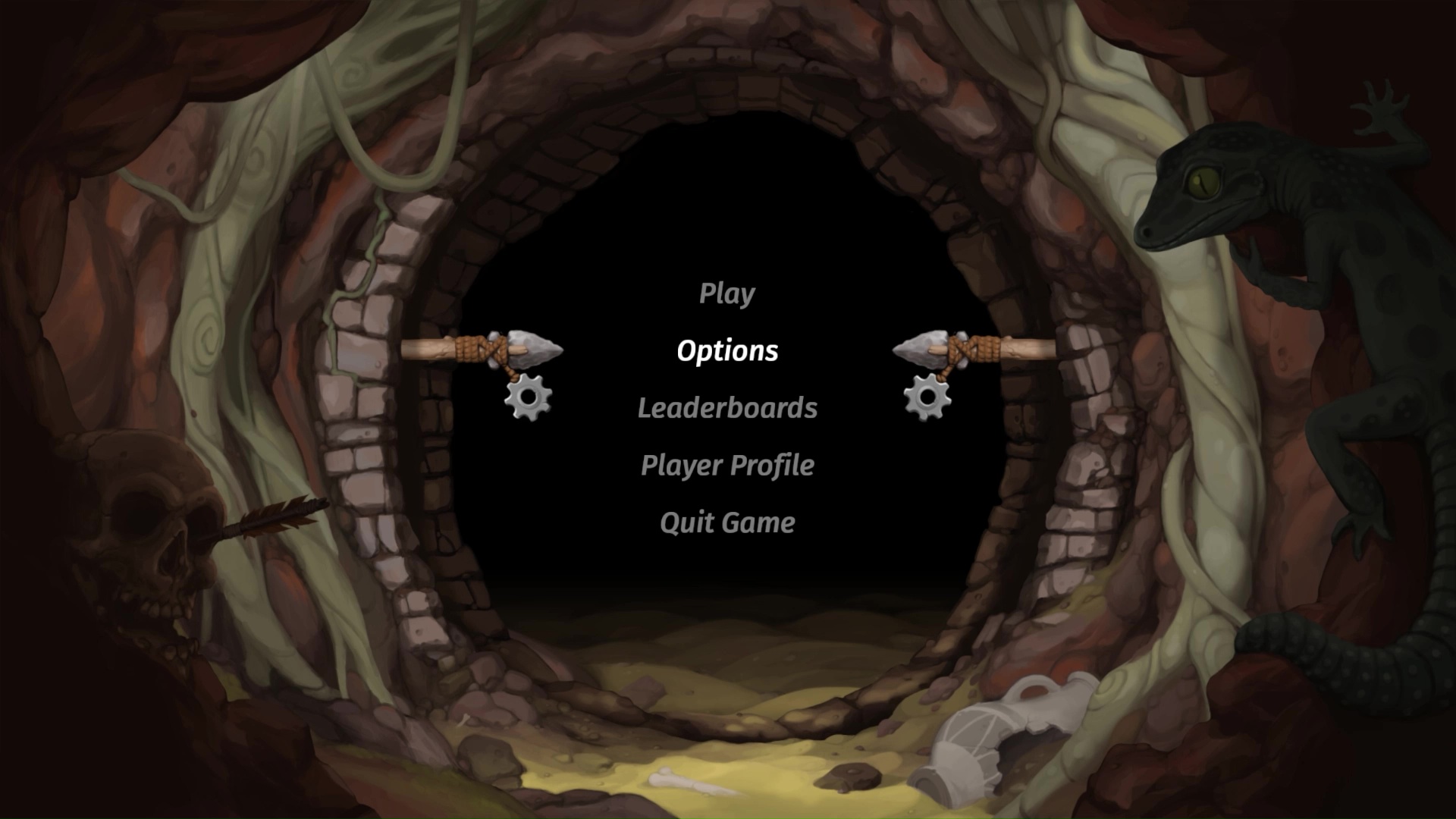
What I like about Spelunky 2's intro sequence s the way it reflects the spirit of the game, which I think is actually quite unusual. Most developers treat intros or title cards as a very functional aspect of the game, something that sits in front of the thing you actually want, but right off the bat there's an interesting set of secrets that introduces you gently to the game.
You get to see that you're playing as the daughter of the character you played in the last Spelunky, but there's also this wonderful audio sting right as you see the title card. It evokes this strong feeling of wonder and discovery that's really in line with the emotions I feel while playing Spelunky, in addition to frustration. Then you see this spinning stone carving that has different bosses etched into it, and maybe you don't know that yet. I love the care that was taken to fold the sense of wonder and secrets that are so deeply embedded in the experience in playing Spelunky into this whole sequence. It's really elegant and clever, and I appreciate that it's not simply a start menu. —Evan Lahti
World of Warcraft
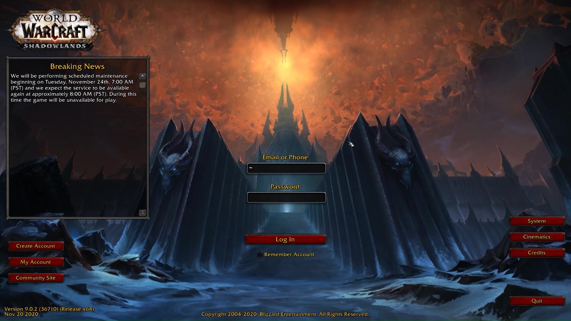
WoW's title screen isn't winning in the UI department, but there's a nostalgic charm in its little username and password prompts beside a news boxes always and forever reminding us of upcoming maintenance. The imposing vistas that change with each expansion are what we remember most though, each basically framing that expansion's Mordor in a properly menacing light. Server maintenance may be nigh, but so is doom, also, forever. —James Davenport
Thumper
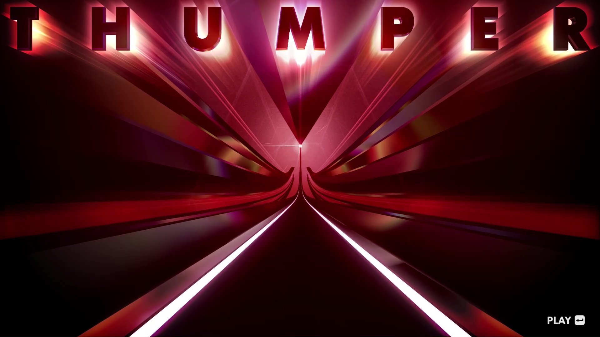
Coasting through impossible geometry purgatory before plunging into impossible geometry hell. It's a nice starter mood, a major contrast to the sweaty, stressful rhythm horror that awaits. I'm also into the title font and text placement here. I'm a sucker for symmetry and slick typeface. —James Davenport
Half-Life 2
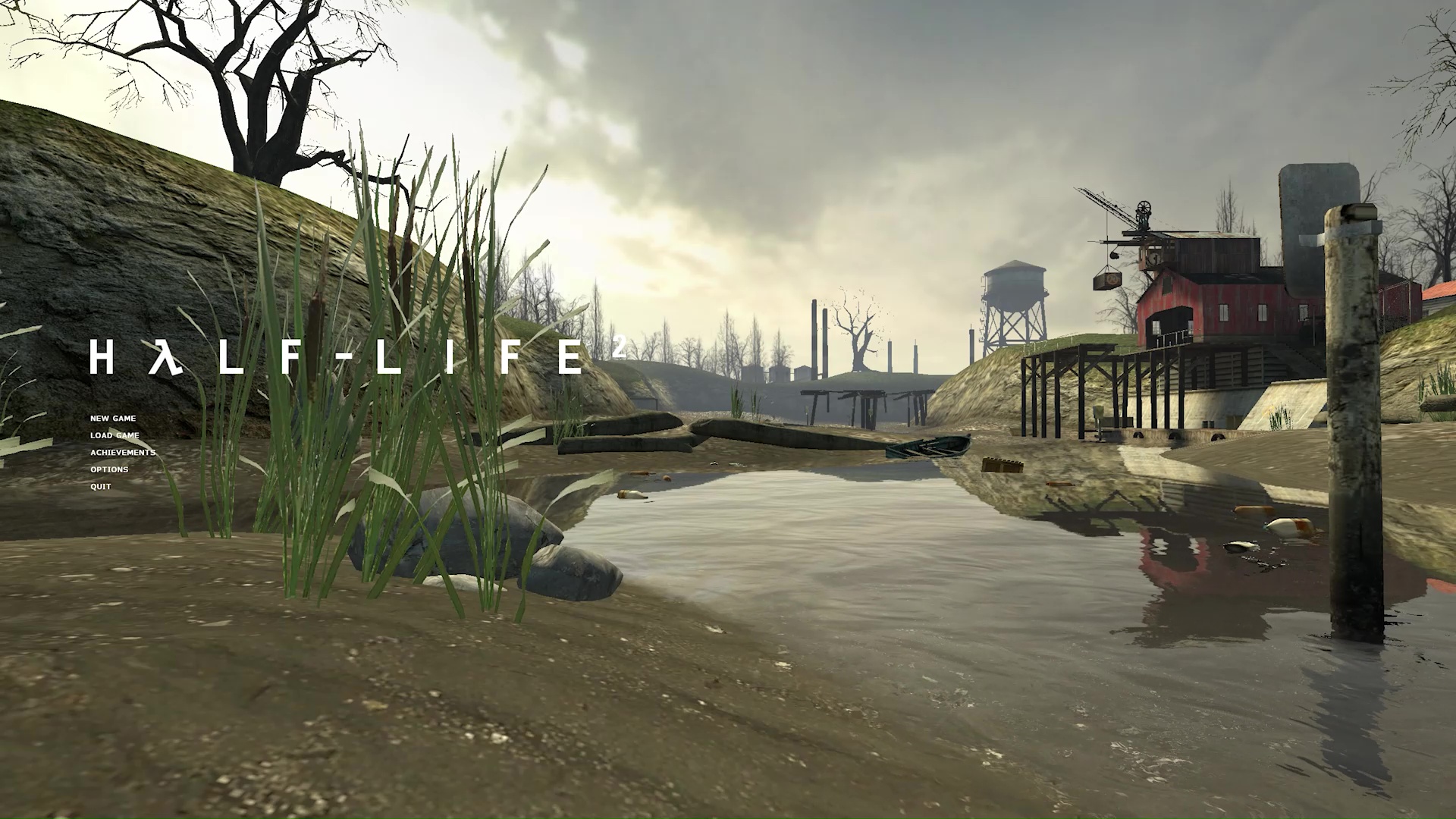
Half-Life 2's main menu is the videogame equivalent of a bookmark. You get a minimalist list of menu options and the title in white layered over a scene from the chapter you last left off in. Before you even load up that save, we're eased back in with setting and a nice dose of atmosphere in all those iconic sound effects. —James Davenport
Stardew Valley
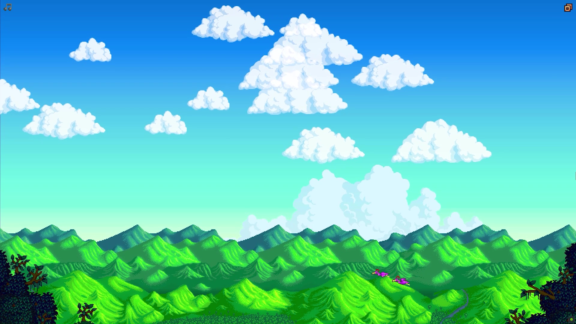
Stardew Valley's title screen sequence is like getting kicked in the groin by good vibes. We open on gorgeous mountain scene, the iconic theme welcoming us in, that slowly pans up into the sky to reveal the title and menu options. Leave it on for some chill tunes to study (or farm) to. —James Davenport
Session
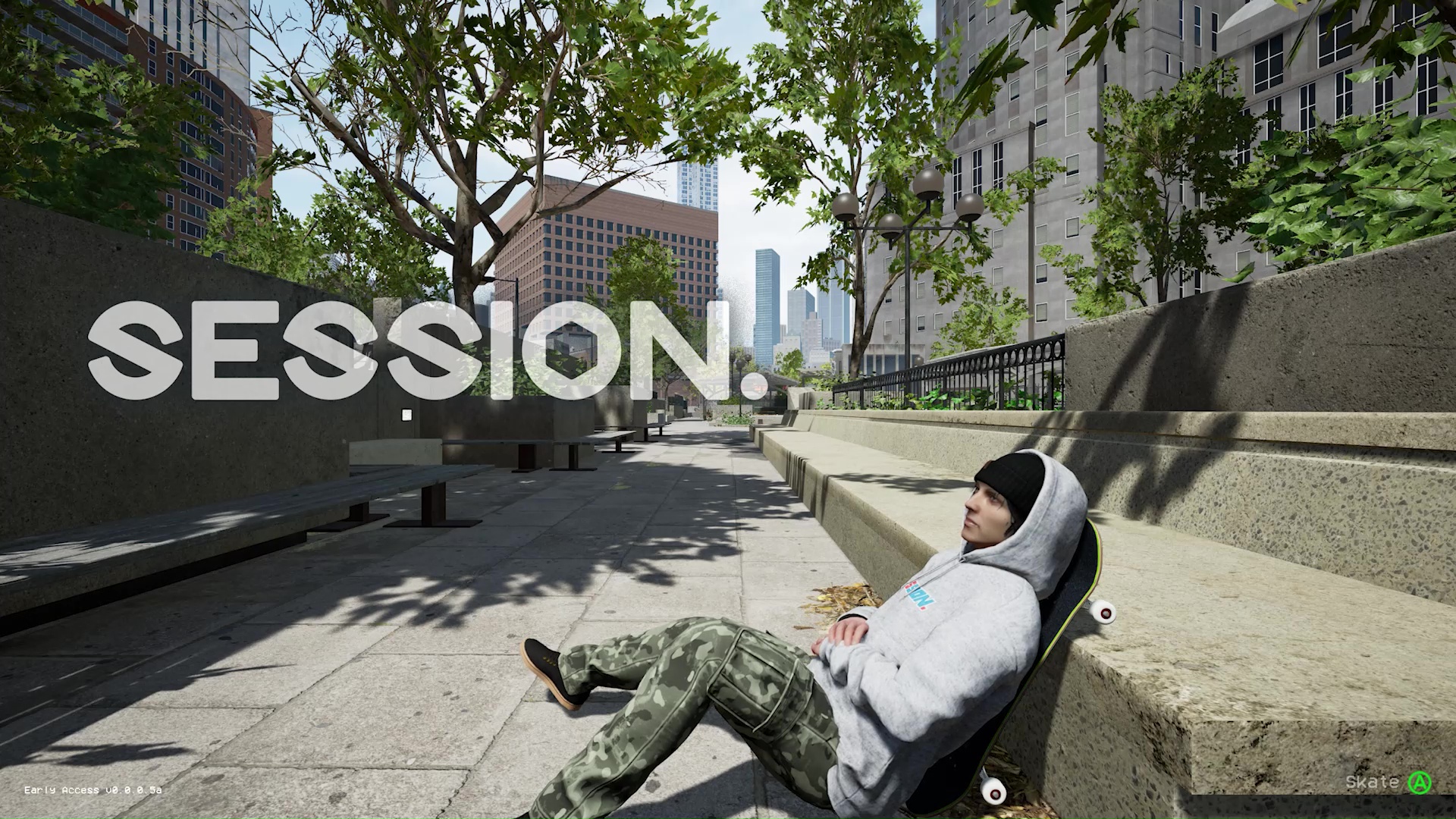
Session makes its purpose clear from the first second. We open on your skater avatar, chilling so hard it should be a crime. There's one option here, and it's to press A to skate. Do so and our skater stands up, kicks over the board, and gets to it in a seamless transition. It's smooth as hell. —James Davenport
Hylics 2
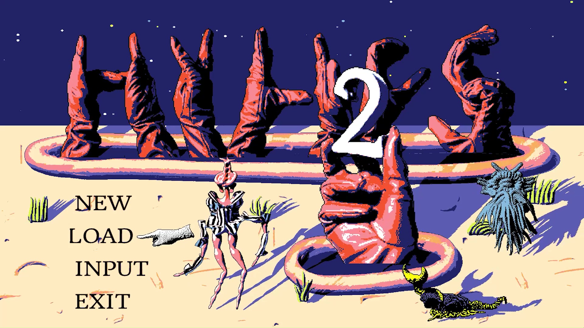
Hylics 2's title screen accomplishes the goal of disorienting you with its absurd style and psychedelic sounds immediately. The letters are hands, some little guys made of clay squiggles and sprites do a little dance, a scratchy electric guitar finds an erratic rhythm, dipping in and out of tune. You'll know if Hylics 2 is for you in the tiniest measurement of time perceptible to the human brain. —James Davenport
Metro Exodus
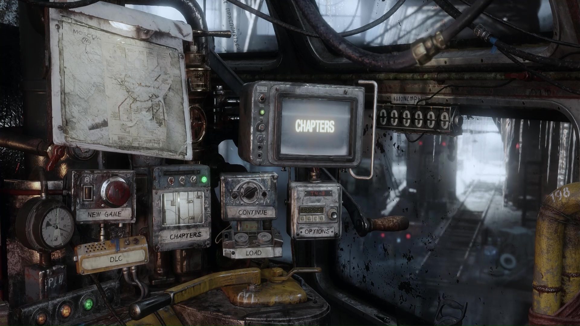
Metro Exodus combines the Half-Life 2 bookmark approach with something to orbit. Besides the tactile menu options built into the train controls, we are, might I remind you, on a damn train. It's where all your friends live and grow on the ensuing post-apocalyptic road trip, and as the scenes change outside the windows in the main menu as you progress, there's always the train to keep you anchored. Dread and horrors in the background, home and hearth in the foreground. It's gonna be alright, probably. Maybe. —James Davenport

Jody's first computer was a Commodore 64, so he remembers having to use a code wheel to play Pool of Radiance. A former music journalist who interviewed everyone from Giorgio Moroder to Trent Reznor, Jody also co-hosted Australia's first radio show about videogames, Zed Games. He's written for Rock Paper Shotgun, The Big Issue, GamesRadar, Zam, Glixel, Five Out of Ten Magazine, and Playboy.com, whose cheques with the bunny logo made for fun conversations at the bank. Jody's first article for PC Gamer was about the audio of Alien Isolation, published in 2015, and since then he's written about why Silent Hill belongs on PC, why Recettear: An Item Shop's Tale is the best fantasy shopkeeper tycoon game, and how weird Lost Ark can get. Jody edited PC Gamer Indie from 2017 to 2018, and he eventually lived up to his promise to play every Warhammer videogame.
