Opera's 'Reborn' browser makes the web an even darker place
Opera is retooling its web browser and you can test drive an early build right now.

Opera is attempting to "redefine the modern browser" and is putting its vision for whatever that entails into version 59 of its browser, which is due out in March. In the meantime, you can download the first developer edition of what Opera is ambitiously calling "Reborn 3" (R3), which quite literally makes the web a darker place to surf, if you're into that.
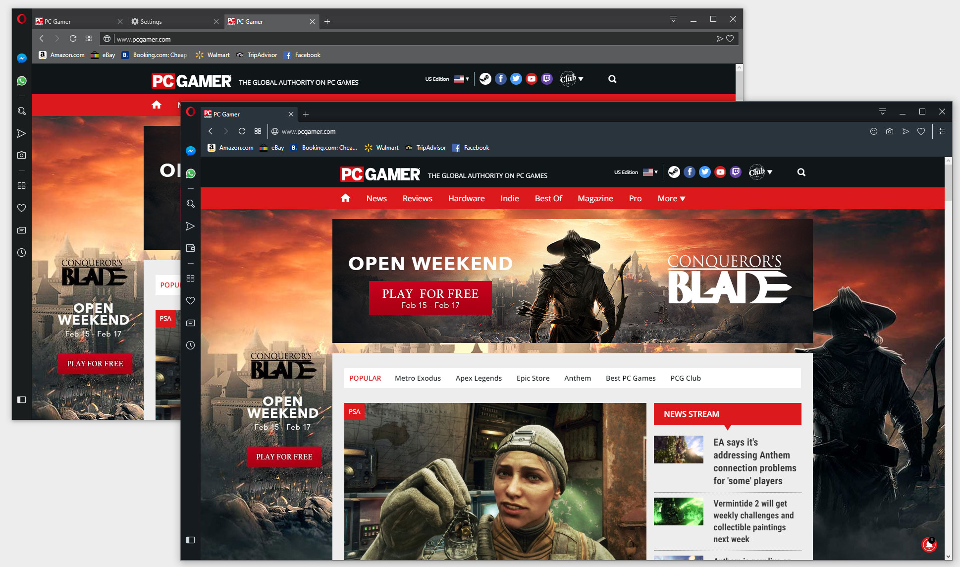
No, the homepage doesn't default to some sadistic place on the web. What I mean by making the web darker is that R3's dark mark is noticeably dimmer than the current version. You can see this in the screenshot at the top of this article—the browser in the foreground is R3, and the one behind it is version 58 (or 58.0.3135.65, to be exact).
Overall, R3 looks more like a minor refresh than an all-out overhaul. The differences are subtle, like rounded corners on tabs. Opera's intent, however, is to "put web content at center stage," and it uses the analogy of a picture frame to describe how it is going about building the new browser.
"The main function of a frame of a picture or painting is to enhance the viewer’s experience of the work it houses, not to distract from it. We believe a browser should provide such a frame for the web," Opera explains.
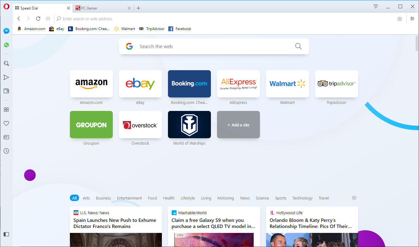
"We’ve removed dividing lines between sections so you can browse without borders and unhindered by unnecessary distractions. And, just as no one frame is effective for every picture or in every lighting, we’ve given the browser two distinct themes, light and dark," Opera continues.
Opera says it was inspired by high-key and low-key lighting photography when designing the light and dark themes, where the goals are to maximize or minimize light in a photo while retaining contrast.

"With the light theme, your entire browser, including the sidebar and tab area, is bright and clean. To us, this evokes a feeling of openness and optimism. We designed it to spark productivity and lift your mood. The dark theme signifies to us a certain elegance and focus. It turns the browser dark and subdued, almost mysterious. But on a practical note, it’s also soothing for the eyes," Opera says.
The biggest gaming news, reviews and hardware deals
Keep up to date with the most important stories and the best deals, as picked by the PC Gamer team.
It's a lot of hyperbole for a web browser. Sure, it looks nice, but I can't say that the redesigned tabs elicited a "visceral response" as they were designed to do.
R3 is also not an entirely minimalistic browser. Opera says it would have been easy to do that by simply stripping out features, but doing so would come at the expense of functionality and so a minimalist design was not the goal.
It's shaping up to an interesting year in the browser space, at least as much as that is possible. Microsoft, for example, is gutting its Edge browser and rebuilding it around Chromium, which is the same platform that powers Google's Chrome browser, and also Opera. It will be somewhat of a slow rebuild throughout the course of this year.
As for R3, follow this link if you want to give it a try. If you already use Opera, this will install alongside it, rather than replace it.
Paul has been playing PC games and raking his knuckles on computer hardware since the Commodore 64. He does not have any tattoos, but thinks it would be cool to get one that reads LOAD"*",8,1. In his off time, he rides motorcycles and wrestles alligators (only one of those is true).


