On The Level: The unnamed dystopian city from Mirror's Edge

In each chapter of On The Level, Andy Kelly celebrated a great map, level, or location from a classic PC game.
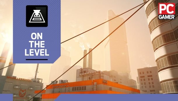
Faith might be the protagonist of Mirror's Edge, but the city is the star. While most dystopian science fiction uses the Blade Runner model—grime, neon, perpetual rain—the artists at DICE went in the opposite direction. Their futuristic city is every bit as sinister as Ridley Scott's Los Angeles, but also serenely beautiful. Glance at a screenshot for a fraction of a second and you'll know it's Mirror's Edge, which is a testament to its stylish, vivid art design. The gleaming skyscrapers, contrails streaking across the sky, and use of bold primary colours are instantly recognisable.
Mirror's Edge is undeniable proof that art is king. Games that strive for realism age horribly, but this will always look great. The natural lighting, stark primary colours, and clean architecture give it a defined personality that will, I think, prove to be timeless. Crysis 3 might have the most sophisticated particles, physics, and foliage on PC, but it's artistically forgettable. Playing Mirror's Edge today, I'm struck by how good it still looks six years on. There's little or no dynamic lighting—it mostly seems to be 'baked' into the world—but it really doesn't matter when it looks like this .

I love how the personality of the city shifts as the lighting changes. Early in the game it's the peak of the afternoon, with the sun burning high in the sky. The bright, cerulean blue above you and the the way the skyscrapers are bleached white by the sun really drills home the idea that this is—at least on the surface—the perfect city. It's an idyllic vision of a modern metropolis, free from trash and graffiti and dirt. Exploring with a free camera mod, I realise just how small the maps are. Clever use of perspective and skyboxes makes these outdoor areas feel much bigger than they actually are.
Then the time of day changes. The sun begins to set, casting a golden glow over the buildings. It feels like the city is winding down as the glass monoliths looming over you glint in the fading sunlight. It's almost peaceful, if it wasn't for the masked government goons chasing you across the rooftops. That's the problem with Mirror's Edge, at least for someone like me who wants to savour the environments: you're always running madly from place to place, and rarely get a chance to admire the artists' work.
Eventually night falls and the warm glow is replaced by a cold, dark blue. This is when Faith finds herself drawing closer to the Shard; the tallest building in the game that, naturally, serves as the headquarters for the totalitarian government who control the city. This is always on the horizon as you skip across the rooftops—getting steadily closer as you progress through the story—and is a constant reminder that the city is under its watchful eye, like a modern take on Lord of the Rings' Eye of Sauron.

Not enough has been written about the interior design in Mirror's Edge, which is just as impressive as its urban vistas. The use of colour indoors is particularly striking, with different colours being used for different organisations—the crisp orange of Pirandello Kruger or the blues and whites of the government buildings. Even the furniture looks good, with chairs and desks that wouldn't look out of place in some expensive avant-garde homeware store. Get close enough to the art on the walls and you can see the texture of the paint. There's a remarkable amount of detail, which most players won't even notice as they bomb around the environments trying to shake off their pursuers.
The biggest gaming news, reviews and hardware deals
Keep up to date with the most important stories and the best deals, as picked by the PC Gamer team.
Mirror's Edge is far from a great game, but in terms of its art and design, it's hard to fault. If I ever replay it, it'll be to explore the city again more than anything else. I don't know what direction DICE will take the sequel in, but I hope the art design is just as stylish and considered.
Here's the Mirror's Edge edition of Andy's Other Places YouTube series. To see what the game looks like running at 4K, check out Ben's screenshot showcase.
If it’s set in space, Andy will probably write about it. He loves sci-fi, adventure games, taking screenshots, Twin Peaks, weird sims, Alien: Isolation, and anything with a good story.


