Nvidia's cloud gaming platform gets a more user-friendly redesign
GeForce Now gets a UI overhaul to accommodate an ever growing library of games.
Keep up to date with the most important stories and the best deals, as picked by the PC Gamer team.
You are now subscribed
Your newsletter sign-up was successful
Want to add more newsletters?
Update 9/19: Nvidia discovered a bug that would negatively impact users' experience, so its holding off on the rollout until it can fix and test the new UI. It could take a couple of days before it's totally fixed, but GeForce Now members can still use the current version without issue in the meantime.
Original story:
When we tested Nvidia's cloud gaming platform, GeForce Now, back in February, the user interface was organized as if you were opening up Netflix or Amazon Video for the first time. The most popular games were splayed across the top, and then categorized into groups like new releases and free-to-play. Nothing was alphabetized. If you wanted to easily see if GeForce Now supported your game, you'd have to go to the Nvidia website, where the entire catalog was and still is alphabetized. Not terribly inconvenient, but not exactly user-friendly either.
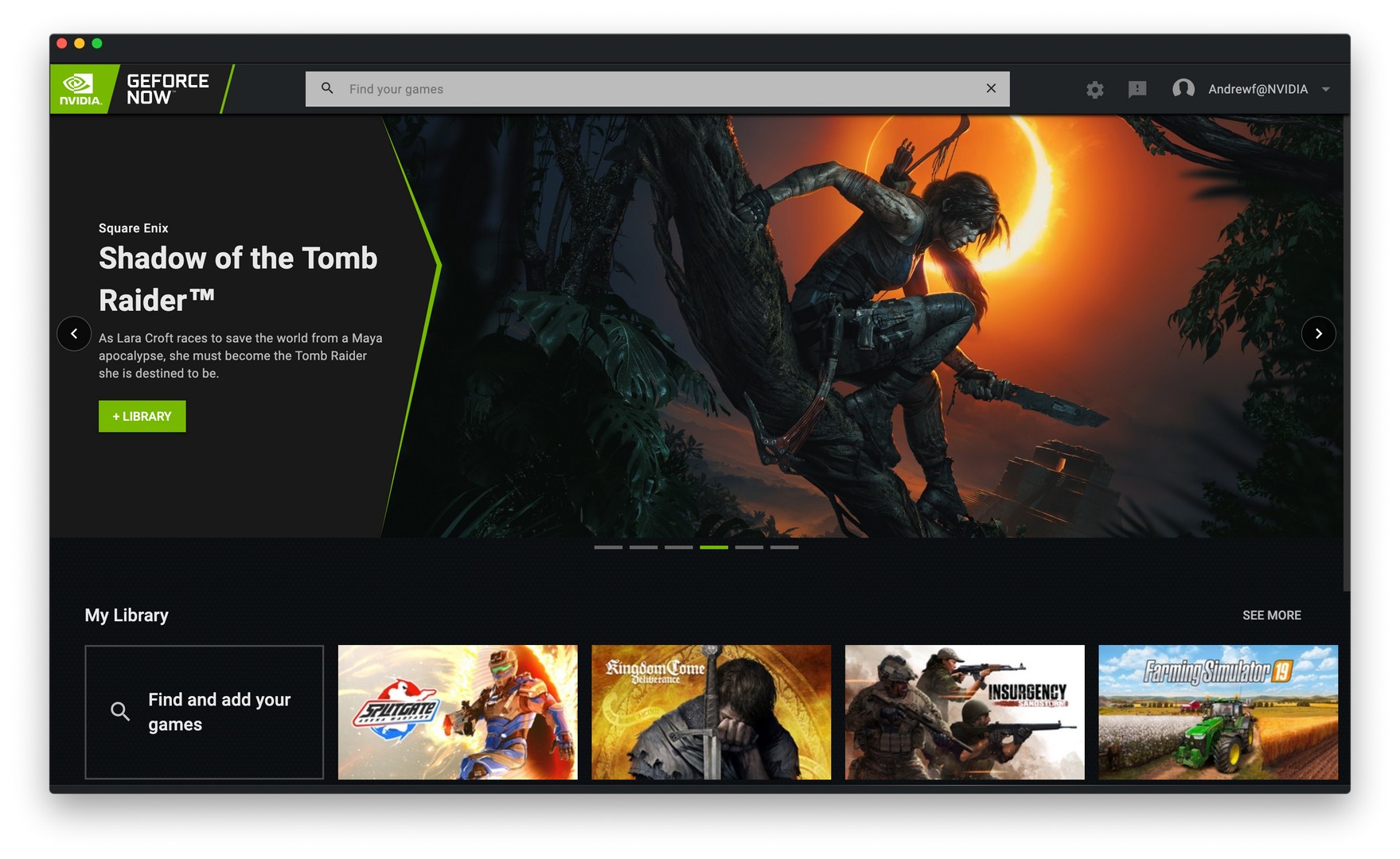
Article continues belowOnce the service's catalog of games grew to more than 500, it became even more difficult to search for games. If you had already played a game, it was added to an easily accessible personal library. Finding a specific new game was a challenge with the way everything was categorized, but at least there was a search bar in the app itself. Now, Nvidia has completely changed that with its new GeForce Now UI design, saying it brings "search front and center."
And that search bar is definitely front and center, now extending nearly all the way across the top instead of being a tiny icon near the top right corner. The vertical left side bar that had your 'games' and 'library' buttons are gone now too. Your library is now the first thing displayed across the bottom, with a button all the way on the left that allows you to "find and add your games." Spotlighted games are still predominately featured across the center of the app.
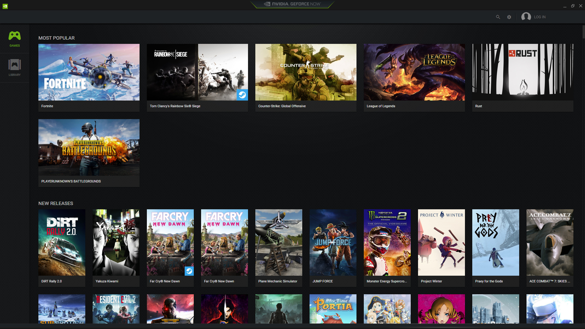
In the old UI, your library was sorted by recently played and whatever launcher you needed to play the game—Battle.net for Blizzard games, Steam for most other games. To see your full library in the new UI, you click on 'see more' just above the far-most right thumbnail in the 'my library' category.
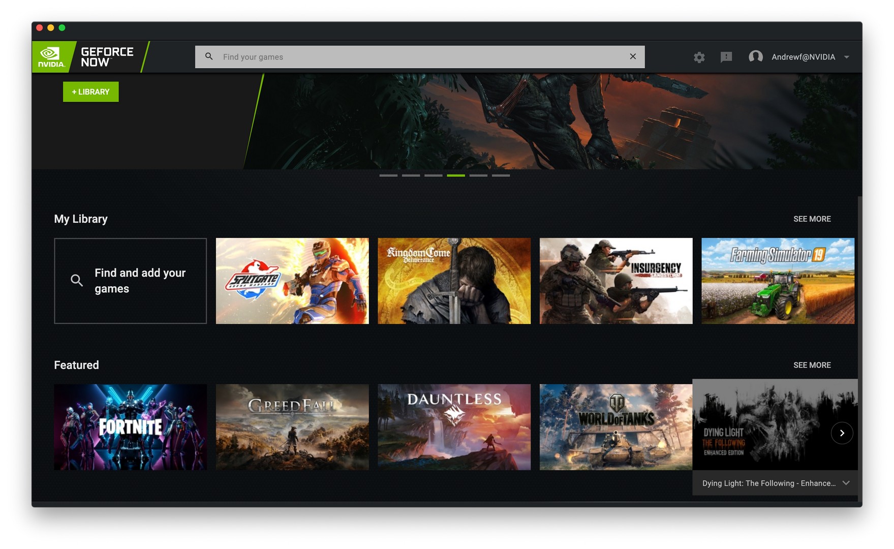
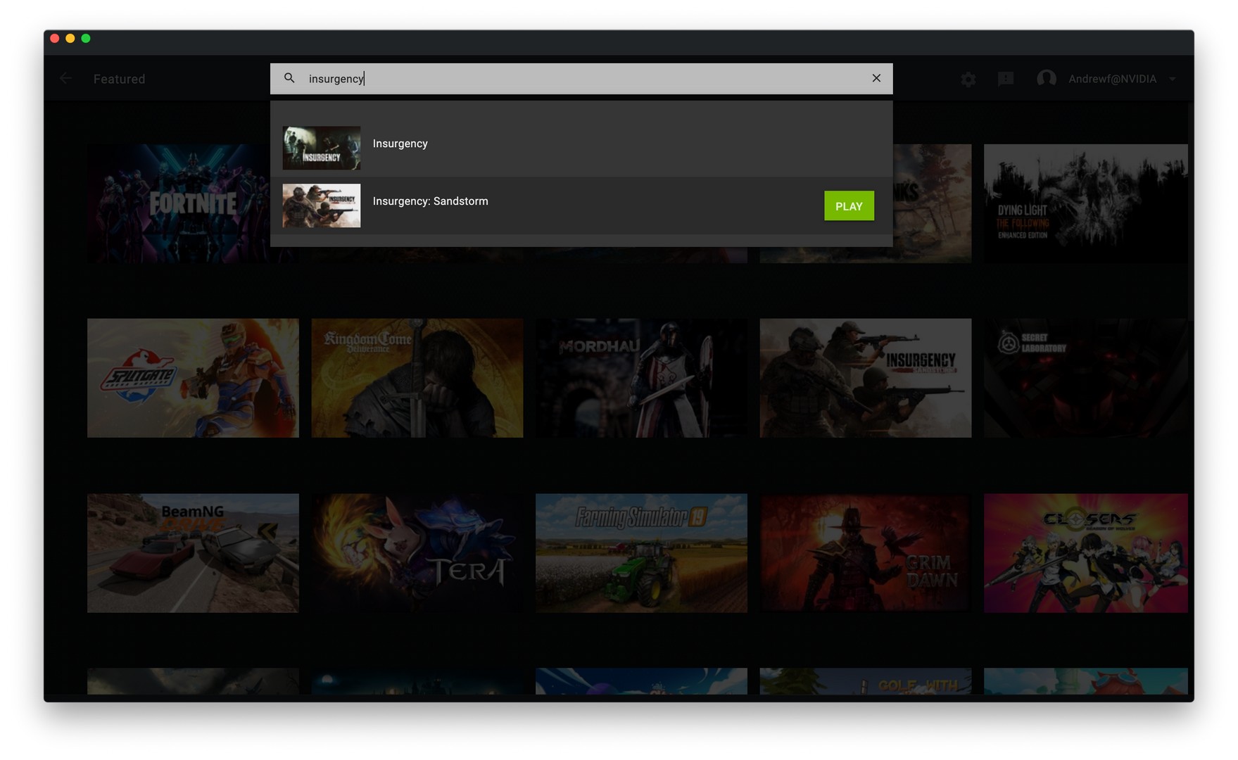

Nvidia says it's also improved its search feature to handle more complex searches. "If you’re looking for a post-apocalyptic game that features kittens in sweaters, we may have a game for that," said the company. More details about each game are also included when you view it in the app, including "which games require a controller, games that are developed by indie teams and much more."
Keep up to date with the most important stories and the best deals, as picked by the PC Gamer team.
GeForce Now members on either PC or Mac can apply the update by restarting their app or downloading the update here, although as of this writing the update has yet to become available.

