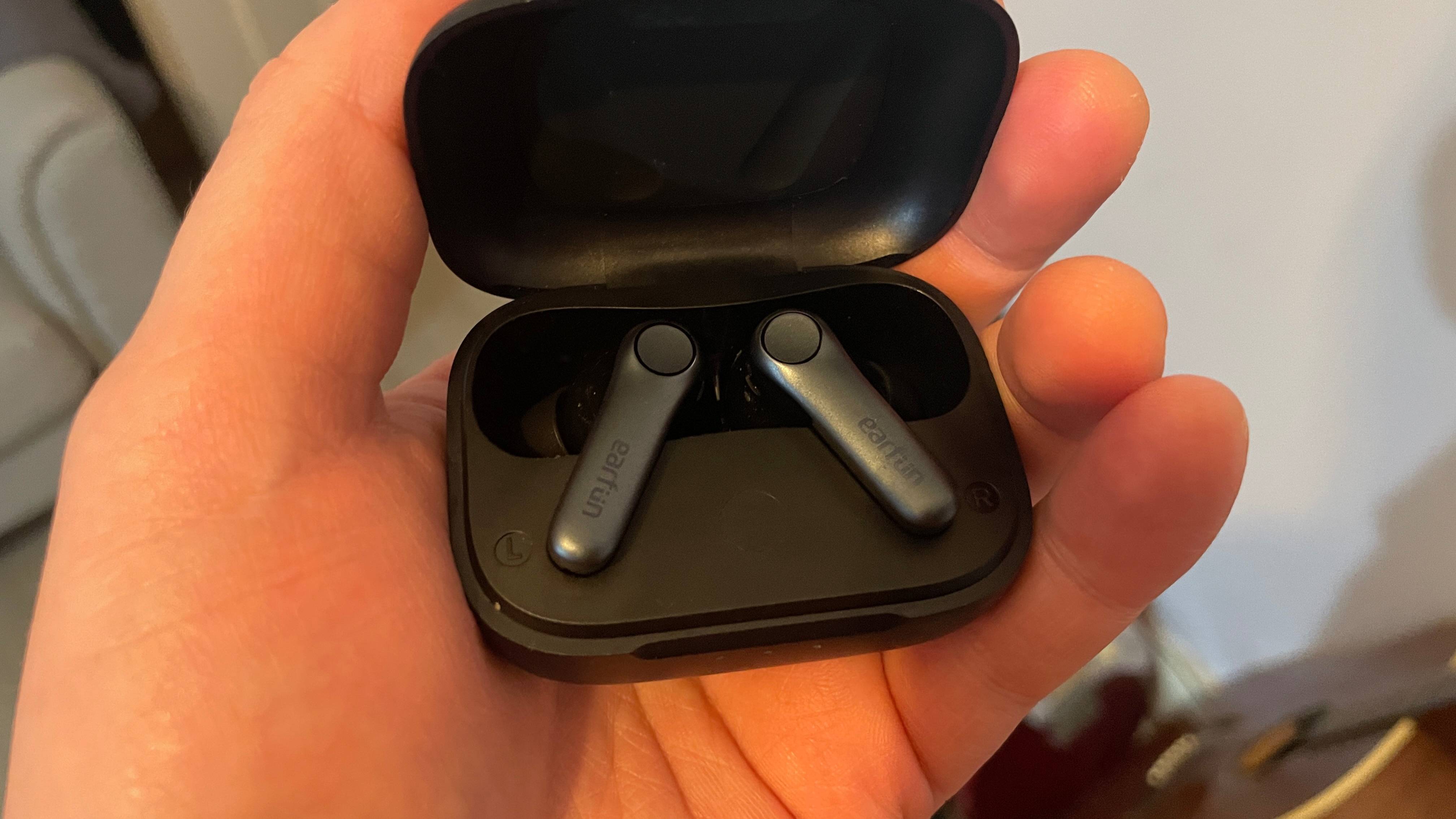
More than a decade on, does Bioshock still hold up?
Returning to Rapture.
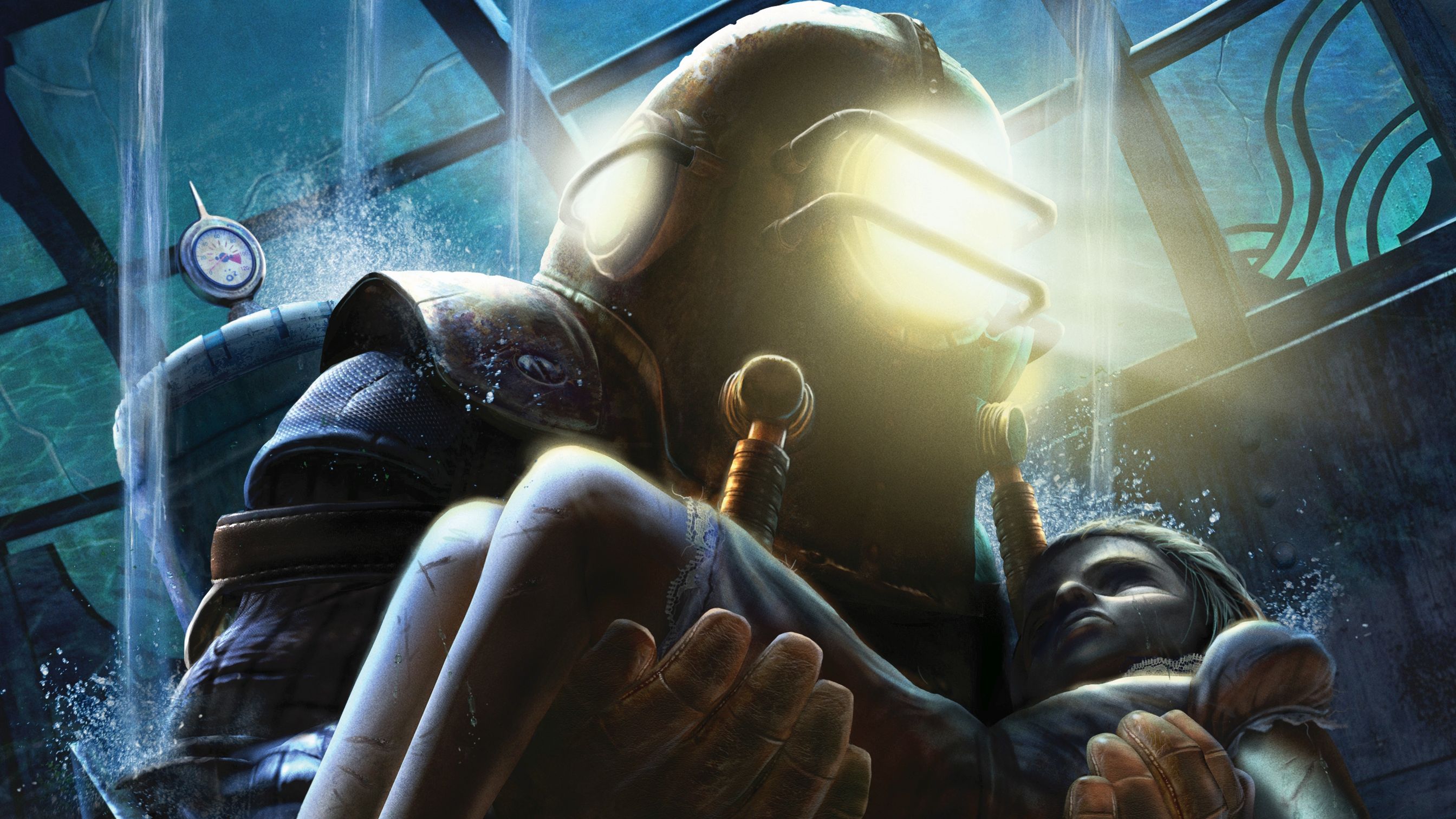
Reinstall invites you to join us in revisiting PC gaming days gone by. Today, Pip revisits Irrational's classic immersive sim.
Ken Levine’s slightly overlong adventure about killing a man who wants to live the libertarian geneticist dream of playing office minigolf at the bottom of the ocean (or something like that) holds up surprisingly well to a contemporary visit. I mean, the whole thing falls into the bin by the time you fight an Ayn Rand book cover and then sit through a Hallmark commercial or a vague nuclear threat, but still.
This is a reinstall, but only in the most technical sense. I have indeed previously installed the game, but it led with an injection scene. That meant I quit instantly while trying not to throw up. Several years later and I’m marginally better at stomaching on-screen injections, so I have returned to Rapture to see what all the fuss is about.
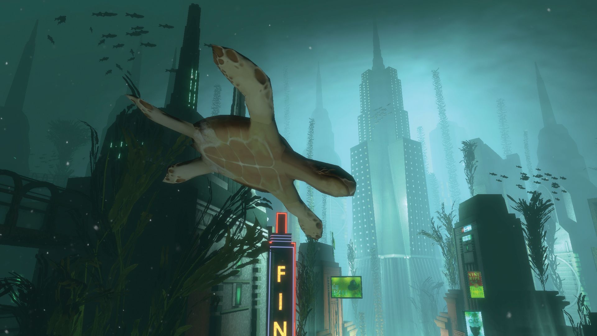
The opening segment has you descending to Rapture in a bathysphere. It’s a cinematic-style showpiece which wants you to luxuriate in the Art Deco skyscrapers and the neon lights which encapsulate the vim of early 20th century capitalism and consumerism. I can’t think of another game which looks like BioShock—and given gaming’s love of aping what’s influential, that’s surprising.
It’s the art style which carried me through to the end of the game, actually. I’ve gone back several times to ‘classics’ of PC gaming which I missed when they were first released. Each time I’ve played enough to get a sense of what they are, but tend to drop out once that’s accomplished, whether it’s because of clunky controls, dated graphics, a save system we’ve improved on a hundredfold since, or a propensity for tedious boss fights. Sometimes it’s just that without the context of its release—when it was first or new or interesting—it’s just not very good.
Breakaway
BioShock is not a subtle game. It bludgeons you with its references and I was never interested in the story—especially when key beats were delivered as monologues while the player is trapped in a room with nothing to do. I, uh, managed to miss the main twist/infodump because I was so bored during one monologue that I went to listen to some Kelly Clarkson while I waited for the dude to stop yammering.
But generally, it’s a fun game—all theatrics and loud fighting—despite some odd limitations. For example, BioShock is really stingy with its resources. Most obviously you can see the stinginess when it comes to the magic juice called EVE. But I was also aware of scarcity when it came to ammo. Y’see, the game has a photography system where you can take snaps of enemies in order to learn more about their weaknesses and which ammo to use against them for optimal results. The implication is that you would use this information, selecting the right tools for the job.
In practice this meant I knew what would be more effective if I had it in my arsenal, but would then need to make do with the scrapings of ammo I had to hand. Armour-piercing rounds might be the ideal option, but try telling that to the bunch of napalm, two proximity mines and three regular pistol bullets in my inventory. I was doing the equivalent of rummaging round in my handbag for bus fare and then trying to buy a ticket with a fluffy toffee, four stamps and a hairband.
The biggest gaming news, reviews and hardware deals
Keep up to date with the most important stories and the best deals, as picked by the PC Gamer team.
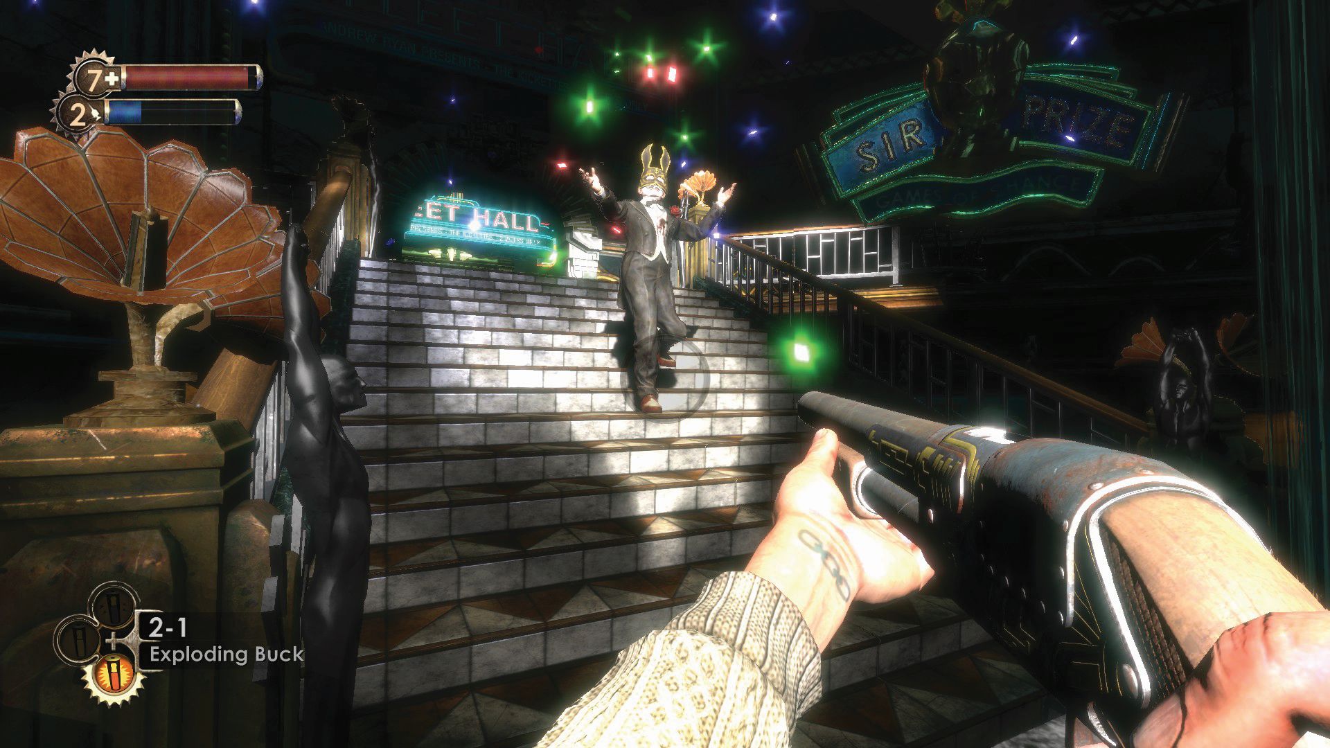
It also seemed like the game was teasing interesting power/weapon combos and aiming for Dishonored-style emergent experiences (don’t @ me about the release timeline). But in reality, you never needed to progress from the electric-shock-then-wrench-or-shot tactic. You could try other combos if you wanted to, but it felt awkward to do so and the payoff wasn’t really worth it.
Springing a leak
While I’m talking about the negatives, there is a dreadful escort mission, the level layouts can be rather confusing and the save system meant it was more efficient to die, respawn and return to a brawl than expend health packs during a fight.
I also found the feted Fort Frolic level hard to navigate. I can see why it’s the standout of the game in terms of being the level which does something different. It forces a different kind of complicity out of the player—making you photograph corpses and display the images is a very different experience to simply killing a boss.
It also allowed for rare moments of expressive play in terms of how you framed those photographs. I only photographed the feet of the dead. At the time I was trying to photograph as little of a corpse as I thought I could get away with and still trigger the next step. Looking at the resulting display of dead feet in the level’s lobby, I think I managed to outdo the boss, Sander Cohen, in creepiness.
But as someone who has played games with hub-type levels since the mid-’90s, the navigation here felt counterintuitive. As I became frustrated I knew I started missing atmospheric or theatrical touches which Fort Frolic’s designer, Jordan Thomas, had included and thus Fort Frolic started to meld into the bombast of the rest of BioShock.
I would’ve quit earlier. Especially given every EVE refill meant sitting through another injection animation. But I stayed, and it’s because I wanted to see more glimpses of this underwater world.
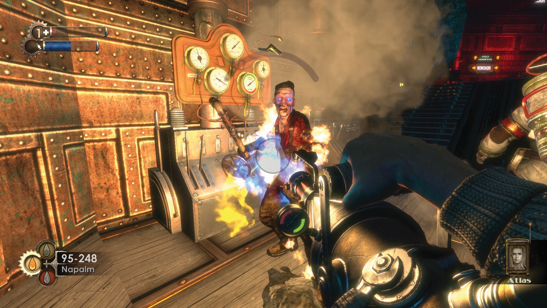
Absentmindedly pinging a crossbow bolt into the head of a splicer was made a bazillion times more palatable by the shadow of a shark passing over a glass tunnel. Faffing around with the squillionth Pipe Mania minigame to pay slightly less for napalm was offset by sightings of red coral formations outside the Hephaestus region.
I’ve since tinkered with the .ini file so I could access the free camera and toggle the UI. The bathysphere opening is great when playing normally but fantastic when watching it from the outside, stopping to watch turtles skim past neon signs or getting sidetracked by shoals of fish.
Dumpster diving
Playing BioShock also helped me make a bit more sense of BioShock Infinite. The latter is still flawed and rather dull, but elements like finding bullets in chocolate boxes now had a reference point rather than simply being weird. The original BioShock is all about finding cash, snacks and proximity mines in ashtrays.
Occasionally this rummaging came together in a brow-raising way (one splicer had two cream cakes and a length of a hose in her pocket, which sounds like the recipe for one hell of an evening) but more often it was just nonsense. No more nonsensical than the contents of pockets in Fallout and other games, but in BioShock the detail in the world design makes this pocket-and-bin lucky dip feel far more incongruous.
Limiting resources can make decisions within a fight sequence feel important. You aren’t just able to fling bullets indiscriminately or heal whenever the fancy takes you. But games have found less clunky ways of achieving the effect over the years, or of rebalancing the rarity of each resource to better support experimental play.
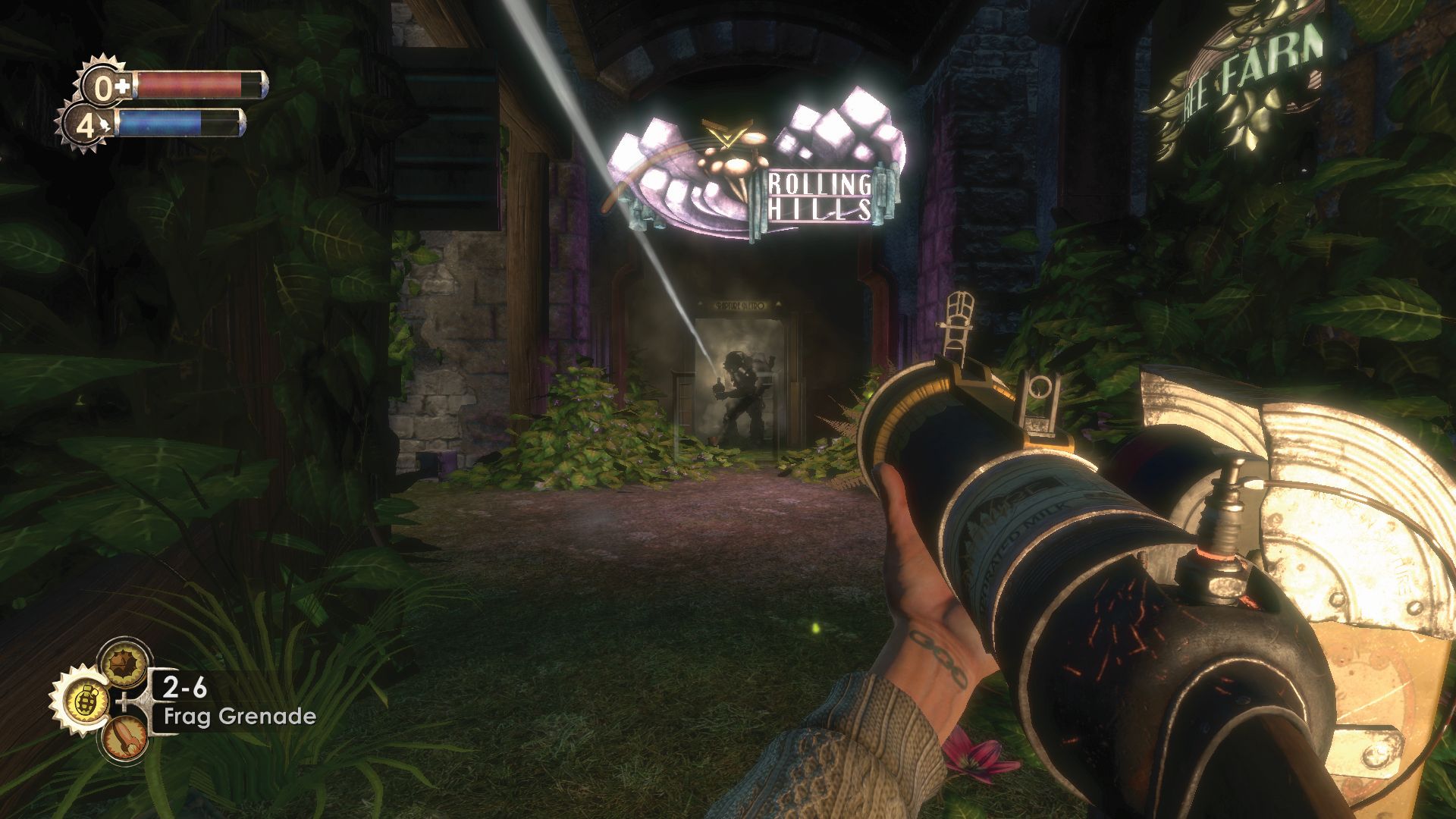
It’s the same story with the bins and pockets. Hiding resources incentivises players to scour areas, making these feel more like consequential spaces which the character inhabits, rather than dead zones. But BioShock represents a more basic implementation than I’m generally used to now.
Infinite used the same idea and I remember being so confused by why anyone would hide edible hotdogs in bins. With the added context of a BioShock playthrough I assume the developers were treating this loot system as one of the defining elements of BioShock or as a knowing nod to the original. It doesn’t make it less weird, but I guess it’s interesting that BioShock’s protagonist has always been a raccoon. I mean, I assume that’s the twist?

