Microsoft has a new default font, which means you do too
It's done with the Calibri-ations.

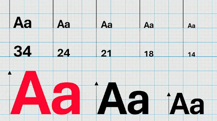
Microsoft has announced a change of typeface and, in a self-aggrandising open letter addressed to "every human on earth [sic] that’s ever typed text", says the default font of 15 years, Calibri, is to be replaced with the newly created font Aptos. The company says this is "the perfect font for higher resolution screens" and the choice was made following "impassioned feedback" from users on five new fonts it had commissioned.
The five fonts were named Bierstadt, Grandview, Seaford, Skeena, and Tenorite. Bierstadt was chosen but has been renamed Aptos. This is a total guess but I reckon the font was probably named after Albert Bierstadt, and re-named because in German it means "beer city". Aptos is taken from its creator Steve Matteson's favourite unincorporated town in California, with the word coming from the indigenous language Ohlone and meaning "the people".
As of today Aptos will appear as the default font across Word, Outlook, PowerPoint and Excel for the hundreds of millions of users of Microsoft office software across the world. Over the coming months it will become the default across all PCs running Microsoft software.
Microsoft's post announcing the new font does go into the realms of the slightly mad, and I say this as someone who's actually interested in fonts. It says Aptos "was crafted to embody the many aspects of the human experience" and was designed with "a slight humanist touch". This is a lot to say about what is essentially a pretty nice-looking sans serif.
"There’s always that little voice inside of me saying, 'You know, you gotta try to sneak in a little bit of humanity. You can’t just use rulers and straight edges and French curves to make all these shapes mechanical.'", said creator Matteson. "I did that by adding a little swing to the R and the double stacked g."
Microsoft goes on to talk about what a good job the font does of being readable then really cracks out the thesaurus of praise: "bold, well-defined, directive, and constrained [...] articulates many different languages and tones [...] Stem ends are clean cut [...] Subtle circular squares within the letters’ contours allow higher legibility, especially at small sizes."
There is also an extremely amusing bit of font snobbery when Microsoft goes on to talk about the little dots above certain letters: "the heads of i’s and j’s are circular dots as opposed to grotesque squares." Take that, squares.
The biggest gaming news, reviews and hardware deals
Keep up to date with the most important stories and the best deals, as picked by the PC Gamer team.
Ironically enough Matteson drew the font (Microsoft's term: "ideated") with paper and pencil, because he finds working on computers too "ephemeral." He cites the "nuances that you get on paper that may not occur if you’re clicking, dragging and holding down the shift key" and for good measure adds that drawing is "a more physical expression of yourself."
As well as Aptos the other four commissioned fonts will live on in Microsoft's Office suite and, just like its predecessors Times New Roman and Arial, Calibri will remain pre-pinned at the top of the new font menu if you'd rather stick than twist. "Fonts are personal," says Microsoft, rubbing your arm and offering a hot drink, "we get that."

Rich is a games journalist with 15 years' experience, beginning his career on Edge magazine before working for a wide range of outlets, including Ars Technica, Eurogamer, GamesRadar+, Gamespot, the Guardian, IGN, the New Statesman, Polygon, and Vice. He was the editor of Kotaku UK, the UK arm of Kotaku, for three years before joining PC Gamer. He is the author of a Brief History of Video Games, a full history of the medium, which the Midwest Book Review described as "[a] must-read for serious minded game historians and curious video game connoisseurs alike."

