Meet the developers making bugs and glitches on purpose
It's not a bug, it's a narrative device.
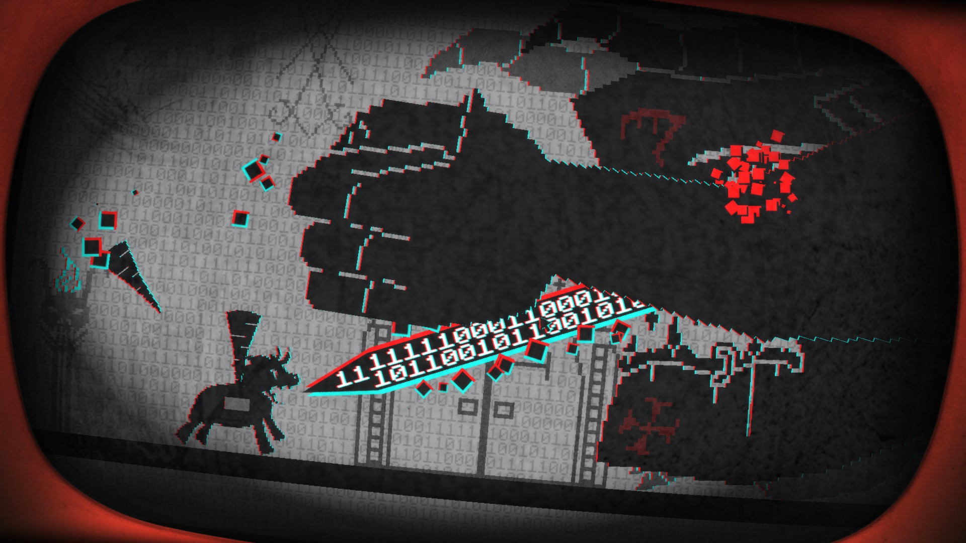
In early 2015, Daniel Mullins was working on a PC version of Grandia 2 at Skybox Labs in British Columbia. Mullins was a pretty seasoned programmer at the time, but porting a Dreamcast title from 2002 felt like starting from scratch. "I was looking at this ancient code written by a Japanese team," he says. "It was so hard to parse—it was like nothing I'd ever done. Just getting basic things to appear on the screen was a huge accomplishment." When the porting team did manage to output graphics they were awash with bugs, including improperly rigged meshes leading to "knees moving as if they were elbows, creating grotesque walking Frankensteins". Mullins only spent a few months on the project, but the ordeal stayed with him. It would prove foundational to his 2016 gamejam creation Pony Island, which traps you inside a glitchy arcade machine that is actually the work of the devil.
Loosely modelled on the pixel fonts, boot-up noises, and curving low-res monitors of older PCs, Pony Island is a wicked celebration of videogame bugs. The graphics fluctuate wildly between a sugar-pink pastoral backdrop and a glaring bone-white wasteland. Menu options corrupt under your cursor. Swirling artefacts unlock a desktop behind the main menu, where you'll trade messages with other imprisoned souls. To restore certain broken features, you must guide a key around a maze of command line text dotted with English words—a representation of how it felt to wade through Grandia 2's innards, deciphering the odd line here and there.
Crash course
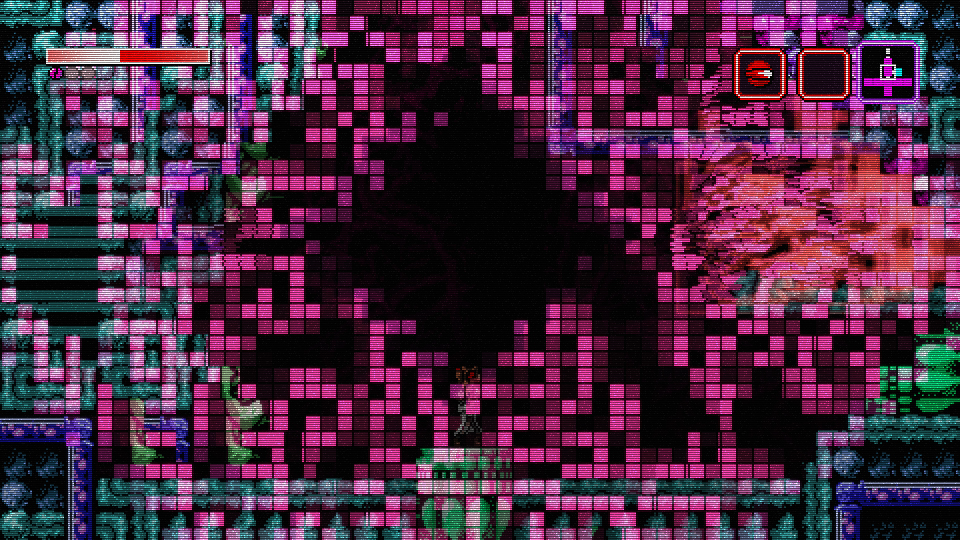
Pony Island is part of a curious tradition of games that build stories, levels, and features around simulated technical problems. These games come in all shapes and sizes. As you'd expect, many are indie experiments—take Metroid homage Axiom Verge, where you can 'glitch through' corrupted terrain, or The Cursed Pickle of Shireton, a raucous faux-MMO that runs in text-based debug mode thanks to a 'malfunctioning' graphics engine. But there are also big-budget titles such as Metal Gear Solid: Ground Zeroes, which may be 'infected' by the fictitious FOXDIE virus, and Eternal Darkness: Sanity's Requiem, where stressing your character out might see the game pretending to delete your save data. These projects give you a glimpse of the artistic potential in the disruption of form and function; they don't just 'turn bugs into features' but suggest that imperfections can be a source of drama.
But what exactly counts as a bug or glitch? These concepts are arguably meaningless in themselves: they are defined with reference to specific technologies and expectations. There are plenty of graphical errors, such as texture-wobbling in 3D PS1 games, that are embraced as hallmarks of a particular platform rather than slammed as failings. Similarly, lighting issues that are overlooked in lo-fi productions might be perceived as terrible shortcomings in blockbuster shooters with slick, photorealistic aesthetics. Simulating a glitch is thus a kind of silent, inverted commentary on a game's production and design context. It reveals the unvoiced rules and assumptions that surround these games by breaking them.
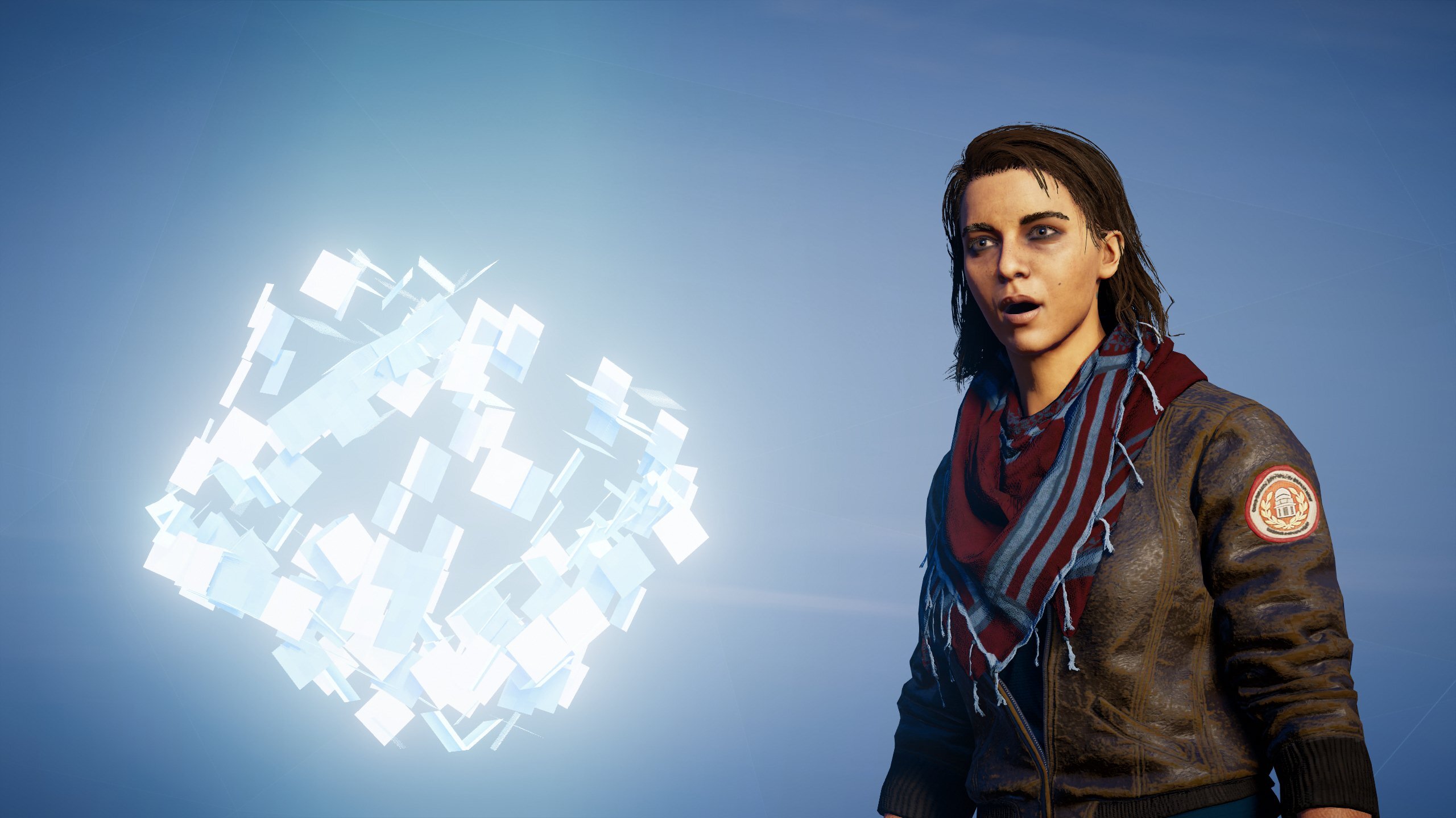
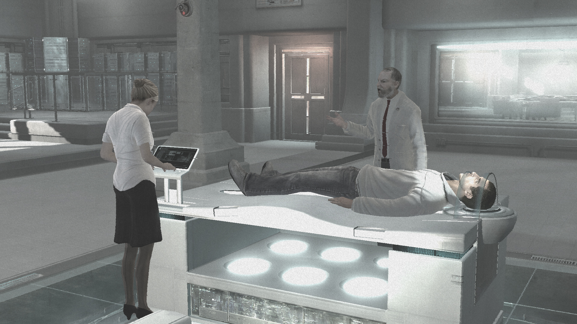
There's obviously the risk that a pretend error might be interpreted as the real deal. One common way of avoiding this is to frame them as problems with a technology inside the game's world. The most famous example is Assassin's Creed, in which modern-day protagonists relive the lives of their ancestors care of the Animus, a piece of holographic genetic memory tech.
The Animus—or at least, the present-day storyline it connects to—is often reviled by fans as a wonky distraction; Ubisoft's own marketing department was dubious about it back in 2006. But it has proven to be a powerful storytelling framework, allowing Ubisoft to string a dozen games in different eras into one, on-going sci-fantasy intrigue. It allows the developer to explain away contrivances such as the HUD itself as features of the Animus software. And of course, it allows the game to dramatise errors—notably, catastrophic 'desynchronisation' resets when you fail to act as your ancestor would have acted.
Altaïr ego
If Assassin's Creed is a potent 'glitch game', however, it is also a game about fixing glitches and reconciling the tension between the Animus UI and the setting. "We didn't want the Animus technology to overwhelm the player or to break the experience by having too much 'data stuff' happening," observes Nicolas Rivart, visual design director on this year's Assassin's Creed Valhalla. Rather, the new game's Animus and Norse aesthetics are carefully entwined. "Given that the machine is decoding the memories of a Viking chieftain, we felt that it would be interesting to show the visual elements of the era transferring to the Animus." The Animus of Assassin's Creed Origins, Rivart goes on, had a "goldish, sand-stormy feel" reflecting its Ancient Egyptian timeframe. For Valhalla, the developer has based the colour scheme on the Northern Lights and incorporated Norse runes into the interface.
The biggest gaming news, reviews and hardware deals
Keep up to date with the most important stories and the best deals, as picked by the PC Gamer team.
This blended aesthetic is governed by a withered grid pattern, redolent of both Norse runes and the Animus UI, which is present everywhere in the game. Besides helping to structure menu screens, it's a way of subtly imposing a role on the player—to "lay a pattern before them, the pattern of the ancestor," as Rivart explains. Desynchronise, and the grid tears itself to pieces. In a way, your objective in Assassin's Creed is simply to maintain that grid—to behave as the simulation requires in order to continue the art direction's efforts at blending the ancient with the modern. In Valhalla, you're literally asked to patch up Animus anomalies, marked by incongruous 3D artefacts that generate wireframe platforming courses.
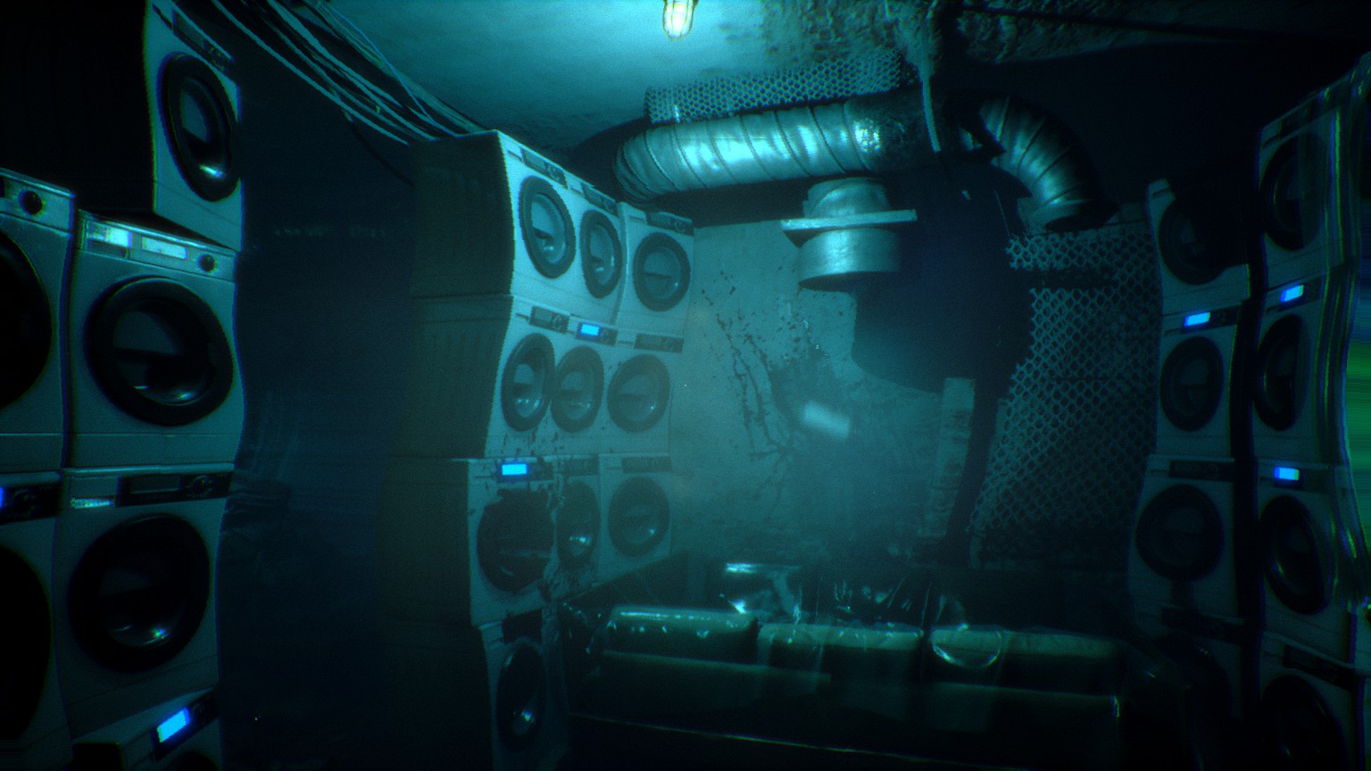
Horror game developers have proven more willing to embrace the jarring effects of glitches. Like Assassin's Creed, Bloober Team's cybernetic chiller Observer is caught between eras. In the words of creative director Mateusz Lenart, it is "a clash between retro-style design and more typically futuristic technologies, inspired by Blade Runner and Alien," and "filtered through the lens of a Polish communist-era aesthetic". The game casts you as a cyborg detective in near-future Krakow, equipped with the ability to hack the brains of the deceased.
Polished visuals
Observer is also about synchronisation—you must take pills to stop your body rejecting your implants, which leads to dizzying effects such as smeared movement, colour changes, and compression artefacts. There's only so much 'synchronising' you can do, however, because the glitches are metaphors for social divisions.
There's no seamless Animus-style blending of the high-tech and antiquated in Observer's capitalist dystopia; instead, flesh and machinery are forever pulling apart, and pristine holograms float eerily against crumbling, insanitary brickwork. Observer's rickety cyborg HUD alters the appearance and colour of pixels according to various open-ended parameters, as game designer Pawel Niezabitowski explains. There's "the 'overdose' effect, with its blurry shaky screen—large delay, fluid dispersal, no colour change". And there's "the intensely 'electronic' glitch effect—short, sudden and drastic colour changes". Simulating bugs like these can be pretty hardware-intensive. "Optimisation proved to be our biggest challenge," Niezabitowski continues. Bloober eventually created a complex managing tool to balance more specific post-processing effects against those resulting from your character's shifting mental state. There were some dramatic setbacks. "At one point during production, one of our designers cranked up the 'glitchy' visual effects to such a level that even his computer couldn't take it any more and shut down, killing the controller in the process," recalls Lenart, adding that "after some intense deliberation, we decided to leave that particular feature out".
Players, of course, may be turned off by simulated glitches long before computers give way. "There's a wide spectrum of how various people react to these sorts of visuals, with some suffering from motion sickness," Lenart continues. "The effect of our HUD destabilising wasn't meant to be pleasant, as we wanted the player to feel motivated to take another dose of the synchronising medicine. Then again, we certainly didn't want the player to become physically ill from the experience. Hence, a lot of the effects we'd tested ultimately didn't make it into the game." Bloober Team also stopped short of portraying the glitches as fundamental problems with the game. "Breaking the fourth wall is always tempting, especially in this genre," Lenart adds. "We certainly played around with some interesting ideas. Ultimately, however, we focused on making the player immersed in what's happening to the protagonist."
Immersion and the fourth wall are key terms in discussion of videogame glitches. They suggest a firm boundary around the illusion—an illusion that must be purged of reminders that you are interacting with a piece of software. This disregards what can be achieved by taking the software's status as software as your artistic and narrative premise. Consider last year's indie hit Anodyne 2, another work of period-splicing in which you explore an overworld rendered in PS1-grade polygonal 3D, jumping into NPC mindworlds that recall 2D Zelda maps.
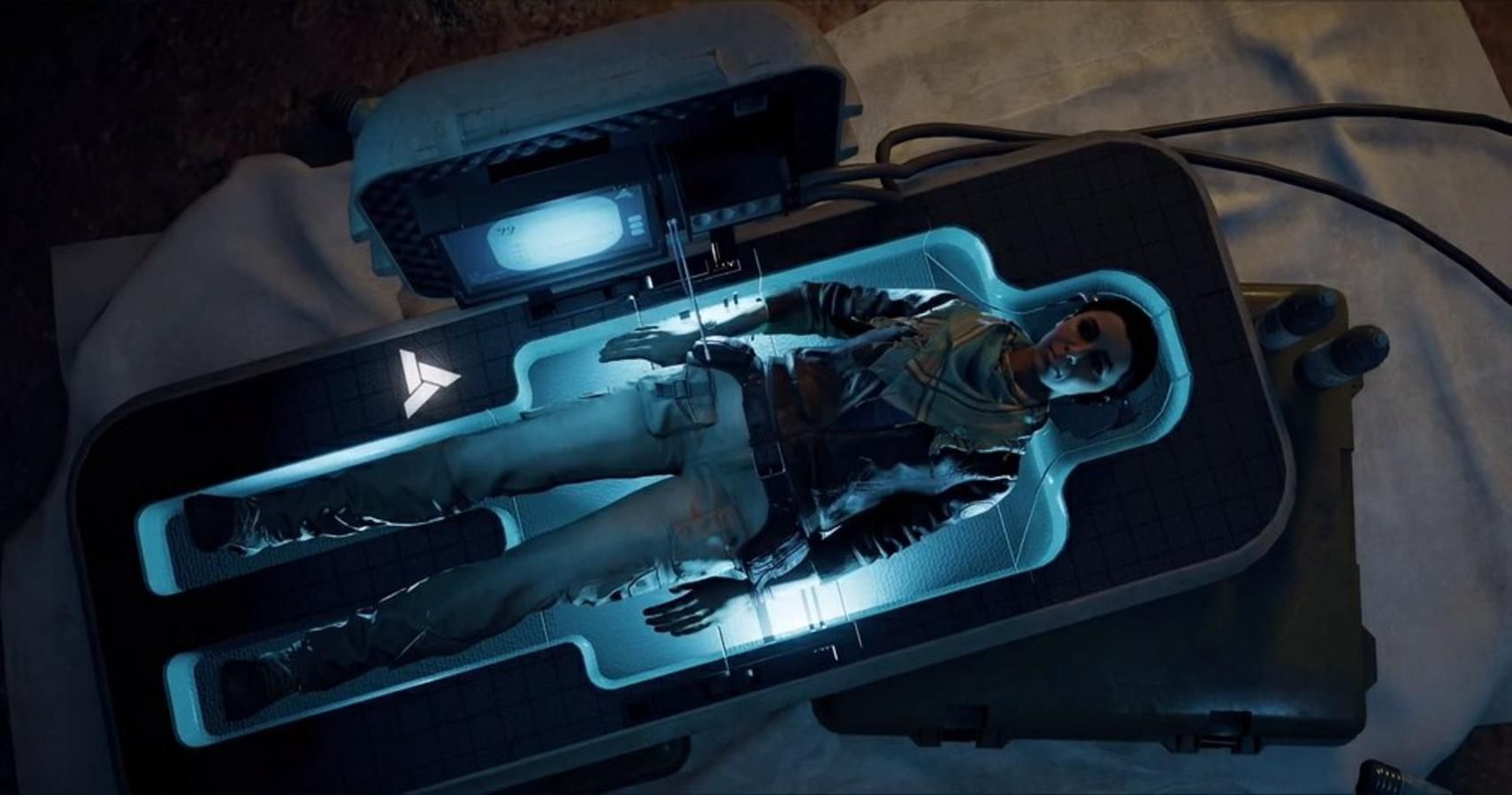
The game is full of simulated blemishes or shortcomings—among other things, you'll hear characters sneer about the quality of the background art—but these aren't treated purely as disruptions. Rather, they exist "to draw attention to there not being a hard boundary between the game's fiction and, I guess reality," notes Melos Han-Tani, one half of developer Analgesic Productions. "It's not just like 'whoa, meta stuff!' It's tied into the fiction of the game in sort of a blurry way". The game's open-world includes 'Unzones' filled with incomplete features that aren't just 'director's cut' additions, but a playful elaboration of the core mythology. There is an isometric horror segment triggered by talking to a placeholder NPC, which continues the protagonist's personal dilemmas into a different genre.
Behind the scenes
Dismantling that 'hard boundary' is important because so much triple-A videogame production is essentially about hiding the developer's labour from view—strenuously polishing away anything that feels artificial. Analgesic co-founder Marina Kittaka argues that this culture has trained players to be pathological nitpickers, branding developers lazy over the slightest discrepancy, "There has been for a long time a very unhealthy feedback loop between big game companies and their audiences, where for capitalist reasons, companies are selling a certain fantasy of perfection and ultimate immersion."
Bugs and glitches are maker's marks—they remind you that every game is the result of somebody's sweat and toil. Games that simulate errors are invitations to think about that toil more analytically—they are a kind of irreverent making-of feature, more compelling for being woven into the game's fabric. This is an important theme of Pony Island, which invites you to develop a certain sympathy for the devil even as you battle for freedom. If the game within this game is an instrument of torment, the bugs also paint a portrait of an overwhelmed lone developer, struggling to fit in some QA before shipping.
None of which is to suggest that we should tolerate actual errors in our games, but it's worth thinking about both the work that goes into steaming out bugs, and what we lose by insisting on that rigid barrier between an immersive game and a buggy one. As Pony Island and its peers reveal, games are seldom more exciting and mysterious than when they start to break down.

