MechWarrior Online UI 2.0 previewed in new public test video

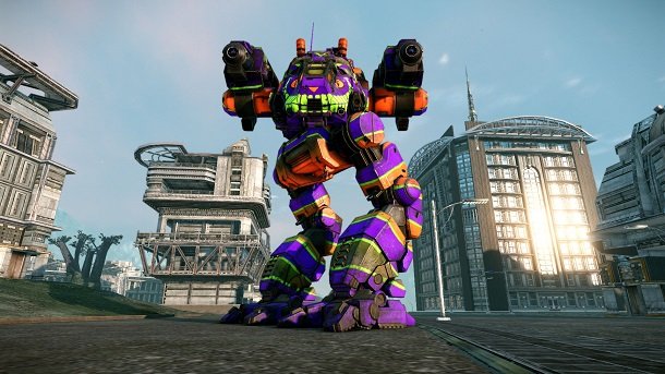
MechWarrior Online has always had a special draw for the would-be engineer and tinkerer. Its mechlab—the user interface that players see before dropping into a match—is where much of the mechanical experimentation in MWO takes place. It's where the pilots first ask themselves, "How do I win?" Now we have a first glimpse of how developer Piranha Games will overhaul the mechlab in the game's upcoming update.
The lengthy video below, hosted by No Guts No Galaxy podcaster Phil Langenberg, shows footage capped during a recent public test of the game's new user interface. To my eye, the UI 2.0 layout looks like an entirely new way of interacting with the giant machines, organizing their deadly weapons, and communicating with the teammates who help make victory possible. It's an upgrade that MWO players have been waiting months for, and not just because of the prettier three-point lighting system that shows off their mech builds.
Set to go live on February 4, UI 2.0 should be the first step on a path towards a much larger and more in-depth MWO experience. In his most recent outline of what to expect in 2014, Piranha Games president Russ Bullock called the new interface the biggest feature upgrade the online shooter has seen so far, which doesn't strike me as at all hyperbolic given what should follow later this year.
"I don't say that purely based on functionality that UI 2.0 will introduce to MWO," Bullock writes. "The reason it is considered in my mind the biggest feature release to date is because of the bottlenecks it removes. Everything relied on its release and back end architecture to build off of."
The roadmap laid out by Bullock would see the release of DX11 visuals, an achievement system, and a new game launch mechanic over the next several months. But it's all meant to lead towards the release in June of the Clan Invasion expansion and the eventual launch of the long-in-development competitive metagame known as Community Warfare . As we heard at the free-to-play game's launch event back in September, it's an ambitious new way of imagining the game that should give veteran players as well as new pilots a lot to chew on. But with UI 2.0 about to drop, the endgame for Piranha's work seems much closer now that we know where the starting line is.
The biggest gaming news, reviews and hardware deals
Keep up to date with the most important stories and the best deals, as picked by the PC Gamer team.

