Let's explore the art of these five gorgeous games
Artists' impressions.
Keep up to date with the most important stories and the best deals, as picked by the PC Gamer team.
You are now subscribed
Your newsletter sign-up was successful
Want to add more newsletters?
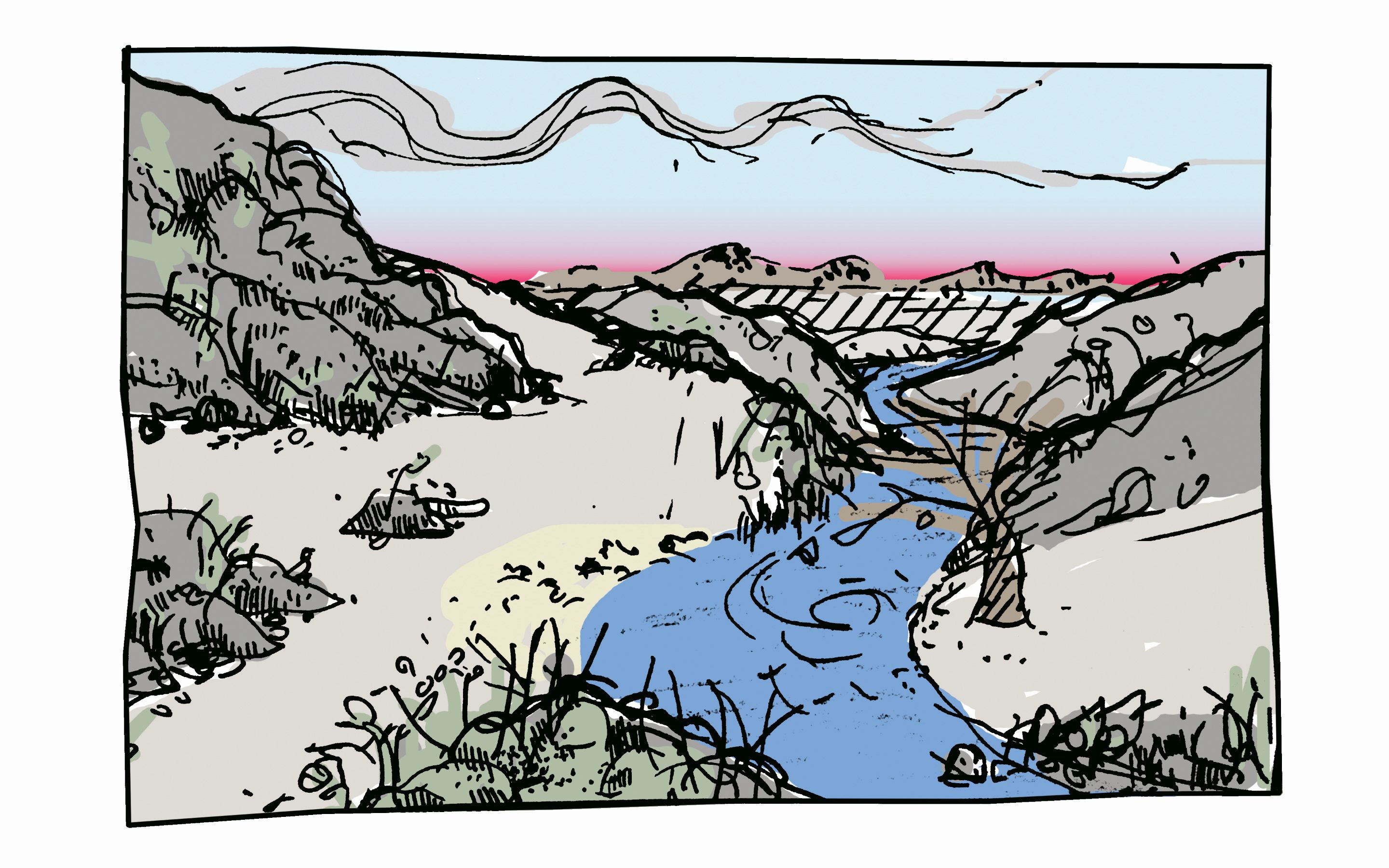
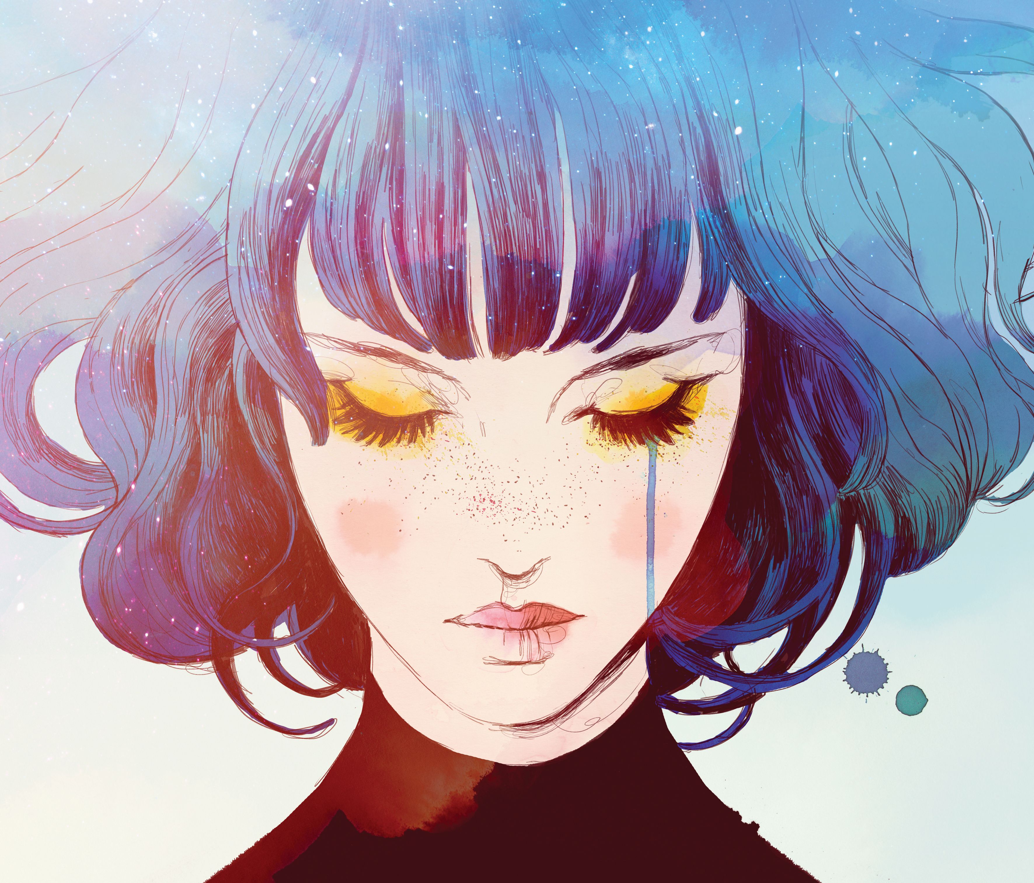
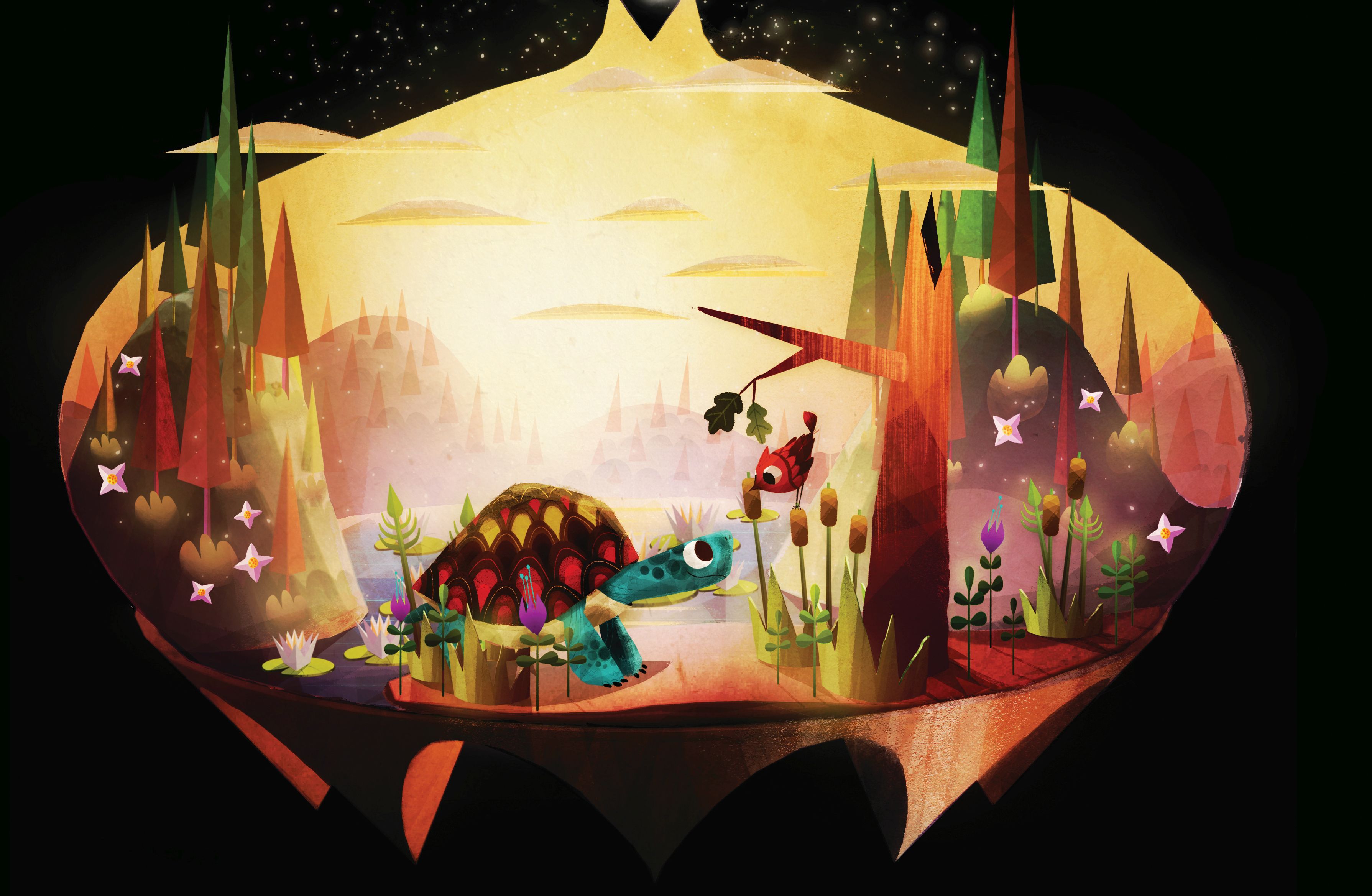
The studios behind five gorgeous games kindly opened up their sketchbooks and discussed inspirations, how each game's art style was formulated. This article was originally published in PC Gamer UK issue 327. For more quality articles about all things PC gaming, you can subscribe now in the UK and the US. The games featured are Apotheon, Haiku Adventure, Gris, The Collage Atlas and Luna (pictured above) Click to see the images at a larger size.
Apotheon
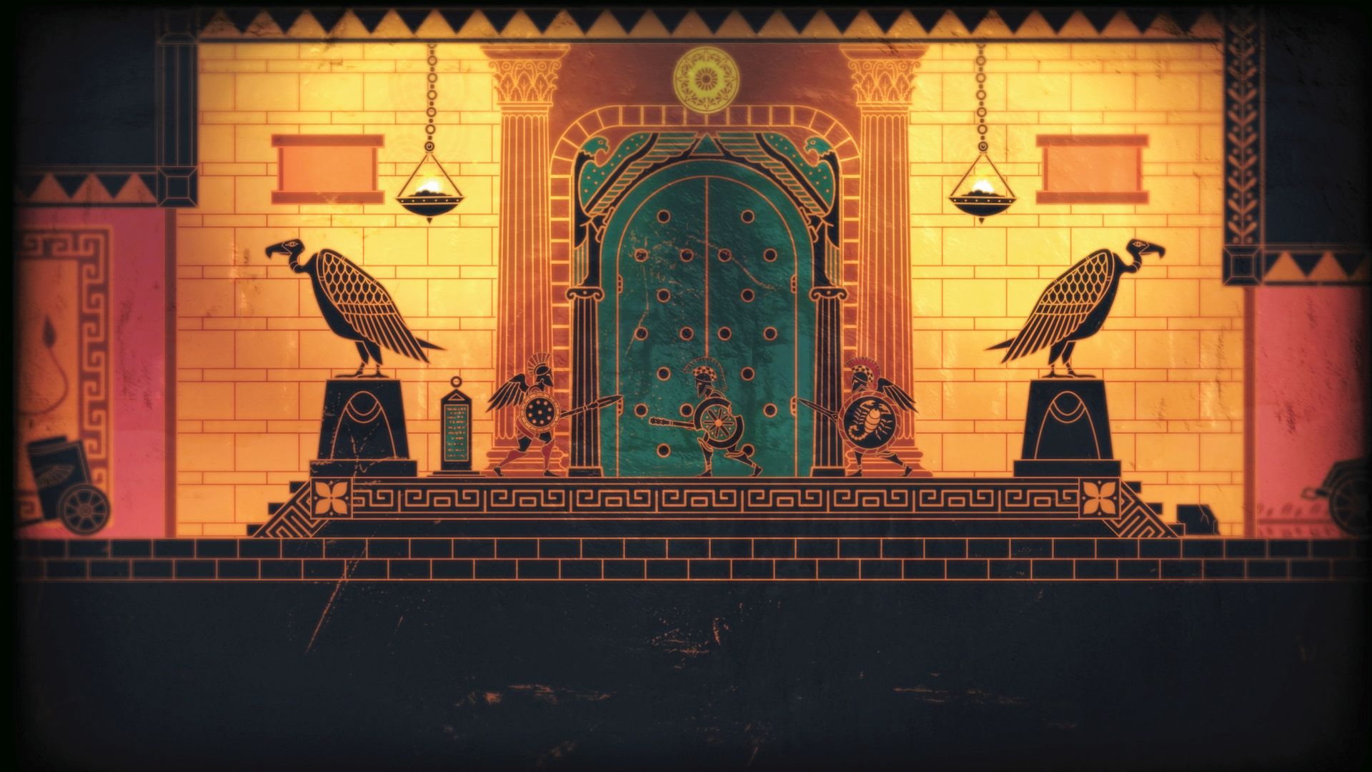
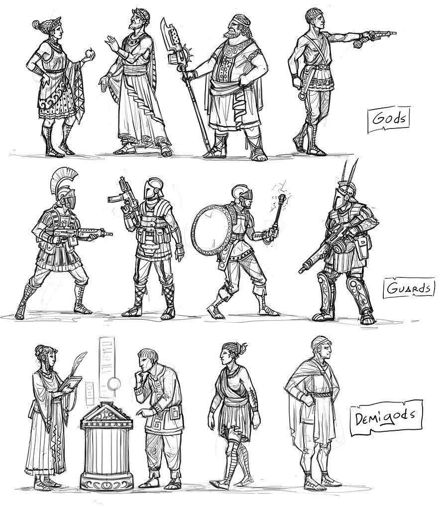
Alientrap’s Apotheon illustrates its ancient Greek story with imagery influenced by black figure pottery. But before becoming a 2D platformer clad in the motifs of ancient Greece, Apotheon was an open world sci-fi project set on a space station; a story of godlike beings manipulating humans from on high.
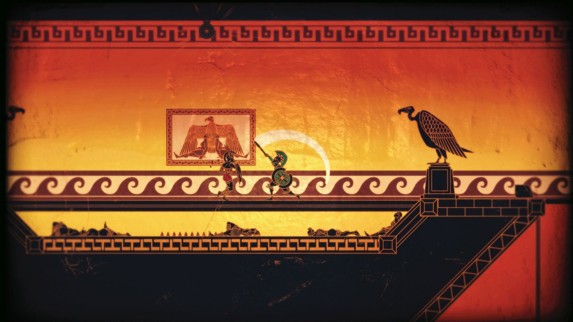
“Eventually we cut away the space parts and just decided on making a game about Greek mythology itself,” says Alientrap cofounder and creative director, Jesse McGibney. “By that point, it seemed like a no-brainer to use the art style that was most associated with those myths; black figure pottery.” For a while McGibney was torn between black figure style (black figures on a red background) and red figure style (a later style with red figures on a black background). “In the end we settled on black figure for readability, but I took a lot of design cues from the more complex styles of the red figure art,” McGibney says.
Article continues belowThe team actually experimented with rendering the game on a pot “with curving rotating edges and all that”, says McGibney. “This was obviously needlessly complicated, but there’s still some visual effects we held onto.” One of these is the vignetting at the corners of the screen. “Another was the subtle normal mapping applied to the screen, which dynamically moves with the in-game light sources to give a clay-like texture to everything and helps reinforce the style a bit more.”
Although characters were abundant in the pottery, he struggled to find references to use for environments. “At most, there might be a tree or a small part of a building,” McGibney explains. “I ended up combining the geometric patterning and interpreting real-world plants, statues, landscapes and architecture to get the effect across. It was a much bigger design challenge than the characters were by a long shot.”
Colour was another challenge. Expanding the colour palette to include blues, yellows and greens helped differentiate areas, and little pops of colour could help highlight objects and other characters. Apotheon also diverges from the pottery in that its scenes have some visual depth—a foreground and a background separated by tinted fog—which helps with legibility.
I ask why games don’t use the style more often—it would seem a natural fit for 2D platforming projects. “My only speculation is that many games want to create their own vision of things (as we did when we first started the project),” says McGibney. “Sometimes they might overlook the perfect solution right at the root of their inspiration.”
Keep up to date with the most important stories and the best deals, as picked by the PC Gamer team.
Haiku Adventure
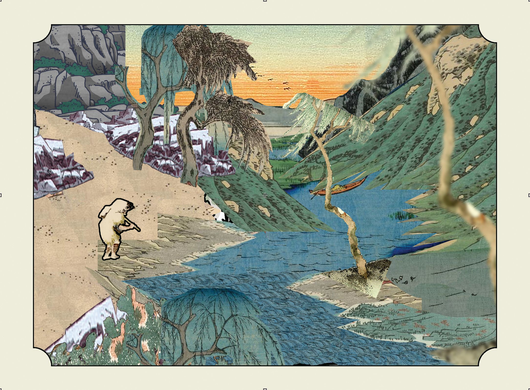
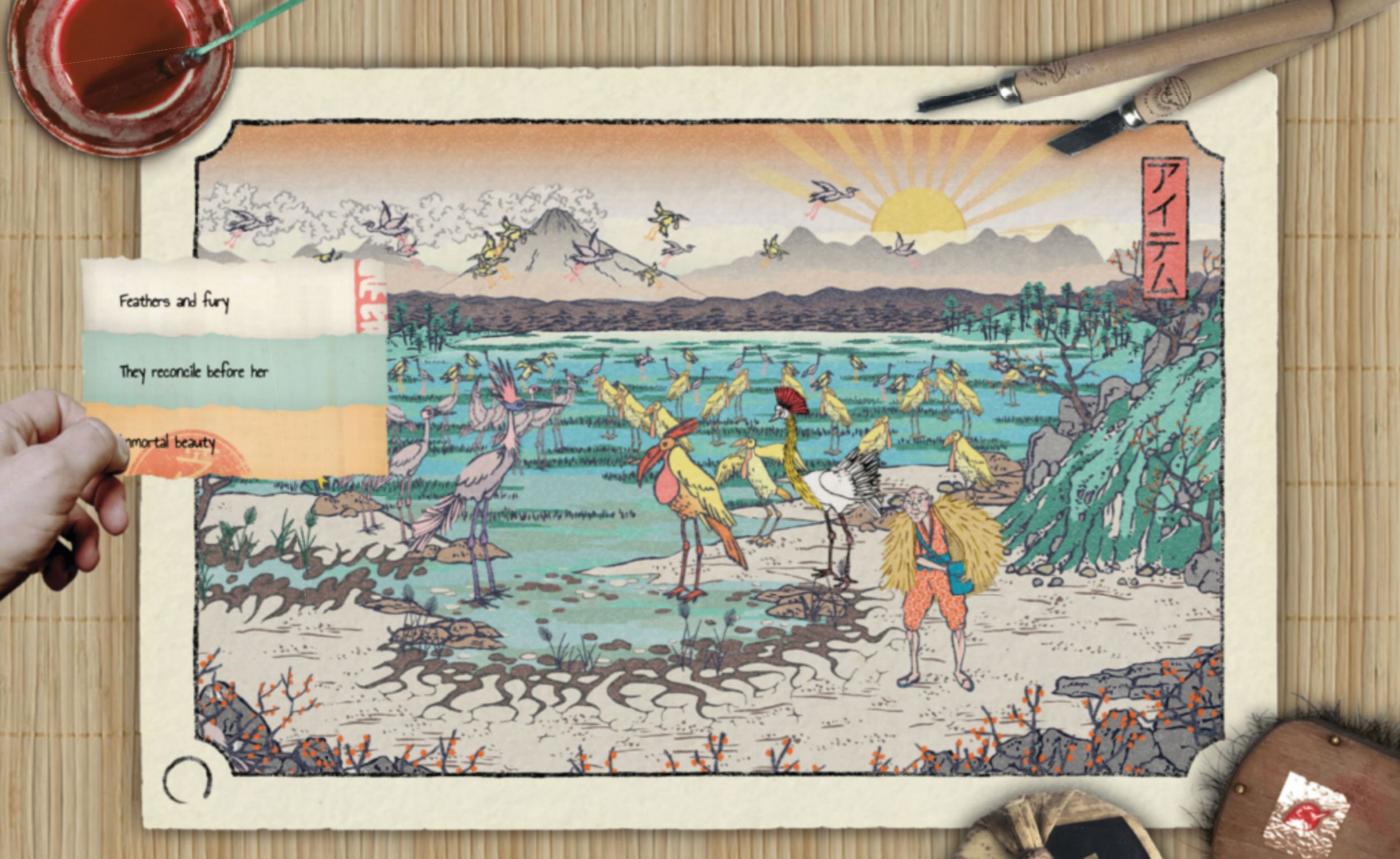
Haiku Adventure is the work of James Morgan and Ceri Williams. It channels their conversations about growing up on islands and their shared connection with nature into a game. The art style draws heavily on the Japanese ukiyo-e woodblock print tradition and, although still in development, will be featured in an exhibition at the William Morris Gallery.
The exhibition, which runs from Feb 26 to May 26, is fitting since it was an earlier show at the gallery that brought ukiyo-e prints into the equation. “The prints seem to acknowledge that capturing a truly accurate representation of nature is an impossibility,” says Williams, “and instead shows a stylised view that gives a fleeting impression of how the natural environment is experienced.” He adds that the absence of a single point of perspective also means the image can be explored by the viewer’s eye as if they were moving around the scene instead of at a fixed point. At the same time, Williams and Morgan had started to look at haiku poetry and how it aims to capture an experience of the natural world. “Stylised ukiyo-e prints offer postcard snapshots of nature, while haiku poetry attempts to remove the ‘self’ entirely to try and get closer to the truth [of] nature. Alongside this, Shinto worships the forces of nature by imbuing every part of nature from animals, trees, plants and even mountains with its spirit, the kami.”
Research included visits to ukiyo-e displays and a printing workshop during Williams’ honeymoon to Japan. Other valuable resources were the V&A’s collection, the British Museum’s Hokusai: Beyond the Great Wave exhibition, and the website www.ukiyo-e.org, which collects hundreds of thousands of prints in a database. “Primarily we want to faithfully get across the feeling of what it’s like to look at the natural world through the framing of ukiyo-e,” explains Williams.
One of the biggest challenges is figuring out the composition of a scene. “The original prints we reference have really precise framing, which is less easy to capture when parallax and animation causes constant changes as players explore scenes,” says Williams. To resolve this, the pair is focusing on how players are encouraged to pause in specific places so they experience particular framings.
Another consideration was how to add a sense of ukiyo-e printing’s physicality to a digital product. Adding visible woodgrain patterns to larger areas of colour is one way of doing this. Williams used to work at a joinery so he’s been back to raid their wood offcut pile, scanning these offcuts to create a texture library, which can then be used in the game.
“Where we have cliffs, a straight grain overlaid horizontally can represent strata in the rock without needing to add extra linework or additional tones and colours.”
But tapping into the traditional artforms of another country carries the risk of appropriation or exoticism. I ask how Williams and Morgan are handling this.
“In deciding to use Japanese artistic and cultural traditions as the key references for the game we’re well aware that proper research, understanding and testing are needed,” says Williams. “We’ve been careful to represent ukiyo-e as not just a visual medium but a tradition with a culture and history attached. Above all, a key principle for us has been to make sure that including or referencing any element in the game should never be solely aesthetic—embellishments must ‘belong’ in the game world we’re building.”
The studio is also in early talks with a Japanese publisher who has offered to provide cultural advice during development. “We think working with people who deeply understand aspects of the cultural context this artform exists within is really important. And as two British developers we had to admit to ourselves that it’s easy to misinterpret things when working outside our native culture.”
Williams gives an example from working with a translator on the Japanese text for the demo: “We thought we had everything covered until learning that we had used the Japanese font equivalent of Arial… not exactly fitting for the style of the game! Working with Japanese calligraphers and other cultural consultants will help lend our game an authenticity that we might not otherwise achieve on our own.”
Williams adds: “We’ll continue to seek feedback but the positive reception we’ve had when speaking with Japanese friends and companies we’ve been in discussions with so far has been really encouraging.”
Gris
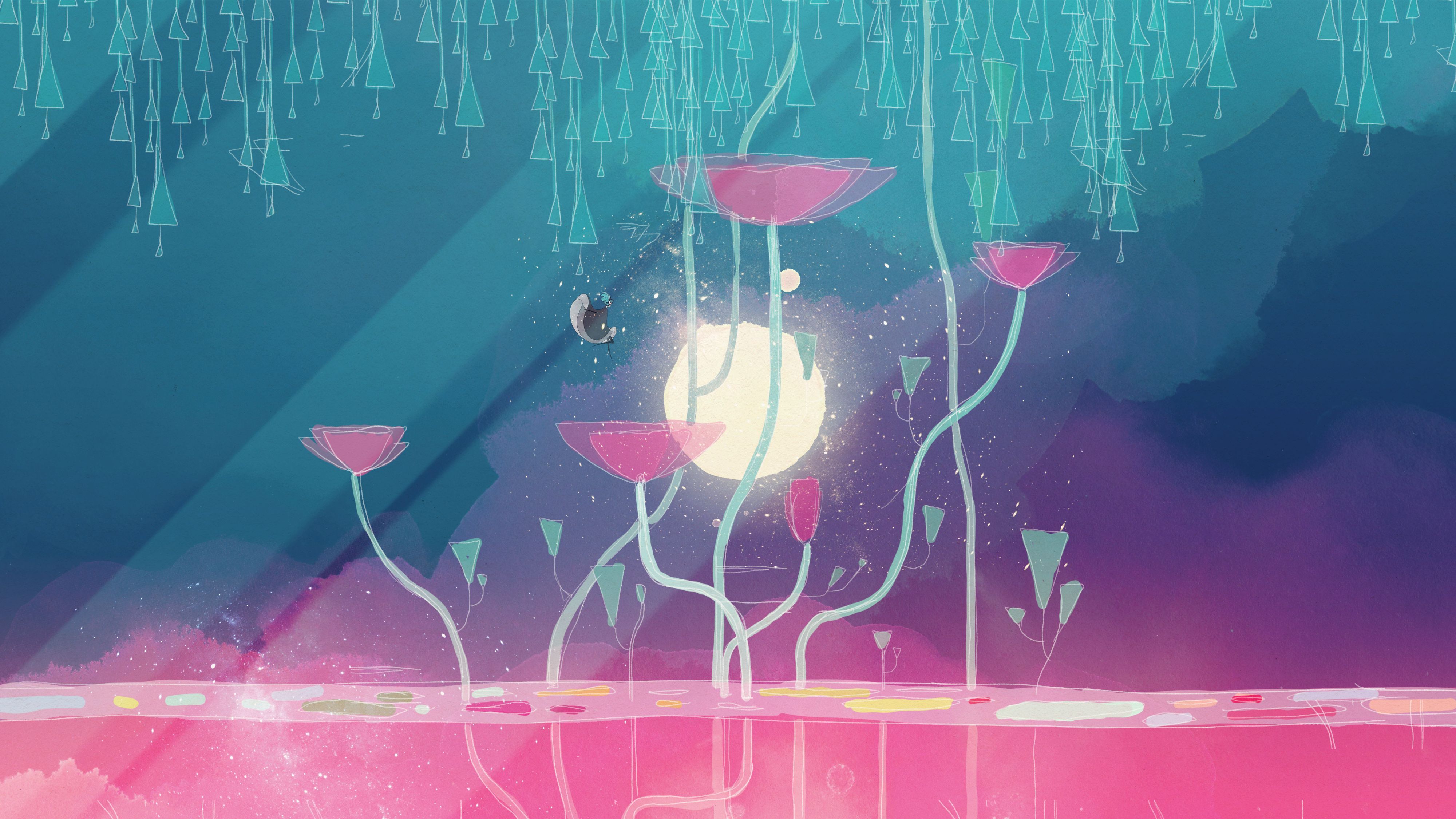
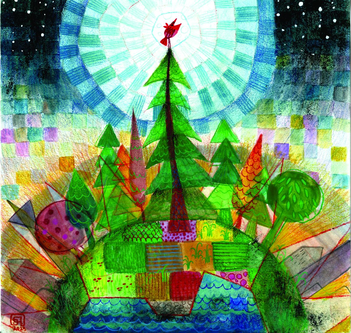
Conrad Roset’s main focus for the poetic platformer Gris was on creating an illustration that players could get lost in. Roset is an artist and illustrator whose work has been exhibited in galleries, featured in magazines and books, and commissioned by brands like Adidas and Zara. Gris was his opportunity to create a world, swapping the static for the fluid.
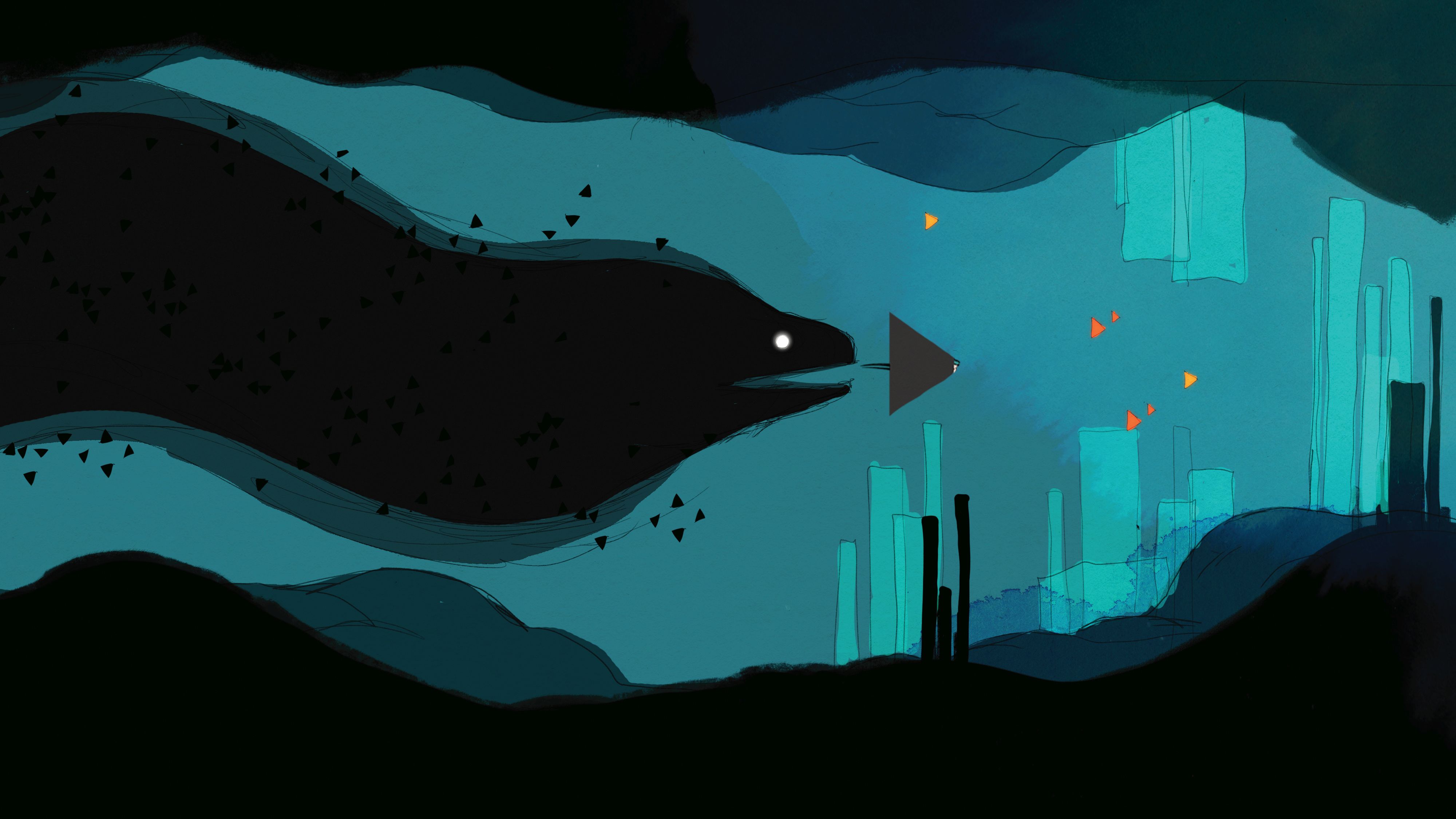
The game unfurls as a tale of loss and sorrow—a dreamy experience that’s more about evoking a kind of wordless enchanted bittersweet mood than offering up a thesis. As such, the imagery is the star of the show. Shapes cluster into plants, buildings form out of collections of columns, platforms and staircases. A gigantic bird shifts between a recognisable silhouette and an animated fluid mass.
Gris picks up motifs from Roset’s existing work. There are blooms of watercolour pigment, neat ink outlines, and a fascination with the bodies of lithe women. His style is spare, using a lot of white space to balance punches of colour. In translating that to a digital environment, he worked with his partners Adrián Cuevas and Roger Mendoza at Nomada Studio to make sure the filters, textures, watercolour effects and so on would produce the right look.
Bringing Roset’s work to life began with hand-drawn sketches, including watercolours. Once he and Nomada started the game, the art and animation moved to Photoshop but with an emphasis on maintaining the organic look and feel.
For example, there’s an animation whereby a cloud of colour blooms across the screen. For this the team used a video of paint falling into a bowl of water and then adjusted it in Unity so it looked like it was blooming from the right part of the screen. Those floods of colour are narratively important, too. They happen when a player gains access to a new part of the colour palette.
As well as Roset’s own work, Eyvind Earle’s Disney artwork is a reference point, particularly his concept art for Sleeping Beauty. Those images use layers to create the illusion of depth without linear perspective—a technique that translates well to a 2D platformer.
Earle’s influence is most evident in Gris’ forest sections where squared-off topiary is held aloft by tree trunks so slender they’re just vertical lines, with other vertical lines as branches.
Curiously for a game about grief, Gris seems to avoid anger, harshness and ugliness. But this too is an aesthetic choice. “There are some rougher scenes,” says Roset. “I liked the idea of talking about harsh topics from a gorgeous, aesthetically pleasing viewpoint.”
Colllage Atlas
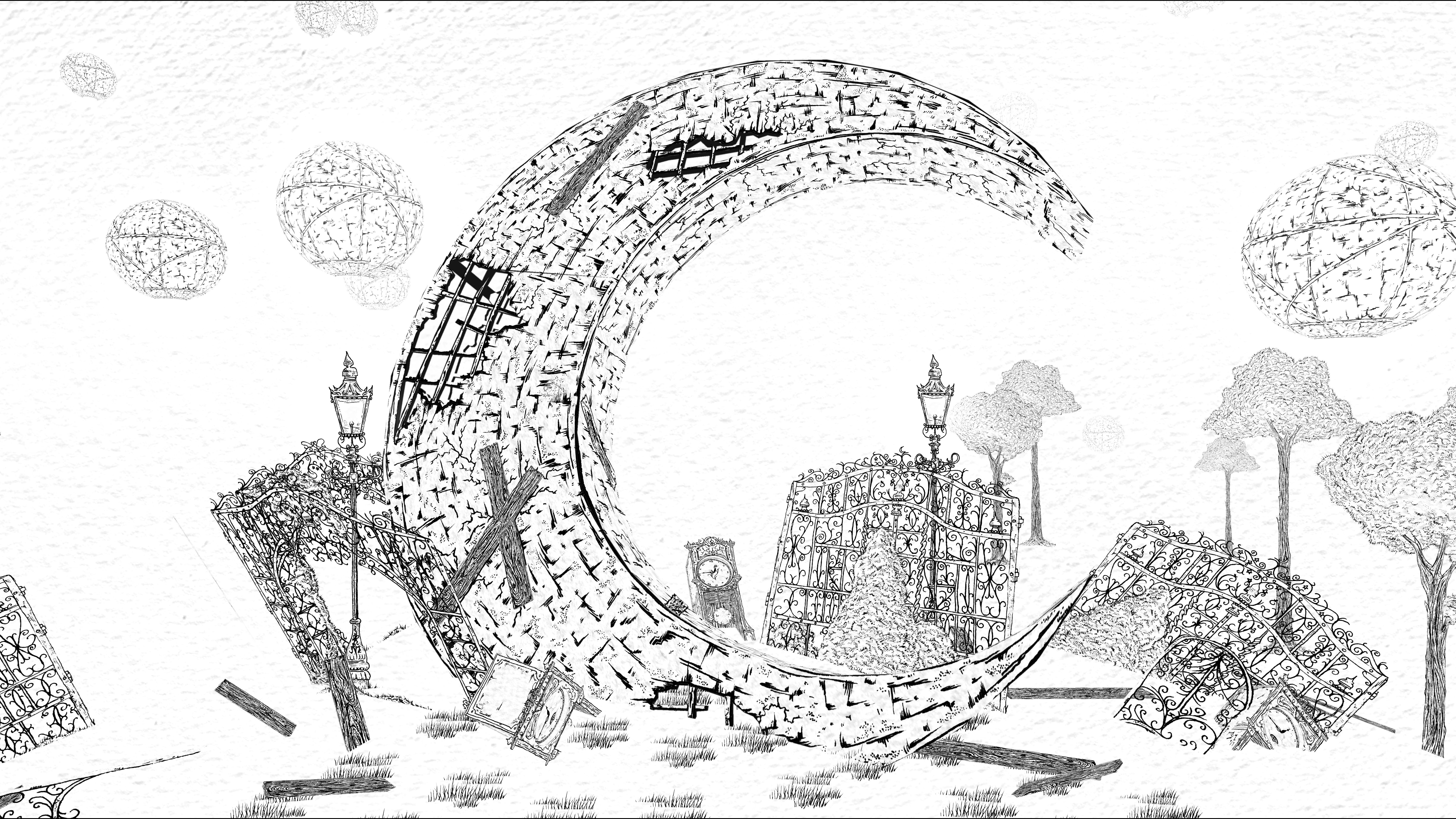
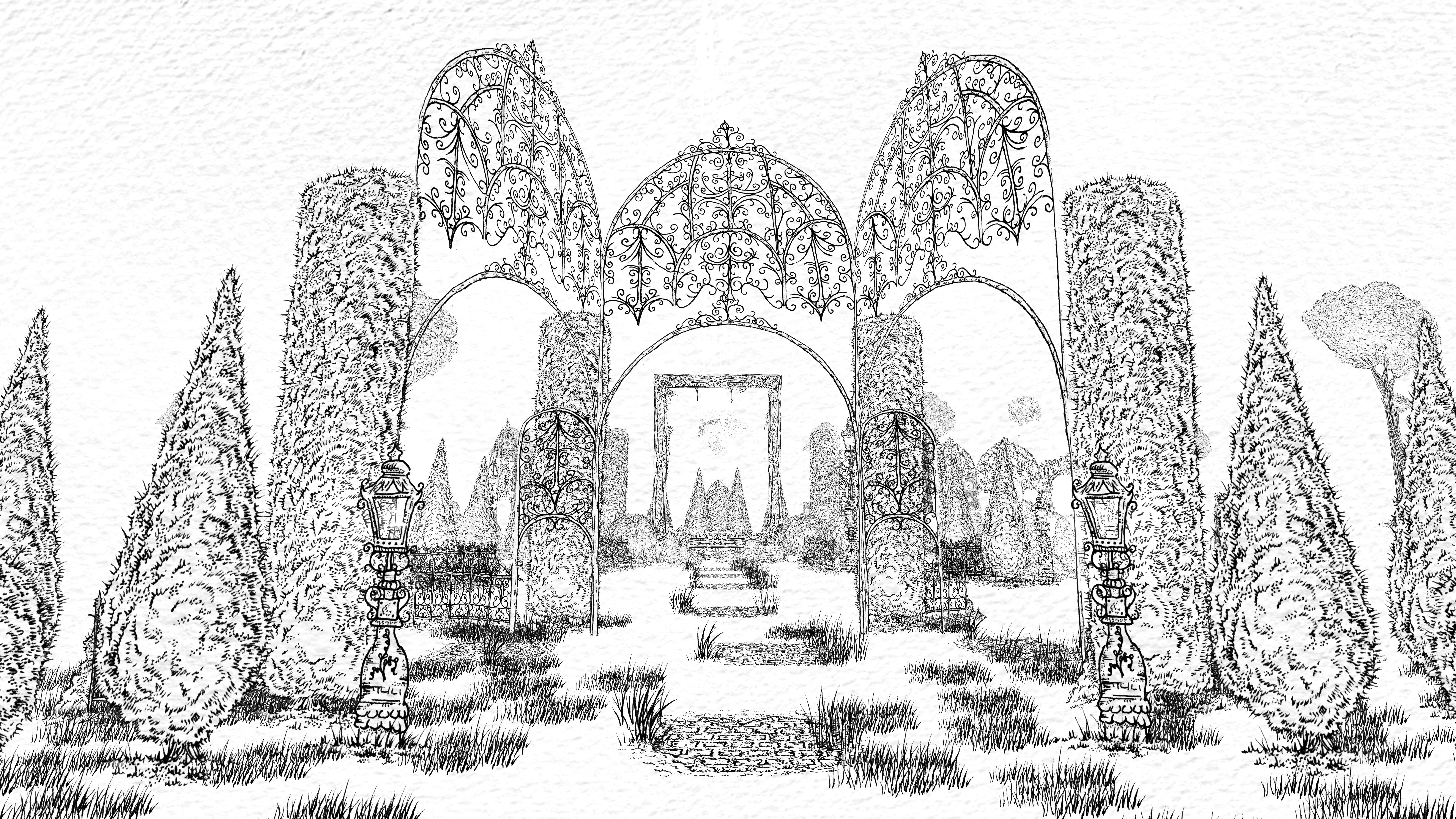
The Collage Atlas is a game that I tend to think of more as a digital papercraft theatre. Cut-outs of bushes and lampposts—each drawn in black ink using 0.03mm fineliner pens—emerge from the rough white watercolour paper ground. Arranged in layers around a central gap, these cutouts create a garden walkway, leading towards an intricate, wrought iron-style pen-and-paper gazebo.
“I draw everything on paper then scan each element,” explains the game’s creator, John Evelyn. He then cuts them out in Photoshop and removes the paper texture, which the scanner struggles to capture. “I then take the bare line art and back it with a high res photo of a blank sheet of my paper.”
3D elements work more like paper construction projects. “I print the flat UV map outlines (like flattening the foil wrap off a chocolate Santa), then I draw all the detail in, scan that back into the computer and wrap the model in the new hand-drawn texture.”
As well as trees, pinwheels and boats, The Collage Atlas uses text as a physical object in the game. For example, sometimes letters appear jumbled unless you stand at the exact right viewpoint. Physical text has been integral to the game since Evelyn decided it should be a game in a 3D space and not a picture book, as was the initial idea.
“It just made sense for the text to live within that space, too—rather than as an overlay. Before long I realised that if the text were to share the space with the player then it logically follows that it responds to, and acknowledges, the player much as the environment does.”
Agency and hope are key themes for Evelyn in this project. In pursuing those themes, The Collage Atlas is overtly reactive in ways developers usually try to hide. For example, assets rotate to face you as you move around, or move only when you look at them.
“Initially people find it strange that the game world essentially doesn’t exist until they act, until they breathe life into it,” says Evelyn. “But I’ve endeavoured to pack the game with regular payoffs, to encourage people on their way and make that seem like a less daunting task.”
Drawing is a liberating experience for the self-taught Evelyn. “I tend to think exhaustively about everything, but when I draw, I don’t. I just let it turn out how it will,” he explains. “The more you learn, the less you realise you know, so I love keeping drawing as my one deliberately naive endeavour, it’s fun to do something entirely free from expectation.”
Luna
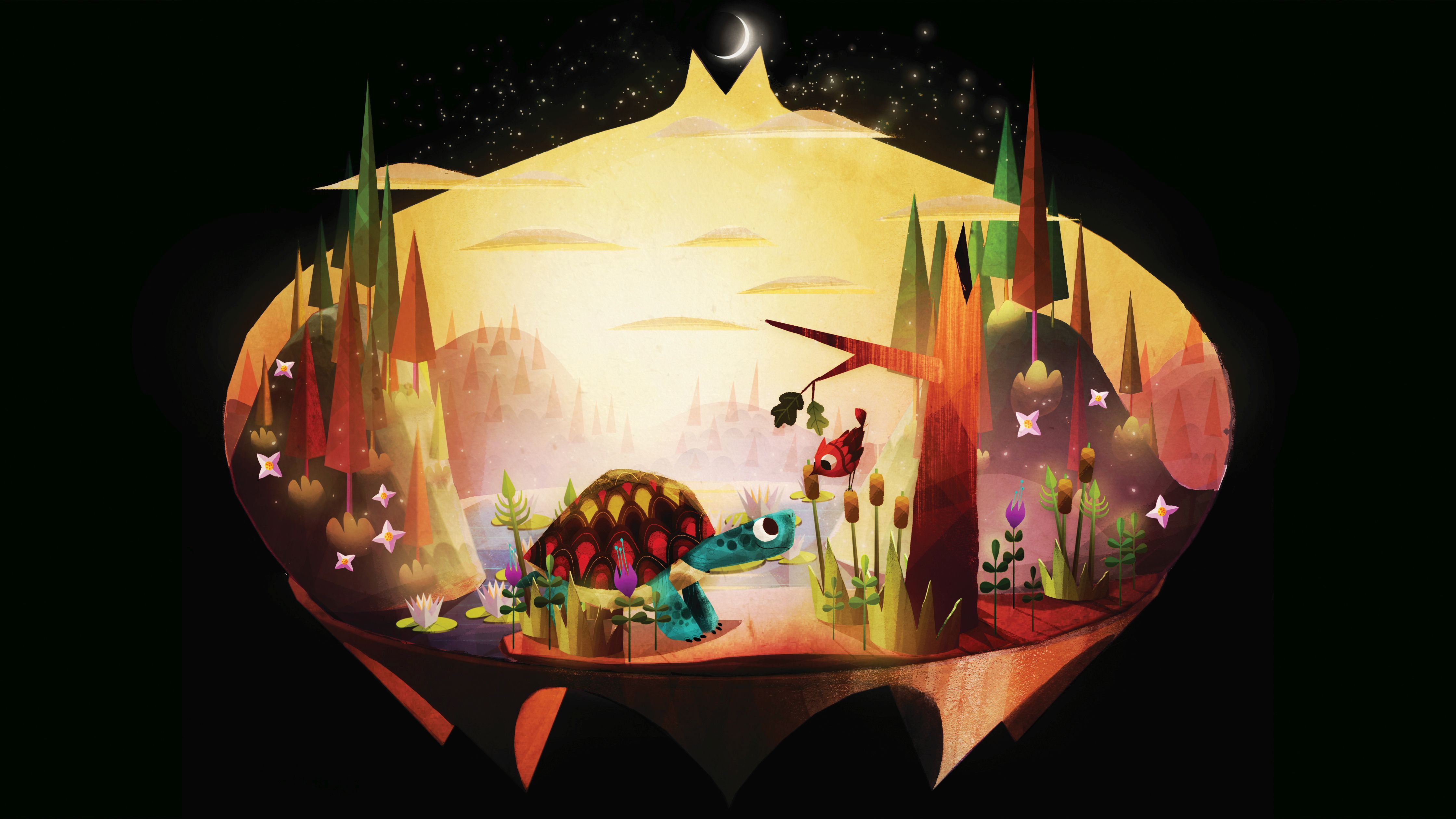
It’s odd to think that Luna—a game with such rich textures and which plays out its gentle story in a variety of interactive terrarium-style spaces—was ever intended as a solely 2D game. Porting it to VR happened about halfway through development after the team experimented with taking a version of Luna to the Oculus platform.
“The tactile quality of the art lent itself perfectly to VR,” says Luna’s art director, Glenn Hernandez. “But this meant that we could no longer simply replicate my concept paintings in the VR realm since the 2D camera was very curated.”
Instead, Hernandez would greybox (block out) the basic forms of the environments and the team would see how different arrangements felt in the headset. Modeler Allena Hail would then add definition to the greybox using Hernandez’ paintovers (images where an artist has painted over an image of the space to show how it should look) for reference.
Hernandez stresses the collaborative nature of the work at Funomena. “My drawings and paintings serve as blueprints, and the real design comes to life when other artists insert their unique senses of style to the finishing touches.”
Luna’s own blueprints take inspiration from the illustrations of Mary Blair, the woodblock prints of Umetaro Azechi, the animations of Jirí Trnka, and the sculptures of Lee Bontecou and Harry Bertoia. Funomena also looked at the folkloric style of the 1975 Yuri Norstein film Hedgehog in the Fog. “Eventually, we set those influences aside and allowed all of the inspiration we absorbed to filter through our own vision,” says Hernandez.
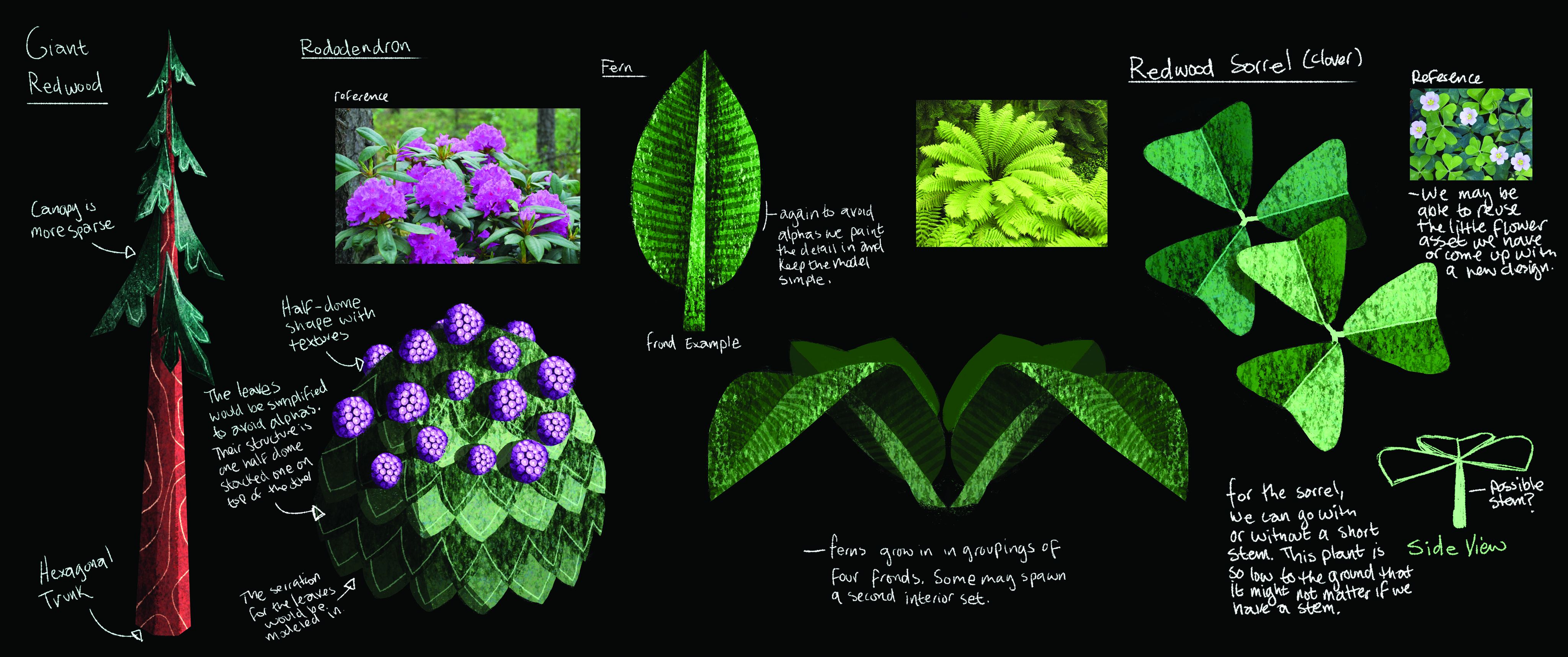
Learning to work in the medium of VR presented more than a few challenges, so the team needed to be flexible. “For example, my initial designs for plant life were rather delicate on the page, but showed up as pixelated when interpreted in VR,” says Hernandez. “At first we tried to make the delicate designs work, since the beefier the assets were the more they felt like Playmobil toys, but we realised this was actually well in line with our vision for the game.”
Although he emphasises everyone’s contribution, it’s working with engineer Greg Lemon to curate a shift in lighting during Luna’s intro which is a particular source of joy for Hernandez. “We open on the Golden Gate Park Terrarium as the sun goes down and the lighting shifts from golden hour to early evening. When the lighting for this scene finally came together, we were ecstatic! We had nailed the sense of mystery and wonder we were going for.”
