I can't believe Windows 11 still hasn't gotten rid of these old-ass menus
It's ridiculous that there are still two separate menus for uninstalling programs, and one of them dates back to Windows Vista.
Microsoft Windows boss Panos Panay sounded almost overwhelmed with emotion when he unveiled the new look of Windows 11 a few months ago, calling it "the Windows that brings you closer to the things you love." The things he was referring to are specifically stuff like rounded edges, glassy overlays, and snazzy dark and light mode themes.
"Modern. Fresh. Beautiful," Panay cooed.
And yeah, Windows 11 is those things—until you go digging beneath the surface and find menus so covered in cobwebs the Crypt Keeper would feel right at home.
I like some of the new design choices in Windows 11. I do actually think it's pretty, and some menus have been improved to be clearer and more useful. But I had to laugh when, within five minutes of booting Windows 11 for the first time, I came face-to-face with a menu that's barely changed since 2007. Windows 11 may look nice, but it still has the same maddening problem as Windows 10, which is that the new menus are competing with ancient ones for basic functionality.
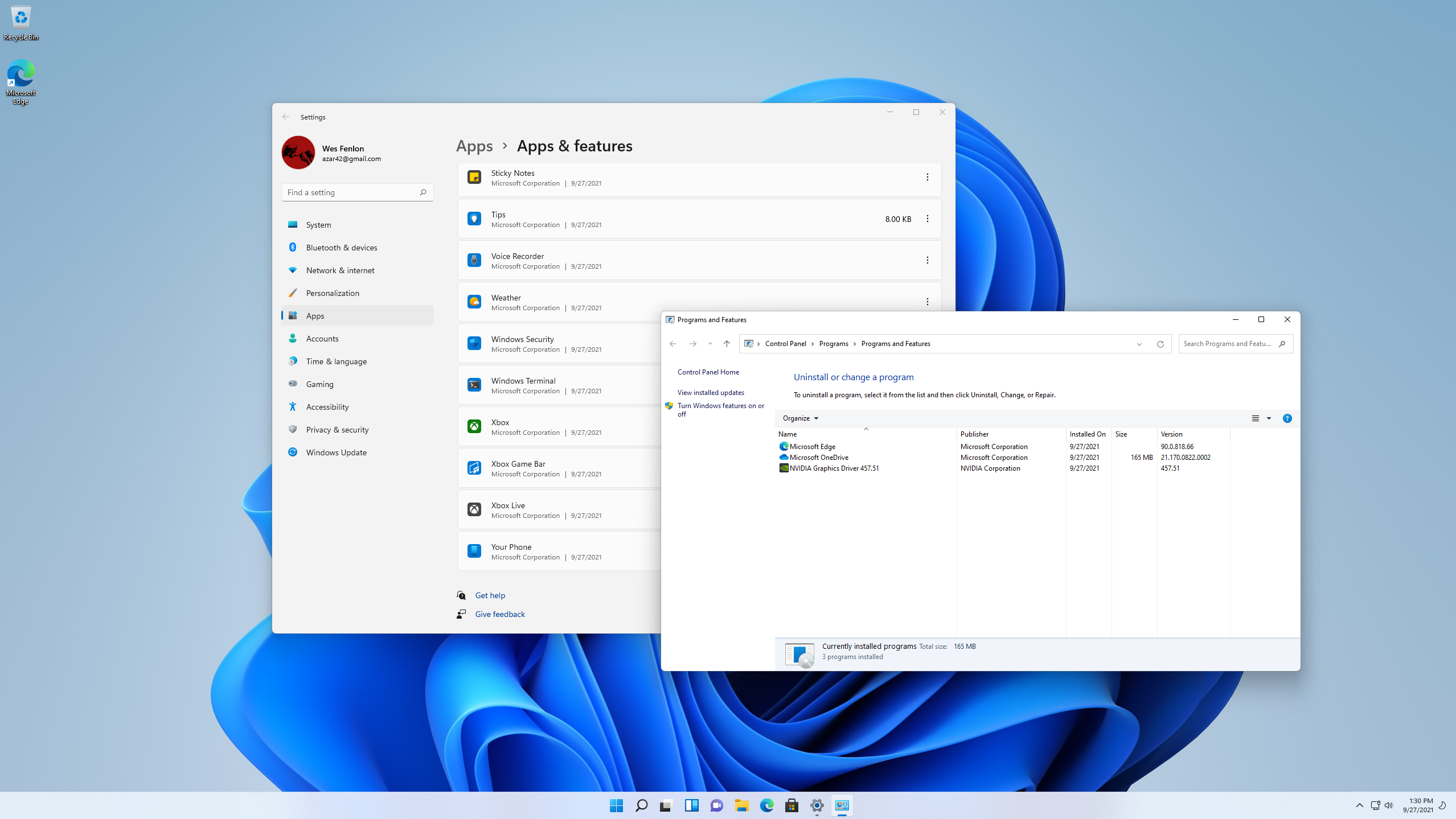
When you uninstall most programs in Windows 11, it'll direct you to the Apps & Features menu, which is a slight redesign of a menu from Windows 10. It's one of many tabs in the modern Settings menu. But when I tried to uninstall OneDrive, Windows 11 didn't open Apps & Features—it took me to the classic Programs & Features menu instead, the one built into the classic Control Panel that looks exactly the same as it did in Windows 10. And in Windows 8. And in Windows 7. And in Windows Vista and XP (well, except for the color scheme).
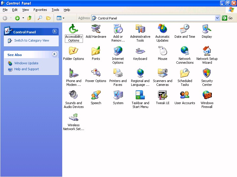
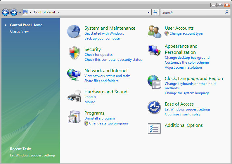
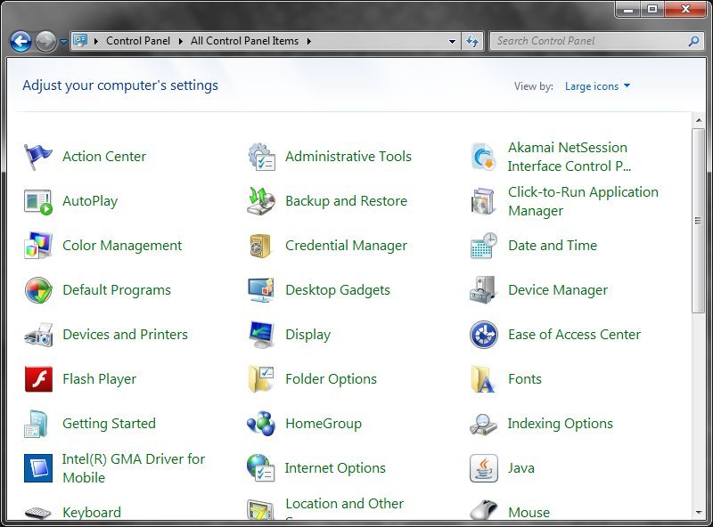
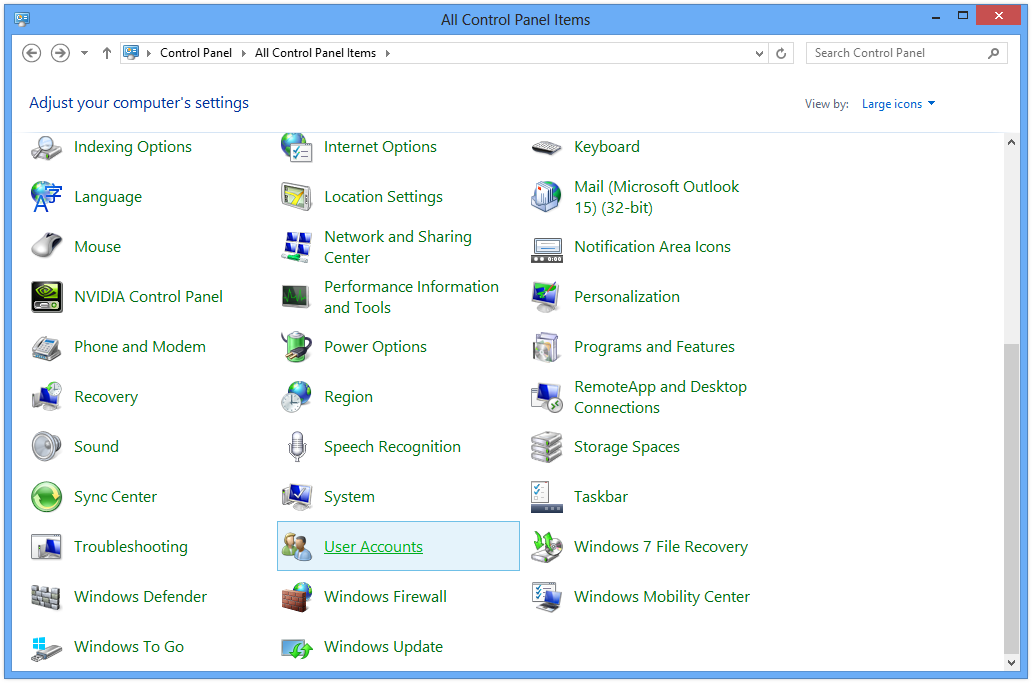
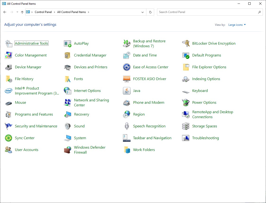
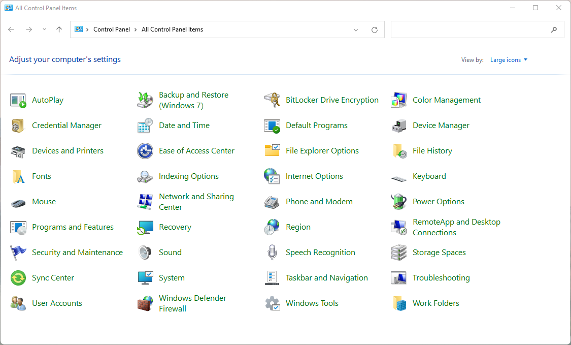
It's ludicrous that the Control Panel still exists. Shouldn't all of its functionality be contained within the Settings menu? Microsoft had six years with Windows 10 to deal with this inconsistency and it didn't. And now, with its big relaunch, and the supposed big emphasis on Windows 11's bold new look, the same old shit is hiding one layer deep. There's still a Control Panel entry called Backup and Restore (Windows 7), for god's sake.
I can't think of a good excuse for it to still be there. If Microsoft hasn't completely made the Control Panel redundant and rebuilt all of its functionality in the newer Settings menu, that's embarrassing—it's been years! And if Microsoft has made it entirely redundant, then why is it still there? As a deep cut of nostalgia for the Windows OGs?
The biggest gaming news, reviews and hardware deals
Keep up to date with the most important stories and the best deals, as picked by the PC Gamer team.
I suppose it's nice to be able to use an old and familiar interface that I know my way around, but it's also jarring when almost everything else in the OS directs me to the new Settings menu. I'm getting a headache just thinking about trying to explain to family members why you have to use a different, much older menu to uninstall certain programs—or what the difference is between the new Settings Power menu and the old Power Options pop-up and its bajillion individual tweaks, for example.
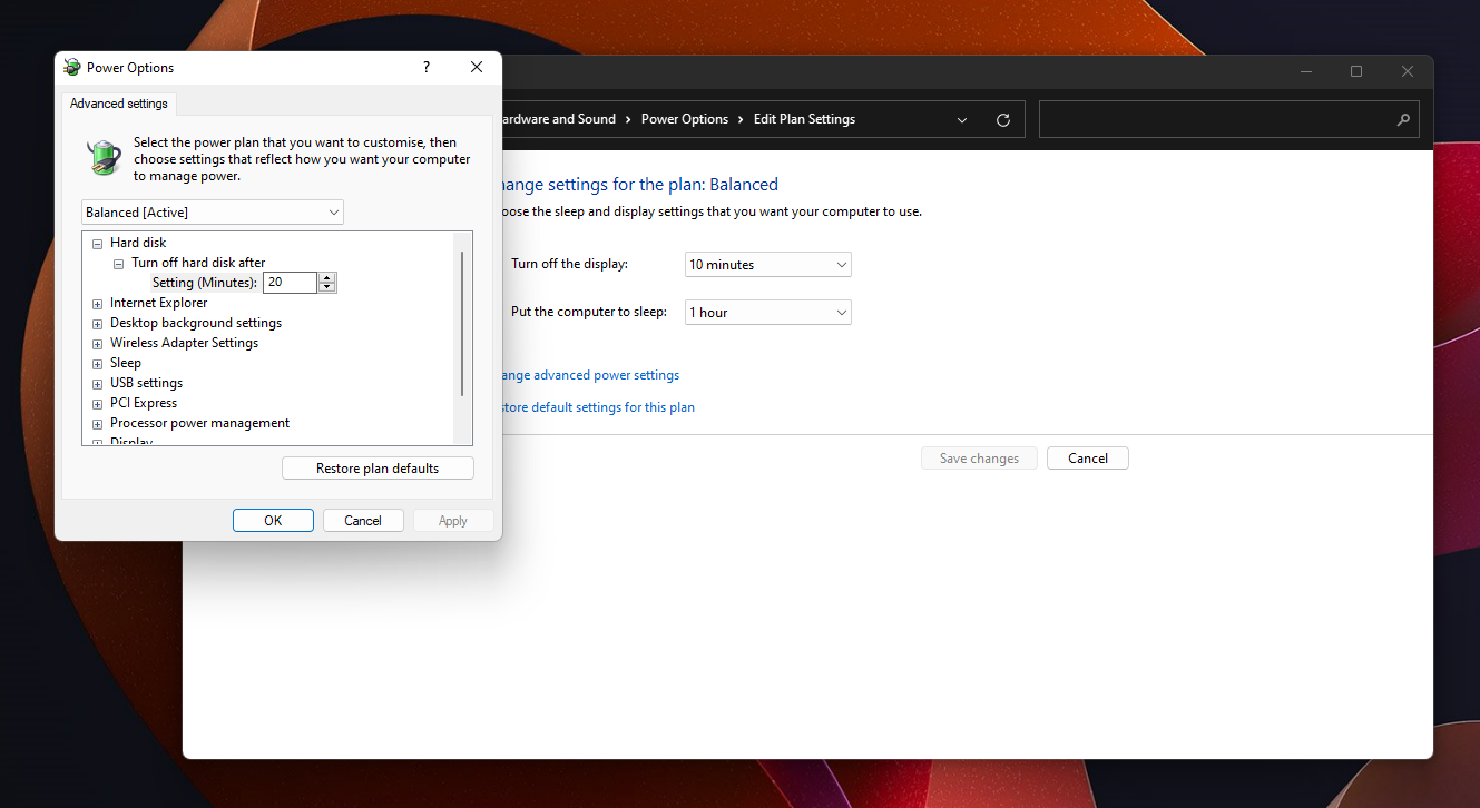
The Control Panel is not the only holdover from old ye old Windows found in 11. Disk Management looks and functions almost identically to the one Microsoft shipped in Windows 2000, and man, Windows could really do with some better built-in partitioning tools. Updating that would've been a great gift to power users, but I guess we still have to shell out money for EaseUS to move partitions around with a nice UI.
You can find all kinds of crusty old menus if you dig deeply enough, usually hiding behind an "additional settings" click somewhere. And bizarrely, as this Redditor pointed out, the old File Explorer with its ribbon navigation is still accessible if you press the "Up" nav button from the Control Panel a couple times, meaning there are two versions of the File Explorer kicking around too. Another redditor highlighted how the shortcut menus accessible from the lock screen represent the Windows 8 UI, Windows 10 UI, and Windows 11 UI. Three generations of design in one convenient place!
There will be plenty of Windows users who don't notice these inconsistencies, and more who do but aren't bothered by them. They won't sink Windows 11, just like the exact same issues didn't sink Windows 10. But for a major release that is notably light on new features except its visual overhaul, it's disappointing to see Windows 11 still carrying so much of its old bloat. And all those competing menus do make it harder to help less computer-savvy friends and family troubleshoot problems. I guess if nothing else, Windows 11 has managed to stay consistent with Windows 10's biggest annoyances.

Wes has been covering games and hardware for more than 10 years, first at tech sites like The Wirecutter and Tested before joining the PC Gamer team in 2014. Wes plays a little bit of everything, but he'll always jump at the chance to cover emulation and Japanese games.
When he's not obsessively optimizing and re-optimizing a tangle of conveyor belts in Satisfactory (it's really becoming a problem), he's probably playing a 20-year-old Final Fantasy or some opaque ASCII roguelike. With a focus on writing and editing features, he seeks out personal stories and in-depth histories from the corners of PC gaming and its niche communities. 50% pizza by volume (deep dish, to be specific).
