How to design a great Metroidvania map
The creators of Hollow Knight describe how they built a complex, interconnected world, from sketches to final game.
Keep up to date with the most important stories and the best deals, as picked by the PC Gamer team.
You are now subscribed
Your newsletter sign-up was successful
Want to add more newsletters?
Join the club
Get full access to premium articles, exclusive features and a growing list of member rewards.
August 2025: Now that Hollow Knight: Silksong finally has a release date, we're resurfacing this interview with Team Cherry from 2017 about the making of Hollow Knight's map. Note that this interview predates any changes or additions to the map from the Hidden Dreams, Grimm Troupe, Lifeblood, and Godmaster DLC updates.
There's something uniquely satisfying about exploring the intricate 2D spaces of games modeled after Metroid and Castlevania. It's a feeling I don't get from any other games: an acute awareness of how the world fits together, a knack for sensing where there might be a hidden chamber, a fulfillment from gaining new powers that carry me to previously inaccessible heights. A great Metroidvania map makes you want to master every square centimeter, and remains fun to traverse the second and 10th and 20th time you follow the same path.
So how do you create a Metroidvania map? How do you design an interconnected world that keeps backtracking entertaining, giving the player freedom to explore but retaining some control over how they progress? Is there a secret formula, a sacred text? I put those questions to the creators of Hollow Knight, a fantastic Metroid-inspired adventure set in the decaying kingdom of Hallownest, which reminds me of Don Bluth's The Secret of Nimh (but with bugs, instead of rats).
We talked about what defines an adventure game like theirs and why they never use the term "Metroidvania" themselves. Then we got to the really fun stuff: looking at sketches, diagrams, and work-in-progress designs for Hollow Knight's world, from the very beginning through the final version.
Article continues belowThe origins of Hollow Knight's map
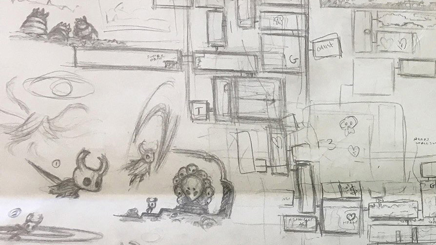
Ari Gibson, animator and co-director of Team Cherry: [Hollow Knight] kind of evolved from a game jam, which was the simplest form. I don't think we discussed genres that much when we were making it, or even consciously thought about the difference between Metroid and Castlevania.

Ari Gibson previously ran an animation studio and drew the art for Hollow Knight by hand, while also working with Pellen on design.
William Pellen, designer and co-director of Team Cherry: Sometimes as we were making the game and other similar games were coming up, indie games, you'd hear people say 'oh my god, another Metroidvania game, why do they keep cranking these out?' And you think, like, 'All it means is a game set in a large, interconnected world.' We pretty much shied away completely from describing the game ourselves, in marketing and stuff, as a Metroidvania.
Gibson: There's a tangential element to that, which is, do you let a genre dictate decisions in your own game? Do you make a conscious decision that you're making something that is a Metroidvania, and build off the conventions of that? I don't think we ever did anything like that. We just said we're going to make an adventure in this big world, and let's build an interesting world with lots of things to discover and see, and hopefully keep people engaged throughout.

Pellen designed the bulk of Hollow Knight's enemies and built out much of the world's interactivity.
Pellen: One of the earlier things we did was come up with the basic progression. All the character's abilities, and then we got them into a rough order. At the same time we were talking about the basic structure of the world. At the start it was basic: 'this is the shape of the world, and the characters are going to get these power ups in this specific order, what is the line, the path they take through the world to get those power-ups.' And then, from there, as the game expanded, we started to do things like change that power-up progression from a linear thing to section it out.
Keep up to date with the most important stories and the best deals, as picked by the PC Gamer team.
Gibson: Less linear, yeah. We chipped away at a lot of the hard gating in the game, to the point where a lot of those power-ups ended up being optional, anyway. And now people are speedrunning the game and getting barely any of the power-ups. Which is exactly what we had hoped.
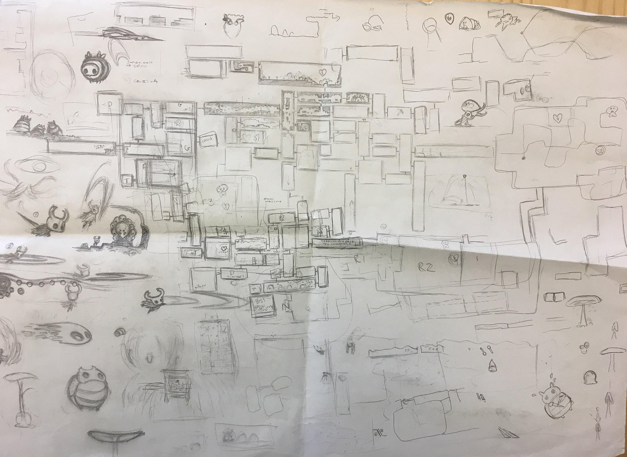
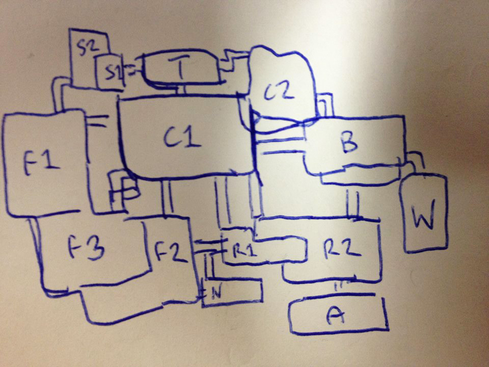
Pellen: One of the early ideas was town at the top area in the middle—the reason it's called Forgotten Crossroads is because it's in the middle, it's the crossroads to the world. Then you had fungus area to the left, desert land on the right, and then underneath was the City of Tears. And you can kinda see that shape, vaguely, still in the game. And the idea at the start was, you'd go down to the crossroads, and then each of these three areas would have one of the bosses, and it was just going to be the same boss, kind of slightly reskinned.
Gibson: Which is the three Dreamers you kill. So they were actually one boss. Their masks still look similar, but now their bodies look different. Once you defeated one in each land, you'd come back to the start and fight the final boss. You can kinda see how that structure is pretty much the structure of the [finished] game, but really blown up, and the Dreamers are now all in different spots, but you still go out and fight those Dreamers, come back to the start, and fight the final boss.
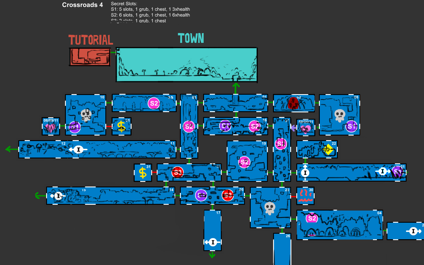
Pellen: [In the original game jam version] the idea was, and obviously we abandoned this, we'd make all these prefab rooms and they'd be rearranged, so the interiors weren't going to be that randomized, but it would be like a tiny Metroidvania that would take an hour or two, but it would kinda rejig itself when you play, and you might get powerups in a different order or something.
Originally these sections, see how there's white lines along the black outline? Those were the potential exits and stuff, that we had to account for, so things could slot together in different ways. S1, S2, S3, that's secret 1, 2, 3. Each one of those could be taken up by a grub, or nothing, or a chest.
Gibson: It was a headache. It wasn't fun.
Pellen: [Laughs] Yeah, it stressed me out. It wasn't fun from a storytelling perspective, and wasn't fun from a technical or design perspective. When we think of the strength of Hollow Knight now, one of the things we really put effort into is the way map locations and things within the world kind of make sense.
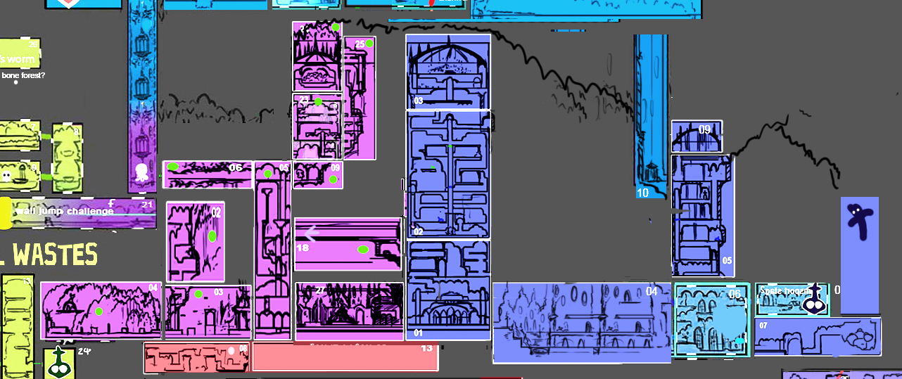
Pellen: So here's, again, that Crossroads area, when it was pretty fleshed out. And you can see vaguer versions of what would become Greenpath, what would become Fungal Wastes. The first step is, where is it placed within the whole world?
We started Crossroads as the heart of everything and everything wrapped around that. So all right, let's do this fungus-y area, and sketch out a basic shape of movement through it, with some other side rooms. Once you have the basic layout of moving through it, you can see here as Ari's done, he's started to sketch out the inner bits.
How the map took shape
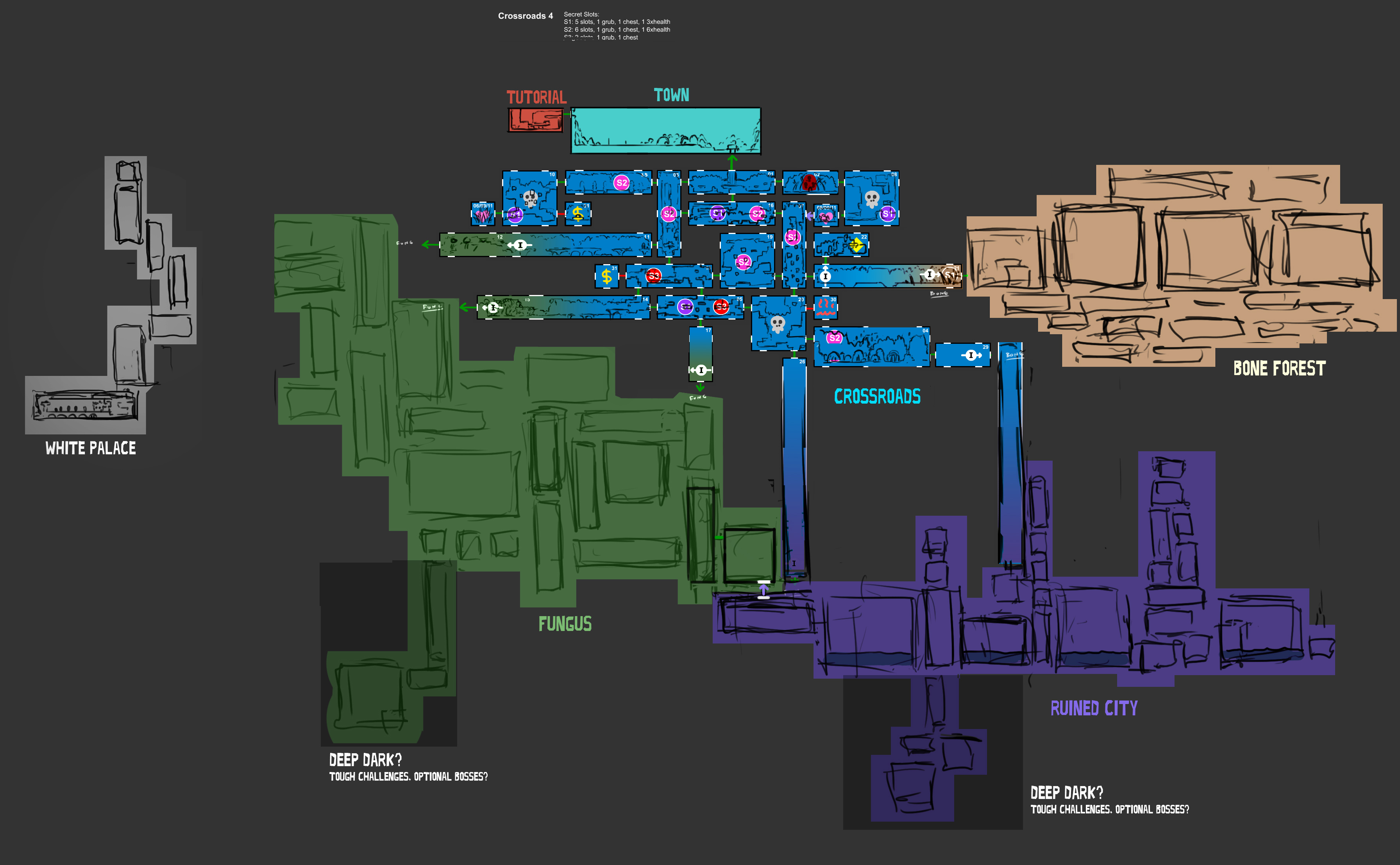
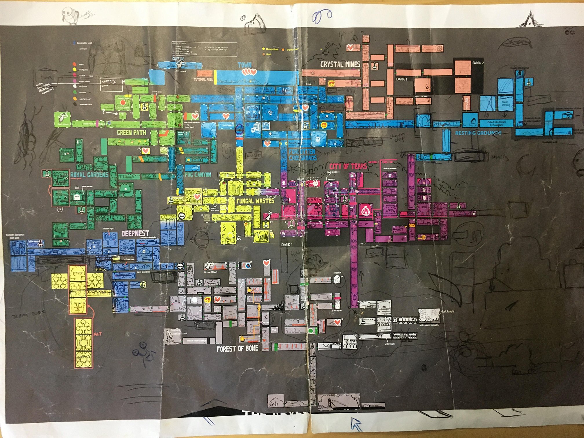
Pellen: This was the structure of the game for awhile. Before we moved to Unity, the first five or six months of the game were in a program called Stencyl, a much smaller Game Maker type of thing. We actually had this whole world tiled out. You could actually run through it in black block mode…
We plotted a basic path through those areas, so you'd come from town, into the crossroads, into the fungus, get a powerup, go into the city, get a powerup, go into the bone forest, get a powerup, then come back and visit city 2, and then come back and revisit fungus, and by then you've done the game, come in and fight the last boss.
A lot of these areas broke off into their own areas. C2 was, 'oh, it would be kind of interesting if you come back and revisit the initial crossroads area, right?' But how could we make it thematically slightly different? What if it kind of looks like it was the mines of the area? And that just ended up being broken off into a whole new area called Crystal Peak. It was Crystal Mines originally.
Ari started thinking how he could differentiate these areas. This Fungus 1 became Greenpath. Fungus 2 became the actual Fungal Wastes. Fungus 3 became Fog Canyon and the Queen's Gardens. So we started with this, and it got played around with a fair bit. Eventually the bone forest, I remember Ari saying that he didn't like the lava land wasn't at the bottom of the world.
Gibson: Eventually, the bone forest didn't end up being a component of the game.
Pellen: These areas that we've talked about, Greenpath, Fog Canyon, you can see how they've really taken shape. They exist. Bone Forest was pretty far along, and you can kinda see the full-on structure of it. Double jump is here, and it's in a whole new area in the final game. You can see how it kind of hooks into everything.
So basically, the next step was, we tore out Bone Forest from the right of the world and put it underneath, here. But we needed to have another area that connected to Bone Forest, and we had an area idea that we talked about, that was a combination of ideas. It was a dangerous area full of predators, tight areas with stuff getting you. And we had a lantern item we talked about, so we wanted to have a dark area. And I think Ari was keen to having a spidery area as well, which makes sense. So all of those ideas combined. And the tram, all of that combined into the Deepnest.
The only area that I can think of that exists purely for narrative reasons is the Blue Lake
William Pellen
Gibson: The Bone Forest area, which is kind of large, it was removed largely because the game was getting too big. Not just for our ability for us to make it in time, but also, the game's already quite overwhelming for some players. It's this huge expanse, and you have to keep a lot of it in your head, and potentially another very, very large area was just pushing people too far in their expectations for how much information they could retain.
Pellen: It was the biggest area. It existed. It didn't have any enemies, but you could run around and see the lava and the bone structures and stuff. But we made a call to take it out. A couple of smaller new areas replaced it, in a way. We cut Deepnest down heaps, and then expanded it, just because we had to. And then added Ancient Basin.
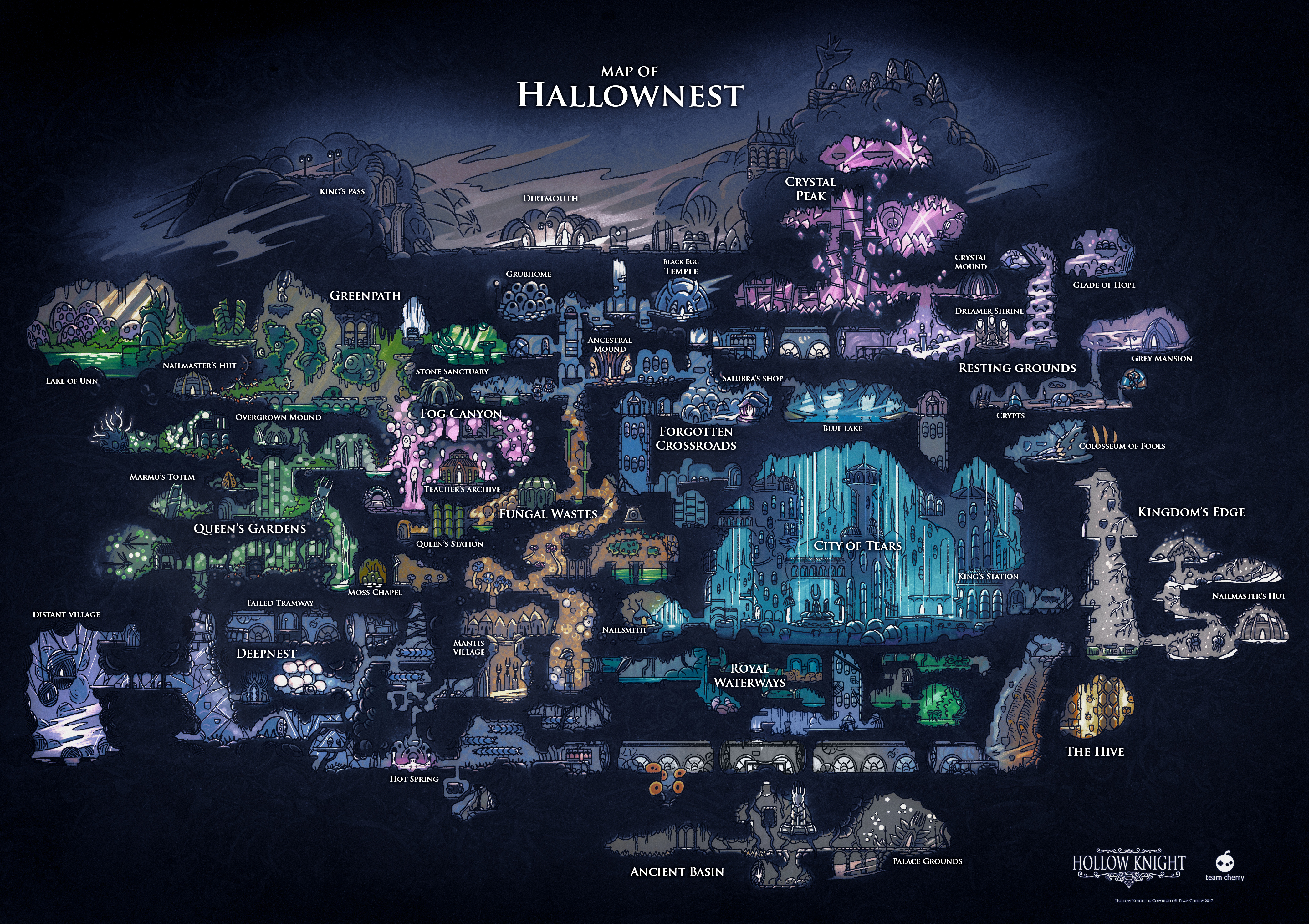
Then we had some stuff that needed to be placed in the game, like the Hive, and the second Hornet fight, some other bits and pieces, so we made Kingdom's Edge. That was the last area that we added, and a lot of it was just for map balance. Kingdom's Edge kind of became the catch-all. It was just called the Outskirts for awhile. Everything that we didn't fit into the rest of the map went there. And then it got its own identity built up around it. It's actually a pretty cool area.
Gibson: The only area that I can think of that exists purely for narrative reasons is the Blue Lake, which is above the raining city. And it's only there because there's all this rain falling on the city, and I just couldn't bear the idea that we didn't explain where this rain was coming from. So we put this big lake above it.
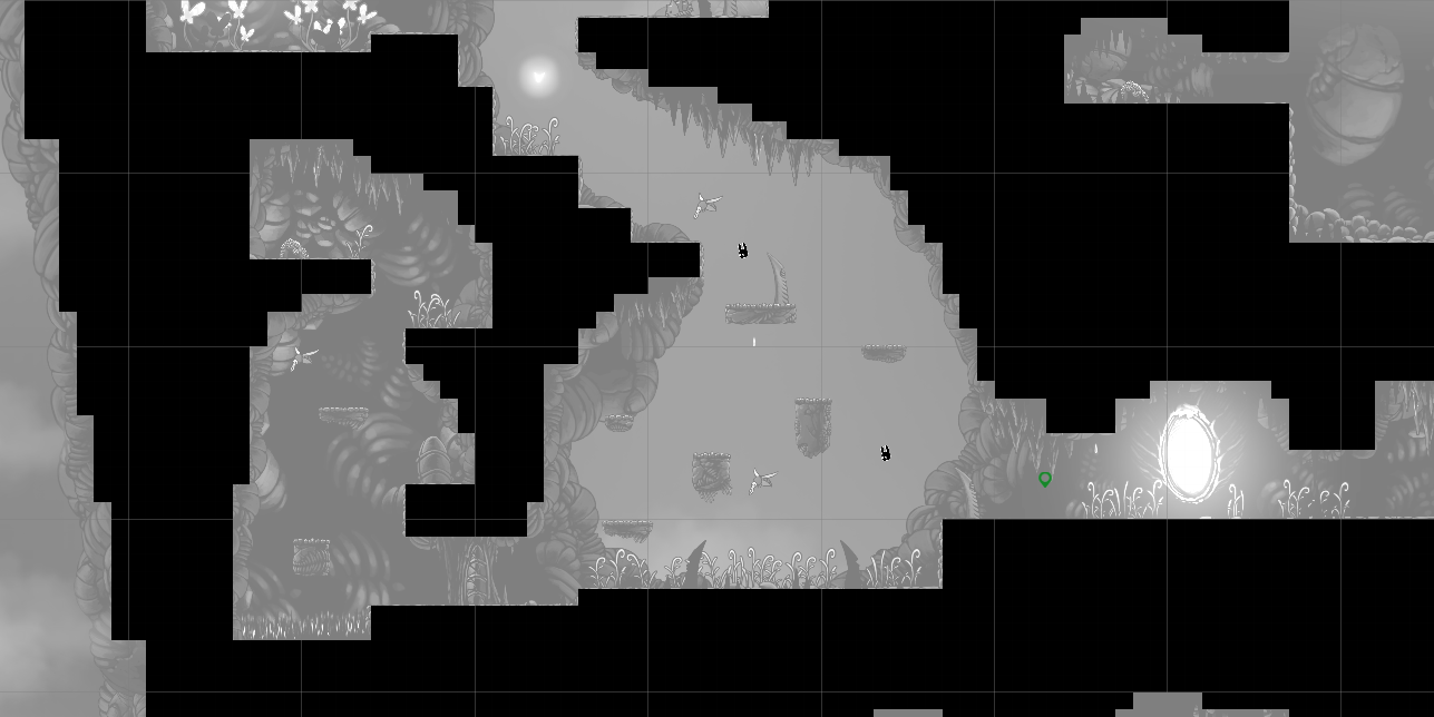
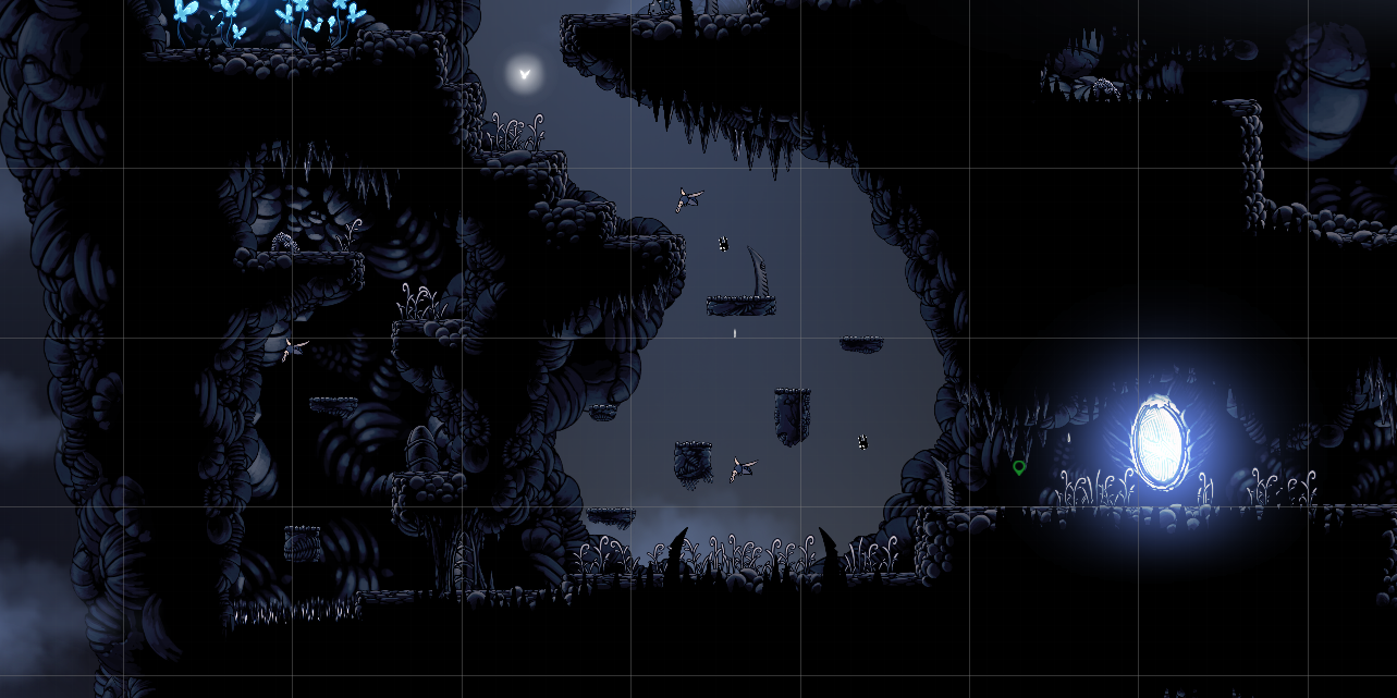
Gibson: This is a slightly abstract representation of what ends up in the room. And then the next step is to go into actually building the tiles and stitching the rooms together. The whole world is just built from black tiles that are 64x64 pixels. They're very quick to paint in, and from there we can just hit play and do a lot of testing to get spacing and working out the right feel. And that gave us a pretty massive framework very very quickly.
Pellen: We call it blocking out or tiling out a room. So that's how we'll start. Then jump around in it, can you roughly reach every platform, does it make sense. Generally, next step per room, is usually Ari will go through and 'dress' the room, put all the scenery and stuff in, and once that's done, me or Ari, depending on who's doing that area, will go in and do enemy and interactivity placements. Putting in the bad guys, the geo rocks, switches, anything we need.
Turning a map into a world
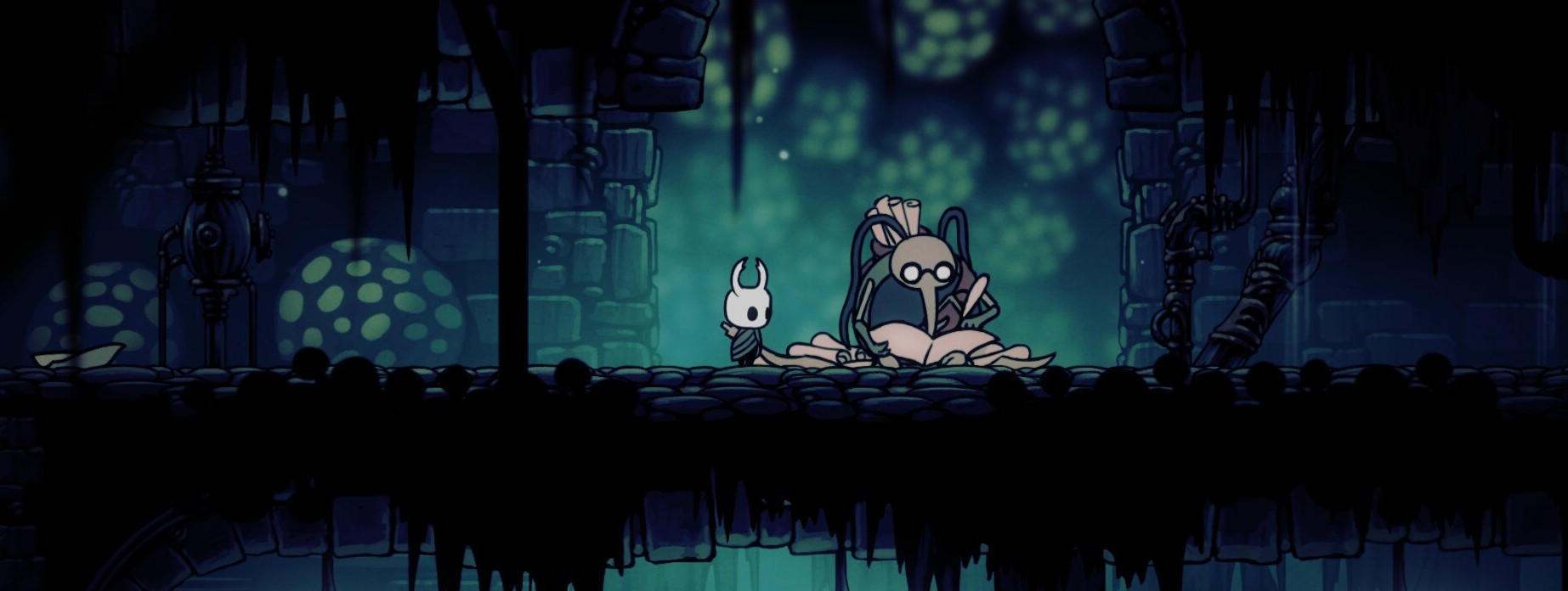
Gibson: It's probably 98% pure. There are just a few cheats...like a tiny room goes down like, 20 tiles too low, that kind of thing. There's never a case where an entire room is a paradox, that kind of thing.
Pellen: We wanted people to be able to navigate the world, and being in a true space, as soon as you have areas where you go through this door and come up through here and suddenly you're in another area and it doesn't make sense anymore, you can't map it in your head. One of the things we were really keen on is getting as many connections between areas as we could.
Gibson: And it helps, obviously, for backtracking, when people are exploring the whole world. It's super annoying to get to a point that's 2 centimeters from somewhere you want to be and you can't get there.
One of the things we were really keen on is getting as many connections between areas as we could
William Pellen
Pellen: It's definitely practical. And players like us, finding connections between stuff, and how those areas blend into each other, is a nice reward in itself.
Gibson: It's a joy. A lot of these decisions we're making, a lot of the scale and the rooms we build, all of it's built around this sense of discovery. Exploration and discovery. And discovery, for us, doesn't just mean finding 500 flags or something. 500 coins. It means actually coming upon unique sights, unique characters, unique systems, like a new shopkeeper that offers you something you haven't seen before, a new event in the world…
Structure is dictated a lot by that. If you have a big lake, you have a sense of where it should go, because you're thinking about it as a world instead of just an abstract game. So you can create pathways that have that coherence we're talking about, and it ends up being an interesting, believable space.
Pellen: Sometimes it's tricky to make things cohesive, but other times it makes a lot of decisions for you, in natural ways that make sense.
Gibson: [Building the map] wasn't really an analytical process.
Pellen: It was mainly intuition. We've never put together something like this before, and I kind of didn't have a great sense of, when people do make it, is it like a mathematical thing, in some way? Even something simple like laying out a small room with platforms, how much of it is iteration? X tiles is the optimum, blah blah blah. We didn't do any of that. Ari kind of said it. We started with the idea of the world, and that was the first thing, rather than an analytical "what's the path going to be." We started putting the world together in ways we thought were interesting, and made sense, and just built on it from there.
Gibson: There is another tack to this that other people take, and it's a perfectly legitimate one. Our intent is we're going to build this world, and because it's this world and it's coherent, you can do things like get lost, really easily. You can go the complete other way than maybe would lead to your next upgrade, and that's totally fine. But it's also very common these days to create something that's a bit more like a roller coaster, a funneled experience where the game developers will direct you on a path. Even within Metroidvania style games, that is a popular way of approaching it, these days, to give you a much clearer goal.
All of it's built around this sense of discovery. Exploration and discovery. And discovery, for us, doesn't just mean finding 500 flags or something
Ari Gibson
Pellen: The world is built around that path, rather than the other way around. Which is fine, by the way, and it works really well for heaps of stuff.
Gibson: If you've played Guacamelee, that's a really good one. It has more of a thrust, a direct thrust through it. It's a really excellent, polished experience through the whole thing.
Will: It gives you a much tighter experience, which means when you're designing it, it's easier to know where the player is at at any point and what they've got. You've got a more consistent type of thing.
We kind of ask for a lot of faith from players, in a way, that if you do get lost, if you explore you'll eventually find your way. And it'll be worth it, and even when you do get lost you'll stumble across something. You won't just spend an hour going through the same caves and find nothing but blockades and the same enemies and stuff. We were mindful of the fact that people would spend a lot of time in the world, going back over it, and so we tried to put in a lot of little secrets, little things to see. We tried to have a really diverse range of enemies, so even when you're just kind of seeing the world and not making a lot of story progress, you stumble across a room you missed last time, and it's got a weird, fat enemy that doesn't exist anywhere else, something like that.
Putting it all together
Gibson: Initially we just see a bunch of tiles. But by the end you just keep developing it with art and gameplay and audio and music and all these little details, and eventually it starts feeling like a world, and that's really satisfying. You run through the game 100 times, but the first time it was blocks, and the last time it's a real space.
If you enjoy just being in the space, if you can make players just enjoy being in the world, you probably are halfway there. You can make mistakes in some tiles or something and no one's going to care, because you've convinced people they should be there. Everything we're concerned about is convincing people they're in the place.
Pellen: Again, not having designed anything like this before… Earlier we were talking about, do you have to tile something out and then put enemies in and then iterate, and get it to that perfect gameplay, and then dress it? But there was no time for that.
Gibson: From memory, it was like, a world was two days to do the tiles, based on the sketches, and then another four days to do the art pass, and then that took it to a level that was probably, 85%, 90% there. If we did that, there wouldn't be a game. The game would be out three years from now.
Pellen: I'd do an interactivity pass, that kind of stuff. I spent a month, at one point, just making every enemy in the game, just in one block. So then I'd have a pallet, and I'd go through each area, a week maybe? Maybe not that long. Putting in all the enemies, switches, the bridges.
Gibson: Just trust yourself. We've played—you yourself have as well—we've played hundreds, thousands of games, for decades. You've sort of accrued taste and intuition. At least in the timeframe that we had, you just trust your intuition that if something feels right, it's probably going to be okay. Thankfully, I think it was.
Pellen: It mainly was. And then making small adjustments, like this platform down one tile, this enemy needs a bit more room, carve out a bit of the ceiling for him. There was a little period of that, but not heaps of that.
One of the key things is keeping it simple. If you think about the player character, all of his stuff you get through the game is a pretty standard set of quite simple moves. All the enemies, some of them are pretty clever, but the blueprints for stuff was having that simplicity to it, and the world having a certain simplicity. [That] allowed us to make things separately and not worry too much that they would never join together. We could make the separate parts of the game, enemies, bosses, world, power-ups, and because they all had that same pedigree and simplicity, when it came time to move those things together, nothing was discordant.
Gibson: In two years of making the game, we became aware of little skips and cuts that we hadn't intended, but definitely left them in once we realized. It's exciting. It's fun to make those little discoveries.
Pellen: Our policy for that stuff was leave it in, unless there's a specific reason not to, like a player can easily, without realizing it, get themselves stuck. There's flying enemies we put in specifically so you can bounce off them and skip bits, as well. There's a bit in Greenpath early on with a mosquito that we put in that room specifically so you can lead it over to a spot, bounce off it, and skip the bottom part of the map.
Gibson: 0.1 percent of players will actually do that, but it'll feel like they've made a nice discovery.
Pellen: When you forge your own path or find your own way of approaching things, then it feels like it's much more your own type of adventure, your own stories. It personalizes the story. And people get really invested in stuff like that. If they get into an area early, just because they happen to hug up against a wall when they're swimming or something, and it's a whole new area, then as they explore that area it takes on a completely different tone, because they're not sure if they're meant to be there.
Gibson: Behind the curtain it's super un-fancy. It's just doing lots of simple things.
Pellen: And then bringing it all together.

Wes has been covering games and hardware for more than 10 years, first at tech sites like The Wirecutter and Tested before joining the PC Gamer team in 2014. Wes plays a little bit of everything, but he'll always jump at the chance to cover emulation and Japanese games.
When he's not obsessively optimizing and re-optimizing a tangle of conveyor belts in Satisfactory (it's really becoming a problem), he's probably playing a 20-year-old Final Fantasy or some opaque ASCII roguelike. With a focus on writing and editing features, he seeks out personal stories and in-depth histories from the corners of PC gaming and its niche communities. 50% pizza by volume (deep dish, to be specific).
You must confirm your public display name before commenting
Please logout and then login again, you will then be prompted to enter your display name.

 Join The Club


