How to customize the UI in The Old Republic
Finally, The Old Republic will allow us to change our UI completely to match our personal tastes! We've played around with the new UI customization options coming to the game in early April with patch 1.2 and have seen how flexible they really are. Here's how you can use them to customize your own UI.
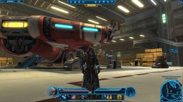
The default UI
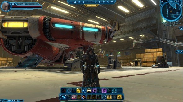
Here's the base UI you'll see when starting the game. Nothing fancy--just the bare bones. It works great, but there's so much more we can do with it now!
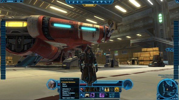
Add action bars and find the new UI customization menu
Click on the small icon with a plus sign on it at the top-left of your main action bar to open the menu for your new interface options. A few default options will be listed there, such as Default (keeps it as-is), Extended Quickslots (which adds the maximum number of action bars to your screen), and Retro (which mimics World of Warcraft's interface).
I recommend starting by activating the Extended Quickslots profile, to give you all the options on screen for you to work with. Custom profiles that you've created and saved will appear underneath the pre-made options in this menu.
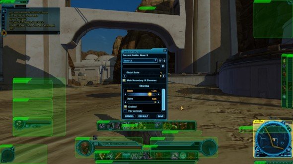
Move, scale, and destroy to your heart's content
The biggest gaming news, reviews and hardware deals
Keep up to date with the most important stories and the best deals, as picked by the PC Gamer team.
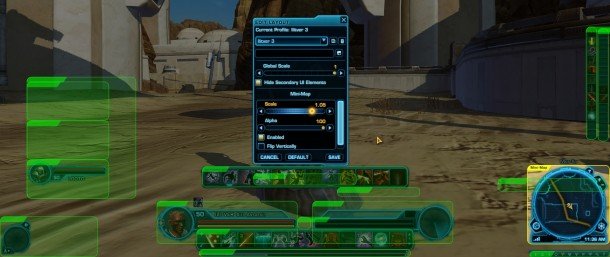
Selecting Open Layout Editor at the bottom of that menu will cause everything in the interface to glow green. Do not panic--you didn't break it. You're now free to move everything you see on the screen.
The large box in the middle houses all the variables for editing your interface. The top portion allows you to save your current layout as a new template, such as "Josh's totally radical Sniper setup." The section just below that allows you to set the global scale for your interface, shrinking everything in unison to a size more to your liking. Personally, I prefer about 70% to show me more of the game world.
Clicking on any element opens up the options menu specific to that element in the bottom half of the layout editor box. Click on the minimap for example, and you'll be given the option to alter it's scale independently of the rest of the UI, it's alpha (transparency), flip it vertically, or even disable it altogether.
Everything that's always on screen can be tweaked this way, giving you complete freedom to put things where you want them and the shape you want them in. Unfortunately temporary UI panes like the character window or crew skills window pane cannot be changed, but I still found the new customization options to be incredibly freeing and I'm much more happy with my new interface. I hope you are too!
