How Rembrandt, Princess Mononoke, and an emu with arms inspired Inside's flesh potato
The story of Inside's very weird ending. (Spoilers ahead!)

Spoiler warning: The last section of Inside is a surprise, in more ways than one. If you haven't completed it, I strongly suggest you do before reading.
At the Game Developers' Conference in San Francisco this week, four members of the Inside team talked through the technical specifics of how they made the thing they call the Huddle: the lurching, wobbling mass of flesh and limbs into which you are absorbed towards the end of the game.
It's a moment that probably got a reaction out of everybody: disgust, bafflement, laughter, disbelief. But most of all surprise. Is this really happening? Can I really control this? Is this the game now?! And how the hell did they make it?
The answers are yes, yes, yes, and they'll tell you, in incredible technical detail. Each of the four speakers is a specialist in a different field, and each delved deep into the guts of their work.
The concept
The Huddle was not a late addition—it was planned and visualised right at the start of the game's six year development, with concept art and concept animations. Andreas Normand Grontved is an animator, and his job was to look at a piece of concept art for this gross blob of flesh and limbs, and visualise how it should move. His first thought was of the boar-demon from Princess Mononoke: a giant beast writhing with tentactles, which "morphs and recalibrates to accommodate its mission." But he also thought of the indie game Gish, where you play physics-driven blob of goo that can stretch and squish to squeeze through the environment.
Andreas combined these inspirations into a series of concept animations that are much like the final thing you saw in-game: a lurching, towering mass, that both grabs and scrambles with human intentionality, while squashing and deforming around its environment like a sack of fat. A sound designer lent his "elaborate recordings of oily naked people getting slapped with pieces of meat" to complete the effect. Andreas made it pee, from some unseen urethra halfway up its wobbling mass.
But none of this is actually used in the game—even if they made thousands of them, pre-canned animations would never make the huddle move as fluidly as it does. The reality is as big and complex a hybrid as the huddle itself.
The biggest gaming news, reviews and hardware deals
Keep up to date with the most important stories and the best deals, as picked by the PC Gamer team.
The potato
The real huddle is a potato-like mass of flesh hovering a few feet off the ground.
The huddle's big secret, how they pulled off something that looks like a believable physical simulation and yet plays smoothly, is that it doesn't use its legs. Or its arms. Or the one leg that's sticking out of the top like an arm but isn't. They don't propel its motion or its grip at all, they're just being dragged along for the ride.
The real huddle is a potato-like mass of flesh hovering a few feet off the ground. And the behaviour of that mass was what programmer Lasse Jon Fuglsang Pedersen worked on.
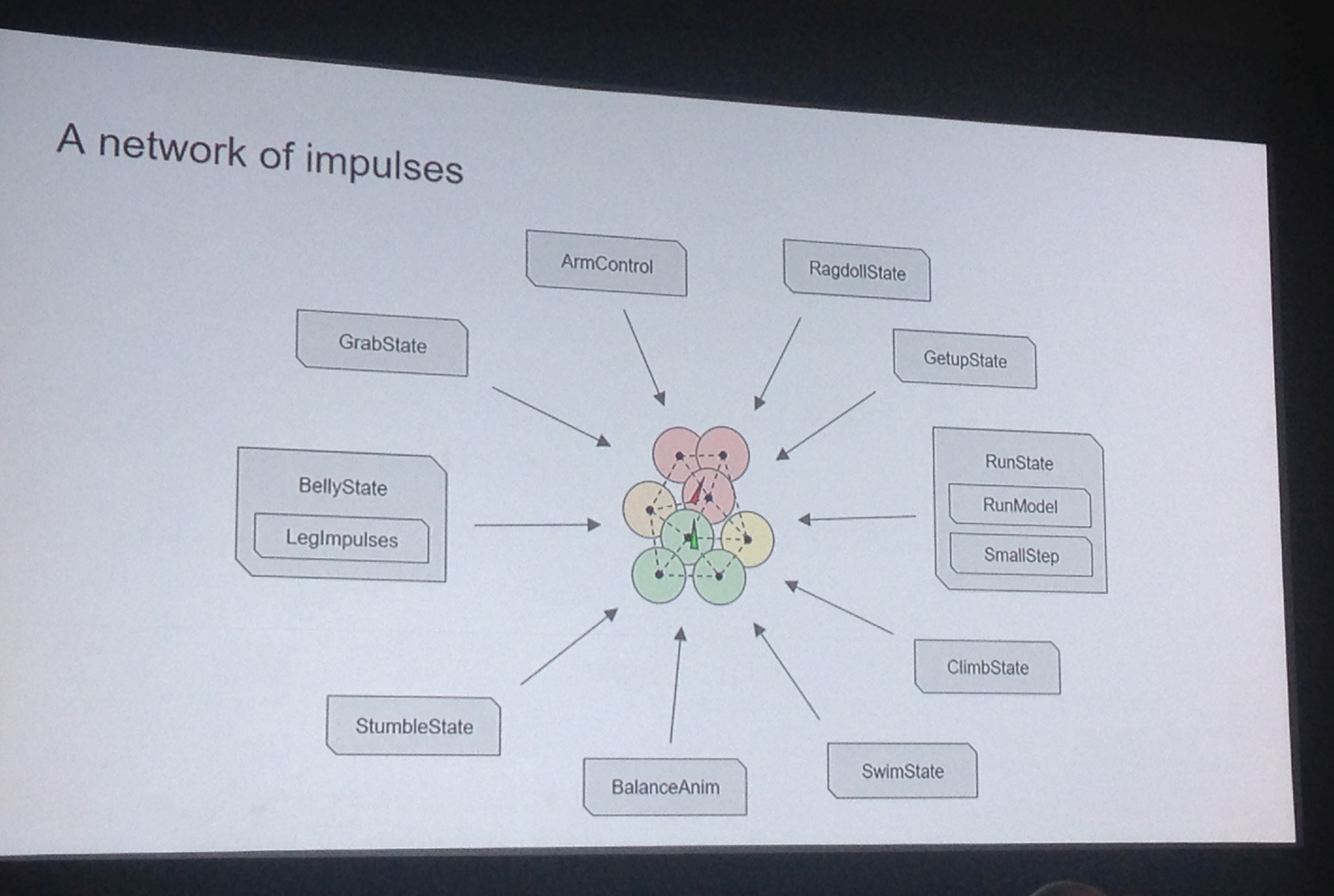
That blob is made of 26 "dynamic bodies"—balls that are glued to each other with invisible spring-like forces. As they're shoved about by you moving the blob around, or bumping into things, they try to stay a particular distance from each other. And the further they're pulled apart or compressed together, the harder they push back. That's squishiness 101.
Because the blob is tall, and because it's physically simulated, it falls over a lot. Lasse could force it to right itself, but a towering thing like that popping upright looks odd. So he used the huddle's squishiness to its advantage: when you fall over, those secret blobs it's made of just reorganise themselves: the ones that are now on top are happy to become the upper half of the body. Now all it has to do to stand up again is stretch up a bit.

The limbs
He shows us a GIF of an emu with animated arms that illustrates exactly what he had to achieve with the huddle's limbs.
Soren Trautner Madsen is a gameplay programmer. His job was to take the floating flesh potato and cover it with limbs. Specifically, he had to figure out how to make those limbs move in a way that gave the blob weight, life, and intentionality. It was already fully playable—you could lurch around the environment with smooth controls, pick up crates, and throw them around. There was just nothing connecting the blob to the ground or anything it held.
So Soren wasn't allowed to change how the blob actually moved, he just had to make it look like the limbs were causing the motion that was already there. Since Inside's release, he's often been asked how many thousands of animations it must have taken to make the legs look right. "I'm almost embarrassed," he says. It's six.
A leg can run forwards or backwards, and it can be bent low or stand up straighter. And it has a few idle animations. The rest is all done with blending: as the blob is squashed towards the ground, the legs affected transition smoothly from their 'tall running' animation to their 'low running' animation, even as they animate. This is not even a new or complex process, and it works much as you'd think: when the blob is halfway to its lowest position, the knee is halfway between where it should be for 'tall running' and where it should be for 'low running'.
And yet it's hard to believe it's this simple, even as the coder who did it is showing you how it works. I watch the blob pushing itself against a wall, and the way one backwards-facing leg kicks and shoves looks so much like a human intelligence trying to assist the motion from an awkward position—like a dad lifting a sofa. It's even harder to believe this motion is having no effect at all on the movement of the huddle.
But you only have to look to Soren's own inspirations to see this effect in reality. He shows us a GIF of an emu with animated arms that illustrates exactly what he had to achieve with the huddle's limbs. Without the arms, the emu looks excited, but there's so much less character and intention that we can read.
The skin
Not only does it need texture, but that texture needs to smooth the shape and catch the light in a way that looks like fleshy sack.
All these frankensteinian components of the huddle look odd if you actually see them: it's like a bunch of fat, neon grapes. Not only does it need texture, but that texture needs to smooth the shape and catch the light in a way that looks like fleshy sack. That fell to visual effects artist Mikkel Bogeskov Svendsen, whose job is a sobering glimpse into how much work goes into a game that looks as good as Inside: "Most of the time I made and maintained water. But I got to do something fun—this guy."
For the look of the huddle's skin, Mikkel drew from John Isaac's uncanny sculptures of fat bodies pooling and bulging, and from the way Rembrandt painted skin in his portraits. Rembrandt used strong reds and yellows and browns on faces, yet the overall effect is convincingly human skin.
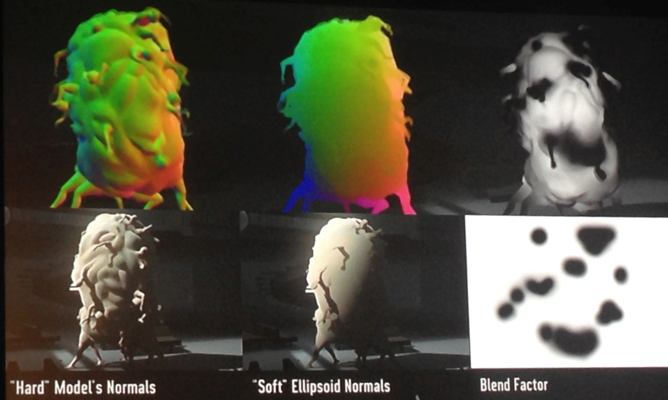
The technique usually used to add the illusion of detail to a 3D model is called normal mapping: you don't actually model every bump and crevice in a surface, you just paint a 'map' of which bits should catch the light and at which angles. But Mikkel didn't actually want the huddle to be intensely detailed—he wanted parts of it to be vague and smooth like the original concept art. So he also tried what he calls 'normal unmapping'—making the surface look less detailed by having it all reflect light the same way, as if it were completely smooth. "It looks like a meaty soap bar," he says.
Neither approach is quite right, so he painted a new map that combines the two: ramping up the light-catching details in areas he wants you to notice, but leaving big areas of the model smooth and "vagueified" to match the stylised look of the rest of the game.

There are dozens of other tricks. The huddle looks best lit from the back, but doing that artificially of course looks false. So instead, any light that does naturally come from the back is magnified, making the most of the artistic effect any time it makes physical sense. Then there's the 'chicken skin normal map': an extra layer that adds poultry-like dots and veins, but only lets them catch strong direct lights, so you'll only see them briefly glint.
It all sits in this fascinating, complex land between maths and art, finding slightly tricksy ways to make something very simulated match an art style that's very directed. It sounds like a staggering amount of work, for one bizarre section of the game that you don't even want to tell your friends about because it'd spoil the surprise. It's not hard to see why Inside took six years. But it's also hard to argue with the results. No one makes games that look quite like their's, and sure as hell no-one else has made anything like the huddle.
Tom Francis is a former PC Gamer writer turned game developer. He released Gunpoint in 2013, and is currently working on Heat Signature. Tom offered to write up his thoughts on some of the GDC panels he's attending this year.

