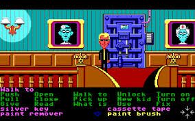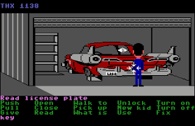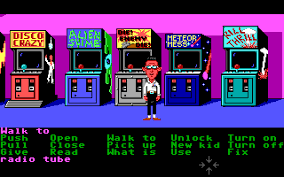
It’s hard to imagine what adventure games looked like before Maniac Mansion, although that’s partly because most of them looked like a big wall of text. Prior to Maniac, adventure games and text adventures were pretty much the same thing. There were a handful of what might generously be termed “graphic” adventures, such as Mystery House and the early King’s Quest games, but these were still text adventures at heart. The communication of what environments looked like was still mainly done through writing, and they relied on interfaces that required the player to input commands (Walk to, pick up, talk to etc) manually.
There’s a good reason why text adventures let you type in commands yourself. It implies the player has infinite possibilities at their disposal, establishing the most basic illusion of player freedom that games have been building on ever since. Just as open-worlds lets you wander in any direction and space simulators like No Man’s Sky let you visit billions of planets, text adventures let you type in any command you want.
Even now, with hundreds of meticulously rendered virtual worlds to explore, I find the blinking cursor at the bottom of a text adventure a tantalising prospect. But as anyone who has played a text adventure will know, it’s a spell that’s broken the moment you type in a command and the game replies with its equivalent of “Sorry, I didn’t understand that!”. It’s like running into an imaginative brick wall, shattering your immersion like a brick wall shatters teeth.

Step forward Maniac Mansion and its ground-breaking verb-object interface, designed specifically to eradicate the frustrating command-line guessing game from adventure gaming. Rather than forcing the player to figure out what commands worked, Ron Gilbert and Gary Winnick decided that all of the available commands would be represented on screen. The player could then click on one of those commands (i.e. “Walk To”) and combine it with an object in the game world (such as a door). In effect, you’re still constructing a sentence which tells the game what you want to do, but you’re doing so through a visual medium rather than a textual one.
The story behind the verb-object interface is fascinating, because it didn’t develop gradually. The idea was fully formed as early as the concept stage for Maniac Mansion. Gilbert and Winnick’s original proposal document from 1986 (which you can read in full here) describes the system exactly as it was implemented, stating “The player will always be able to see all the buttons ever used in the game. No buttons will appear or disapear [sic] as the game progresses. This will allow the player to know all the choices he has from the beginning.”
It’s worth noting there’s some evidence the interface is an iteration of an earlier LucasArts adventure concept that was never put into production. I was a teenage Lobot was pitched by Gilbert in 1985, although this time working with Noah Falstein and David Fox. It cast the player as a teenage boy on a space station who has his brain accidentally transplanted into a shoe-buffing robot. A running joke in the game would have been the robot could only communicate through a limited number of sentences, which the player would be able to scroll through rather than inputting the commands manually. Incidentally, this interface had the even less catchy acronym of TATLIUAJAB (totally awesome text line interface using a joystick and button).

What’s strange about verb-object interface is that it is in effect a limiting of the player’s possibilities. Rather than pull the wool over the player’s eyes with a potentially infinite number of commands as a text adventure would, Maniac Mansion confronts the player with everything they can do in the game from the start, amounting to a total of fifteen verbs. But the way it is presented has the opposite effect. It immediately demonstrates all the possibilities open to the player, presenting them in a positive way, whereas playing a text adventure involves a slow chipping away of everything that’s not possible until you hit on the correct solution.
The biggest gaming news, reviews and hardware deals
Keep up to date with the most important stories and the best deals, as picked by the PC Gamer team.
It’s a remarkable bit of systemic sleight-of-hand. Maniac Mansion is more honest with the player about the limits of their freedom, while also making those limits feel more expansive than what has gone before. In a way this is a hallmark of the broader LucasArts adventure game template. The silly red herrings, the replacing of vanilla “I can’t do that” command rejections with varied, witty responses, are all examples of taking the limits of adventure games in the late eighties and framing them as an integral part of the experience, making these small 2D worlds feel fuller and freer than they ultimately are.
Maniac Mansion’s interface was hugely influential both inside and outside LucasArts. Within a few years, nearly all adventure games had ditched command-line interfaces in favour of what eventually became known as “point ‘n’ click”. This included LucasArts’ main rivals Sierra, who used it for games such as Gabriel Knight. It was simply much more efficient, especially with games that the player could explore through looking at the screen rather than reading from it.

But the reason LucasArts continued to use the verb-object interface wasn’t just because it worked. They were also kind of stuck with it, because the interface was hardwired into the SCUMM engine. When you look at a LucasArts adventure game, the verb-object interface isn’t an overlay as you would find with most modern game UIs. The game world literally sits on top of the interface. In fact, when you click on the screen, the first thing SCUMM does is figure out whether you clicked above or below the line that separates the game world from the interface.
In other words, even if LucasArts had wanted to dispense with the interface for some reason, doing so would have been extremely difficult. Over the years it evolved with the games that LucasArts released, introducing sleeker, icon-based versions in games like Full Throttle. But these systems still used almost exactly the same logic and codebase as Maniac Mansion. Eighty percent of SCUMM’s codebase went unchanged between 1987 and 1997, when the final SCUMM game, The Curse of Monkey Island, was launched.
LucasArts’ repeated use of this interface, and their continued success with it, set in stone the structure of 2D adventure games, and still maintained influence when 3D adventure games began appearing. What’s more, virtually every evolution of adventure game interfaces since has been in response to the work done by Gilbert and Winnick on Maniac Mansion. Attaching the verbs to the mouse cursor, or adding context sensitive-actions, all follow the same evolutionary thinking of making those interactions with the game world simpler and more natural, minimising the chance that the player will be rebuffed by the game’s rules, and maintaining the illusion of freedom within the fiction.
Most Popular


