How level designers make us feel smart
While also balancing story and environment in plausible worlds.
Ubisoft Toronto level design director Matt West will never approve a four-meter-high wall. Three-meter-high walls look scalable, he told me over the phone, and five-meter-high walls look unscalable, but four meters high? That’s a confusing wall. You’ve got to run up to it and mash a key to find out if you can climb it—screw that, get rid of it.
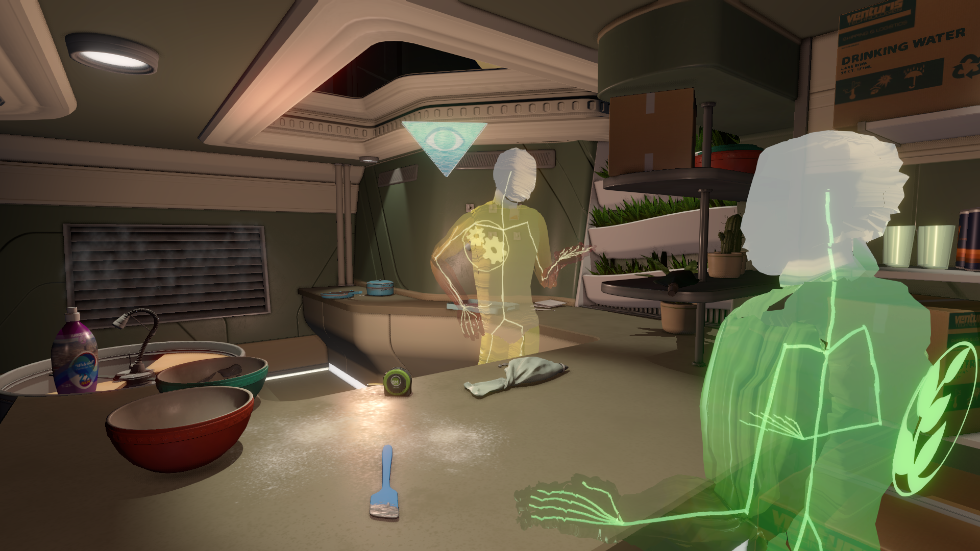
West works on some of Ubisoft’s big open world games, including Far Cry 4 and Far Cry Primal, which feature vast environments. At the same time, another level designer, Nina Freeman, is wondering what someone’s bathroom might look like. Freeman started her career studying poetry in New York, where she developed an appreciation for 70s and 80s poets and “vignettes about ordinary life and people’s life experiences.” She’s now a level designer at Gone Home developer Fullbright, working on science fiction exploration game Tacoma, and thinking about how people live on a spaceship: What’s on the dinner table? Who left a sock on the floor?
Putting a light at the end of a hallway, according to West, will nearly always attract the player’s attention.
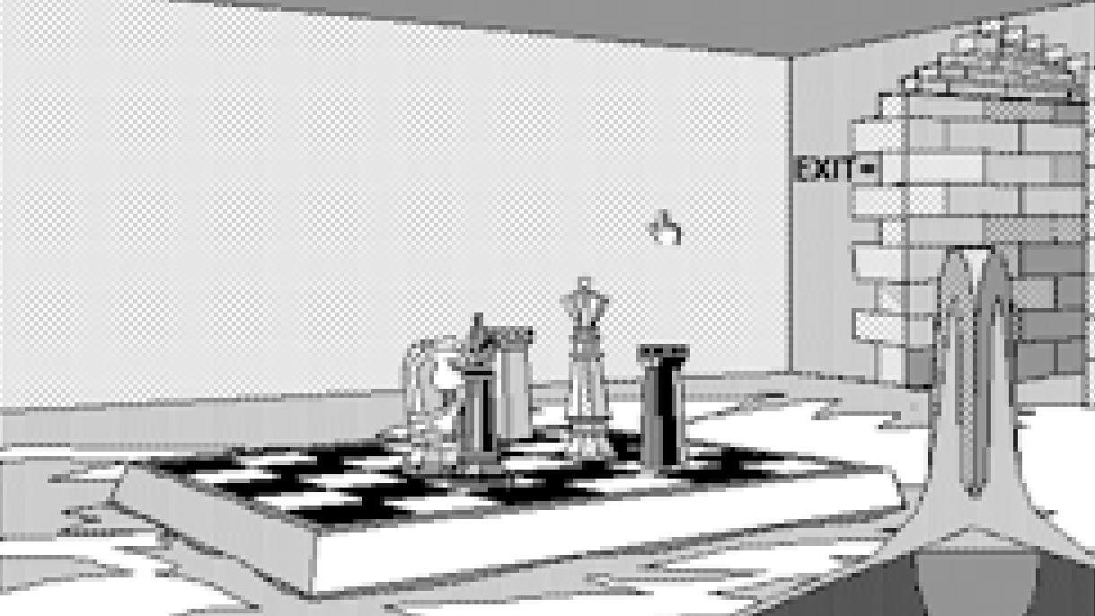
Freeman probably thinks about wall height too, but level design is such a broad pursuit that gunfights and Jeeps and mountain tops and stray socks exist in the same discipline. It involves psychology and storytelling and logic mechanisms and architecture and ecology. Rand Miller, one of the creators of Myst (along with his brother, Robyn Miller) and the recent Obduction, was designing levels nearly 30 years ago as black and white still frames, and says he still “hasn’t really figured it out yet completely.”
I interviewed West, Freeman, and Miller—as well as a couple other level designers over email—looking for commonalities in their work. I wanted to see what sort of tricks they use to guide players. Putting a light at the end of a hallway, according to West, will nearly always attract the player’s attention—and that’s the sort of thing I was after. But 10 wild and wacky tricks level designers use to totally Criss Angel mindfreak us didn’t turn out to be exactly the story I found. What fascinated me is how much else these designers share in common, whether they’re making a firefight or a puzzle or a crumpled note on a kitchen floor, and how they seek to gently guide us toward clever thoughts.
Clear, but not obvious
West describes level design as the practical counterpart to game design’s theoretical art—if a creative director decides what kinds of decisions and experiences should be in a game, the level designer creates specific decisions and experiences. Even on the practical side of game design I found that there’s a lot of theory, but wall height is important too. In the practical work and testing, you see echoes of the big ideas.
When there are boundaries that aren’t walls, for instance, Warframe’s lead level designer Ben Edney tries to make them “clear, but at the same time, not obvious” through differences in materials and lighting. Before having heard that, I coincidentally asked Miller how he makes his obscure worlds, which hint at puzzle solutions, clear, but not obvious. He laughed and acted flustered. That’s one of the challenges he’s been experimenting with throughout his life.
It’s all experimental, as far as Miller is concerned. He got his start designing levels for children’s games such as The Manhole. “The advantage we had is it was just a mouse and one button, and we could sit a kid in front of it and watch what they do, and it was amazing how kids and adults did the same thing in front of those early games,” said Miller. “They’d click on the same spot, you could entice them to click somewhere, entice them to go somewhere, and we had to figure out how to give them continuity, connect all the dots.”
The biggest gaming news, reviews and hardware deals
Keep up to date with the most important stories and the best deals, as picked by the PC Gamer team.
The advantage we had is it was just a mouse and one button, and we could sit a kid in front of it and watch what they do.
Rand Miller
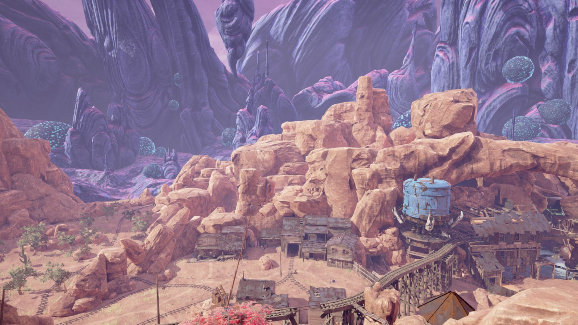
As a puzzle designer, Miller has a somewhat unique perspective—he wants players to be stumped, at least for a little bit—but the dots should all be there to see so we can connect them. At one point in Obduction, the player is asked to restore power to a building (aren’t we always) and the solution is to look up, see a powerline, and follow it, “a literal connection.”
“It’s amazing how many people, though, walk out of that hut and don’t see it, don’t put that together," said Miller. "But at some level, then, it’s not up to me anymore. We did our job.”
In that case, the powerline was enough. But watching testers fumble to make sure they only fumble so much does often lead to changes. The week before Obduction was released, for instance, Miller and the team added a license plate to a desk. “We put it there because we were seeing a lack of connection, and hearing it from some of our testers, and that small little change gives people, a lot of times, just the push—it might even be subconscious—a subconscious push to make a connection to something that was important in that space.”
Finding a path
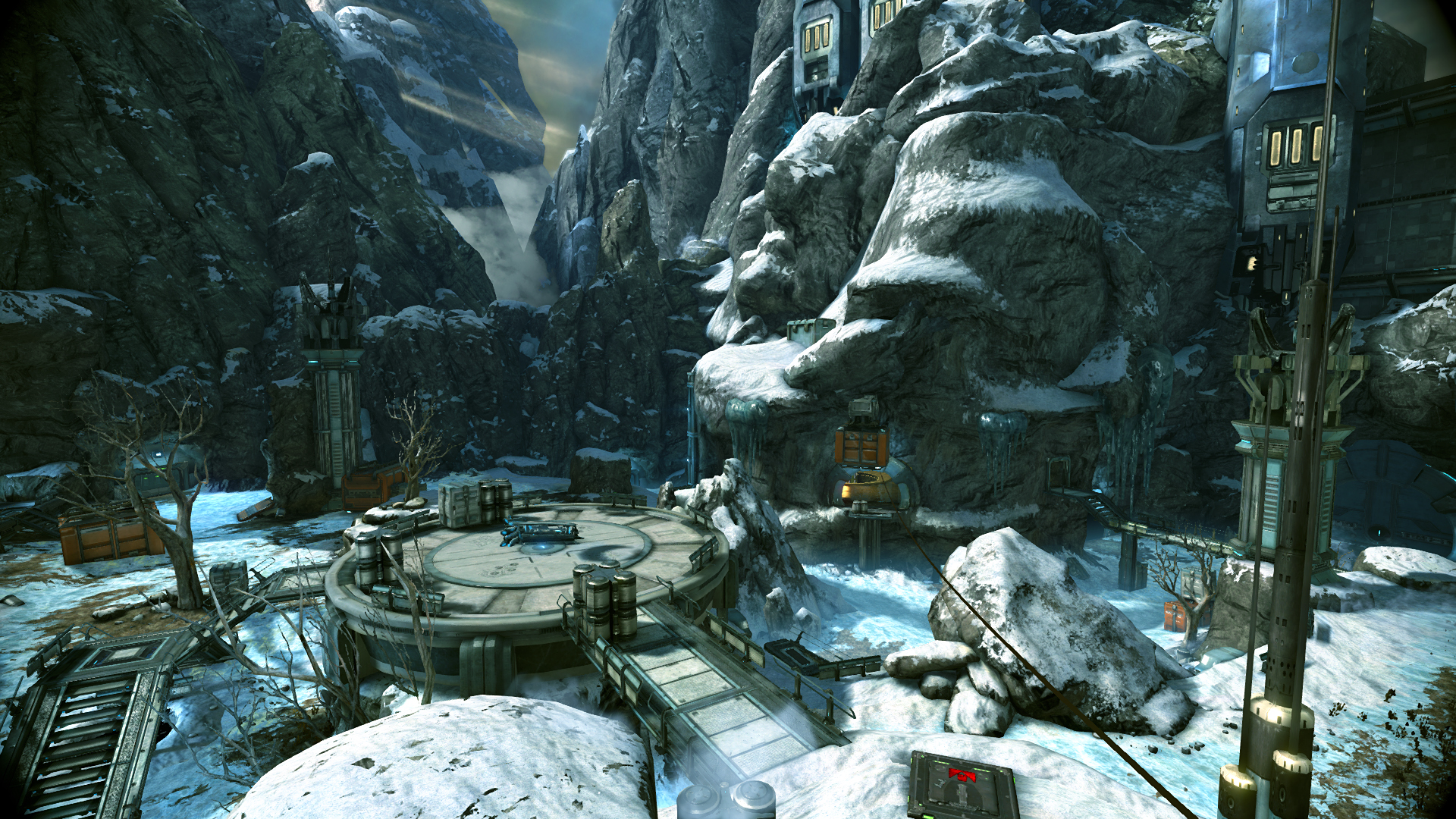
Aside from keeping players on track with well-placed license plates, I heard a few things that might be called ‘tricks’—that Criss Angel headline isn’t bad, so don’t count it out for the future—such as using enemy pathing to direct the player. But what I found more of were good old fashioned architectural principles, such as what Warframe’s Edney calls “hierarchy of space.”
“This is essentially designing our crazy sci-fi levels with the same considerations one might plan a new building in the real world,” Edney wrote. “Main through-paths are open, clear of obstacles, and generally inviting when first entering a room. Side rooms and access hallways are tighter, more defined in their usage and utilitarian.”
The same goes for Freeman and Tacoma. She’s concerned with spaces people live in, and how they’re laid out in our world—be it natural or cultural, it’s what we already experience. Bedrooms are typically tucked away in the backs of houses, not the front. More fundamentally human, if you find a kitchen, you should probably find a bathroom somewhere in the same area. Granted, Tacoma takes place on a spaceship, so there’s also room for set pieces that “aren’t going to be totally plausible”—but as long as they’re plausible enough the player can get around with their already-learned understanding of architecture.
In the world, there definitely are dead ends, and I’ve had level designers kind of glibly inform me of that fact.
Matt West
Good architecture is one aspect, but designers have to support the game design as well, and give players the opportunity for clever solutions—a game where you can scale walls would suck if 90 percent of walls weren’t scalable. And there’s balance to find between complex mazes and stifling linearity.
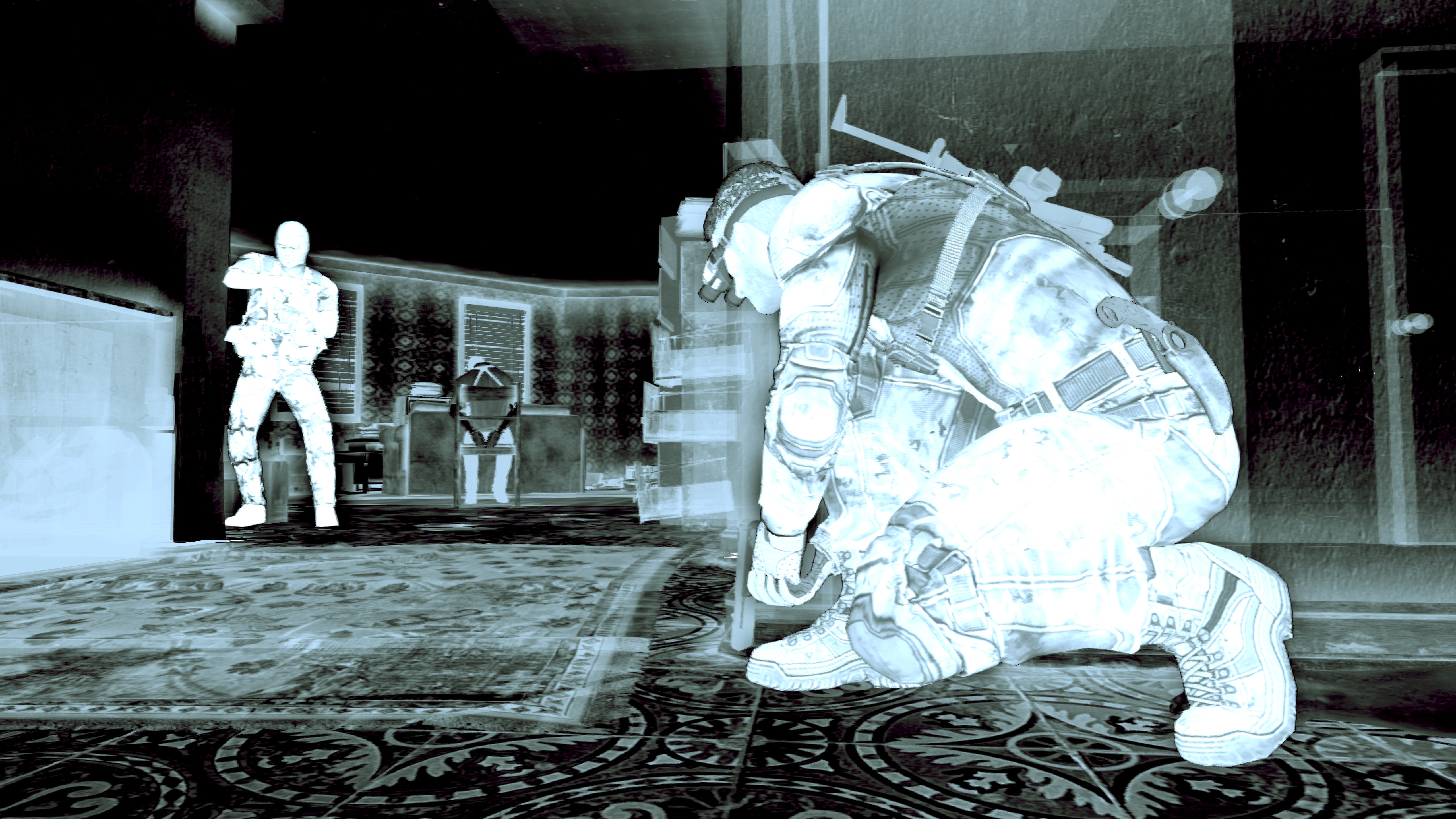
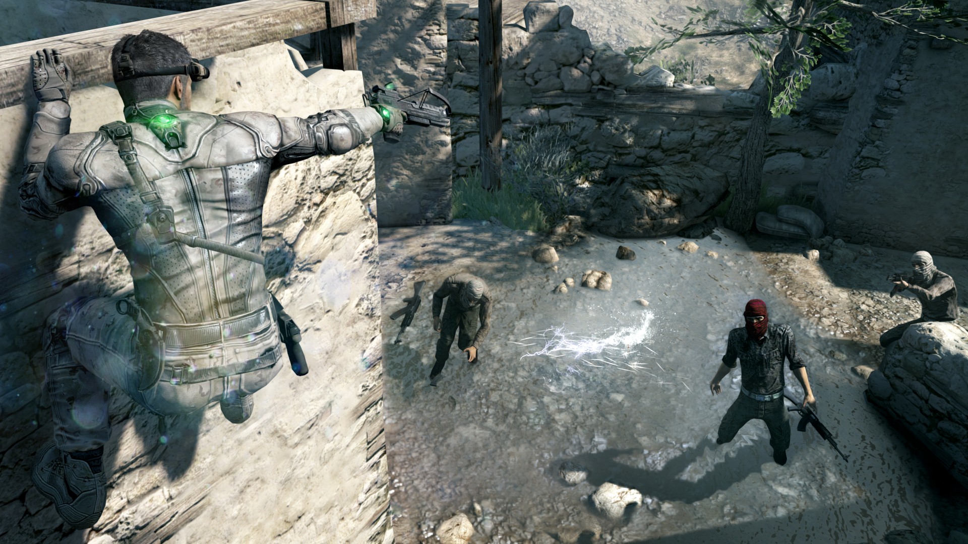
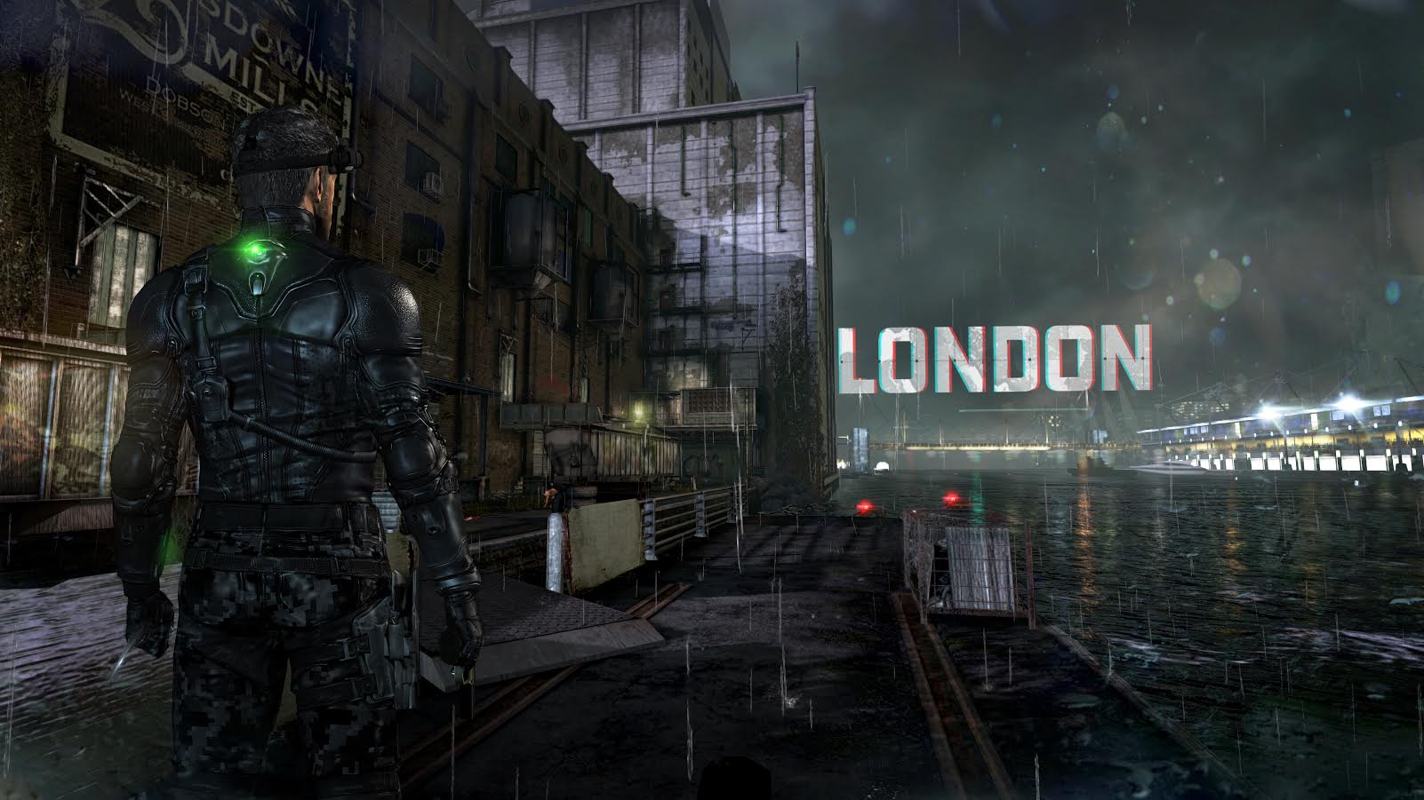
Earlier in West’s career he worked on Splinter Cell: Blacklist, which he describes as linear, but “Splinter Cell linear”—meaning that there was always more than one way to approach a problem. There’d be a center path, more brightly lit and obvious than the others, for instance, and contrasting paths to either side. Maybe one goes to the left and below and the other to the right and above. And all of them should feel like good choices.
“In the world, there definitely are dead ends, and I’ve had level designers kind of glibly inform me of that fact,” said West. “But in a game, it just takes the wind right out of your sails. The whole thing is about making players feel smart, making players feel like they’re intuitively selecting good routes, but then smacking into a wall? That is a personal pet peeve of mine.”
Now that he works on open world games, West has many more paths to think about than he did with Splinter Cell—as many as the players want. Out there in the wild, big landmarks in the distance give guidance, and that’s a major principle of Obduction’s design as well: there’s literally a big red beam on the horizon. “You can’t even see what the source is,” said Miller. “But we knew when we put it there that everyone would head over that direction, of course they do.”
Opening up
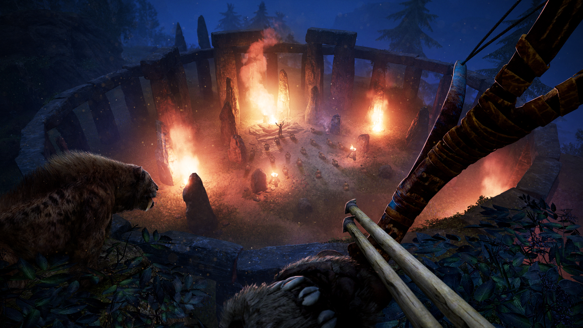
For West, open world level design is about getting out of the player’s way, letting them tell their own story. It’s “almost like you’re dressing kids to go play outside in the winter,” he said, recalling a conversation with a recently-hired junior level designer. “You’re giving them scarves, hats, and boots and all that stuff, but eventually they’re going to go outside and throw snowballs. So we’re just preparing them so that they can do that stuff, but we’re not telling them to throw exactly 13 snowballs and then take cover behind a tree.”
He has another metaphor: a buffet table with all the different types of foods the player could want. The food is actually elements of the game design and different playstyles, of course—so if the player wants to stealthily eat a banana, it’s there. If they want to throw a steak at someone, that’s an option as well. I might be mixing up his metaphors. The point is that West tells young designers to pull back on any urge to design specific action sequences.
You’re giving them scarves, hats, and boots and all that stuff, but eventually they’re going to go outside and throw snowballs.
Matt West
“The player is the best storyteller,” said West. “If I see this kind of elaborate set up, and the level designer is saying, ‘Enemies are going to come in from here, and then there’s going to be a big swinging scythe, and then you have to jump to this spot, and turn and fire,’ I will just turn around and tell her, ‘No, we’re not doing that. We’re going to say the scythes can be there, and the enemies can be there, but there’s got to be three or four or five ways to get out of this situation.’”
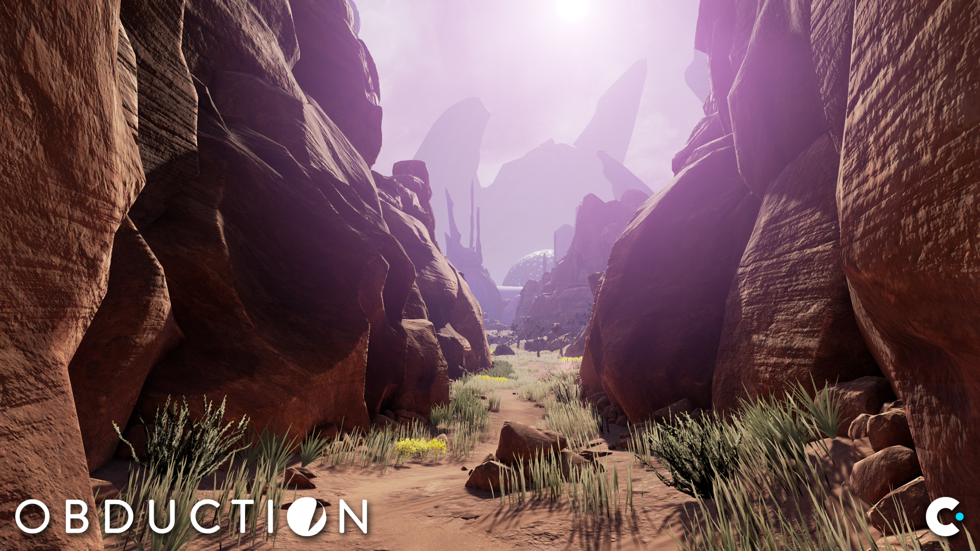
Miller also employs open areas and branching paths, and our conversation took West’s thoughts about preparing players further. Miller compares games to trips to foreign countries, in that the unfamiliarity can be stressful at first.
“We realized that providing people completely wide open space to start with, with options in every direction that you can just click anywhere and do anything is not a very reassuring way to start a game,” he said. “People don’t respond well to that. They feel a little inhibited, they are uncomfortable with so many options.”
As a result, Obduction begins in a cave—which is very similar to Fallout 3 starting in a vault—with only one direction to go. Outside of the cave, there’s a canyon that begins to widen. (West also mentioned that widening paths attract players, while narrowing corridors do the opposite.) As the canyon widens, there’s still only one way to go—the world is expanding, but the player is still comfortably going in one direction—and then a man gives you a goal: go to the house with the white picket fence.
“It was very deliberate that we gave you the goal before we branched open the path,” said Miller. “Because now you have the assurances of, ‘Well I have the white picket fence in my pocket, I know I can go there eventually,’ and you feel the freedom to start making some choices without anxiety. Now it’s interesting to see what players do depending on their style, whether they’re rebellious and like, ‘Screw you, I’m not going to the white house with the white picket fence, I’m going over here to the second path that you didn’t tell me to go on.’
“Well, they can act all rebellious but the fact of the matter is they’re only doing that, they only have that rebellion in them, because they have the security of the little goal in the distance.”
Plausible spaces
Freeman is less interested in how players might find their way through a canyon, and more interested in the little details of life. She loves the bar in the game Catherine, for instance, where the player can sit with friends, go to the bathroom and look at their phone, play an arcade game. “It’s all these little, little moments, and I like that stuff because that’s just what I do every day,” she said. “And I think ordinary life is interesting and I like to see the ways in which these game designers are putting their characters into those situations, and what those spaces are like. I’m always just like, ‘Put more bars in your videogames!’”
I’m always just like, ‘Put more bars in your videogames!’
Nina Freeman
Her focus on Tacoma is making spaces that feel lived-in, and it was her previous game, Cibele, that led her to Fullbright. “The kind of level design I was doing on [Cibele] was, ‘How do I design an in-game computer that feels plausible and feels lived in,’ very similar to how someone might design a bedroom in Gone Home or something,” said Freeman. She had never designed a 3D level before joining Fullbright, but a penchant for designing around authentic stories was there. “Tacoma is definitely about ordinary lives and people who feel like you could know them, like they could be your neighbor. That’s what we share despite coming from different backgrounds.”
While Freeman’s focus is heavier on tasking players with putting together the remnants of an ordinary life—connecting dots in a different way than in Obduction, or in Far Cry 4—all three designers share a desire to build plausible spaces.
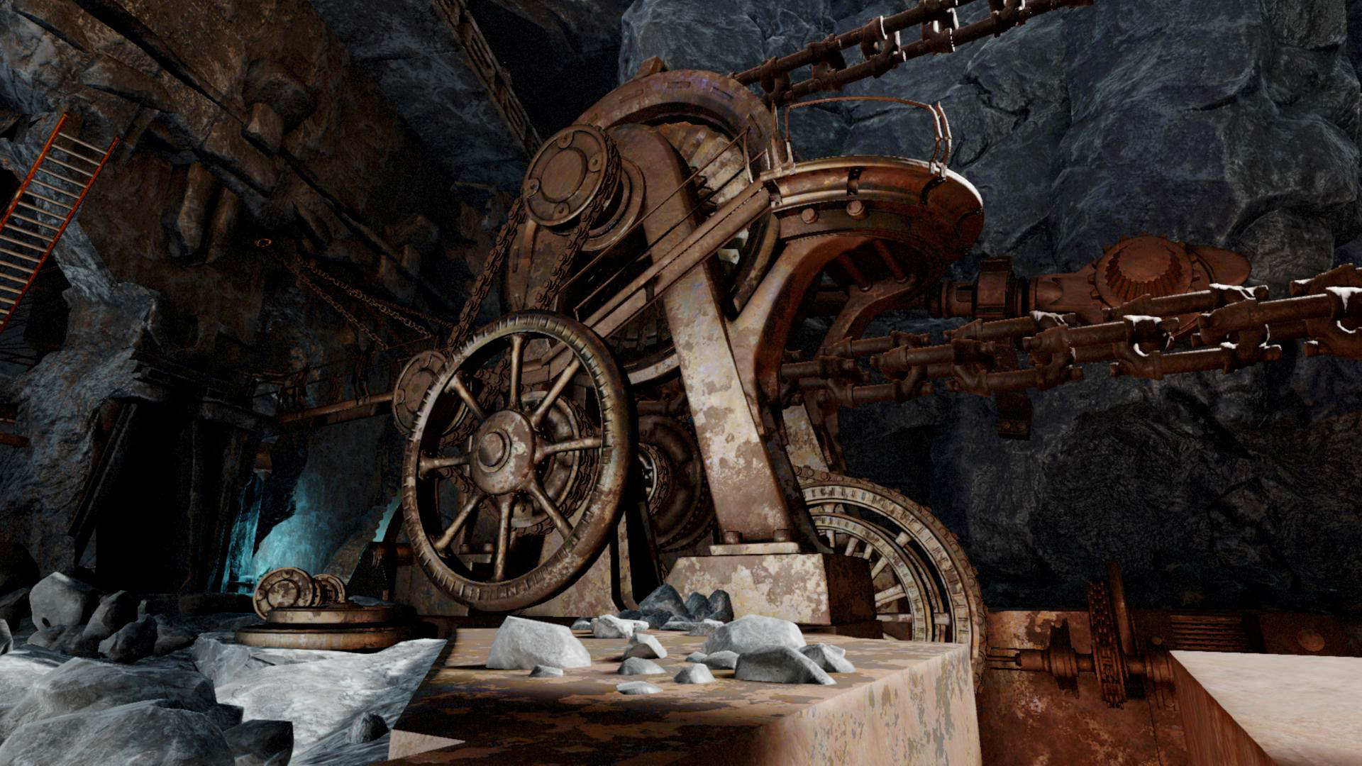
"The puzzles have to fit the world as best as possible, at least the way we do it," said Miller. "Jonathan Blow loves to feature the puzzles, so his levels, the puzzles that are there just in some ways can be arbitrary, because the thing is the puzzle. But I think what we've done and what we've gotten to in our little niche, what we do, we're trying to balance all three of the legs that I think are interactive: the environment, the puzzles, or whatever the friction is, and the story."
He added later that it’s “a pain in the ass.”
“We have people who are in charge of those aspects. So the art guy may come up with a visually stunning looking piece of equipment, but the story guy goes, ‘That doesn’t make sense, that couldn’t be in this world,’ and we have to figure that out.” The same goes in any direction—puzzles that don’t fit the story, story that doesn’t fit the art. It must be cohesive.
For West, a level design could start as a sketch on a soggy bar napkin (he actually once approved a bar napkin scrawl as an initial design) or an MS Paint drawing, but from there he believes collaboration with artists is vital so that they “don’t get handed this dodecahedron that’s done in this gray flat texture and get told to turn it into a carousel.” He wants to see plausible spaces, and he makes a point of saying that it’s a team effort, that “the best level designers are the ones who work well with their artists.”
The best level designers are the ones who work well with their artists.
Matt West
A typical level designer can be seen as a balancer of Miller’s three legs—environment, obstacles, and story—which I prefer to call 'Miller's Pillars.' The other part of their challenge might best be summed up by that phrase I stumbled on earlier: be clear, but not obvious.
In Cibele, Freeman wants players to discover a folder of photos on a desktop, and later put together themselves why it’s there and what it means to the character. Miller wants players to have a “cognitive rush” as they discover how his puzzles and worlds fit together, without ever telling them explicitly how it all works. West wants players to choose their own path and feel good about it without being guided too closely—to know where to go, but to tell their own personal story on the way.
These level designers don't want to tell us what to do or think, but to guide us gently—like good parents. I think it’s telling that Miller delights that there’s no difference between what adults and children click on, and West thinks of the player as a kid getting dressed to play in the snow.
It's a good principle, but of course these are hardly the only game design philosophies. Miller doesn't make puzzle games like Jonathan Blow makes them, for instance. A favorite game of mine, Lovely Planet, forces players to perfectly execute the designer’s vision in an entirely implausible world—a very strict parent in an abstract shapeland. West would never design a shooter like that. Miller would wonder if the planet could actually be three planets, connected by giant gears. Freeman would add a bar.
So there are methods but not rules, and every level designer brings their own experiences and ideas to the task. But however I'm guided toward a designer's conclusions, I like it best when I'm shown the way, but not told.

Tyler grew up in Silicon Valley during the '80s and '90s, playing games like Zork and Arkanoid on early PCs. He was later captivated by Myst, SimCity, Civilization, Command & Conquer, all the shooters they call "boomer shooters" now, and PS1 classic Bushido Blade (that's right: he had Bleem!). Tyler joined PC Gamer in 2011, and today he's focused on the site's news coverage. His hobbies include amateur boxing and adding to his 1,200-plus hours in Rocket League.
