Gabriel Knight and the Colours of Voodoo
How the war between blue and orange helped a good game become great.
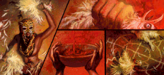
In this column Richard Cobbett dug into the world of story and writing in games—some old, some new. Sometimes, a bit of both. What can you tell me about voodoo?
Many years ago, John Carmack said of stories in games that they're like stories in porn movies, "It's expected to be there, but it's not that important." I've always disagreed... with the gaming side of that I mean, not the other. Story is wonderful stuff. It's what makes our victories satisfying, it's what turns a few pixels on a screen into a character that we can fall in at least platonic love with, and what turns, say, running around a city of glorified boxes into being given the freedom of Paris.
I love story. I hope you do too. If not, I hope to convince you over time.
Where a lot of people go wrong though is thinking of story as simply 'plot' - the reason why you're shooting aliens in the face, the dead wife and child justifying some angry man's rampage, the doomsday weapon somewhere on the final level. All that is part of it, sure, but done well story is a thing that touches every part of a game. It's in the script, but it's also in the design, in the ambience, in the music, and in what's allowed to be unspoken. It's not a thing that someone simply pours onto a game when all else is done... or rather, it shouldn't be... but something that goes down to the bones.
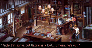
As such, I thought we'd start off by looking at a classic from a slightly different perspective. If you know anything about adventure games, then Gabriel Knight needs no introduction. If not, this 1993 adventure was one of the first mainstream titles to really go for the mature audience in a way that counted as mature rather than simply adult. It sold itself as a horror game, but it was its characters and meticulous exploration of voodoo (or at least, the convincing appearance of it, especially in a time before Wikipedia) that made it a legend. Later, there was a thing about a cat-hair moustache stuck on with syrup. Let's, uh, not speak of that. Ever.
As such an overtly story-heavy game, there's a lot of interest here, from the character relationships to the setting itself, and at least one thing that I plan to return to. Instead of the words and the plot though, let's kick off with something whose influence is almost never talked about - the colour palette. Gabriel Knight only had 256 colours to work with, and part of what made it such an impressive game was how far the artists stretched them to create amazingly detailed locations like the one above. As the game goes on though, it's soon revealed to be even cleverer than it first appears. Take a look at this, the first of several graphic novel style cut-scenes, where Gabriel meets his love interest and the technical villain, socialite Malia Gedde.
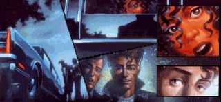
There's a lot more going on here than first meets the eye. This is the meeting of two different worlds, in a number of ways - hero and villain, rich and poor, hunter and hunted (though neither knows that bit yet...) This is represented visually by the use of complementary yet contrasting colours - blue and orange - to the point that Malia looks more like a sunbed obsessive than the leader of a murderous voodoo cult. It's a vivid look, made all the more notable by the fact that the artist could absolutely have gone with a more subdued, less illuminated skin tone had they wanted to - just look at Gabriel himself in the middle there. It's also notable that while Malia does get described elsewhere as having copper-colour skin, which is fitting, the poetic description of her at the start of the game opts instead for this:
I dreamt of blood upon the shore, of eyes that spoke of sin.
The biggest gaming news, reviews and hardware deals
Keep up to date with the most important stories and the best deals, as picked by the PC Gamer team.
The lake was smooth and deep and black, as was her scented skin...
Maybe it's just me, but bright orange is not the colour I'd personally associate with a deep lake. It is however surprisingly important within the overall art style...
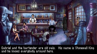
In particular, the contrasting colours are used throughout to represent the two lovers' different worlds - Gabriel's is cold, and for much of the game actively mundane. While there's a warmth to his bookshop, generally his parts of town are painted in blues and magentas - his cop buddy Mosely adding a dose of yellow with police tape, his jacket, and his office decorations, but otherwise maintaining the mundanity.
Malia's world however is implicitly one of magic and of mystery, with both fire and orange becoming recurring themes in any environment where those elements are in focus. She doesn't have exclusive rights to them, but when they appear outside of this context it's almost always either obscured or in a far more muted shade.

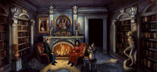
Orange in fact soon becomes an almost invasive force in Gabriel's world, as seen here in her house - the blues and magentas representing her public identity as simply a rich socialite and philanthropist (seriously, are they ever not evil?), but the fire acting as the focal point of the scene and Malia's red clothing doubling down on it.
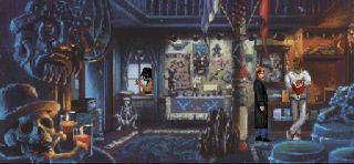
In a similar vein, this shot from the voodoo museum shows another member of the cult, Dr. John, carefully standing in the small pool of orange light rather than in the part of the shop meant for tourists. Also of note is that his corner is where you find the snake that's the only thing that tries to kill Gabriel for most of the early story.
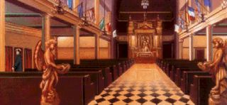
The more overtly voodoo related locations meanwhile go all-out for it. The Dixieland Drug Store that specialises in paraphernalia without actually being linked to the murders directly uses all orange. So too, initially oddly, does the church. This makes more sense later on when it proves to be the home base of the villains, accessed via a secret passage in the confessional. Yeah, this game does get a bit goofy. They have a whole James Bond base underneath it, complete with offices where people work and janitorial cupboards, but also a whole zoo full of voodoo related animals and a inter-office communication system that involves someone going to a sacrificial chamber and banging out codes on a drum. These guys badly needed e-mail.
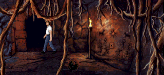
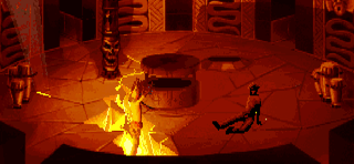
Even that late in the game though, the theme is continued. Here's an ancient tomb in Africa from the villains' past. Torchlight is of course always going to be orange, but someone still had to put them there, and the key colour remains notable...
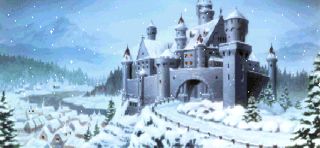
...while Gabriel's own ancestral home embraces the old contrast between cold and warmth, blue and orange, to the point of looking like this in the middle of summer! (The castle is one of the major changes made by the remake, upgrading it to the sequel's more modern one and surrounding it with greenery. I totally agree with this, because the snow is bloody stupid in the original. Theme only goes so far!)
Now it's certainly not the case that every case of fire and every splash of orange in the game feels like part of this theme, but these patterns are present and notable throughout most of it. It's a natural fit in many ways. The main story revolves around a family of witch-hunters (technically, shadow hunters, but it's a witch at the centre of this story), whose mistakes have led to their family declining while Malia's rose in power to become the rulers of New Orleans. In a very real sense, they've stolen their fire. It's a thematic element that bookends the game. The first thing we see is Malia's ancestor burning at the stake while Gabriel's watches and regrets his decision. The very last thing is the final battle between the two families literally ripping New Orleans apart (in arguably the only scene in gaming that makes geologists weep more than taking a tour of World of Warcraft) as Gabriel finally atones for the past.
This use of contrast is something that Gabriel Knight gets fantastic use out of, allowing it to keep its most powerful colours for its biggest scenes, but also creating a mood that's at least slightly unsettling without ever being too noticeable. In the first instance, there's a distinct split between the areas in which Gabriel is comfortable in, and those where he's at least somewhat out of his comfort zone - daffy voodoienne Magentia Moonbeam for instance is no threat, and she's just treated as a kook, while the drugstore whose owner casually mentions human sacrifice and then immediately claims all his stock is just to milk passing tourists has a slight alien element to it.
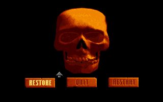
Its use even extends to the death screen; the triumph of orange.
It must be said though that after a while, you do start to wonder about the voodoo cult's membership. They don't really do a lot during the game, and never seem to be around. Even when you go into their base, it's largely deserted. So who are these cultists? Let's see... almost entirely unknown, very mysterious, most likely bright orange to keep with the general theme they've got going here... very likely on the far wrong side of politically correct by modern standards... wait a damn minute!

Oompa Loompa, doing Voodoo
Delivering just one last warning to you
Oompa Loompa, we guarantee
Stop or you'll be eaten by Ogun Badagris.
What do you get when you get in our way?
Messing things up in ten or so days?
Keep poking round and you'll just wind up dead
And quit riding our Loa in your bed.
(That is inappropriate!)
Oompa Loompa, Gabriel Knight
We bought your books, and thought they were shite
Be smart and stay in your dull world of blue
Because the Oompa Loompas are watching you...
(Always watching you.)
...
Brr. Anyway, where was I? Oh, yes.
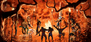
On a wider level, the colours subvert the usual concept of warm being comfortable. Here, they're always charged. The church that you expect to be safe is where a man dies horribly. The voodoo ceremonies are dangerous and intimidating, with a raw power that has nothing to do with any magic that may or may not actually be happening... at least, early on. And when those sequences reach a crescendo, the colour scheme is quick to back that up as it shifts colour all the way to blood red.
None of this would work if not for the words and the storyline driving the game, but it acts as a multiplier - just one way that all the disparate elements of the game pulled together towards a common goal. The game already rests heavily on symbolism, especially in elements like Gabriel's family medallion and the use of dragon and snake imagery. Where those are always pushed front and centre though, not least in the introduction, the colours are there to be felt more than actively noticed.
This kind of direction is, for me anyway, the main thing missing in the recent remake. Where the original artists had to make every last pixel work for their money, the remake gets all the colours in the world and probably garrow too, and as such adopts a more realistic graphical approach. Here for instance is the updated cut-scene where Gabriel meets Malia, done in the remake's more modern style.
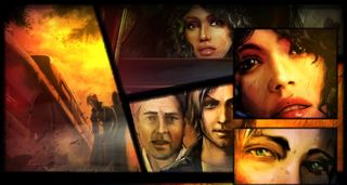
While the art here is basically okay, it doesn't convey even half as as much as the original. Later cut-scenes fare much better at that, and are genuinely good. The backgrounds though tend to be attempts at realism compared to the stylised world of the original, and it's a distinctly different world as a result - less threatening, less alien, less hanging with menace. Not bad, but definitely different, and more than you'd think given that the details of most of the locations are much the same as they were in the original. Largely, it feels like a result of two very different goals - the original on supporting the story at the expense of an immediate wow factor, the remake aiming to make the existing screens as visually impressive as possible (Which is of course what you'd expect a game pushing HD graphics as its main selling point to do.)
Certainly, the original's locations - while beautifully done - lacked the snap factor of many other titles of around the same time, like most of Lucasarts' games or the gorgeous Hand of Fate. At first glance, they were even somewhat unpleasant by the standards of the time - claustrophobic, dark, and very restrained outside of the cut-scenes. Very few other sprite based games though managed to get the same levels of presence and texture, even in the many, many scenes when nothing was happening. It's one of the reasons they still look good today, while most games shooting for reality soon look ancient. Artistry fades much more slowly than art.
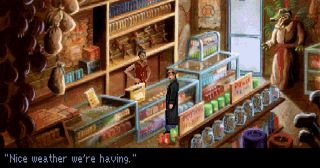
This level of both craft and willingness to support the story isn't the kind of thing that in itself marks the distinction between a bad game and a good one, but it is the kind of thing that marks a great one from a merely good one—the willingness to dig that little bit deeper than most other games, and make all the components come together to be the sum of their parts. The writing, the plot, the characters, the research, all the most obvious elements absolutely deserve the lion's share of the credit on Gabriel Knight, much as they did in its sequel, The Beast Within's fusion of European mythology and modern adventure.
The best games, though, find many ways to make all their elements work together, and I don't think many would argue that Gabriel Knight doesn't qualify. It was a hit back in the '90s, and remains a classic.
Most Popular


