Dragonflight's UI is great but I'm not going to uninstall my addons just yet
But there's plenty of customisation if you want to cut back.
World of Warcraft: Dragonflight is set for release on November 28, 2022, and it brings along with it an overhaul to the nearly 18-year-old user interface.
WoW's UI might have looked pretty good when the MMO first launched back in 2004 but it's become a bit of an eyesore in recent years. Of course, this can be easily remedied with the use of WoW addons but these need to be updated often and they can add significant loading times, as well as a drop in performance if you're not careful.
With the introduction of the new—and much more customisable—UI in Dragonflight, it's possible you won't need as many addons to get the look you're after. And as most of the updates are now present in the Dragonflight beta, it seemed like a good idea to find out what it can do.
Move with the times
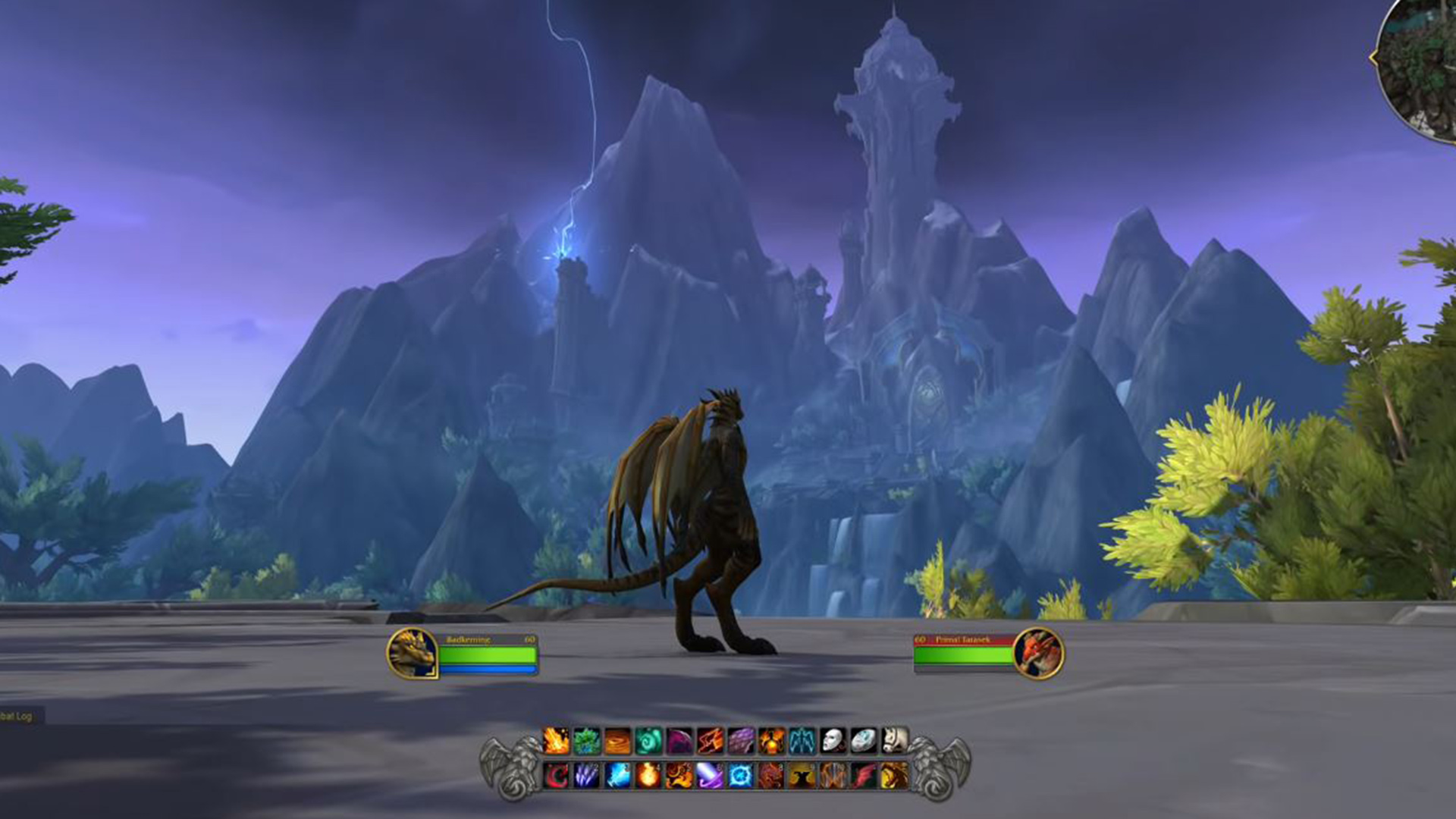
You notice the UI changes the moment you log in to Dragonflight. Everything looks much cleaner and more compact than it has in the past. Perhaps one of the most obvious differences is the player health bar—it's moved from the upper-left corner to its new home just to the right of your character. This has become the preferred position for players over the years as it lets you keep an eye on your health without having to take your eyes off your character during hectic fights. But up until now, you've needed an addon to move it. The size of the health bar has increased too, which is much better than the tiny sliver of green we're used to seeing with the default UI.
The default Dragonflight UI now shows two action bars stacked, rather than having them run side-by-side across the bottom of the screen. The "bar art" has also been updated and other options such as bags, quest log, character sheet are housed in a far more subtle group in the bottom-right corner.
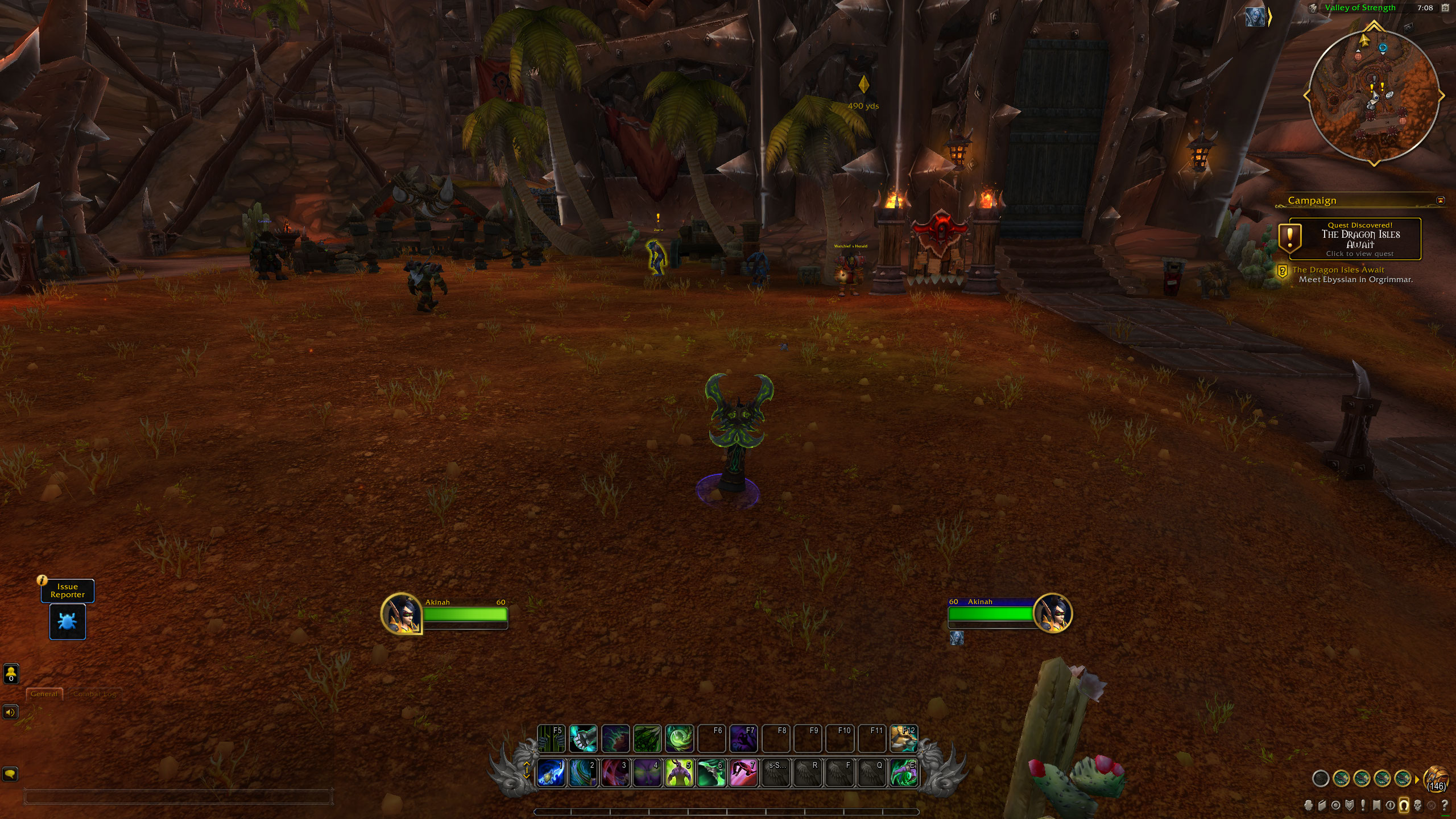
You can move pretty much everything you can see using the Edit Mode in the main menu. Some of the individual elements have additional options for resizing too, or the ability to access additional menu options straight from the edit window. You can toggle various elements, such as raid and party frames to adjust their placement and there's even a grid so you can make sure everything lines up. Once you're done moving everything around and have it to your liking, you can save the layout as a profile which can be applied to all characters or just your current one.
That's not all of it though: there is also a fair amount of customisation that isn't immediately obvious. For example, you can consolidate your bags into one large container, and set up a modifier key so you can cast spells on mouseover instead of having to target them directly. You can also make adjustments to the way combat works. "Press and hold casting" lets you continually cast the same spell with one keypress instead of having to repeatedly tap the same key, and the "action combat" option automatically targets enemies in front of you. Pretty neat, huh?
The biggest gaming news, reviews and hardware deals
Keep up to date with the most important stories and the best deals, as picked by the PC Gamer team.
It all adds up
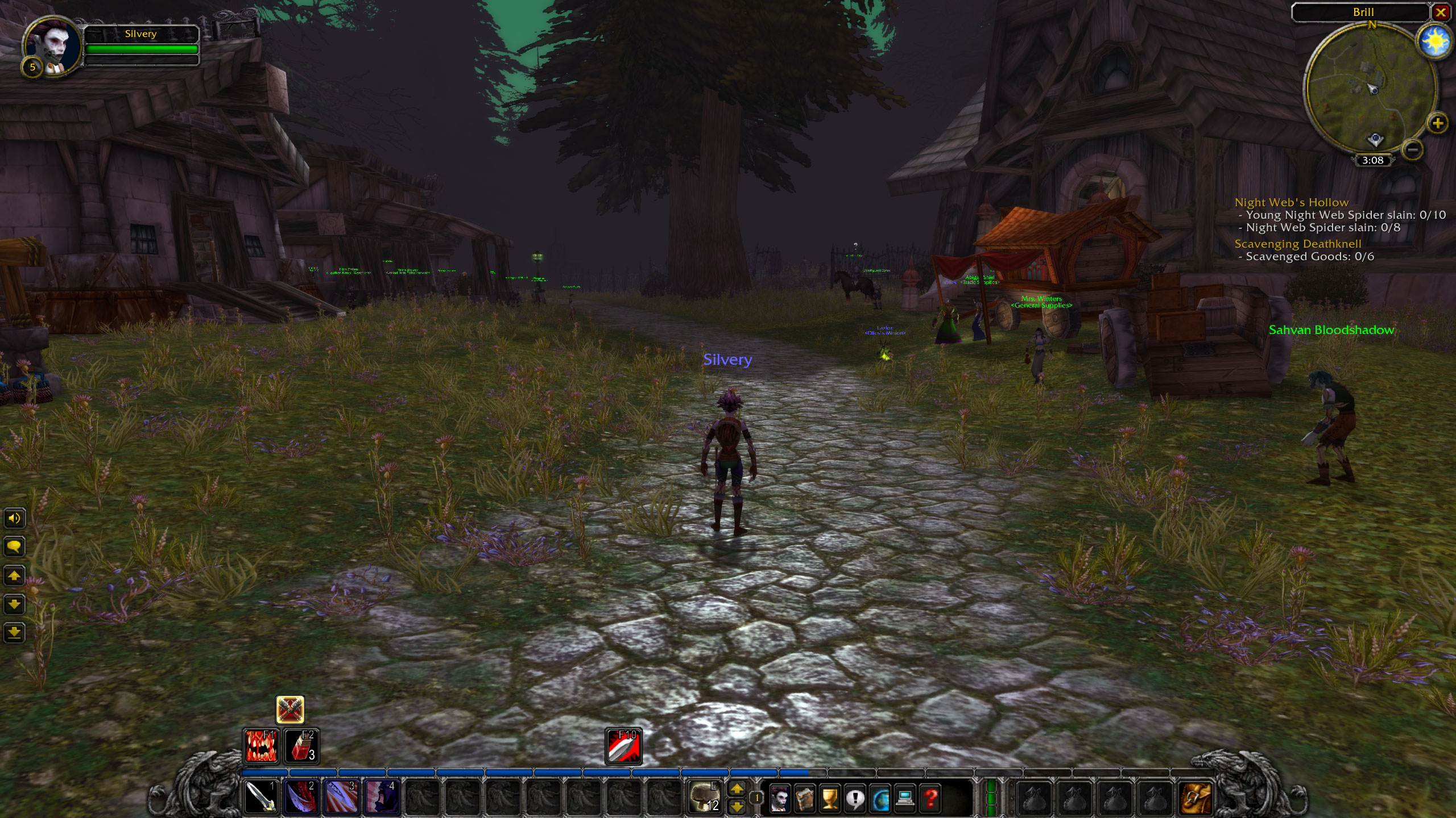
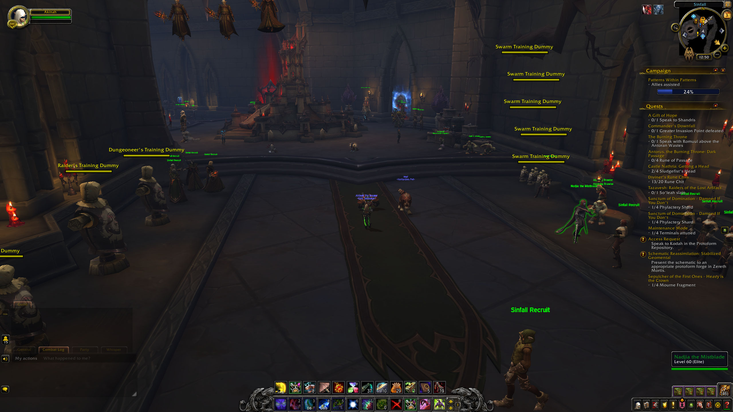
So now that we have an idea of what the Dragonflight UI can do, I decided to see how close I could get it to my current Shadowlands set-up. The results are actually pretty close as you can see in the comparison below.
The most obvious difference between the two is the player health bar. In the Shadowlands version, I'm using ElvUI—that's also what's giving me the Titan Panel-style bar at the top. In the third screenshot, I've added the Weakauras and Plater addons to the Dragonflight UI.
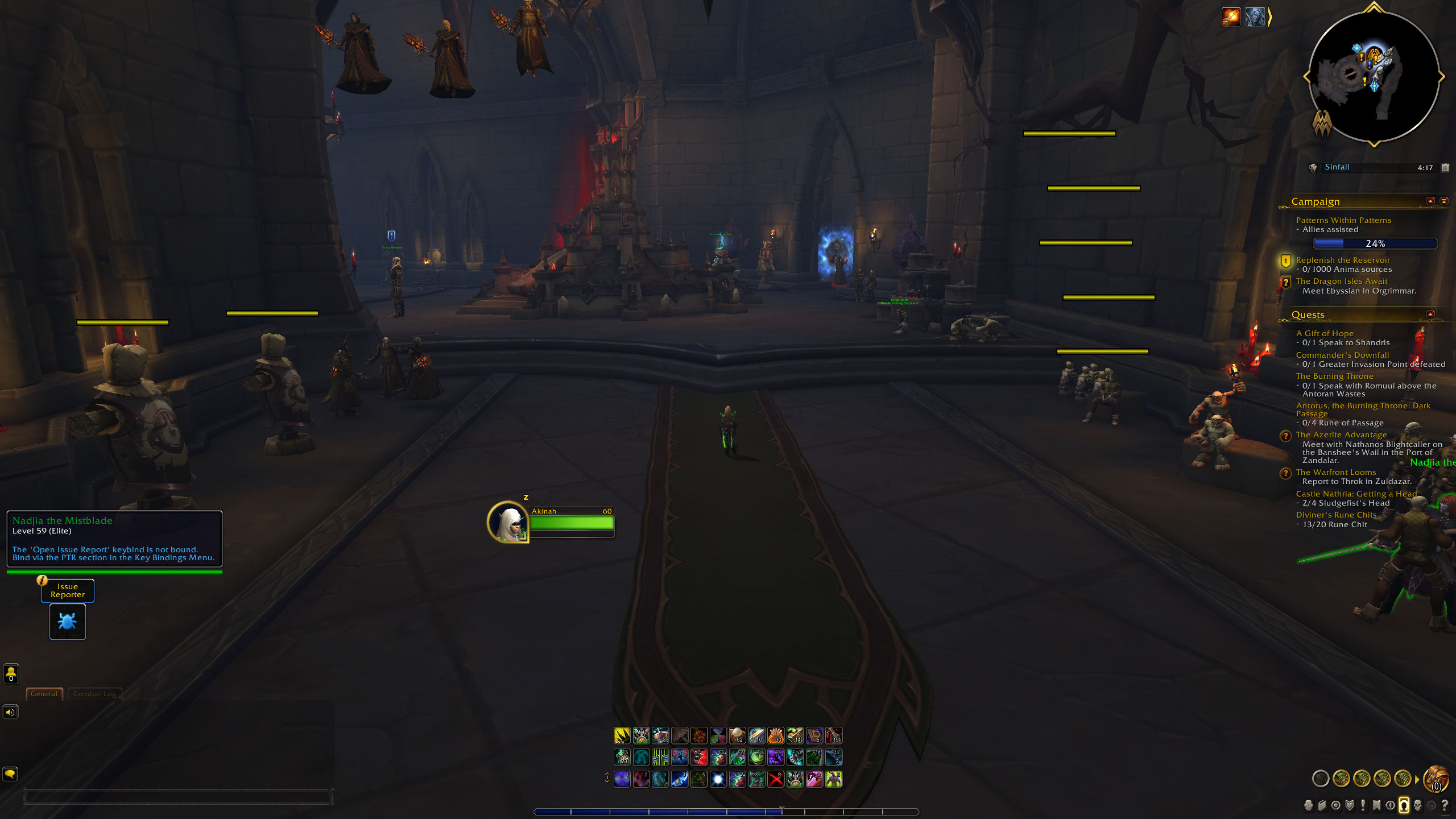
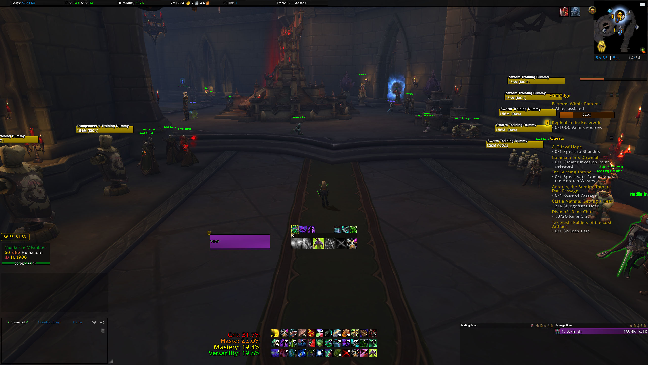
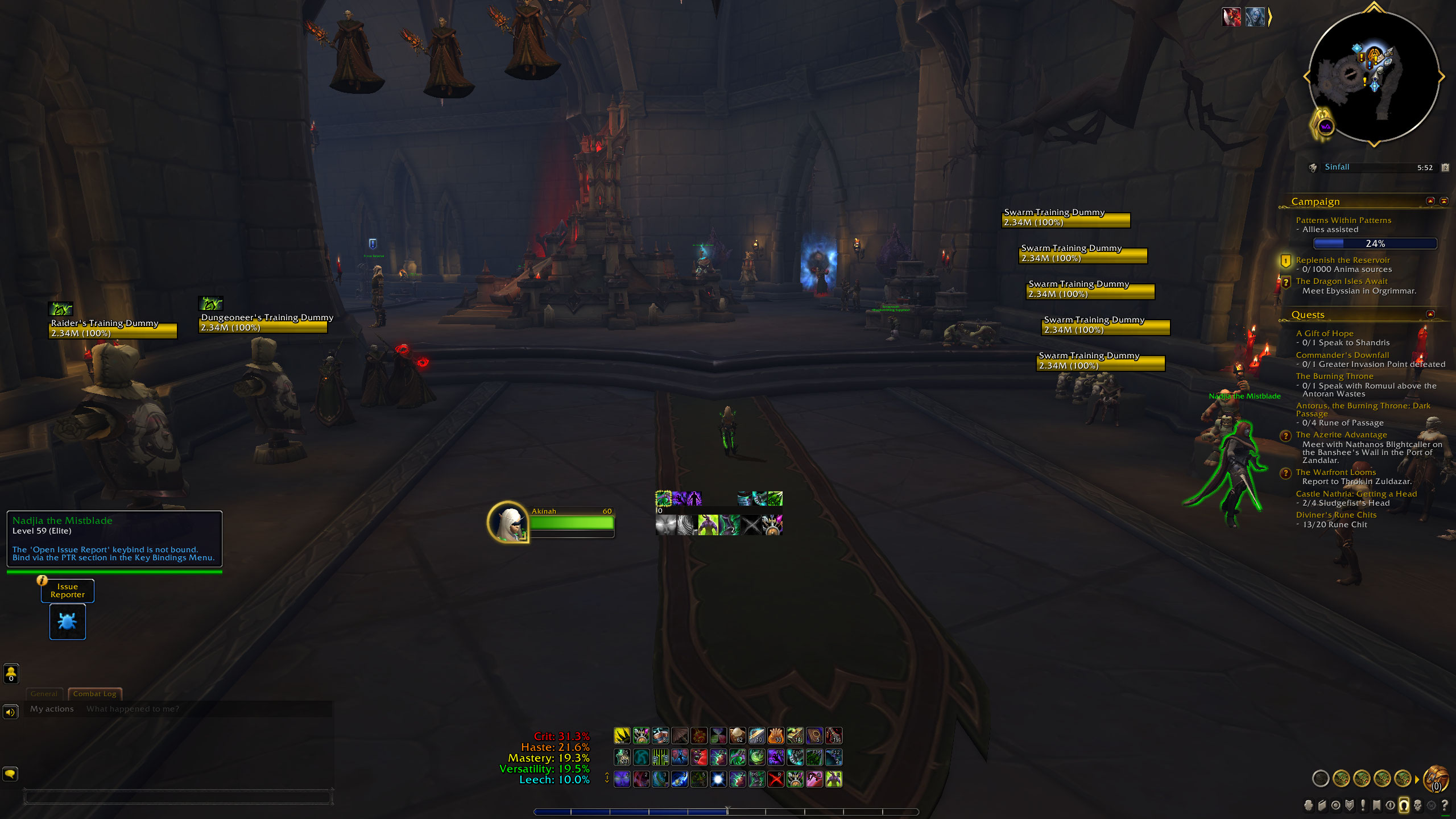
As far as looks go, the new UI is pretty sleek but there are still plenty of addons that either work behind the scenes or have become accepted as part of a good set-up. To name the most obvious, Deadly Boss Mods, Weakauras, or a damage meter aren't likely to be replaced any time soon, and if you really like the customisation that ElvUI offers, there's nothing saying you have to get rid of that either.
Of course, your addon usage will come down to how you like to spend your time in Azeroth—if you regularly raid or run mythic plus dungeons, then you're likely to use a lot more than someone that collects mounts. Even so, I don't think we'll be moving away from addons anytime soon, but Dragonflight's big UI update certainly gives us more options for customisation than we've ever had before.
Dragonflight feels like a great time to take stock of the addons you use and cut out the ones that really aren't pulling their weight. Even if you cut one or two of them, you'll give more breathing space to those that you do rely on—not to mention it will be better for your overall load times. If you think addons don't have much of an impact on that, try disabling them before logging into the game and see how much faster you load in. You might be surprised.
WoW Dragonflight: Everything we know
Dragonflight leveling: Get to 70 fast
Dragonflight talents: New trees explained
Dracthyr Evokers: The new race and class

Sarah started as a freelance writer in 2018, writing for PCGamesN, TechRadar, GamingBible, Red Bull Gaming and more. In 2021, she was offered a full-time position on the PC Gamer team where she takes every possible opportunity to talk about World of Warcraft and Elden Ring. When not writing guides, most of her spare time is spent in Azeroth—though she's quite partial to JRPGs too. One of her fondest hopes is to one day play through the ending of Final Fantasy X without breaking down into a sobbing heap. She probably has more wolves in Valheim than you.
