Dota Underlords is a streamlined Auto Chess with some nice tweaks
Valve's take on the autobattler loses some of the wilder and weirder elements, but the UI is a welcome improvement.

Dota Underlords, Valve’s standalone Auto Chess game and the heir to mod Dota Auto Chess, is in closed beta for those who have a Dota 2 battle pass. I’ve sat down and played a bunch of Underlords, and just like Dota Auto Chess it’s such a tempting blend of gameplay types: Somewhere between real-time strategy, set collection card game, and compulsive gambling. It’s a weird, emergent genre that could only be born from modding, and we’re watching it blossom in real time. Even unfinished, Underlords already makes some significant improvements to presentation and balance.
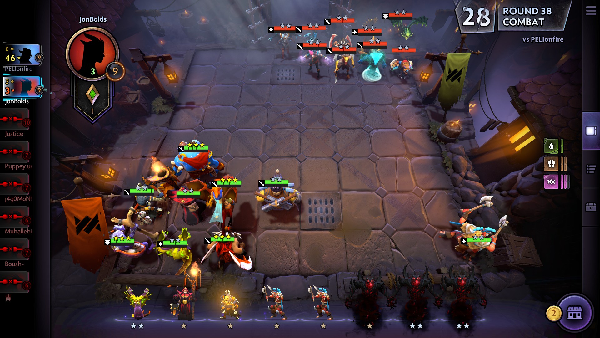
Auto Chess is a hard game to explain, but basically: You control the composition and placement of a team of heroes on a chess-like board. In every round you're placing more heroes and fighting against neutral creeps (see the MOBA influence) or one of seven opponents' teams of heroes. The "auto" part comes from the fact that you don't control your heroes directly. If you win, you move on to the next round and get some gold. If you lose, you lose some HP. A game is basically an eight-player tournament, and the last one standing wins. You can read about the ins and outs in detail in my guide to how to play and win.
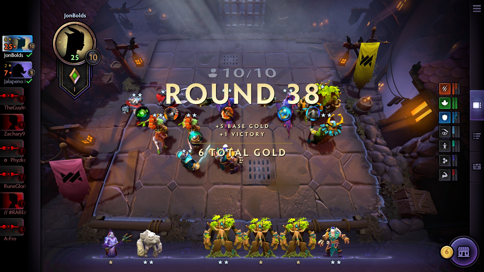
Unlike Auto Chess, Underlords has an interface that actually feels like an attempt to design explicitly for the genre, rather than just cribbing pre-made parts from real-time strategy and MOBA interfaces. Underlords’ interface design realizes that the genre is composed of very simple elements, so it scales up the corresponding UI bits to fit the screen and adopts a fixed camera perspective. It isolates battles into their own fields, rather than placing everyone on a big map like an RTS mod would. Instead of panning around to see things, you can now click or tab through a list of the other players to scout what’s going on around the match as a whole.

Items are easier to manage and move between characters quickly. The UI is generally well distributed and decluttered: Match info on the left, your collection on the bottom, shop on the top, and statistics on the right. Obtrusive and distracting elements like the shop are easy to hide when you don’t want them cluttering up the screen.
If you’re wondering about huge changes to the game mechanics in Dota Underlords, as opposed to Dota Auto Chess, it’s a bunch of small things and one big change. Though there are huge quality of life improvements, Underlords and the smartphone Auto Chess game are two forks of the same design. That doesn’t mean there aren’t improvements in Underlords: Some synergies have been reworked and redistributed, but Dota Auto Chess players won’t be lost.
The real improvement to the game design in Underlords is items. In other autobattlers the distribution of equipment for your characters is both random and capricious—sometimes you get items and sometimes you don’t, and when you get items they can sometimes be bad. In Underlords, you'll always get something. Even if you lose against the creeps you'll get a random item, and a choice of three if you win. Those three items may not be great, but at least you won’t lose because you got nothing at all.
It’s a simple change, but it pulls the item ethos into line with the design of the unit pool you recruit from. You also now assign items and move them between characters with a dedicated interface.
The biggest gaming news, reviews and hardware deals
Keep up to date with the most important stories and the best deals, as picked by the PC Gamer team.

Items are generally more interesting and useful choices too, and the item pool includes passive buffs that tweak the game rules. You can get passives that buff a class of hero, or make humans synergize with heartless undead. Others give you a fourth choice when picking items, or deal additional damage to opponents when they lose to your team.
The decluttering of the UI also has benefits for play. It’s often frustrating to tell where your strategy has gone wrong or is excelling in a game of Auto Chess, but Underlords makes it easy. You can learn from an interface that tracks your unit damage, healing, and damage taken, all segmented by whether an item, ability, or attack created the effect. You can also easily show or hide the hero type synergies you’re getting, as well as which you’re close to achieving. (The store also shows that info.) When you go up against an opponent you’re shown both their hero synergies and your win-loss record against them during this match. All of this information is presented in a simple, easy-to-read way.
There’s also a little whisper effect from your bench when you could have another hero on the field but don’t currently, and it is very cute and good.
That personality is absent in some places, though. Whereas the huge, cluttered joint battlefield of Auto Chess can be overwhelming, you might miss it in Underlords. You see only your perspective unless you go out of your way to view others', and there’s (thankfully) no direct chat, but that can mean that sometimes the game is a little lonesome or quiet. Your units don’t have the fun personality and breadth of voice lines they do in Dota, so sometimes all you hear is just a quiet music track and a countdown timer plonking away.
In the transition from mod to full game, Underlords has lost some of the wild and weird elements that defined it, though it has shed the more baroque or annoying stuff too. Hopefully with time Valve layers on the polish and restores some of that personality.
Underlords is still a beta, but will be widely available later this week. Right now it looks like a promising step forward in the design of the genre on the PC. I’ll be playing more for sure.
Jon Bolding is a games writer and critic with an extensive background in strategy games. When he's not on his PC, he can be found playing every tabletop game under the sun.

