Get more out of Dishonored 2 with these gameplay settings
There's a lot to be gained by taking the training wheels off.
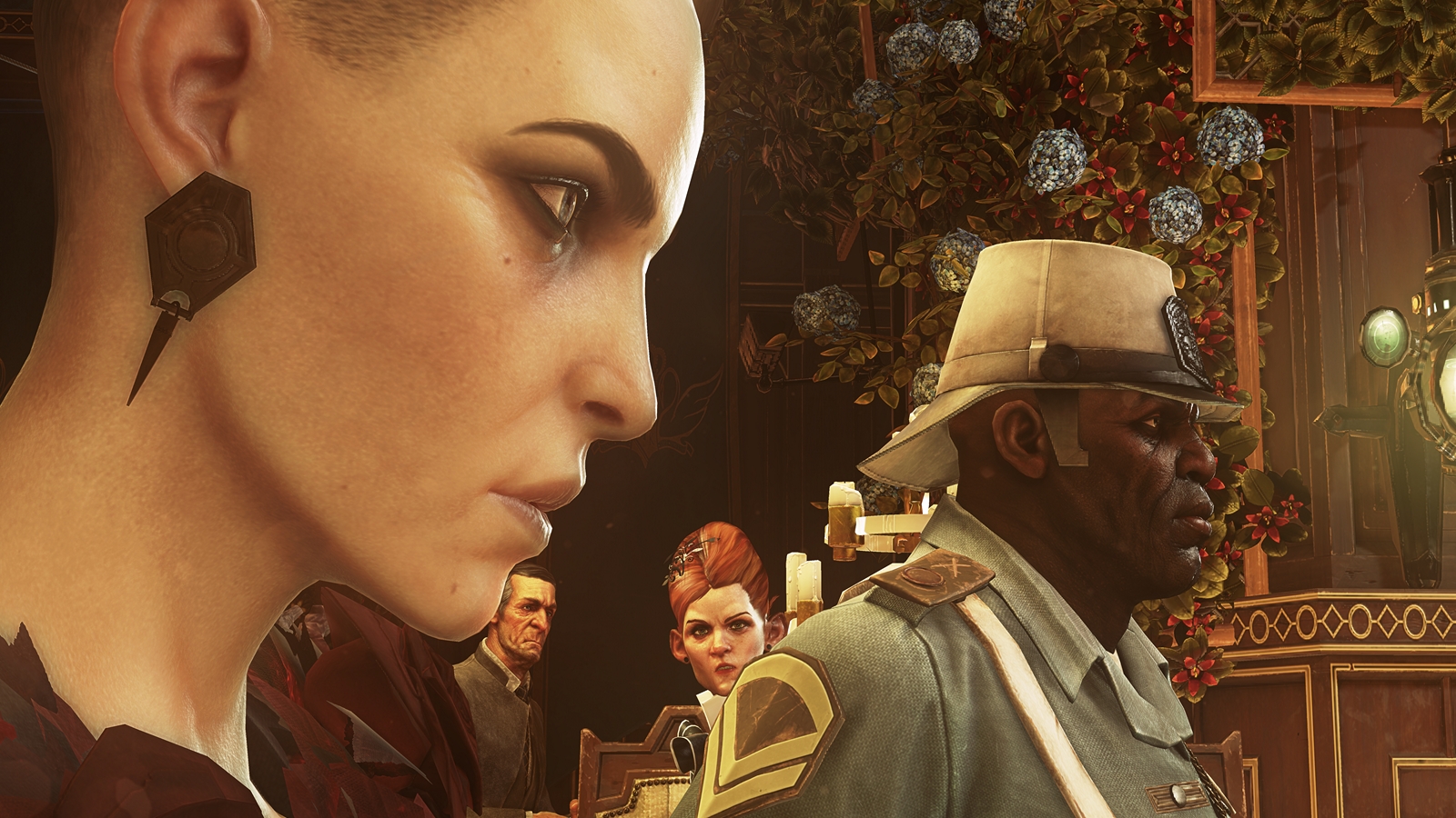
I'm currently a few missions deep into my second run through Dishonored 2, and I can comfortably say that it's my game of the year (though I'm one of the fortunate people to experience no technical difficulties, which helps.) The original is one of my favourite games and this is a worthy successor: a densely-featured stealth sandbox that warps itself effortlessly around the will of the creative player, an intricately-designed piece of clockwork to be toyed with, reconfigured, or broken according to your will.
It comfortably occupies its role as the successor to games like Thief, System Shock, and Deus Ex, but it expresses an interest in accessibility that those games do not. By default, Dishonored 2 includes a number of features—many of them to do with the hint system and UI—designed to help new players to find their feet within its world. In particular, objective and target markers take a lot of the challenge out of navigation, which can be intimidating in levels as big as these sometimes are.
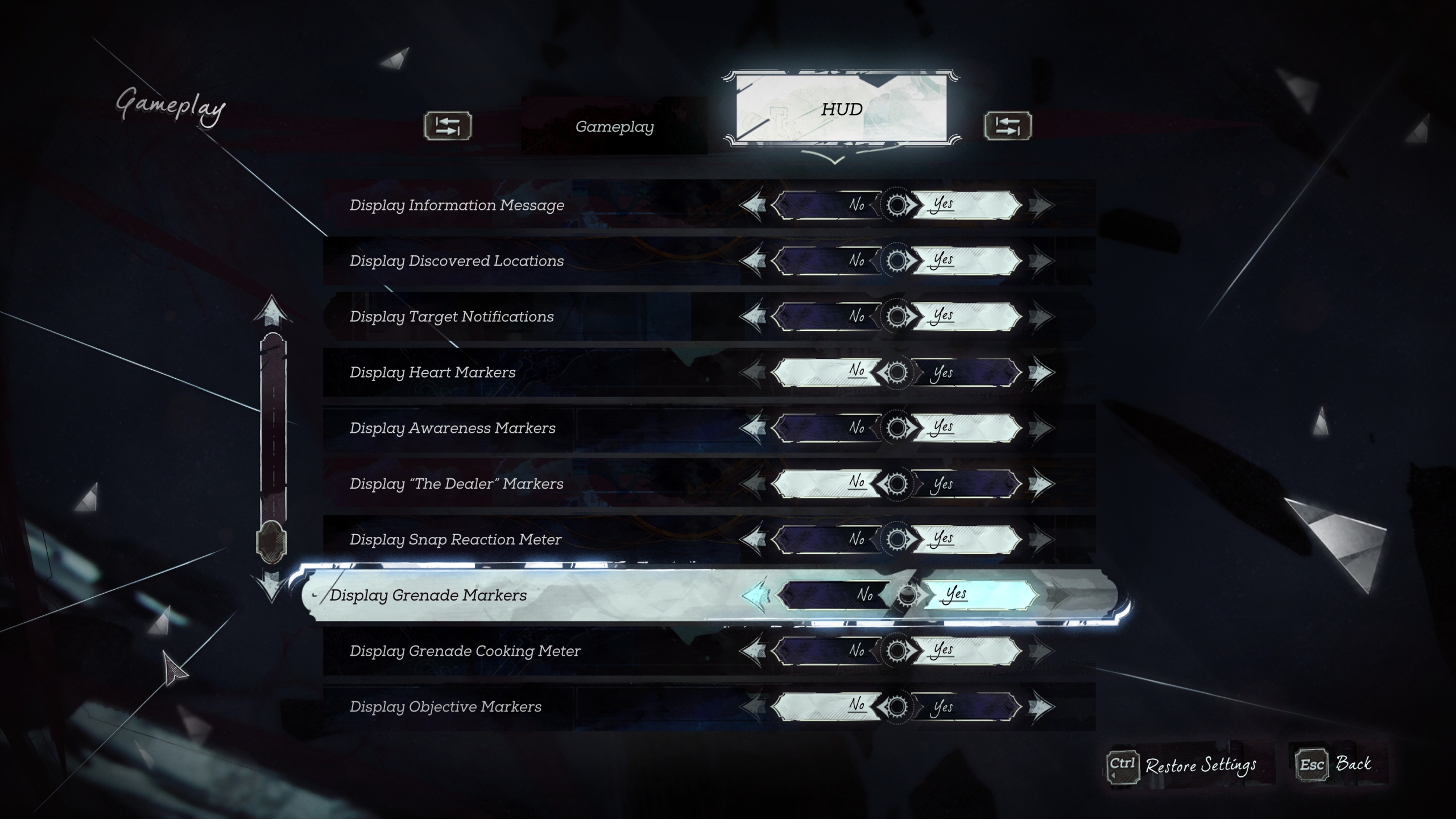
I want to stress: there's absolutely nothing wrong with using these assists, and the majority of the game's qualities shine through with them enabled. But there's another Dishonored 2 waiting to be discovered if you're willing to make some tweaks in the 'gameplay' section of the options menu. The options you're given can be confusing, so here's a set of recommendations aimed at making the game harder, slower, and clearing out UI clutter to allow you to appreciate more of that phenomenal environmental art.
Markers
'Markers' are icons that appear in the gameworld to let you know where things are—distinct from 'notifications', which are popups (usually in the top right) that let you know about changes in the world or your mission.
Switching off two crucial markers makes a big difference to how the game feels. These are objective markers and Heart markers.
Without objective markers, you'll have to track down targets and key areas the old fashioned way. The game actually provides lots of tools to help with this, but you might not notice if you've become reliant on UI prompts. Often, missions will include pictures of key areas and you can use these as reference points. You can also unlock maps by finding them in the game world or, sometimes, buying them from black market stores. Navigating one of the game's labyrinthine mansions using a map is a much more satisfying challenge than relying on a marker.
Having trouble getting the game to run well? These tips should help.
Without Heart markers, you'll still be able to use the Heart to find runes and bonecharms: they show up as glowing red 'presences' and the Heart beats faster when you're looking at one. What you lose is the ability to lock on to a marker to create a waypoint, as well as the description and distance information. This requires you to do a bit more work to extrapolate a rune's location from your surroundings, and—again—this creates a more satisfying navigation challenge.
The biggest gaming news, reviews and hardware deals
Keep up to date with the most important stories and the best deals, as picked by the PC Gamer team.
Finally, you'll also have to find black market stores by going out and looking for them. They're always accompanied by subtle graffiti—a picture of hands with an arrow—and you'll sometimes find other hints or uncover NPCs seeking the same thing that you are. Karnaca's sense of place is enhanced by the idea that these are hidden crime dens, not landmarks to be bookmarked on your internal GPS.
The other markers—grenade, awareness, reaction meter, grenade cooking meter—are all reactive. They appear when a grenade is nearby or a guard has spotted you, and as such they've got nothing to do with navigation. I recommend leaving these on, as they reflect your character's intuitive sense of danger. However if you really want to live by your wits, then disabling them requires you to pay careful attention to sound cues.

Notifications
While the purist in you might wish to disable notifications as well as markers, I recommend leaving the majority of them on—although you can switch off tutorial notifications as soon as you're comfortable with the basic mechanics.
The reason for this is simple: notifications are usually used to communicate information your character has gained but that isn't readily expressed in another way. The pickup log, for example, lets you know what the key you just picked up is actually for: something Corvo or Emily would know, but that you can't otherwise find out without digging into the journal.
Notifications also clarify what's expected of you in terms of the next step in a mission, but unlike markers they don't tell you where to go or exactly what to do. You're left with enough to figure out that the game remains a challenge, but disabling notifications entirely can result in a few too many trips to the journal to figure out exactly what it is that you're supposed to be doing.
Other UI elements
Here's a few more tweaks to reduce the amount of visual clutter on the screen.
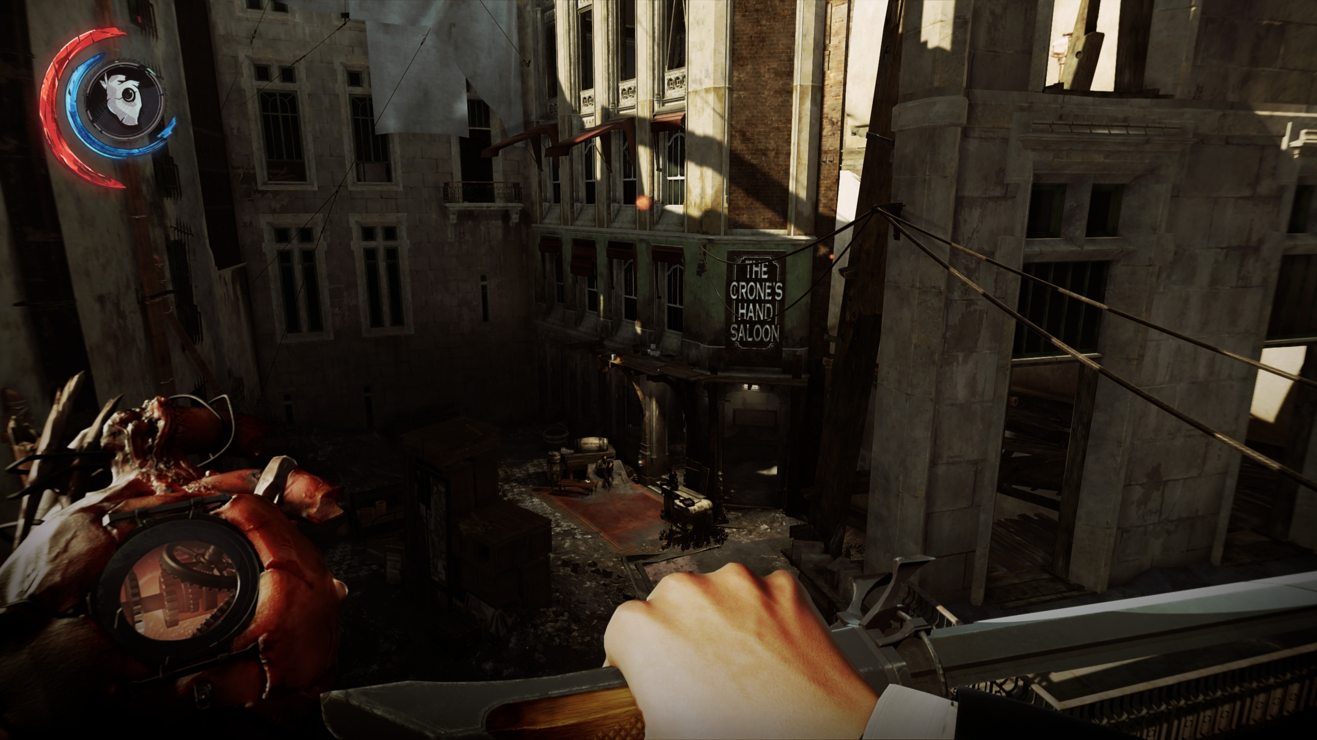
Set crosshair style to 'simple' to replace the ornate regular crosshair with a simple white dot. Reduce its opacity to 50% to make it barely visible: you can still use it to precisely aim a crossbow bolt, but you won't really notice it the rest of the time.
Also, set the health/mana meters to fade out when inactive, clearing up screen space when you're at 100%.
That said, I recommend leaving 'display interaction' and 'display object highlighting' on. These don't make the game easier, they simply make it more obvious what you can interact with and what it is. Without them you'll have to employ a lot more guesswork, which tends to result in eating a load of rotten fruit for no reason just because you spammed the 'use' key near somebody's manky cabinet. Unlike other games of this type, Dishonored 2's object highlighting is actually relatively subtle and you'll be glad to have it when you're exploring a dark area packed with detail.
Joining in 2011, Chris made his start with PC Gamer turning beautiful trees into magazines, first as a writer and later as deputy editor. Once PCG's reluctant MMO champion , his discovery of Dota 2 in 2012 led him to much darker, stranger places. In 2015, Chris became the editor of PC Gamer Pro, overseeing our online coverage of competitive gaming and esports. He left in 2017, and can be now found making games and recording the Crate & Crowbar podcast.

