Chrono Trigger patch brings back old-school battle UI and character design
Square Enix slowly fixing the Steam version of the 1995 JRPG.

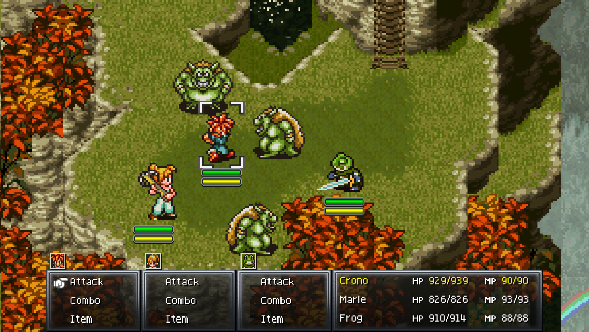
Chrono Trigger's PC port was a disaster. Fiddly controls, a weird smoothing filter and a locked resolution disappointed fans, prompting modders to embark on a quest to fix it. Square Enix is doing its part too, with a patch last month that brought the graphics in line with the original, and yesterday it released a second patch that adds new options for both the battle UI and character models.
The new UI is "based on the look and feel of the original Chrono Trigger", and you'll be able to switch to it in the settings menu. It's designed to be used with either a keyboard or a controller—you can pause the game during battle by tapping the space bar or the start button on your control pad. The UI that shipped with the port, which is still available, is meant to be used with a mouse or a touchpad.
The update also adjusts the appearance of playable characters on the world map to bring them "more in-line" with the SNES original. The resolution and display area in cut scenes has been tweaked, and the game should no longer randomly slow down during certain sequences.
Another patch is due in early June that will change the UI outside of battle, Square Enix said. You can read the full patch notes here. What do you think of the new battle UI?
The biggest gaming news, reviews and hardware deals
Keep up to date with the most important stories and the best deals, as picked by the PC Gamer team.
Samuel Horti is a long-time freelance writer for PC Gamer based in the UK, who loves RPGs and making long lists of games he'll never have time to play.


