Borderlands' change of art style shaped sci-fi games for years to come
Gearbox's smart and bold mid-development change helped usher in an era of more vibrant-looking and colourful sci-fi games.
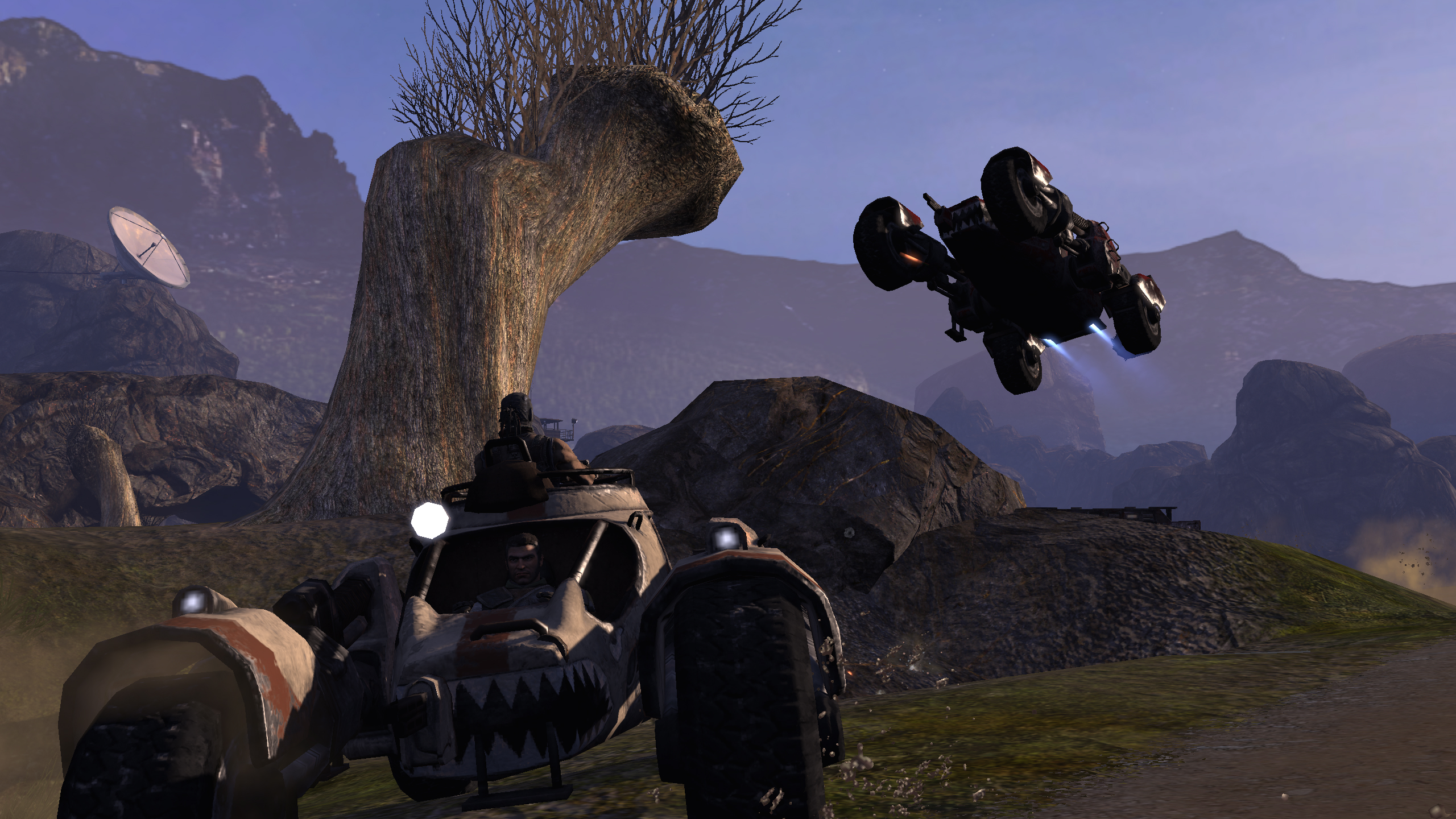
Anyone with a long-ish memory of the internet will remember how Gearbox changed the art style of the original Borderlands. It's been talked about a lot in the years since its original 2009 release, and it's widely considered a 'last minute' change that helped the co-op FPS series take off.
In its first public showings in 2008, Borderlands was a drab and mostly brown-looking shooter that looked a little like the original Halo via Mad Max. It was definitely a product of its time, emerging in an era dominated by Gears of War and other games with a muted colour palette, like the Resistance series on PlayStation, or Metal Gear Solid 4, or Resident Evil 5. The pieces of Borderlands were certainly there—the guns, the vehicles, the enemies. It just looked boring in any screen where someone wasn't firing a weapon.
Interestingly, the UK games media resource Games Press still has all of the original screens of Borderlands from before the change—a time capsule of the game as it once was. I've put most of them in the gallery below, if you've never seen them before, or it's just been a while. The first six were revealed at Leipzig 2008, while the latter three were dropped at E3 2008 a few months earlier.
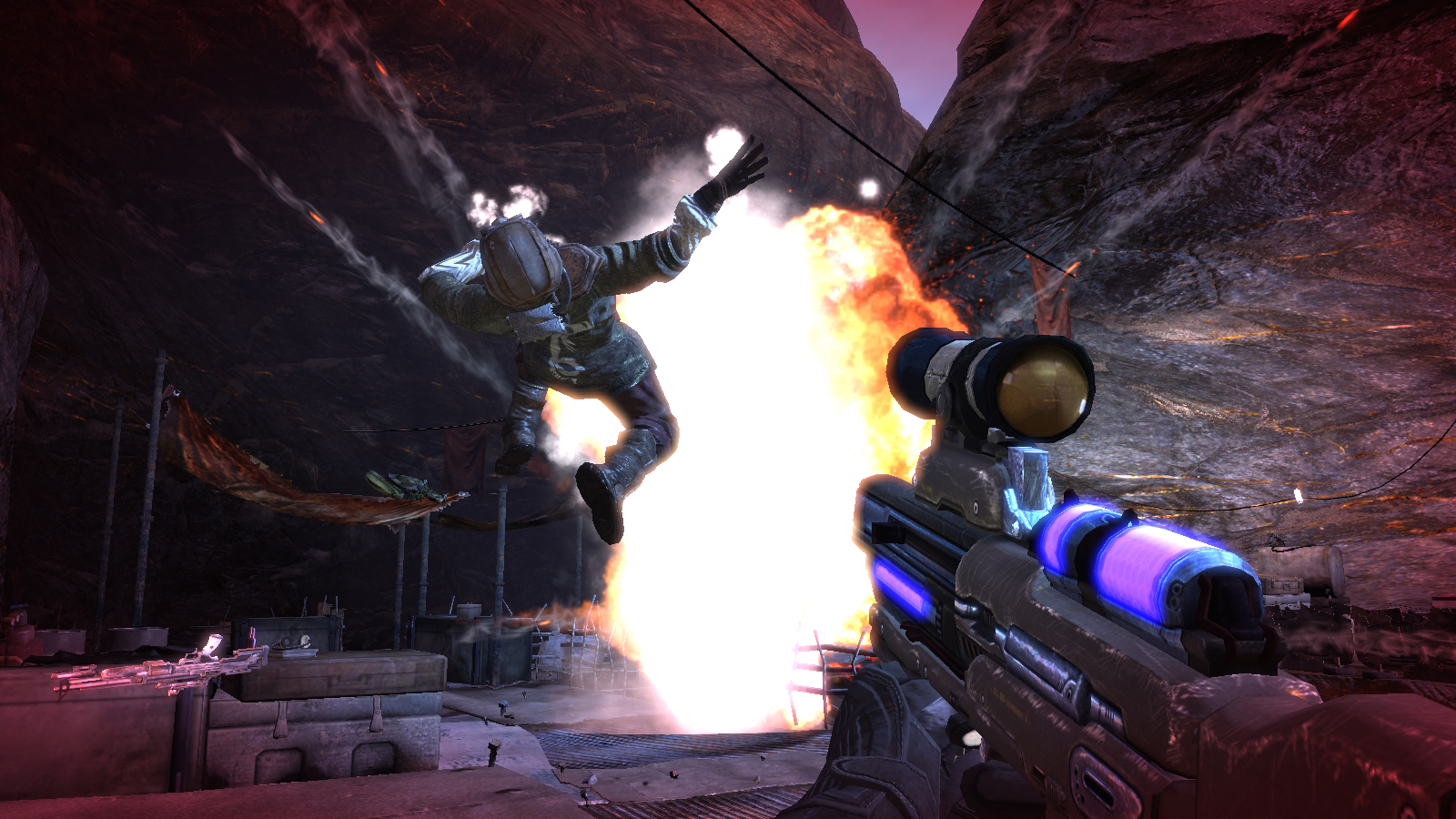
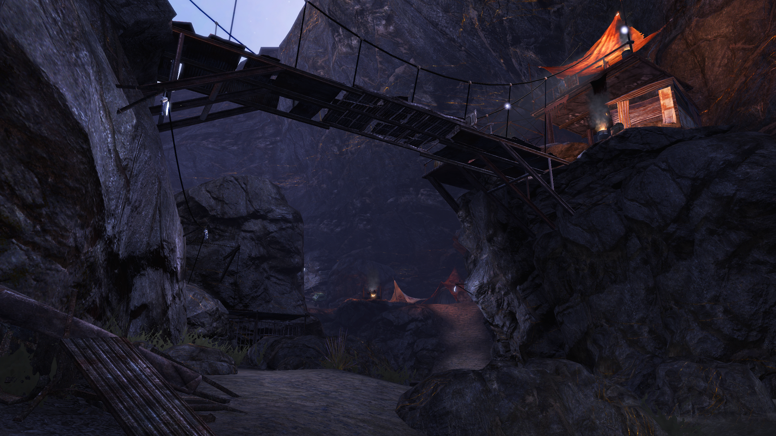
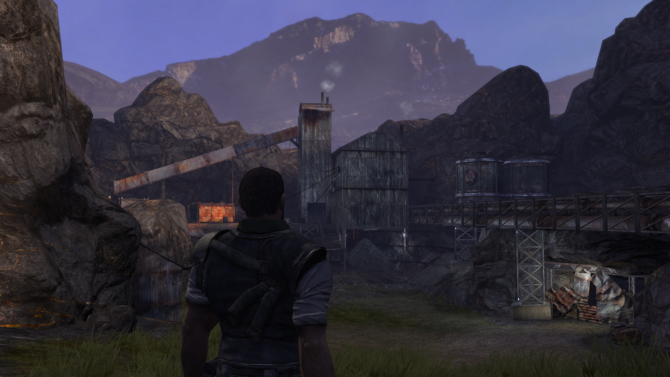

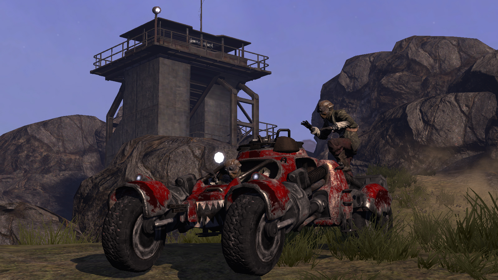
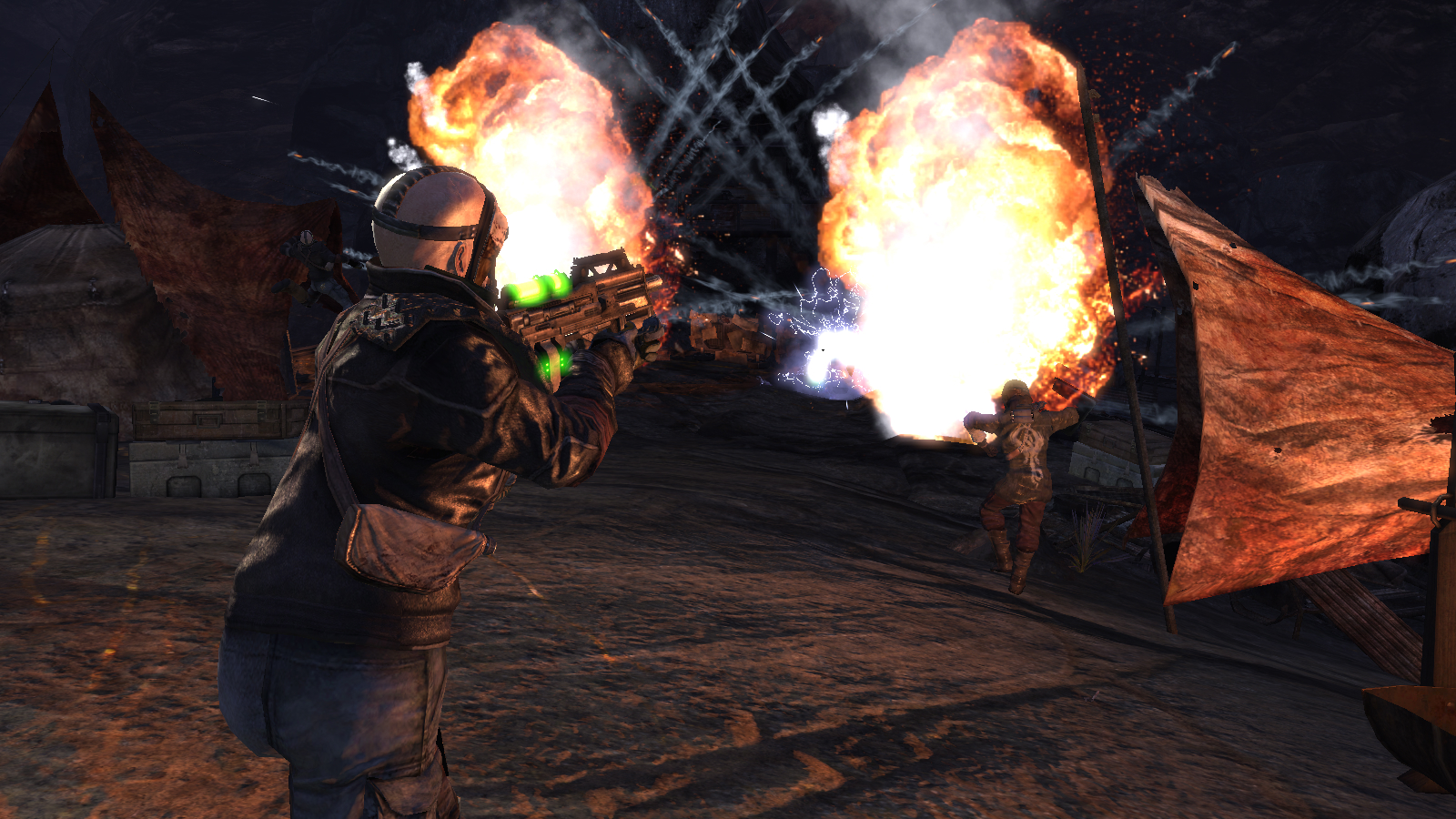
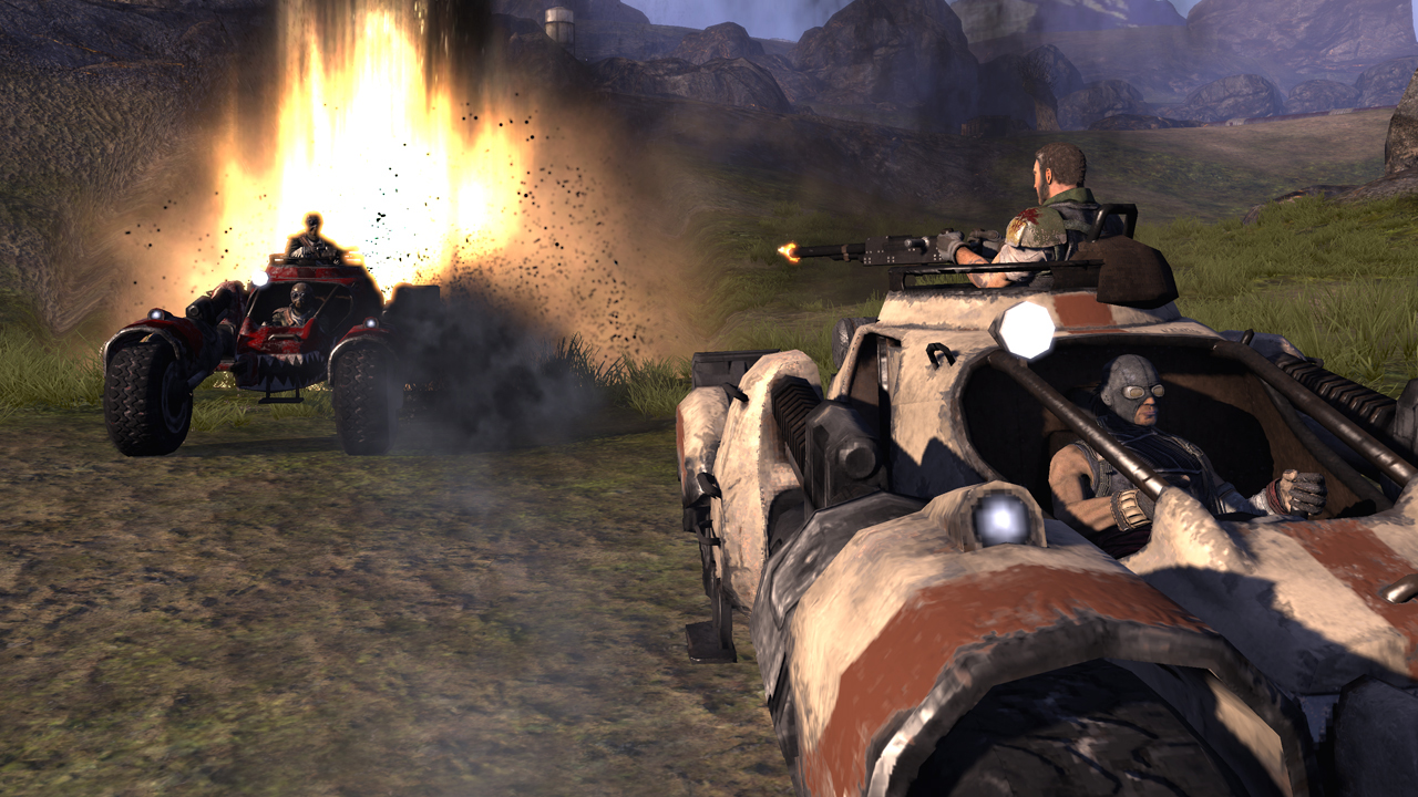
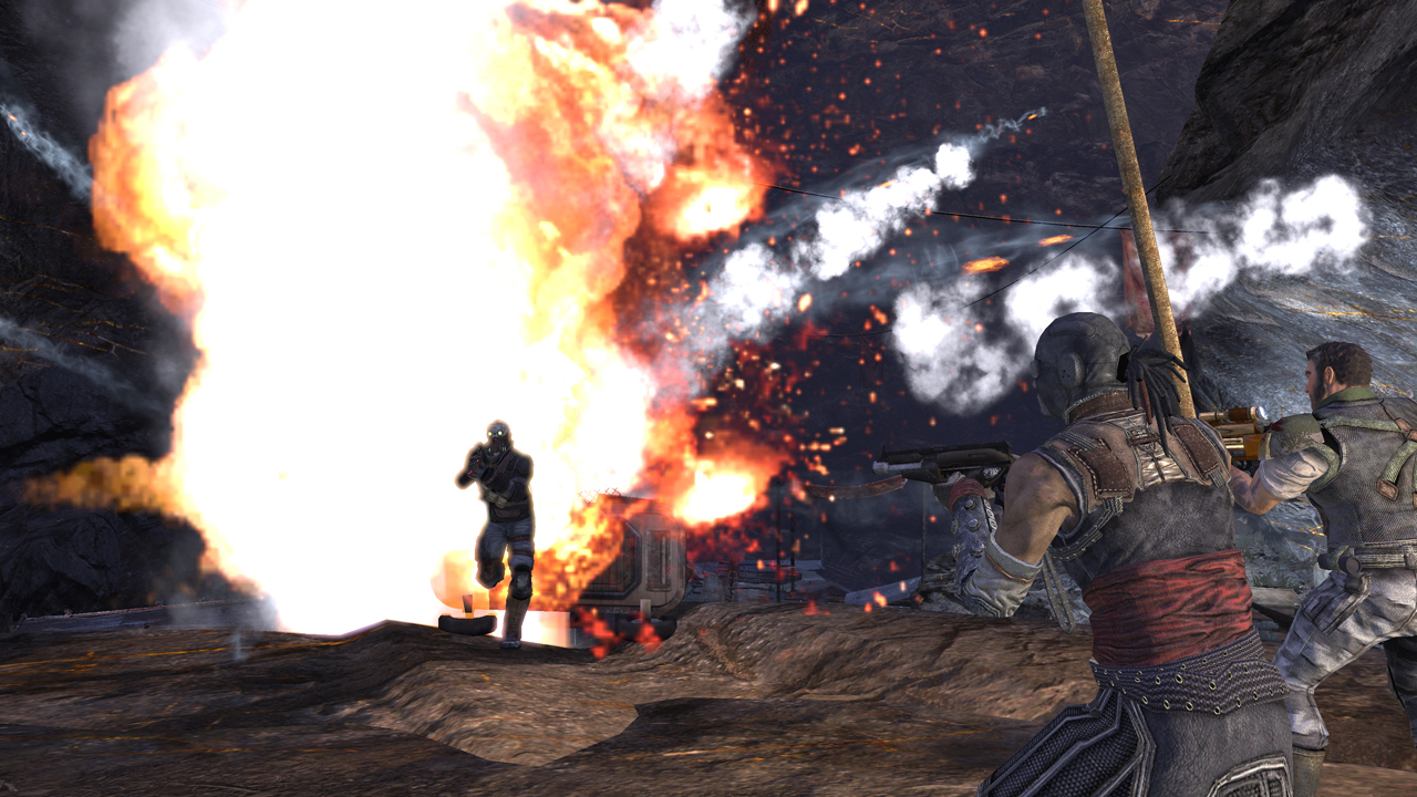
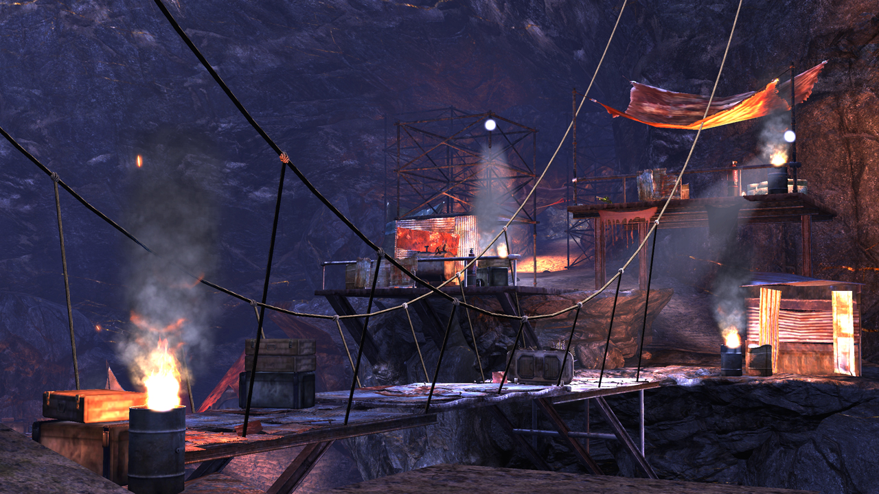
As meticulously detailed by Gamespot back in 2010, Borderlands was conceived as 'Halo meets Diablo' in 2005. The swap of colour palette was attributed to a few factors, notably that testers thought it looked too similar to Fallout 3 and the then-upcoming Rage from id. The change came at about 75 percent through development, and what soon became the previous iteration was hence referred to as the game's "brown period".
The thing is, the decision to give Borderlands a wild, cel-shaded art style wasn't just a key moment for the game and Gearbox's collective fates. It was a turning point for sci-fi games generally—cel-shading was a bit of an early '00s gimmick previously seen in games like Cel Damage and Ubisoft's XIII, but here it made perfect sense when combined with the game's bizarre sense of humour. When I reviewed the original Borderlands for a now-defunct Xbox magazine back in 2009, it unexpectedly became a game I was calling colleagues over to check out—either because I found a ludicrous new gun that fired elemental bullets, or because the tone surprised me in some way (I gave it 9/10). I remember insisting to a friend in a pub that he buy it, so we could try it in co-op. It went from barely being on my radar at all to my personal GOTY.
Along with the second more colourful Borderlands game that arrived in 2012, I think the series' art style helped to steer us out of an era of muddy shooters and into one where Destiny, No Man's Sky and Fortnite could thrive. These games might not be directly inspired by Gearbox's work, even if Destiny's Cayde-6 would blend in perfectly on Pandora—but it helped kick off the trend to which they would eventually belong.
The biggest gaming news, reviews and hardware deals
Keep up to date with the most important stories and the best deals, as picked by the PC Gamer team.

