BioShock Infinite's animation director discusses Elizabeth's visual evolution

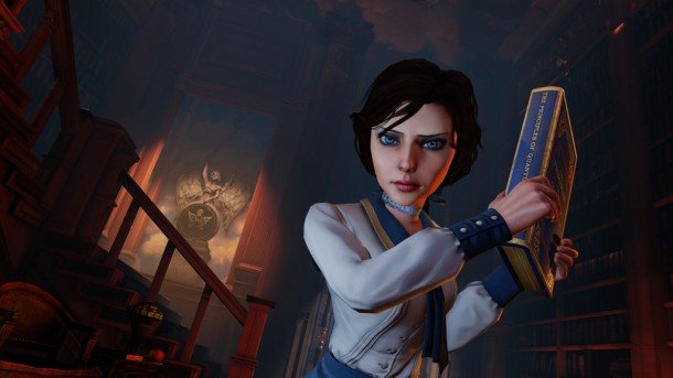
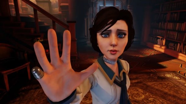
The saga of BioShock Infinite's journey from the studio to our hard drives could fill a fair-sized codex , but one of the most visible transformations from the game's initial concepts took place with co-protagonist Elizabeth. Irrational has talked previously about her complicated scripting and her personal motivations that were shaped by Ken Levine's personal experiences —and even that she was nearly nearly cut from the game altogether—and now Eurogamer , after a chat with Irrational Animation Director Shawn Robertson, has revealed the rationale behind Elizabeth's stylized, "hyper-realistic" appearance in the finished game.
Robertson's goal was to create a character whose expressions and body language could easily be detected at a distance, emphasizing Elizabeth's importance to the player as they traverse Columbia and elude her former captors. Earlier Elizabeths used motion capture and normal proportions for facial features, but that changed to hand-keyed animations and a slightly exaggerated look after testers started losing notice of her in the midst of Infinite's other eye-grabbing features.
"Hand-key really simplifies the process and lets us push her expressions just a little beyond what would maybe be comfortable for a normal human being," Robertson says. "It also lets us iterate at that moment when we're animating, not three months ago when the mo-cap was shot, so we can roll with the punches on any changes or ideas that have come up for that scene as we're working on it."
He continues: "The first Elizabeth we tried to do that pushed us towards hand-key was the Gibson girl we showed you, and she had a completely normal-looking face. Even in that early model, she wouldn't have made it as a star character—she wasn't attractive enough, there were problems—but even there, we could really see that in a game where you're moving around so much with a companion you want to elicit an emotional connection to, you really need to be able to see what she's thinking at all times."

While the word "attractive" might suggest Robertson only cares about aesthetics, the context suggests he's not talking about sex appeal. Rather, Robertson was probably referring to how relatable Elizabeth is, and how well the design conveys her emotional state in a readable way. He goes on to describe the technical criteria Elizabeth's look needed to meet.
"We wanted to exaggerate her facial structure so that you could see her across the room and read the expression she has on her face," said Robertson. "Even at 1080p, it's tough as a player to look at the screen and analyse what's going on. There's so many things—a gun, the UI, combat, things to pick up, and you're moving constantly. So, the resolution you're seeing all these things at is diminished somewhat just by the pure choice you have in what to look at. So, we wanted to give Liz a nudge up, and that's why she's hyper-realistic."
BioShock Infinite releases March 26. Irrational also shared a mini-documentary on the various actresses, models, and artists influencing Elizabeth's formation, which you can watch below.
The biggest gaming news, reviews and hardware deals
Keep up to date with the most important stories and the best deals, as picked by the PC Gamer team.
Omri Petitte is a former PC Gamer associate editor and long-time freelance writer covering news and reviews. If you spot his name, it probably means you're reading about some kind of first-person shooter. Why yes, he would like to talk to you about Battlefield. Do you have a few days?


