Back 4 Blood is sorely missing Valve's magic
There's one thing keeping B4B from being the Left 4 Dead 3 it wants to be.
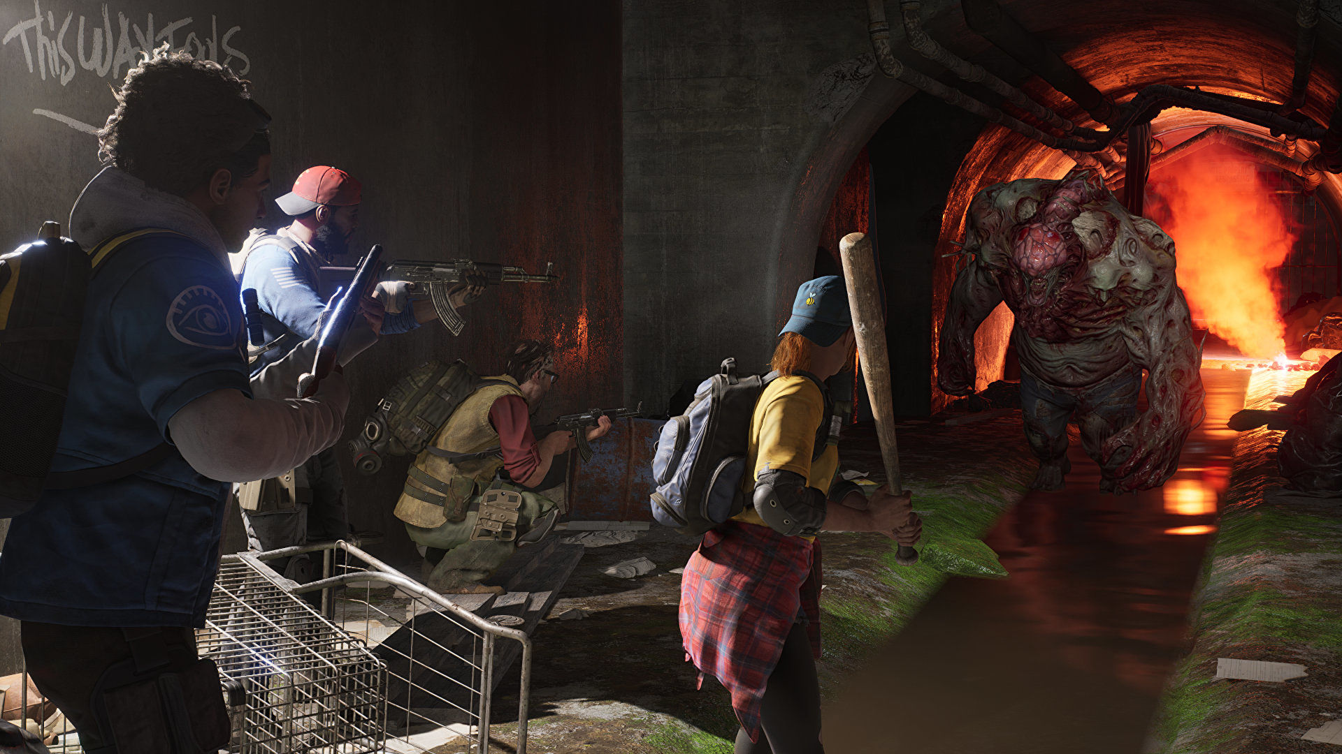
Back 4 Blood isn't shy about being basically Left 4 Dead 3. Zombie apocalypse? Check. 4-player co-op? Check. Special zombies that scream, grab, and projectile vomit? Check, check, and double-check. A cast of memorable, lovably goofy survivors?
Well… okay, here's where things get tricky.
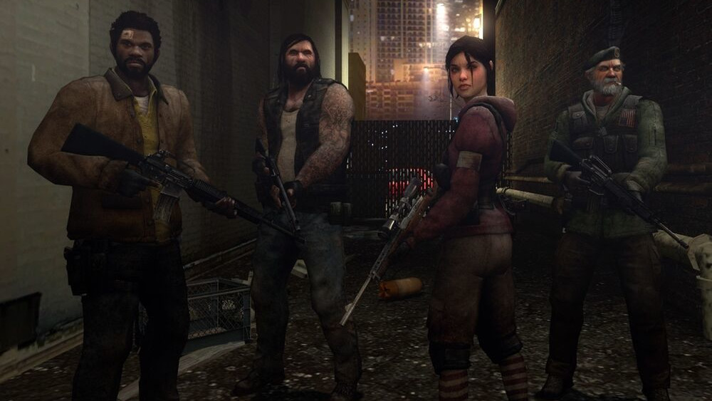
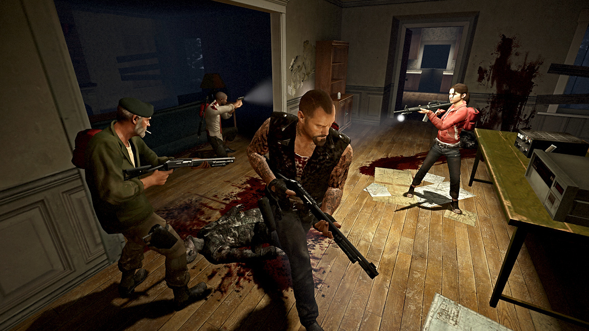
Back 4 Blood may be a spiritual successor to Valve's zombie-slayer. But since its reveal, I've had the nagging sense that the game just can't compete with Left 4 Dead's absolute comfort in its own style. From the moment Bill, Zoey, Francis and Louis stepped into the game's pulp horror intro, you knew exactly who you were dealing with.
Part of this comes down to the trailers themselves, sure. Valve has always been fantastic at telling you everything about a game without ever really "telling" you. Back 4 Blood having one of the survivors (sorry, "Cleaners") simply run through the game's characters, zombies and tools just isn't as captivating. But there's something more fundamental going on here, and it's in how much absolute care Valve took in nailing down Left 4 Dead's visual identity.
Valve in 2008 was at the absolute top of its game. From Portal to Half-Life 2's episodes to Team Fortress 2, the company was putting out banger after banger, each with its own, distinct character. So much of this came down to the way Valve painted its world—a strong, almost obsessive attention to colour palettes and character silhouettes to make scenes both attention-grabbing and (more importantly) readable.
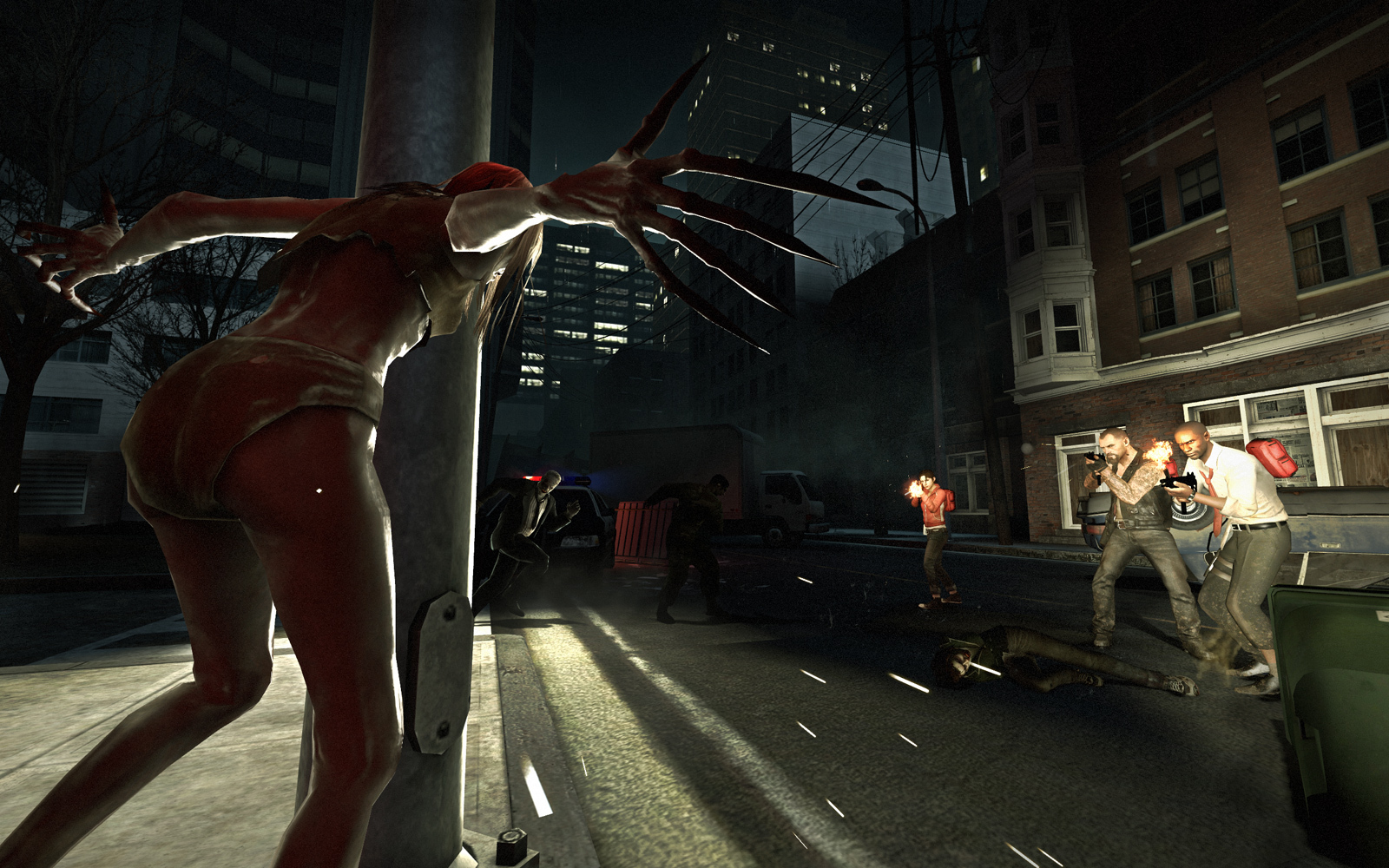
"Readability was a very important thing—we wanted the characters to stand out in the world, and the ability to tell who is who," TF2 art director Moby Francke explained on that game's art direction back in 2008.
"We wanted to put all the detailing up towards the chest area of characters, so you could easily see the weaponry—the patches, vests, bandoliers, neckties, caps, pants. They all contribute to this readability factor. We then also gradated the character from the dark bottoms to the contrasting upper torso for better readability."
The biggest gaming news, reviews and hardware deals
Keep up to date with the most important stories and the best deals, as picked by the PC Gamer team.
This attention carried over into Left 4 Dead. After all, it's important to tell if you're looking at a Witch or a fellow survivor when peering down a dark corridor through film grain, vignette and flickering lights. You can even see where Valve pushed hard on readability—early survivor models looked busier, more rugged, but less immediately distinct than their final forms.
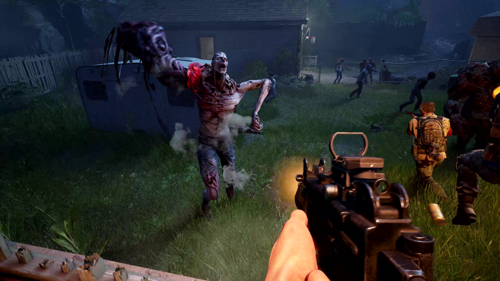
In contrast, Back 4 Blood's survivors don't really say anything. They're all just guys and gals in knackered hoodies and baseball caps, saddled down with holsters and survival gear. Maybe they'll have a "quirk" (the nerd with glasses, the old lady), but by and large they read pretty much the same.
Their foes suffer the same fate—gnarly, overdesigned monsters that lack the immediate recognisability of a Smoker or Boomer.
That's to say nothing of a worldbuilding that just isn't quite there. Back 4 Blood feels like a hodgepodge of contemporary zombie flicks, The Walking Dead meets World War Z. And on the face of it, that's nothing bad—what is L4D, after all, if not a videogame pastiche of 28 Days Later?
But there's something awfully "branded" about the way Back 4 Blood names its apocalypse. Survivors aren't survivors, they're cleaners. And in a tired trend of refusing to call your zombies by the z-word, the infected here are called "The Ridden". They're terms you can practically see plastered on a developer's whiteboard.
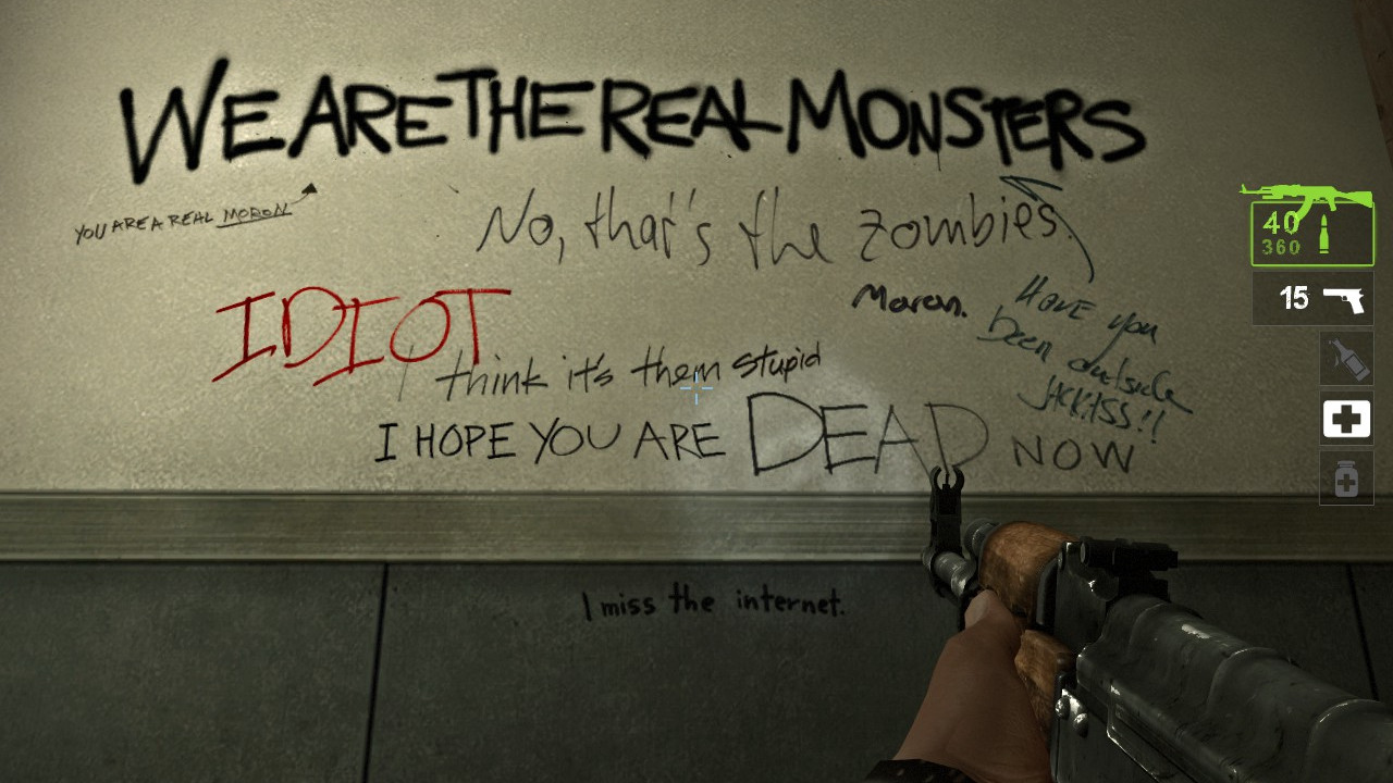
L4D wasn't exactly original, but that meant it could cut to the chase. No explainer on where the zombies came from or how these survivors knew each other. If you wanted to dig into that stuff, it was there—scrawled across the game's levels in wonderfully comic graffiti, instead of being painstakingly explained to you in every facet of the game's marketing. This left plenty of space for the characters to grow far, far beyond the archetypes they might've been.
Francis isn't just a biker, he's the guy who hates everything—except vests. Louis' "pills here" holler is probably more well-known than the game itself. L4D2's survivors might not have stuck in the cultural consciousness quite as hard, but Coach sure did become the face of some truly bizarre music videos.
It's too early to tell, obviously. But when the most memorable line to come out of Back 4 Blood's latest trailer is "I love Mondays", it's hard to imagine Back 4 Blood's cleaners sticking in the mind in quite the same way.
I'm sure Back 4 Blood will be a bloody great co-op shooter. Turtle Rock knows how to make 'em, and I trust the developer to carry the adrenaline-pumping zombie shooting it pioneered in 2008 in bold and exciting directions. But without the charm Valve's sensibilities brought to those first two games, Back 4 Blood will never be Left 4 Dead 3, for me at least.

20 years ago, Nat played Jet Set Radio Future for the first time, and she's not stopped thinking about games since. Joining PC Gamer in 2020, she comes from three years of freelance reporting at Rock Paper Shotgun, Waypoint, VG247 and more. Embedded in the European indie scene and a part-time game developer herself, Nat is always looking for a new curiosity to scream about—whether it's the next best indie darling, or simply someone modding a Scotmid into Black Mesa. She also unofficially appears in Apex Legends under the pseudonym Horizon.
