Analysing what are probably two Just Cause 3 screenshots

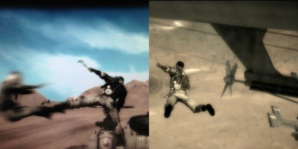
Two weeks ago, Just Cause creator Christofer Sundberg posted a blurry, sepia-toned screenshot of a man knocking another man off a motorbike. Rumours had been kicking around that their studio, Avalanche, might be making a Mad Max game, so we theorised this might be from that.
But last night he posted another shot of the same character, this time looking a lot like Rico Rodriguez, and doing Rico Rodriguez's favourite thing: jumping out of an aircraft. This is very, very probably Just Cause 3. So a) Woo! and b) Ooh. Let's analyse!

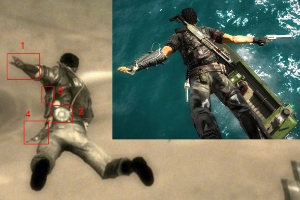
Compared to the Rico of Just Cause 2, this guy has 4 interesting differences.
1. The glove. It's still big, which suggests it's for more than just gripping things, but the grappling cable that used to stick out of it is gone. Which leads us to:
2. The spool. A circular thing near the belt with a thick cable leading out of it to his shoulder. Interesting! To me this suggests a new grappling hook, one that's stronger and maybe designed for Rico to spend more time dangling from. You could hang from aircraft by your hand-grapple in Just Cause 2, but I always wanted to be able to extend it to do big Tarzan-swings between planes.
3. This thing. Probably a gun holster.
4. This curved thing. Completely mysterious to me here, but the other shot shows him swinging a short, curved weapon or tool - something he's presumably just hit the bike's former driver with. This could be the holster to that, though I don't have a good theory for what it is.
The biggest gaming news, reviews and hardware deals
Keep up to date with the most important stories and the best deals, as picked by the PC Gamer team.
The context is also interesting. What we can see of the aircraft he's jumping from looks like the undercarriage of a blimp, and the blurry white thing on the ground next to the character's shoulder could easily be a blimp on the ground. If they're planning to strap a stripclub to the bottom of it, this'll be a prequel.
In both shots, every vehicle we can see looks a bit old-fashioned. But it's hard to know if the sepia tone is an artistic hint to the setting or just a shitty Instagram filter.
Anyone spot any other hints?

