The worst PC game box art ever
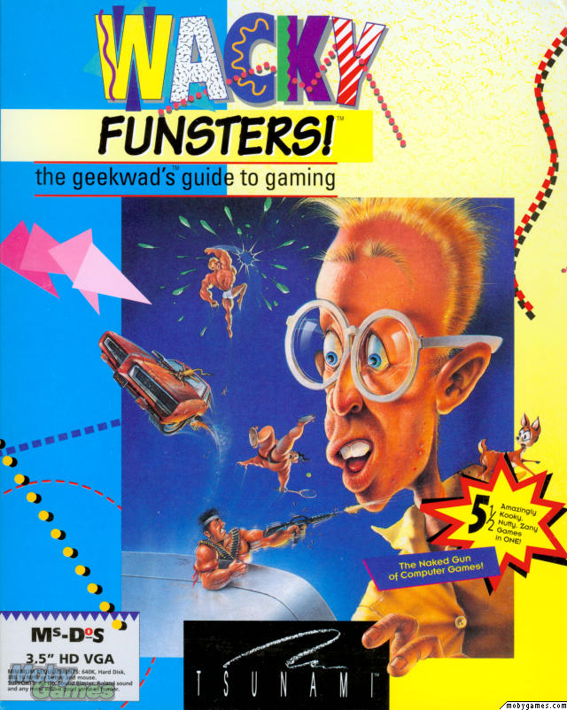
My eyes, my beautiful eyes!
Box art images taken from Mobygames.com, the best information repository for games around, unless otherwise noted. Visit them, love them, they do sterling work.
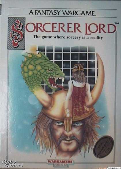
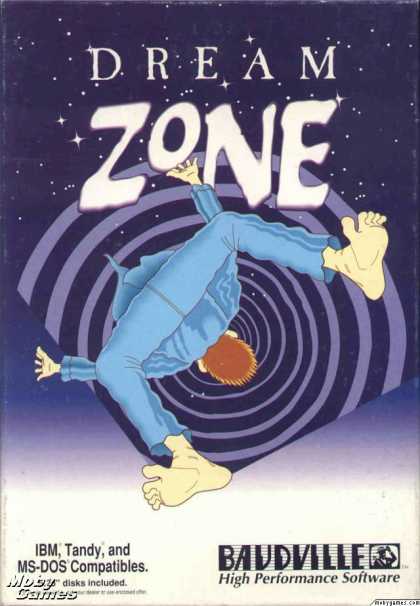
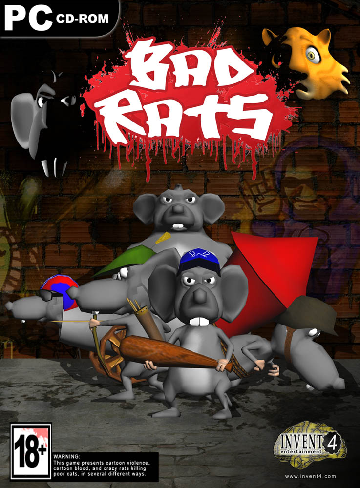
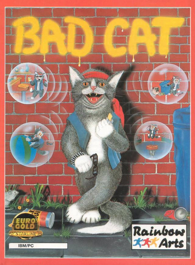
It's hard not to judge a book by its cover when that cover looks like... this. The PC has never been quite as artistically cursed as some platforms, as anyone who's ever seen the NES Mega Man box or just about every Sega Master System game will know, but that doesn't mean it's been an artistic home-run. For every bit of stunning box art that we'll remember forever, there's a monstrosity that's seared its way into our memory. Here's our updated list of some of the worst PC game box art known to man. Remember, in every case, someone thought this would make you buy the game within. With money.
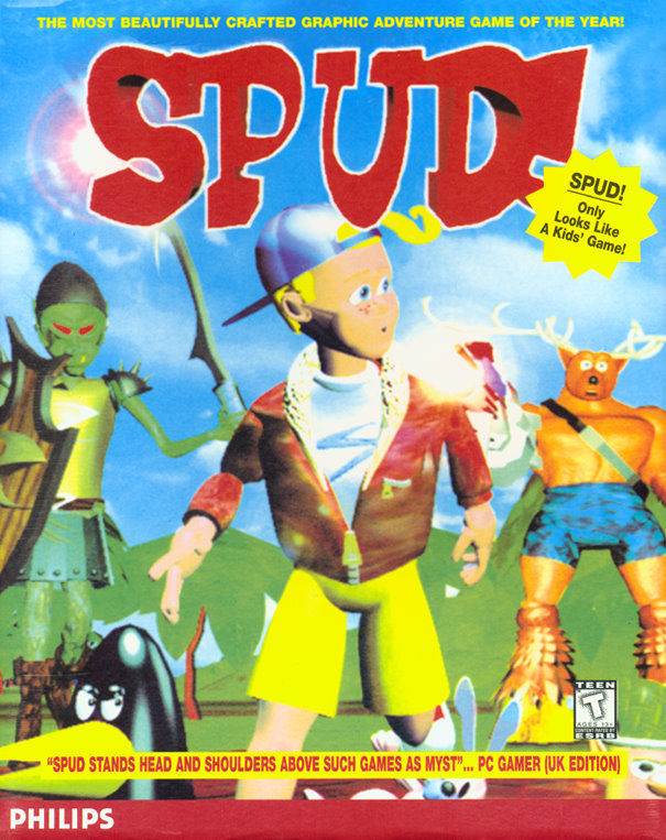
Spud!
There's just so much to love on this cover. The reindeer(?) in the background wearing skin-tight boxers who just realized he left the stove on; the utterly failed attempt to make this CG abomination of a child look cool; the tag that reads "Spud! only looks like a kids' game!" because someone knew this cover was a failure on every conceivable level and was trying desperately to save it. At least it's a fitting cover for the actual game, which is beyond description.
Someone at PC Gamer back in 1995 thought this was better than Myst, apparently. We're so, so sorry.
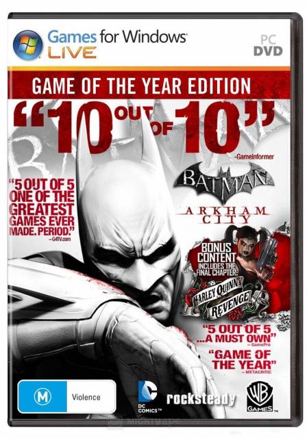
Batman: Arkham City Game of the Year Edition
There are seemingly dozens of variations on this cover from different platforms and regions, but they all have one thing in common: ruining austere art with a laughable quantity of marketing taglines. The Games For Windows Live banner is really the icing on this disaster cake.
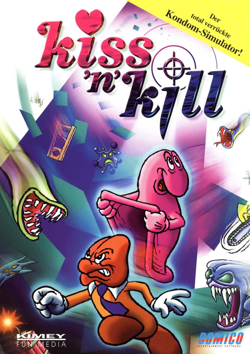
Kiss 'n' Kill: The Ultimate Condom Simulator
As described on Archive.org: "Sex education game on CD-ROM featuring anthropomorphic cartoon penis & condom characters, for Windows 95 and Macintosh." Utterly horrifying.
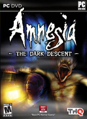
Amnesia: The Dark Descent
Amnesia is an incredible horror game. It's tense, thrilling, and constantly unnerving, as an invisible monster chases you throughout. And yet someone decided to put that monser on the cover, and make it look like a vampire duck man with a rope covering his nipples. Disaster.
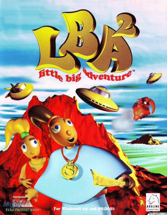
Little Big Adventure 2
Take your pick of the terrible box art for this one: it had different art and different names across regions, and they're all godawful.
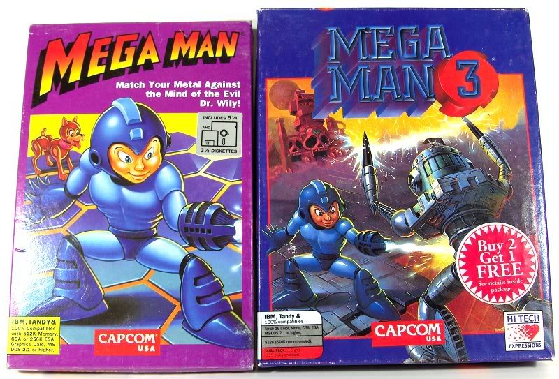
Mega Man
While not as infamously terrible as the American NES Mega Man box art, I just can't get over Mega Man's face in this cover. It's not awful, just... wrong. Perhaps that's fitting for the Mega Man DOS games, which were bizarre one man projects licensed by Capcom.
Mega Man's face is still in creepy doll territory in MM3's cover, but at least there's a pretty cool robot.
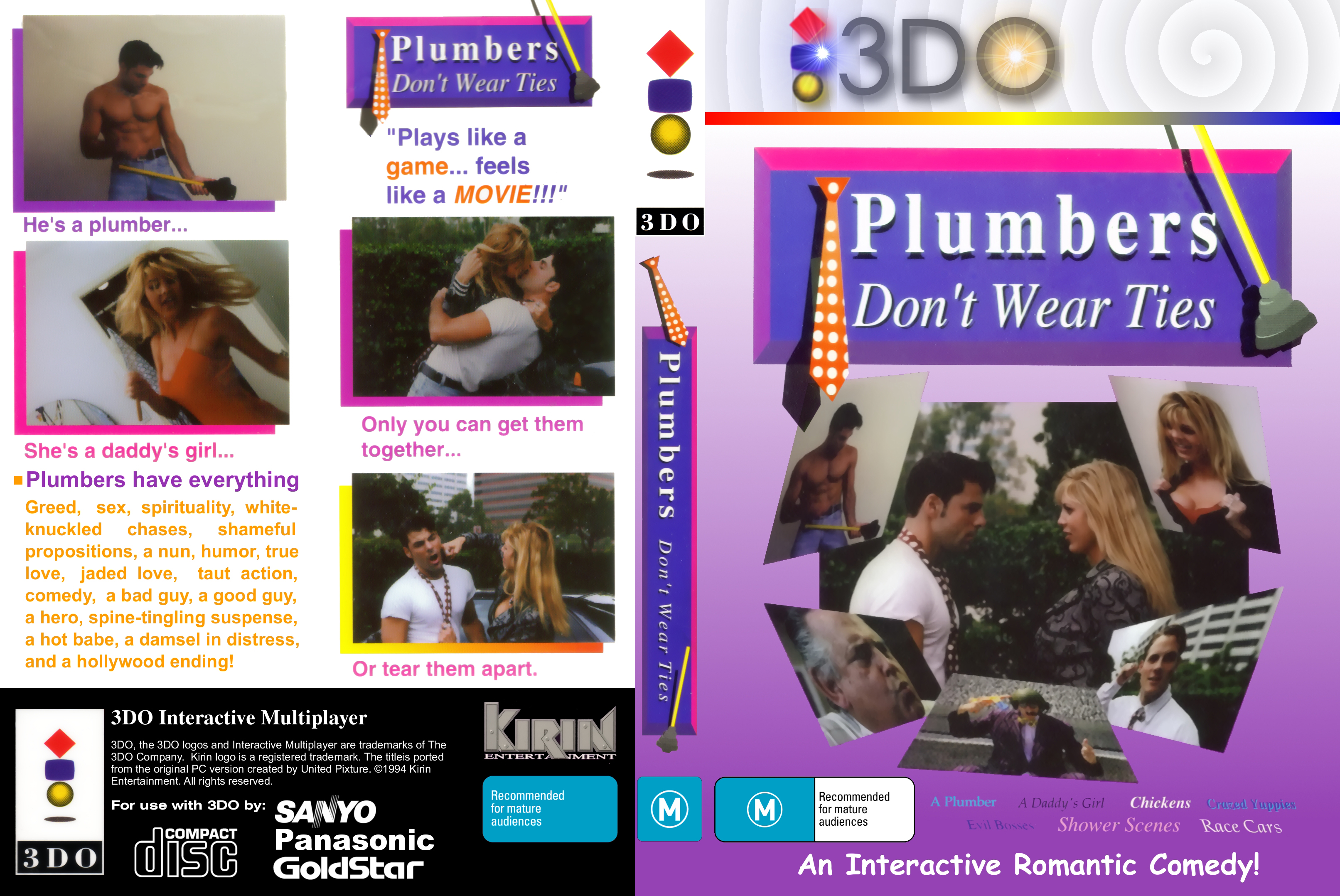
Plumbers Don't Wear Ties
One of the worst PC games of all time. Thought lost forever, it probably should've stayed that way. That clip art use is unforgiveable.
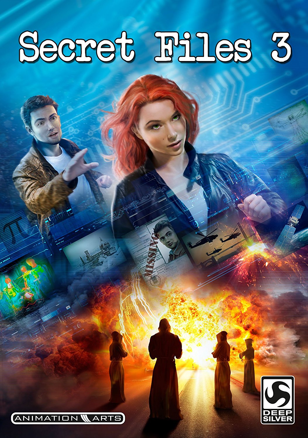
Secret FIles 3
Far from the worst on this list, but Secret Files 3 checks every box necessary to make it look like a terrible direct-to-video CSI spin-off. What a perfect mix of generic imagery. Satellites! Helicopters! The Vitruvian man! Why is this guy labeled as "missing" when he's literally right there? Just turn around, lady!
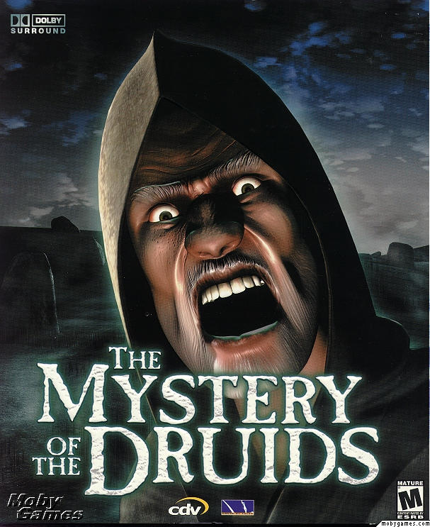
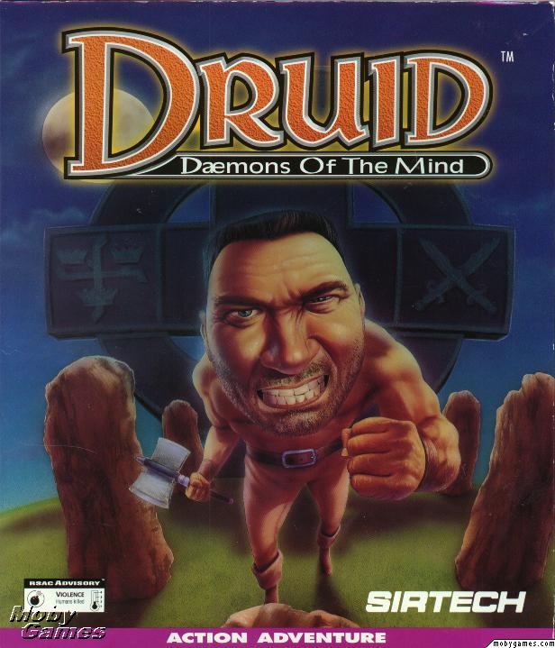
Mystery of the Druids
Hehehehe. Truly, the face that launched a thousand Photoshop memes. This screaming horror show isn't even the game's villain (and what a dreadful, dreadful game it is), but it doesn't matter. Nothing could give this pop-eyed screamer the sense of beardy menace it's obviously going for.
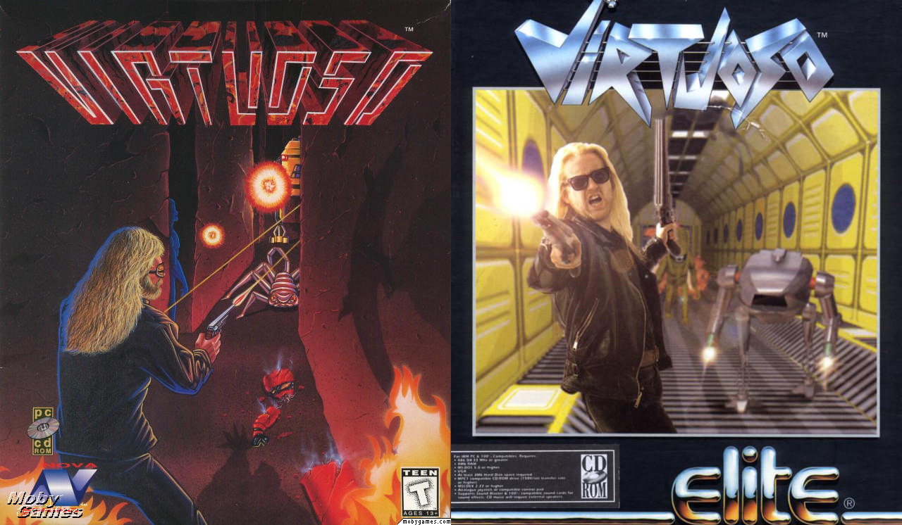
Virtuoso
Two terrible covers! I don't know which one to pick—the appallingly drawn US version, or the UK one where the rockstar version of Mr. Magoo doesn't seem to know where his enemies are! Luckily, both were wrapped around the same game—a truly wretched third person shooter with all the mastery of a piano player with sledgehammers instead of fingers.
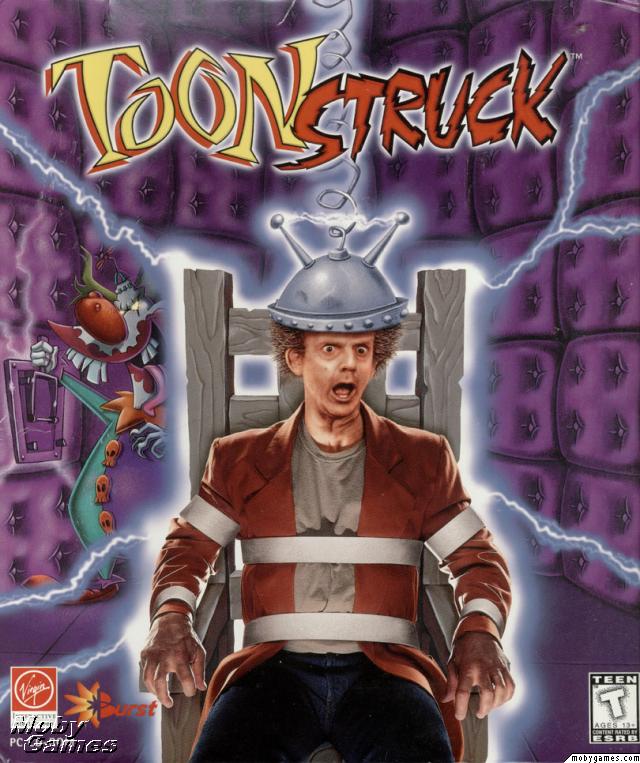
Toonstruck
You'd think that if you were creating a game with the hook "Christopher Lloyd interacts with toons like in Roger Rabbit", the first job would be convincing people that you could actually, well, draw. But no! Far better to serve up this glorious exercise from How To Not Entirely Suck At Photoshop In 28 Days and help guarantee a great adventure languish in obscurity for years. Hurrah for GOG finally bringing it back to the market so more can play it.
This of course was just the horrible US cover. The UK got a very different box. It wasn't exactly attractive, but it was definitely eye-catching...
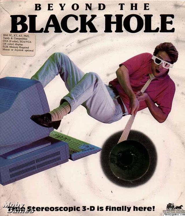
Beyond The Black Hole
That's a sink. You're falling into a dirty sink. Or possibly the Ubisoft logo. If this was the world's welcome to stereoscopic 3D, it's no wonder it died on its arse. "With your GrenoVision goggles locked in place, the entire computer comes alive!" it promised back in 1989. You're probably wondering if this claim was a little over-ambitious. You will not be surprised to hear that yes, yes it was.
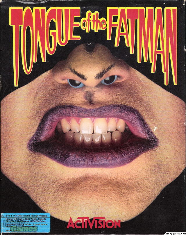
Tongue of the Fatman
I guess with a name like "Tongue of the Fatman", it could have been worse. Maybe. Still, when your cover consists of a face with eyes shoved up the nostrils to make an alien face, I'm going to say you've just defined the exact opposite of 'special' effect. When even Red Dwarf is willing to take the piss out of a technique... yeah, you've failed.
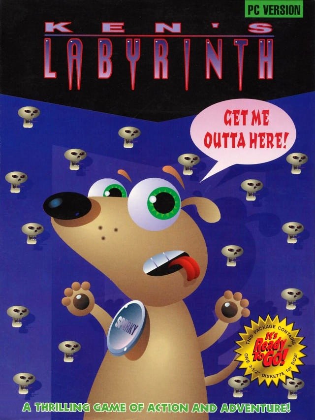
Ken's Labyrinth
Back when Epic Games was Epic Megagames, the standard way of buying the full version was to send a cheque through the mail and get disks back in return. Still, a few of them did get boxed releases, and... yeah. Ken's Labyrinth wasn't exactly the grittiest shooter ever made, but it still deserved something with a bit more oomph than this hastily thrown together mass of shaded shapes. This is the worst of them, but don't think Epic's other characters got off much easier...
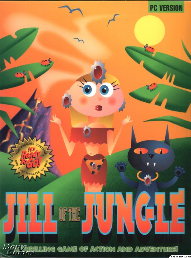
Jill of the Jungle
...Pity poor Jill of the Jungle in particular. You know you've got a bad bit of box art when even the main character is looking around and thinking "What the shit?"
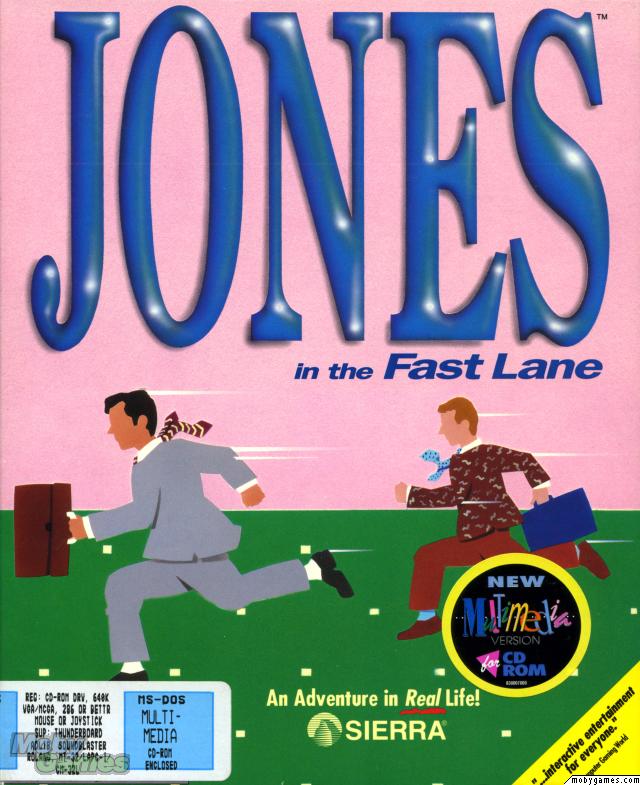
Jones In The Fast Lane
No, it's not a desktop toy to kill some time at work. It's a light-hearted life simulation board game from Sierra, the makers of games like King's Quest, Gabriel Knight, Space Quest, and Quest for Glory. How could such a prestigious company release something so dull that it could be filed next to Microsoft Excel and still look like the more boring product? Only with incredible effort. And to think, it always felt like nothing would ever top Wheel of Fortune.
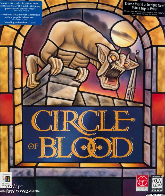
Circle of Blood
Adventure players will know this better as "Broken Sword: The Shadow of the Templars". The Broken Sword name kinda hung over the series after it lost all relevance, but at least beats Circle of Blood. Meanwhile, absolutely anything beats this hilarious gargoyle that seems to be shouting "Hey! Hey you! Buy another game! ANY other game!"
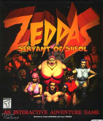
Zeddas: Servant of Sheol
Sometimes a developer or publisher will realise it has a turkey on its hands and try and compensate by putting boobs on the cover. In the case of Zeddas, I think we can safely picture someone staring miserably at the game in progress, picking up a megaphone and just yelling "More boobs!"
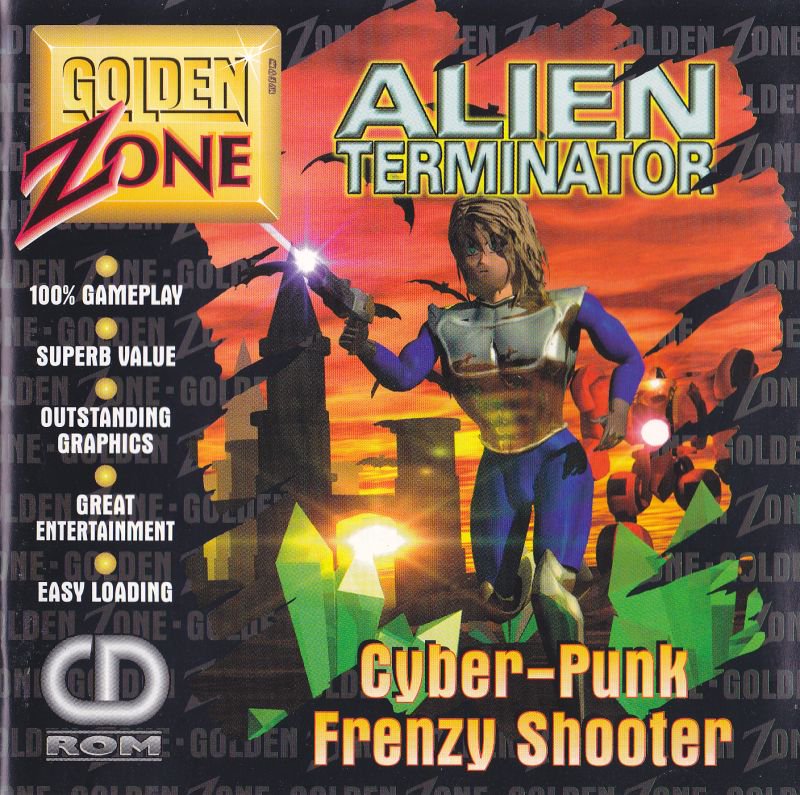
If you believe this game has outstanding graphics, boy have I got a bridge I want to tell you all about. Although, to be fair, it actually looks quite a bit better than its cover. And it's comforting to know that it's 100% gameplay.
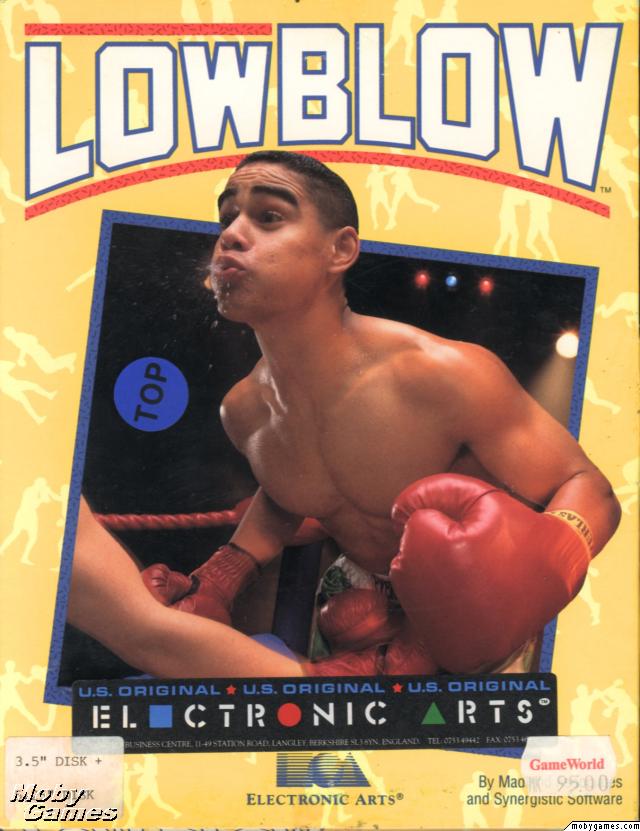
Low Blow
I can't decide if this is one of the worst... or one of the best.
Either way, goodness what a lot of terrible art! But is there a big stinker we've missed? Pop it in a comment, ideally with a link to its pic page over on Moby. PC only though! As terrible as, say, Phalanx absolutely was on SNES, we've got plenty of failures on our own platform to both enjoy and endure.
Keep up to date with the most important stories and the best deals, as picked by the PC Gamer team.
You are now subscribed
Your newsletter sign-up was successful
Want to add more newsletters?
Every Friday
GamesRadar+
Your weekly update on everything you could ever want to know about the games you already love, games we know you're going to love in the near future, and tales from the communities that surround them.
Every Thursday
GTA 6 O'clock
Our special GTA 6 newsletter, with breaking news, insider info, and rumor analysis from the award-winning GTA 6 O'clock experts.
Every Friday
Knowledge
From the creators of Edge: A weekly videogame industry newsletter with analysis from expert writers, guidance from professionals, and insight into what's on the horizon.

Every Thursday
The Setup
Hardware nerds unite, sign up to our free tech newsletter for a weekly digest of the hottest new tech, the latest gadgets on the test bench, and much more.
Every Wednesday
Switch 2 Spotlight
Sign up to our new Switch 2 newsletter, where we bring you the latest talking points on Nintendo's new console each week, bring you up to date on the news, and recommend what games to play.
Every Saturday
The Watchlist
Subscribe for a weekly digest of the movie and TV news that matters, direct to your inbox. From first-look trailers, interviews, reviews and explainers, we've got you covered.
Once a month
SFX
Get sneak previews, exclusive competitions and details of special events each month!
