A brief history of PC case design
From beige towers to mini-ITX power, we look back over the past decade and a half of PC case evolution.

If there's one part of the a PC that can be an expression of the builder's personality, it's the case. Today, cases come in myriad sizes and shapes and offer a wide array of features, but it wasn't always this way.
PC cases used to be beige, heavy, and unwieldy. The 2006 Dream Machine departed a bit by opting for an aluminum chassis, and improved its appearance with a paint job inspired by race cars. As time passed by, case manufacturers experimented with new features. Some designs failed, others became standards that we expect in modern cases.
Today's PCs are often smaller and offer luxuries that we would've died for in 2000: sliding hard drive trays, magnetic dust filters, and cable management galore. It's taken a lot of iteration (and some weird design) to get to the PC cases of 2016. Let's take a look back.
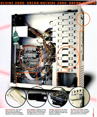
PC Power and Cooling full tower (2000)
Big steel was the name of the game back in the day, and Maximum PC's 2000 Dream Machine definitely went big on the case. The case showed that the "bigger is better" mentality dominated PC building, at least when it came to high-end performance.
Some key features to note are the position of the PSU and the drive cage. Like many cases at the time, this one mounted the PSU above the motherboard. The drive cage in this case is also fixed, without any intake cooling fans to speak of.
Also note the lack of ventilation at the top of the case. Where there is ventilation and airflow, it is provided by 80mm fans and cutouts, which are minuscule by today's standards.
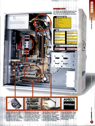
Falcon Northwest Mach V (2000)
While the Falcon Northwest's Mach V didn't get the highest of marks from Maximum PC in 2000 (it got a 6 out of 10), it was a great example of what system builders were doing at the time.
Like the cases of the era, the Mach V mounted its PSU up top and used screws to secure all of its drives in place. The exterior of the case was a drab off-white color, like many cases of the era. And like other cases, there was no real cable management to speak of, though Falcon did improve airflow by using zip ties to roll the IDE ribbon into a more manageable shape.

Antec Super LanBoy (2003)
Antec's Super LanBoy was an experiment in making cases smaller and lighter when most desktops still favored heavy steel frames. The Super LanBoy was made of aluminum and plastic, and featured LED lighting. The case came with a carrying strap that was meant to make it easy to transport the PC to LAN parties. Super LanBoy reviews criticized its flimsy-feeling (compared to steel) materials, but applauded its relatively light weight and portability.
The case featured nine drive bays and a "tool box" for spare screws and such. (Some modern cases like the Cooler Master CM Storm Trooper still come with a tool box.) The case also featured a pair of 120mm fans, which had a 50 percent larger diameter than the 80mm fans that were common at the time.
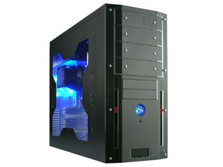
Rosewill TU-155 (2004)
While the internals of the budget-priced Rosewill TU-155 were very much status quo, it's the externals of this case that raise eyebrows. In 2004, PC cases still opted for off-white and silver color schemes. In contrast, this case came with a black exterior, blue LED accents, and a window so you could see your parts. These design elements are alive and well today.
Note that the inside of the case is not painted, however.
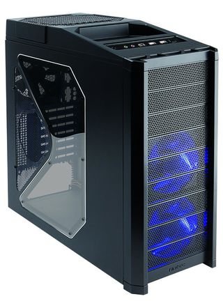
Antec Nine Hundred (2006)
The Antec Nine Hundred was important for its time because of what it represented. It was one of the most popular gaming cases of its era, sporting blue LED fans, a huge side window, and an impressive front panel that was positioned up top.
Unfortunately, that's about where the impressiveness ended. Though relatively roomy for its time, the Nine Hundred didn't offer much in the way of cable management, and had a big vertical drive cage that was bolted to the frame.
Innovative it was not, but it was a mainstay of PC gaming at the time.
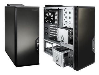
Antec P182 (2007)
The severe-looking Antec P182 had a shape that reminds me of the monolith from 2001: A Space Odyssey. The simplistic and minimalist exterior is a design choice that many of Antec's cases stick to today. However, what interests me is what's under the hood.
The P182 featured a separate compartment for a bottom-mounted PSU. This design feature is widespread today; it helps keep the PSU from affecting the system thermally, and helps keep cable clutter in the rest of the system at a minimum.
The case also had removable drive cages, with tool-less drive brackets that slid into the cages. This modularity is something that we still see today in the Cooler Master Master Case 5 and others and was a great feature for a case built in 2004.
Finally, the P182 featured rudimentary cable management features. Pre-installed plastic straps kept cables neat, and cutouts allowed access to the back of the motherboard tray. While these features seem very basic by today's standards, PSU cables tended to be individually insulated, without a bulky shroud to add girth.
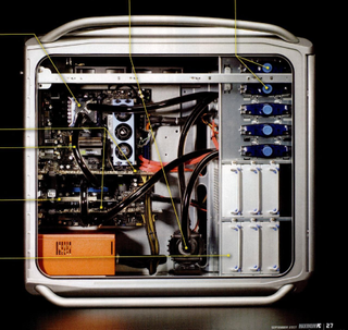
Cooler Master Cosmos (2007)
The Dream Machine that graced Maximum PC's pages in 2007 had a modern exterior and interior. The Cooler Master Cosmos that was chosen as the case had several features that we expect from contemporary cases: bottom-mounted PSU, removable HDD brackets, and tool-less installation for 5.25-inch accessories like optical drives and audio controls. If you look closely, you'll notice the Cosmos even had fans mounted above the motherboard for ventilation.
Even with all these modern features, there's one glaring omission: cable management. All of the cables are still routed in the main compartment, on full display.
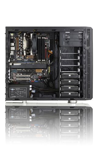
Fractal Design Define R2 (2010)
The one thing you might notice about Fractal Design's Define R2 is that it's modern in just about every sense possible. With its clean exterior lines, the R2 eschews the gaudy LED fans of years past, and focuses on providing the basics in a logical layout.
The white removable tool-less drive trays are oriented sideways for easier swaps. While this orientation seems trivial, it is a common feature in modern cases that you won't have seen in many of the previous slides.
Another thing that's worth pointing out is the cable management cutouts. Rubber grommets cover the cutouts and help give the case a cleaner look, while multiple cutout allow for several cable routing options. And the interior is black, helping parts disappear instead of popping against a plain steel back panel. It just looks nicer.
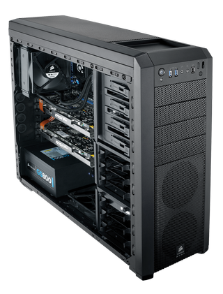
Corsair Carbide 500R (2012)
Corsair's 500R is a modern tower in every sense of the word. With a moderate price, good build, and lots of features, the Carbide 500R does just about everything right.
The 500R features removable drive cages, good cable management, and tool-less drive and accessory installation. The drive trays are even designed to be compatible with SSDs without an adapter, which you'd commonly need half a decade ago.
The main thing that sticks out to me is the physical space made available for liquid-cooling radiators. The introduction of closed-loop (or all-in-one) coolers made liquid cooling more accessible for everyone. However, you still need the physical space and mountpoints to mount the radiator. This case has ample room for those features, as well as a modern airflow design that pulls air up from the bottom of the case and radiates it out the top and rear.
Falcon Northwest Tiki (2012)
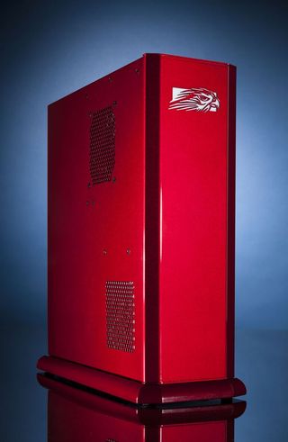
This little powerhouse is a radical departure in design (and power) from Falcon Northwest's Mach V , from the year 2000. Sure, the i7-5960X and GTX Titan X are far, far more powerful than the system at the turn of the millennium, but it's the design that is so striking.
The super-compact case fits easily on a desk. While it's quite heavy, the system isn't much larger than a hefty dictionary. You can open up the case, but this case isn't designed for system expansion.
Besides the obvious clean lines and stellar paint job, one thing that's worth noting is the base. Falcon Northwest offers either machined aluminum or granite bases for its Tiki systems, providing an even higher level of that premium feel.
While the Tiki is a great example of mini-ITX case design, other system integrators have some pretty great designs too. DigitalStorm's Aventum line of PCs are big but beautiful.
Phanteks Enthoo Evolv mATX (2014)
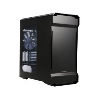
I'm a big fan of Phanteks's line of Enthoo Evolv cases. With modern shapes and aluminum exteriors, the Enthoo Evolvs look great and offer a ton of cooling options. The Evolv is great on the inside, but it also has style that you wouldn't find in case design in the mid-2000s.
Like the 500R, the Enthoo Evolv cases offer great cable management, though the Evolvs also offer built-in hook-and-loop straps for cables in the rear.
The cases are built with cooling in mind, whether you want to go air, all-in-one liquid, or custom loop. The cases come with pleasantly austere interiors, though the accessories (like HDD mounting brackets) allow you to expand the system elegantly and as you see fit.

Fractal Design Define S (2015)
As earlier case designs tended to opt for more pizzazz and whiz-bang features, the interiors of the boxes became cluttered with cages, fans and who-knows-what. Fractal Design's Define S went the other direction, opting for the type of clean simplicity you'd expect from an Ikea ad.
The Define S eschewed 5.25-inch drive bays completely, which helped usher out the era of internal optical drives. It also did away with the hard drive cages, opting instead to mount hard drives and SSDs vertically in brackets on the back of the motherboard tray.
Even with these design elements aside, the Define S is well known for the sound dampening features. The side and top panels of the Define S come with a thin padding that helps reduce acoustic noise from fans and hard drives inside the case. (I have the windowed version pictured, but there is a solid-panel version for even better sound dampening.) While many users don't mind the noise generated by their systems, the Define S looked to people who preferred working or gaming without the constant hum of fans.
DeepCool Tristellar (2015)
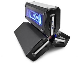
Deepcool's Tristellar case is interesting for obvious reasons. Its wild departure from the boxy form factor shows how small components have gotten. The mini-ITX case keeps its major components in separate sections, and manages to show off the GPU s well.
The Tristellar isn't lightweight, though. The panels for each of the sections are made of steel, and the frame is heavily reinforced. In recent years, partially thanks to the size if mini-ITX motherboards, we've seen many more case designers experiment with unique shapes like the Tristellar and open air builds like the In-Win D-Frame and Lian Li PC-06X.
NZXT Manta (2016)
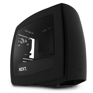
While most people think of small form factors when it comes to mini-ITX, the Manta proves that using a small motherboard doesn't mean you need to have a tiny box full of compromises.
The roomy Manta really is a culmination of modern case design. It has beveled channels for cable management, a separate PSU compartment, tool-less drive trays, plenty of room for radiators and liquid cooling, and a rounded exterior design that departs from the traditional box shape that PCs have been shackled to for years.
As much as I like the Manta, it's just one of the many mini-ITX cases that challenge traditional PC case design methodology. If you're interested in the future direction of exciting case design, I highly suggest you keep an eye on mini-ITX cases.
Do you have a favorite case that you think helped shape modern case design? Nostalgic for an old build? Let us know in the comments.

Most Popular


