Hate me for it if you want, but I like Windows 8.1. Here's why.
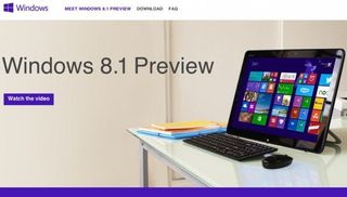
Right, I'm very much aware there's a good number of folk out there harbouring a great deal of scepticism towards Windows 8 and it's subsequent updates and I'm likely to be vilified in the comments for saying this, but I'm still a big fan. I like the apps, don't mind the new interface - even on a desktop rig - and it's got a host of behind the scenes code improvements for gamers.
And with the Windows 8.1 Preview released last week, around Microsoft's Build developer's conference, I think this latest OS has only gotten better.
Microsoft has a lot of work to do to win back the people it angered by removing the Start menu and forcing people into its Modern UI (née Metro) interface, but with this update it shows they're at least listening.
A bit.
And then kind of doing their own thing anyway.
First thing's first; the Start menu hasn't returned. Microsoft are sticking to their guns and keeping the Start screen instead. They have added a Start button , but its function is similar to the one in the original Win8 Developer Preview, so it only takes you back into the Modern UI Start screen.

"You want the Start button back? Well, there you go," MS seems to be saying. "Oh, you wanted the Start menu back? You should've said...you did? Oh well, we like the Start screen.'
The biggest gaming news, reviews and hardware deals
Keep up to date with the most important stories and the best deals, as picked by the PC Gamer team.
But it's not all bad, as they've added a little more functionality to the already powerful Power User Menu. It's almost like having the Start menu appear on clicking the Windows icon, but you instead have to use the right mouse button instead. You can also change the way you boot too, so you can now avoid the Modern UI from the outset and jump straight to the desktop at login. You can also configure it so that when you hit the Win key on your keyboard or click the logo on the taskbar it takes you into the app screen rather than the Start screen. What's more, they've added a shutdown option to the right-click menu, removing the convoluted old process and solving one of my biggest gripes with 8.0.

My favourite thing about the Windows 8.1 Preview release so far though is one of the simplest. You can now have your standard desktop background persist into the Modern UI. Like I say, it's a simple thing, but it makes a big difference. Switching between desktop and Modern UI used to be incredibly jarring, feeling like moving into a completely different OS - by simply having the same background that disconnect to me almost seems to have disappeared.
There are a fair few other improvements in there and you can pick up the Windows 8.1 Preview yourself from Microsoft . But be warned, this is still a preview of an operating system - not even classified as a beta - so install on your main PC at your own risk.
It also has to be pointed out that when the final release is out there - which will be a free upgrade for Win8 users - you will have to completely refresh your Preview installation. And that means installing all your apps again. You have been warned.
Phew, that's my positivity used up for today. Is there anyone else out there who doesn't mind Windows 8?

Dave has been gaming since the days of Zaxxon and Lady Bug on the Colecovision, and code books for the Commodore Vic 20 (Death Race 2000!). He built his first gaming PC at the tender age of 16, and finally finished bug-fixing the Cyrix-based system around a year later. When he dropped it out of the window. He first started writing for Official PlayStation Magazine and Xbox World many decades ago, then moved onto PC Format full-time, then PC Gamer, TechRadar, and T3 among others. Now he's back, writing about the nightmarish graphics card market, CPUs with more cores than sense, gaming laptops hotter than the sun, and SSDs more capacious than a Cybertruck.
'When a widespread outage affects devices from starting properly, Microsoft can broadly deploy targeted remediation': MS introduces 'quick machine recovery' for Windows 11
Implementing a spellchecker on 64 kB of RAM back in the 1970s led to a compression algorithm that's technically unbeaten and part of it is still in use today
