The 19 worst game design crimes
From invisible walls to unskippable cutscenes.

Some game mechanics are divisive. There are those who would argue vehemently against regenerating health in shooters, while others would be entirely fine with it. It's a matter for debate. This is not a list about those mechanics. This is a list of design quirks that should be consigned to the scrapheap forever. We see them time and time again, even in multi-million dollar games built by hundreds of developers, so we decided to get some of our biggest gripes together in one place. And on that day, in a storm of fire, fury and intense grumbling, we forged our list of gaming's greatest design crimes.
Defeating the player in a cutscene

You've reduced a pirate camp to rubble. In a firestorm of hot lead and popping grenades you've taken out twenty or thirty foes and now you're charging into the caves with a shotgun and a tiger-bag full of ammo. Hordes more rush out of the shadows, but you cut them down effortlessly. Then you turn a corner and WHAM. Cinematic banding clamps the screen in place, the controls stop working and a goon bludgeons your character into unconsciousness with a rifle butt.
With a squeaky POP , the carefully crafted power fantasy implodes. The cutscene takedown doesn't just jolt the player out of the action, it undermines all of their efforts leading up to the interruption, and can make entire levels feel like a waste of time. Worse still, the offending cutscene then forces you to swallow a monologue from the main bad guy.
Unskippable cutscenes

Cutscenes can be great, but we don't play games to watch films. We already have films, and they're often made by people who have spent their entire lives learning how to make films. By all means, have a cutscene or two, but make them instantly skippable and give us a way to pick up any plot details we may have lost in the interim. That goes for intro movies too.
Save points before unskippable cutscenes
There are certain points at which a player is likely to just switch off a game and never, ever play it again. Being thrown back to a save point before an unskippable cutscene is a big one. The cutscene we barely got past the first time will seem much worse the second time round.
No options for colourblind players
This one particularly applies to games that require players to differentiate between colours in order to play effectively—RTS games with lots of units, for example. According to the National Eye Institute, as many as 8 percent of men and 0.5 percent of women have some form of colour blindness. Alternative colour schemes that counter various forms of colour blindness can be essential to these players.
Invisible walls and unconquerable waist-high barriers

Creating believable ring-fences in a high fidelity 3D environment is a tricky problem, but the solution should never be a magic invisible barrier that blocks all progress. A shin-high trickle of rubble is almost as bad, and the flight-sim tendency to take control of your craft and force it into a U-turn feels equally awkward.
The biggest gaming news, reviews and hardware deals
Keep up to date with the most important stories and the best deals, as picked by the PC Gamer team.
An approach we've seen recently in military shooters grays out the screen and threatens the player with death unless they get back in bounds before an arbitrary countdown expires, which at least adds an interesting element of blind panic to boundary navigation. Why not employ a spring loaded boxing glove USB peripheral to increase the tension? Alternatively, put a wall there.
Crafting systems that force you to leave the game to find recipes
For some players it’s fun to discover crafting recipes through experimentation, but most would rather be able to look them up in-game than go searching for answers in the wild untamed wikis of the internet. It is irritating having to alt-tab out of a game to go searching for extra information that the game really should supply, and presents an issue for youngsters who might have restricted online access. An optional in-game crafting glossary would preserve the experimental experience for survival game purists while still giving other players the knowledge they need to build and progress.
Wasted health items
Ever accidentally press the button to drink a lovely reinvigorating health potion even though you’re already at peak condition, only to watch your character go ahead and wastefully drink it like a chump? Take Resident Evil 7, a game in which medicine must be crafted from scarce resources hidden throughout the game’s creepy corridors. Press the use item button and your avatar will pour precious nourishing health juice all over his completely healthy unblemished arm. It’s a minor thing, but don’t let players accidentally waste health items.
"Are you sure?" pop-ups that can't be disabled
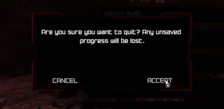
It's good to give the player warning before they do something that might lose progress or otherwise damage their experience, but some games seem to underestimate the level of physical control the player has over their own body. Mouse hands rarely go rogue and start clicking random patches of screen. If you're asking a player if they're sure they want to do what they just told you they want to do, consider including a 'don't ask me again ever' checkbox.
The arbitrary insta-fail
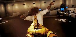
At the beginning of id's post-apocalyptic shooter, Rage, you're told to get in a car by a stranger in a buggy. Behind him a dusty slope heads off into the wasteland. If you walk past the buggy and head off on your own, he threatens you, and then shoots you dead. You're forced to reload and get in the car. Why have the path there? Why offer a false option and then dish out the ultimate punishment when the player indulges? It sends a clear and unpleasant message. "Don't exercise free will. Do as you're told, or you're dead."
Many quick time events are guilty of committing this particular crime. In the final moments of Battlefield 3's co-op campaign, you're required to shoot a foe to trigger your victory cut scene. Instead of letting you aim with the mouse and left click to shoot him, as you've been doing for the entirety of the campaign, it randomises a button-press demand, which in my case was E—the enter/exit vehicle button (here's a video of the scene via IGN ). I pressed left-click to shoot, and failed. Less of this sort of thing, please.
Inventory junk that isn't marked as junk
Some RPGs let you pick up any old rubbish. It’s fun to fill your pockets with dozens of spoons and bowls and random necklaces, but if most of these items are useless the game should make this clear, especially if you can become overencumbered when carrying too much.
It is also infuriating to carry around items that may or may not have utility. Are they the key to a future quest? Are they there to add a bit of flavour text? Designers can have a bit of fun with this, as Miyazaki does with the Pendant in Dark Souls—fans obsessed over its possible uses even though the description describes it as “a simple pendant with no effect.” Mostly though it’s a needless irritation. Mark junk items as junk and let us sell them all off in one go for spare change. If the game includes encumberment systems, let us discard all the junk in our inventory in one go too.
Invincible locked doors

You know the ones. You've walk up to them and press 'use,' you hear a weak rattling noise. Perhaps the handle wobbles apologetically, as though your avatar has given the handle an experimental tug. No dice. Perhaps you draw your shotgun and empty the barrel into the wood. It splinters but doesn't budge. You unhook a grenade, place it at the foot of the door and run down the corridor. BOOM. You wade back through the smoke and the door is still there. It always was and always will be, for it is an Invincible Locked Door, and it exists only to waste your time.
If you've got a building, you have to have doors, of course. It's fun to watch designers work their way around this one. Think of all those convenient stacks of furniture in Half-Life 2, and those big, dark cybernetic Combine locks. It doesn't matter how contrived the visual language is, anything that stops us from wasting our time trying to go through apparently functional doors is good. And for goodness' sake don't put a green light on an impassable door.
Having the first option in a menu be “Start New Game” rather than “Continue”

A minor gripe, but an easy fix. Many people who play games are quite busy. Chances are they've spent five minutes watching a parade of legally mandated developer/publisher/hardware manufacturer/middleware intro logos before even encountering the start menu. If that player has pressed "Start Game" once, how many times are they likely to ever press that again? Shift it down and let players get into the game that little bit faster.
Disjointed maps
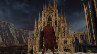
Games which boast wonderfully undeviating maps that guide us from point A to B with minimal effort, while simultaneously encouraging us to explore are great. A well-designed game world grants each in-game journey credibility, and, as Rapture, the Spencer Mansion and Dunwall to name but a few examples have shown us, a well-designed map can be as much a central character as the central characters themselves. But when it doesn't work, poorly designed maps can leave our adventures feeling hollow.
Pardon the pun, but the original Dark Souls is easily one of the most sophisticated, well-structured and inspired videogame worlds of all time—with each interconnected zone leading fluently into the next, lending Lordran a sense of believability, even against all the magic, undead monstrosities, and outlandish locales. Dark Souls 2, on the other hand, presents the opposite in that each destination is well designed in its own right—but regularly feels detached from what came before it. The best example of this is when travelling between Earthen Peak and the Iron Keep, whereby you travel upwards from a dingy labyrinth of windmills and poisonous tunnels overlooking the Harvest Valley below, to a castle surrounded by pits of molten lava. It's hard to become invested in a world so jarring—something Alien: Colonial Marines, Duke Nukem Forever, and Resident Evil 6 have also fallen foul of in recent years.
Unclear savegame destination
There are lots of reasons to want to access savegame files. We might want to back them up, or transfer them to a different machine. In most cases finding the savegame files for a game means looking up the directory address online, where players who have scoured their hard drives for the files share their knowledge. If the game knows where the files are going, show the location on the savegame screen.
Invincible story characters

Fallout 4 cheats
Minecraft commands
Red Dead Redemption 2 cheats
GTA 5 cheats
The Sims 4 cheats
Ark: Survival Evolved cheats
Maybe designers should keep a hypothetical player in mind when building levels. I propose the "frenzied psychotic maniac in a hurry" model. They're a nightmare. You're trying to tell them a story, but they're jumping on the tables and kicking crockery everywhere. Release them into your world and they'll embrace every exploit, try to vault over every barrier and worry at every loose thread of code. Now give them a weapon, and then introduce them to the main character at the center of your story. What will happen next? Everyone who said "tea, biscuits and a sing-song," sit down. Better luck next time. Today's prize goes to everyone who said "giggling murderous rampage"
Developers have found a few ways to cope with psychotic player behaviour. Bioshock locks important characters behind doors and cages, which only adds to those feeling of isolation. Admirably, Dark Souls and Deux Ex let you start a fight with anyone. These are both much better solutions than the dubious Elder Scrolls workaround, which makes important people invincible. Remember Martin from Oblivion? That's him being punched in the face by Tom above. Freeze him, electrocute him. Throw him off a cliff. He'll regain consciousness moments later, march up the mountain and reintroduce himself. This may seem fairer than an instant fail-state, but it breaks the logical consistency of the world to such a degree that it's impossible to feel any concern for the safety of those characters ever again.
NPCs you must follow who walk at a different speed to you

If I was to construct a new circle of hell designed to send victims slowly potty over a period of hours, I would force my victims to follow someone who always moves at a pace slightly slower than their own. If you run, you bump into their back over and over again. If you walk, you slowly fall behind. You can race ahead and backpedal, but it's still not quite right. This happens in games all the time. There's no reason why Captain Price can't run to that door around the corner at a reasonable pace. Why can't the old woman you free from the Spider Queen's web in Diablo 3 mount those five steps to the exit faster than a wad of creeping algae? Who knows, but it sure is annoying.
Bullet sponge bosses

The bullet sponge boss has a health bar that's five feet long. It's probably huge and visually impressive, for the first minute or so at least, but you quickly learn that it's an idiot. Its behaviour involves picking randomly from a small selection of attacks. It probably has glowing weak points somewhere. You engage the bullet sponge boss by shooting/slashing those weak points over and over again, wearing down its vast reservoir of health points in tiny increments. The bullet sponge boss does not win by reducing your health to zero, it feeds upon the ache of despair that takes root when you start to believe that this thing will never, ever die. This old fashioned model for boss encounters doesn't just doesn't wash anymore. Otherwise great games have been marred by this crime.
Wonky cameras/ambiguous jump angles in third-person platformers

Jump angles are defined relative to the camera position in third person platformers like Assassin's Creed, which can lead to infuriating hiccups. Pillar hopping challenges are a classic test. Your character bearhugs some cylindrical chunk of masonry, and must awkwardly shuffle around its circumference to get aligned with another pillar. You line the camera up, you indicate a direction, press jump and watch as your little dude backflips spectacularly into a yawning chasm. Not good.
Exit Game commands that don't exit the game
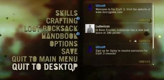
If someone presses "exit," they have a right to expect an exit. It's an unambiguous command. It doesn't mean "hey let's leave the session and then restart the game on the main menu screen." It doesn't mean "the player has indicated they want to exit the game, let's ask them if they're sure they want to exit the game." It means they want you to go away now. Their time with you is done.
That's all for now, but there are many more mistakes out there, waiting to be named and shamed. What are your biggest pet design peeves?
Part of the UK team, Tom was with PC Gamer at the very beginning of the website's launch—first as a news writer, and then as online editor until his departure in 2020. His specialties are strategy games, action RPGs, hack ‘n slash games, digital card games… basically anything that he can fit on a hard drive. His final boss form is Deckard Cain.


